
Diner
Shopsins
New York, NY
Designed in-house.
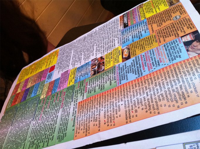
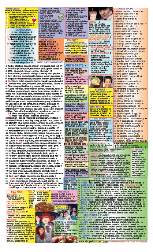
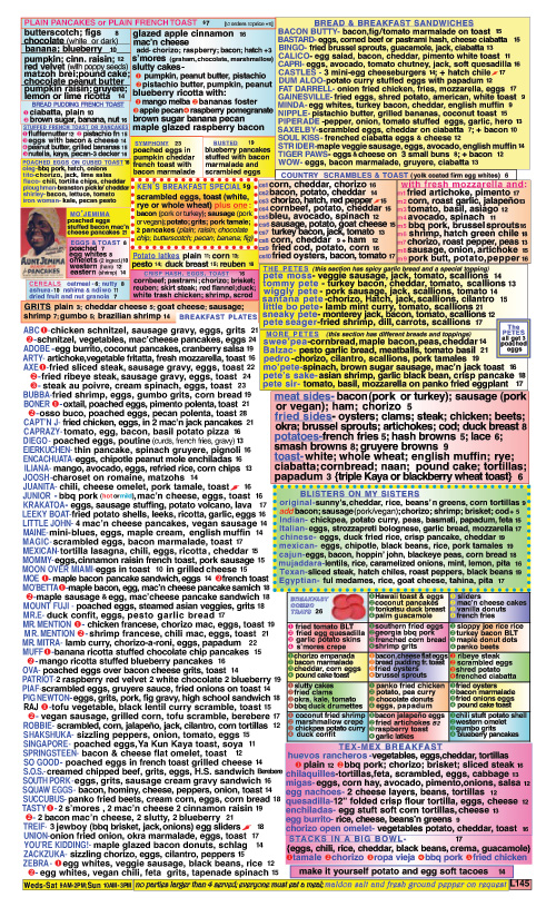
Yes, this is ugly. Both by the standards of common legibility and pleasantness and in contrast to the menus featured so far on this site. But this menu is a perfect reflection of the establishment, Shopsins in New York, the eclectic diner of the eccentric Kenny Shopsin. Once an eleven-page menu featuring over 900 items, the selection has been pared down to fit in a single, double-sided sheet. And fit snugly it does. There isn’t a single bit of white space where your eye can rest, with every nook and cranny filled either with menu items or with really, really bad photography. If you wonder who could design such a sadistic menu you would have to look no further than Shopsin himself: “Shopsin’s daughter, Tamara,” explains a Saveur article, “once admitted that the worst thing she had ever done was teach her father how to use Adobe InDesign. She didn’t expect him to exploit the text-squeeze function to such an extent.” Enjoy. Or not.
Visit Shopsins.
Thanks to Jason Kottke for the suggestion.
Posted
By Armin on 08.10.2011

Joseph Vigor Restaurant Branding’s comment is:
Phenomenally wretched. A true example of everything NOT to do in menu design. I think there is a way to be eccentric without having to ruin the person's ability to actually figure out what they'd like to order.
on 08.10.2011 at 11:55 AM
Patrick Haney’s comment is:
I'm all for "eclectic" but this is probably the worst menu design I've ever seen, and I've seen too many to count. It's not cute or fun, or even "true to the restaurant." It's just horrid and extremely difficult to read.
Try scanning any section of this menu for something you'd like to eat, especially the large blocks of text with white backgrounds. You have to read every single line if you want to consider your meal options.
There's no art here, and design is debatable. Remind me again why this is listed on Art of the Menu?
on 08.10.2011 at 12:07 PM
Marshall’s comment is:
Is this a joke?
on 08.10.2011 at 01:08 PM
Ricky Ferrer’s comment is:
Hahaha...I hear what you all are saying. It kind of gives you a small seizure when you're trying to order, especially when I've seen someone get kicked out for taking to long to order! However, I'm glad to see the menu here. This menu, believe it or not, totally adds to the experience which is Shopsins. Go eat at the restaurant yourself (if you can get a table), or better yet, watch this documentary, eat there, then tell me what you think about the menu.
P.S. I recommend the "Blisters on My Sister"
on 08.10.2011 at 01:30 PM
Kristin L’s comment is:
Ack! My eyes are burning!
on 08.10.2011 at 03:54 PM
Bronson Stamp’s comment is:
Actually, the design is good, even if it's not something you probably saw in a type or design class in undergrad.
It's distinct (which really only matters for competitions or studies like this forum), hierarchy and division of choice is mostly clear, type size is readable, the "grid" helps, it isn't precious or fussy or " cute" (which is were most designers would want this to go toward), it's probably a fair representation of the restaurant, you actually want to read the entire thing because you know there is some wack-ass sandwich somewhere in there. I don't think the point of a menu is to have "white space for your eye to rest." And, considering the quantity of offerings, this output is much more difficult to execute, and was probably under an overly designed designer's budget.
on 08.10.2011 at 04:02 PM
Yael Miller’s comment is:
Come on. This is hilarious. I would enjoy the entertainment if I ate here. This is part of it! Why does everything have to be so perfect, designers? It gets a bit sickening after a while.
on 08.10.2011 at 07:45 PM
Jeff Moore’s comment is:
Love it. I can't imagine going to Shopsin's and not seeing this menu. Fits the place perfectly.
on 08.11.2011 at 07:52 AM
RoibyG’s comment is:
Tons of typos... as for the design, i've never been to Shopsin's so i really can't judge the approach.
on 08.11.2011 at 09:22 AM
Bryan Moats’s comment is:
This design is as honest as it comes. Most of us would probably design it into an unrecognizable myth or something that "perfects" what Shopsin would do "if he only knew how." All that said, it's an ugly menu. No lie.
on 08.11.2011 at 04:55 PM
Joseph Vigor Restaurant Branding’s comment is:
Bottom line: Unreadable. Say what you want about the experience or how it matches up. I'll take your word for it. I can't read it. I doubt anyone really can.
on 08.12.2011 at 02:51 PM
Spencer Cross’s comment is:
I can't read it. I doubt anyone really can.
...and yet, somehow people still manage to order. Amazing!
on 08.14.2011 at 12:16 PM
Rehoboth Beach’s comment is:
Thanks for this interesting article. I hope you post more articles soon, I plan to share this.
on 08.14.2011 at 06:01 PM
Lauren Dickens’s comment is:
Is it just me, or does the guy with the beverage at the top look like Alex from A Clockwork Orange?
on 08.15.2011 at 09:56 AM
n’s comment is:
Really punk, I like it.
on 08.15.2011 at 12:42 PM
Ella’s comment is:
Actually, none of you thought how Shopsin came with the idea. It looks to me the man reads a lot of newspaper ads and his menu looks so much like free ads page of any newspaper in the world. (At least on my side of world)
Except for color, newspapers avoid using so much color but I guess that was his "touch-up" :)
Unreadable? Oh, well, the same is with the ads yet when you're searching for a job or to buy something, you will have the patience to do it, why not when eating at Shopsins :)
on 08.16.2011 at 01:14 PM
Nisrine Sarkis’s comment is:
@Lauren Dickens: That's my exact same thought. It's actually ALL i can see in the menu!
on 08.18.2011 at 01:59 AM

Click Thumbnails Below for Bigger View of the menu
Note: Prices and items may differ in current menu from those shown here.
About
Art of the Menu, is a division of UnderConsideration, cataloguing the underrated creativity of menus from around the world.
Art of the Menu uses Typekit to render Proxima Nova by Mark Simonson and Adelle by Type Together.
Art of the Menu is run with Six Apart’s MovableType 6.8.8
All comments, ideas and thoughts on Art of the Menu are property of their authors; reproduction without the author’s or Art of the Menu’s permission is strictly prohibited
Twitter @ucllc
Thanks to our advertisers
About UnderConsideration
UnderConsideration is a graphic design firm generating its own projects, initiatives, and content while taking on limited client work. Run by Bryony Gomez-Palacio and Armin Vit in Bloomington, IN. More…
blogs we publish
Brand New / Displaying opinions and focusing solely on corporate and brand identity work.
Art of the Menu / Cataloguing the underrated creativity of menus from around the world.
Quipsologies / Chronicling the most curious, creative, and notable projects, stories, and events of the graphic design industry on a daily basis.
products we sell
Flaunt: Designing effective, compelling and memorable portfolios of creative work.
Brand New Conference videos / Individual, downloadable videos of every presentation since 2010.
Prints / A variety of posters, the majority from our AIforGA series.
Other / Various one-off products.
events we organize
Brand New Conference / A two-day event on corporate and brand identity with some of today's most active and influential practitioners from around the world.
Brand Nieuwe Conference / Ditto but in Amsterdam.
Austin Initiative for Graphic Awesomeness / A speaker series in Austin, TX, featuring some of the graphic design industry's most awesome people.
also
Favorite Things we've Made / In our capacity as graphic designers.
Projects we've Concluded / Long- and short-lived efforts.
UCllc News / Updates on what's going at the corporate level of UnderConsideration.
