


Online
- FPO (For Print Only) / Celebrating the reality that print is not dead by showcasing the most compelling printed projects.
- Art of the Menu / Cataloguing the underrated creativity of menus from around the world.
- Quipsologies / Chronicling the most curious, creative, and notable projects, stories, and events of the graphic design industry on a daily basis.
- Speak Up (2002 – 2009) / Discussing, and looking for, what is relevant in, and the relevance of, graphic design. Archives Only.
- Word It (2003 – 2010) / Encouraging creative diversity in the community through monthly, one-word challenges. Archives Only.
- Brand New Classroom (2010 – 2011) / Providing a space for critique and opinions on student identity work. Archives Only.
Publishing
- The 2010 Brand New Awards / 2011, self-published.
- Flaunt: Designing effective, compelling and memorable portfolios of creative work / 2010, self-published.
Events & Judged Competitions
- Brand New Conference / A one-day event on the development of corporate and brand identity projects by some of today’s most active and influential practitioners from around the world.
- Brand New Awards / Celebrating the best identity work produced around the world.
- FPO Awards / Celebrating the best print work from around the world.
Writing
- Graphic Design, Referenced: A Visual Guide to the Language, Applications, and History of Graphic Design / 2009, Rockport.
- Women of Design: Influence and Inspiration from the Original Trailblazers to the New Groundbreakers / 2008, HOW Books.
- The Word It Book: Speak Up Presents a Gallery of Interpreted Words / 2007, HOW Books.
Graphic Design
- Department of Design / Designing corporate and brand identities and full development of printed and digital matter for clients.

A B-Side BY Armin
Dexim
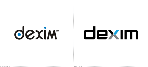
About: “Dexim is a worldwide registered brand manufacturing an extensive line of accessories and applications compatible with popular consumer electronics, including iPhone, iPod, and iPad. Currently selling in over 45 countries, their mission is to provide consumers with products that offer an enjoyable, personalized, and superior experience. Because their corporate image looked so dated, consumers perceived Dexim to be much of the same, and the brand experienced a loss of relevancy and consumer interest in the US. Competing at a higher level required a brand identity redesign to make a statement and better align with their mission and values.”
Design by: Motto.
Ed.’s Notes: Decent. Definitely far better than the original, if a little too envisioning-the-future-in-the-1990s-typography. Plenty of applications below (or after the jump).
Relevant links: N/A.
Continue reading this entry

DATE: Apr.10.2013 POSTED BY: ArminCATEGORY: Consumer products The B-Side COMMENTS:

TAGS: blue, custom, sans serif, x,

A B-Side BY Armin
Doritos
![]()
This post was updated March 27, 2013.
About: “Doritos (literally, from Mexican Spanish doradito or dorito: “turned golden”) is a brand of seasoned tortilla chips produced since 1964 by the North American food company Frito-Lay (a division of PepsiCo, Inc.).” (Source: Wikipedia)
Design by: Hornall Anderson
Ed.’s Notes: Yeah… I don’t know about that bolting triangle destroying the “o”. See it on the bigger view of the logo and before/after of the packaging below (or after the jump).
Relevant links: Full line-up of Doritos variations. Taquitos.net redesign story (much more in-depth than I would ever care to get about it).
Continue reading this entry
DATE: Mar.25.2013POSTED BY: ArminCATEGORY: Consumer products The B-Side COMMENTS:
Opinion BY Armin
Autodesk Folds
![]()
Established in 1982, Autodesk is one of the most well-known and widely used 3D design, engineering and entertainment software companies. Their two flagship products are AutoCAD, a staple in the architecture and engineering industries, and Maya, a powerful 3D animation software used by the likes of DreamWorks Animation SKG. During TED at the end of February, Autodesk introduced a new logo designed in-house.
Continue reading this entry
DATE: Mar.25.2013POSTED BY: ArminCATEGORY: Consumer products COMMENTS:
A B-Side BY Armin
iNature Skincare
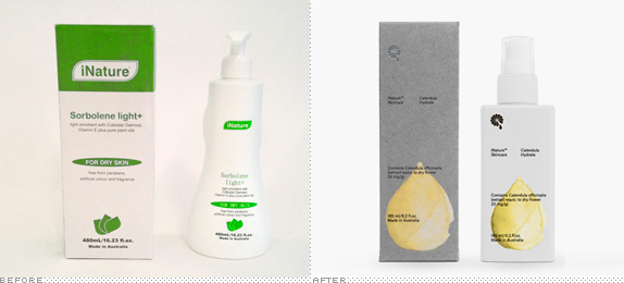
About: “iNature Skincare is an Australian brand with skincare products made of natural ingredients, free from parabens, artificial colours and fragrances. The packaging range consists of three products with different levels of hydration — Calendula Hydrate, Calendula Nourish and Calendula Repair.”
Design by: Bedow.
Ed.’s Notes: Pretty! A few more images below (or after the jump) including big view of the logo, and then some more at the link below.
Relevant links: Bedow case study.
Continue reading this entry
DATE: Mar.19.2013POSTED BY: ArminCATEGORY: Consumer products The B-Side COMMENTS:
TAGS: brush stroke, icon, packaging,
A B-Side BY Armin
Summit Brewing Company
![]()
About: (Est. 1986) “Summit Brewing Company has stayed close to its roots, serving the Upper Midwest and Great Lakes region. Summit’s beers are currently available in 17 states including Minnesota, Florida, Illinois, Indiana, Iowa, Kansas, Kentucky, Michigan, Missouri, Nebraska, New Jersey, North Dakota, Ohio, Pennsylvania, South Dakota, Texas and Wisconsin. Summit now produces 12 varieties of premium craft beer, including seven year-round, four seasonal beers, and the limited release Unchained Series. Since its inception, the brewery has been a consistent pioneer in the craft beer movement.”
Design by: Duffy & Partners.
Ed.’s Notes: Bigger view of the logo below (or after the jump).
Relevant links: Press release. Star Tribune story.
Provided quote: “Summit’s new look is an evolution of the brand’s past two logos, a brand expression that authentically reflects Summit’s unique craft. Duffy’s goal is to express the Summit name so that it punctuates the pictorial idea of an actual summit. This in-turn leverages the equity of the diamond shape that has been the hallmark of the Summit logo from the beginning. Summit Avenue, a vein running through the heart of St. Paul can be seen in the interpretation of a street sign which honors the local community and the heart of this hometown brand.”
Continue reading this entry
DATE: Feb.22.2013POSTED BY: ArminCATEGORY: Consumer products The B-Side COMMENTS:
TAGS: angle, duffy and partners, green, sans serif,
A B-Side BY Armin
Electric
![]()
About: (Est. 2000) “Electric is a global, premium, sport and lifestyle accessory brand rooted in southern California’s rich action sports, music, art and customization culture. Electric designs and markets an extensive line of sunglasses, snow goggles, backpacks, luggage and accessories through a primarily action sport and sporting good global retail network including the Americas, Europe, Japan, China and Australasia. Since 2011 Electric has been a part of PPR, a worldwide leading Luxury and Sport & Lifestyle group.”
Design by: In-house.
Ed.’s Notes: Bigger view of the logo below (or after the jump). Hipster branding at its best! (And I’m not being sarcastic).
Relevant links: Press Release.
Select quote: “The new ‘VOLT’ logo, photography style and brand design celebrates Electric’s Southern California roots with an emphasis on premium quality and timeless style.”
Continue reading this entry
DATE: Feb.13.2013POSTED BY: ArminCATEGORY: Consumer products The B-Side COMMENTS:
TAGS: condensed, lightning, sans serif,
Opinion BY Armin
Nivea Gets Rid of its Own Wrinkles
![]()
First produced in 1882 in Germany by pharmacist Carl Paul Beiersdorf, Nivea is today one of the leading skincare products in the world owned by Beiersdorf AG (which also owns Elastoplast, Eucerin, Labello, and La prairie). Nivea’s most well-known product is its original Nivea Crème which was first packaged in the iconic blue tin in 1925 and now serves as the basis for the “new global design language” introduced by Nivea this week, designed by San Francisco-based fuseproject.
Continue reading this entry
DATE: Jan.16.2013POSTED BY: ArminCATEGORY: Consumer products COMMENTS:
TAGS: blue, circles, fuseproject, packaging,
Opinion BY Armin
Tazo Drops the Gothic Act
![]()
Established in 1994 as an independent company and purchased by Starbucks in 1999, Tazo makes tea products and markets them as if tea were a higher calling. (I’m not knocking it, that’s just the way they do it — example of copywriting: “We experience the goodness of the leaves with all our senses, but most of all with our imaginations.”) Back in November new packaging started to appear in grocery stores and Starbucks and with the opening of the first Tazo store at University Village in Seattle a whole new identity has been introduced. No press release issue or design credit given. My guess is that it was internal, since Starbucks has such a strong in-house team. All the images below have been cobbled together from around the internet so it’s a little hodgepodge in terms of presentation, but you’ll get the point.
Continue reading this entry
DATE: Jan.08.2013POSTED BY: ArminCATEGORY: Consumer products COMMENTS:
TAGS: colorful, packaging, sans serif,
A B-Side BY Armin
Glutino
![]()
About: (Est. 1983) “Glutino and Gluten-Free Pantry is a manufacturer and distributor specializing in gluten-free products. Since 1983, the mission of the Glutino Food Group has been to provide healthy gluten-free products and a healthy lifestyle to all those with celiac disease, gluten intolerance, wheat allergies and those who follow a gluten-free or wheat-free diet.”
Design by: N/A.
Ed.’s Notes: Silly type for a silly name, more stuff below (or after the jump).
Relevant links: N/A.
Continue reading this entry
DATE: Dec.11.2012POSTED BY: ArminCATEGORY: Consumer products The B-Side COMMENTS:
Opinion BY Armin
I See Yoo
![]()
Just launched by SKY New Zealand and Television New Zealand, IGLOO is a “digital set top box that plugs into your telly and broadcasts through your UHF aerial” giving users in New Zealand access to free-to-air channels and, its main hook, a pre-paid range of premium channels without long-term contracts, going on a month-to-month basis with only the channels you want and not bloated packages with channels no one watches. The name, brand, and roll-out have been created by Interbrand Australia.
Update: I have changed the title of the post (originally “Not your Eskimos’ Igloo” (as a play on “Not your parents’ this or that)) as I was not aware that Eskimo is considered a pejorative term. Apologies to anyone who thought of it as offensive; it wasn’t my intention.
Continue reading this entry
DATE: Dec.10.2012POSTED BY: ArminCATEGORY: Consumer products COMMENTS:
TAGS: bold, flexible identity, interbrand, mascot, new zealand,


Books about logo design, the designers that create them and the meaning of branding.
