


Online
- FPO (For Print Only) / Celebrating the reality that print is not dead by showcasing the most compelling printed projects.
- Art of the Menu / Cataloguing the underrated creativity of menus from around the world.
- Quipsologies / Chronicling the most curious, creative, and notable projects, stories, and events of the graphic design industry on a daily basis.
- Speak Up (2002 – 2009) / Discussing, and looking for, what is relevant in, and the relevance of, graphic design. Archives Only.
- Word It (2003 – 2010) / Encouraging creative diversity in the community through monthly, one-word challenges. Archives Only.
- Brand New Classroom (2010 – 2011) / Providing a space for critique and opinions on student identity work. Archives Only.
Publishing
- The 2010 Brand New Awards / 2011, self-published.
- Flaunt: Designing effective, compelling and memorable portfolios of creative work / 2010, self-published.
Events & Judged Competitions
- Brand New Conference / A one-day event on the development of corporate and brand identity projects by some of today’s most active and influential practitioners from around the world.
- Brand New Awards / Celebrating the best identity work produced around the world.
- FPO Awards / Celebrating the best print work from around the world.
Writing
- Graphic Design, Referenced: A Visual Guide to the Language, Applications, and History of Graphic Design / 2009, Rockport.
- Women of Design: Influence and Inspiration from the Original Trailblazers to the New Groundbreakers / 2008, HOW Books.
- The Word It Book: Speak Up Presents a Gallery of Interpreted Words / 2007, HOW Books.
Graphic Design
- Department of Design / Designing corporate and brand identities and full development of printed and digital matter for clients.

Opinion BY Armin
Motorola: Hands Off You Damn Dirty Apes
![]()
Established in 1928, Motorola was a telecommunications company that designed and produced a number of consumer and professional products, from two-way radios to cable TV set-top boxes to cellular and smartphones, including the once groundbreaking RAZR. After a rough patch towards the end of the first decade of the 2000s, Motorola was split into two independent companies: Motorola Solutions, which “provides mission-critical communications products and services to enterprises and governments” and Motorola Mobility, which “delivers personalized information to meet the needs of consumers both in the home and on the go.” The latter keeping the smartphone side of the business. In 2012 Google acquired Motorola Mobility setting up a beneficial synergy between Google’s Android OS and Motorola’s hardware. This week, a new tiny logo for Motorola was spotted on the footer of Techweek100’s site, a conference presented by Motorola. Later, not sure how, another version of the logo, confirmed by Motorola, appeared. No announcement, official reveal, or design credit.
Continue reading this entry

DATE: Jun.27.2013 POSTED BY: ArminCATEGORY: Corporate COMMENTS:


A B-Side BY Armin
First Advantage
![]()
About: “First Advantage provides comprehensive screening, identity and information solutions that give employers and housing providers access to actionable information that results in faster, more accurate people decisions. With an advanced global technology platform and superior customer service delivered by experts who understand local markets, First Advantage helps customers around the world build fully scalable, configurable screening programs that meet their unique needs. Headquartered in Alpharetta, Ga., First Advantage has offices throughout North America, Europe and Asia.”
Design by: N/A.
Ed.’s Notes: As much as I don’t like globes, or globes with pluses, or transparent globes, or cheesy gradient effects, there is something attractive about this, like a mosquito lamp. Also, that old logo? Pure, big-brother evil. Bigger view of the logo below (or after the jump).
Relevant links: Press release.
Select quote: “The new brand communicates First Advantage’s substantial market leading position, which has grown significantly through the recent acquisition of LexisNexis’ screening solutions. The logo — a stylized globe spinning on its axis — has a crisp, contemporary look that underscores First Advantage’s goal to drive innovation in the screening market.”
Continue reading this entry
DATE: Jun.25.2013POSTED BY: ArminCATEGORY: Corporate The B-Side COMMENTS:
TAGS: blue, globe, plus, sans serif,
Opinion BY Armin
And Partners Make Seven
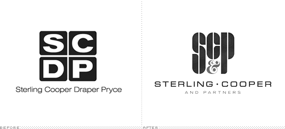
Established in 1968, Sterling Cooper & Partners (SC&P) is one of the leading advertising agencies in New York, NY and is the result of a merger between Sterling Cooper Draper Pryce (est. 1963) and previous competitor Cutler Gleason and Chaough. SC&P’s current list of clients includes Chevrolet, Mohawk Airlines, Manischevitz Wines, and Ocean Spray and Sunkist (which is a conflict of interests). When first merged, the agency attempted to adopt Sterling Cooper Draper Pryce Cutler Gleason and Chaough as a name and SCDPPCG as an acronym but soon after settled on the name Sterling Cooper & Partners honoring the original partners, Bertram Cooper and Roger Sterling Sr. (current Roger Sterling’s daddy), who had founded the Sterling Cooper Advertising Agency in 1923. Yesterday, the agency introduced its new logo through a press release issued for immediate release. No design credit was given.
Continue reading this entry
DATE: Jun.18.2013POSTED BY: ArminCATEGORY: Corporate COMMENTS:
TAGS: 1960s, 1970s, advertising, mad men,
Opinion BY Armin
Mint-Flavored Maple Leaf
![]()
Established in 1908, the Royal Canadian Mint is the for-profit corporation responsible for the minting and distribution of Canada’s circulation and collector coins. At the beginning of June — with all of its press release attention going to a special collector coin designed by comedian Martin Short — it announced its new logo through a tweet. Design credit not given.
Continue reading this entry
DATE: Jun.17.2013POSTED BY: ArminCATEGORY: Corporate COMMENTS:
TAGS: canada, circles, coins, maple leaf,
Opinion BY Armin
The Emperor’s New Coating
![]()
Established in 1866 as Herberts, then purchased by DuPont in the 1990s when it was renamed as DuPont Performance Coatings, and most recently purchased by asset manager, The Carlyle Group, the newly renamed and more independent Axalta Coating Systems is a global provider of liquid and powder coatings to automotive, transportation, general industrial, and selected architectural and decorative customers. Axalta employs 12,000 people across 35 manufacturing plants and seven R&D centers around the world, it has over 1,800 patents held or pending, and revenues of more than $4 billion in 2012. The new name and identity, both realized by Futurebrand, were announced last week.
Continue reading this entry
DATE: Jun.12.2013POSTED BY: ArminCATEGORY: Corporate COMMENTS:
TAGS: flexible identity, futurebrand, glossy, gradient, red,
Opinion BY Armin
News: News Corp New Corporate Logo
![]()
To complete the other part of the equation on the unveiling of the 21st Century Fox logo earlier this month, the other half of the split News Corp has now introduced its new logo — no design credit given. As a refresher: “News Corporation is splitting into two separate businesses. The first, to remain named News Corporation will handle all the publishing properties — newspapers and magazines — like The Wall Street Journal and The New York Post, with the former’s managing editor, Robert Thompson, as CEO. The second, to be renamed 21st Century Fox will handle the entertainment properties — cable and television channels, filmed entertainment, and direct satellite broadcasting businesses — including the FOX network, 20th Century FOX, FX, among dozens of other channels with Rupert Murdoch as CEO.” While the 21st Century logo didn’t replace anything and was a new expression, this new News Corp logo does replace the old one.
Continue reading this entry
DATE: May.29.2013POSTED BY: ArminCATEGORY: Corporate COMMENTS:
TAGS: hand-drawn, news corp, signature,
A B-Side BY Armin
Continental
![]()
About: (Est. 1871) “Continental was founded in Hanover in 1871 as the stock corporation ‘Continental-Caoutchouc- und Gutta-Percha Compagnie’ Manufacturing at the main factory in Hanover included soft rubber products, rubberized fabrics, and solid tires for carriages and bicycles. Today, Continental ranks among the top 5 automotive suppliers worldwide. As a supplier of brake systems, systems and components for powertrains and chassis, instrumentation, infotainment solutions, vehicle electronics, tires and technical elastomers, Continental contributes to enhanced driving safety and global climate protection. Continental is also a competent partner in networked automobile communication. With around 170,000 employees (Status: December 31, 2012) in 46 countries, the Continental Corporation is divided into the Automotive Group and the Rubber Group.”
Design by: Peter Schmidt Group.
Ed.’s Notes: It’s time to play “Spot the Difference”! It’s a nice update, specially to the horse. Application image below (or after the jump).
Relevant links: Annual Shareholders’ Meeting presentation (PDF). News story (in German).
Select quote: “The revamped, more contemporary, fresh design represents the positioning of the Corporation. The message it projects is this: Our technological solutions are helping people enrich the quality of their lives through mobility and structure their living space in a sustainable way.”
Continue reading this entry
DATE: May.24.2013POSTED BY: ArminCATEGORY: Corporate The B-Side COMMENTS:
Opinion BY Armin
P&G is Over the Moon
![]()
Established in 1837, P&G is one of the largest (if not the largest) consumer packaged goods company in the world with operations in 75 countries and more than $83 billion in sales in 2012. Its two key areas — beauty and grooming and household care — include some of the most well-known consumer brands like Pampers, Gillette, Tide, Ariel, Downy, Pantene, Head & Shoulders, Olay, Oral-B, Crest, Dawn, and Always. Earlier this year, without calling much attention to itself, P&G introduced a new logo designed by Landor.
Continue reading this entry
DATE: May.21.2013POSTED BY: ArminCATEGORY: Corporate COMMENTS:
TAGS: blue, landor, moon, procter and gamble,
Opinion BY Armin
Kering Goes Owl Out with New Branding
![]()
Established in 1963 as Pinault — later Pinault-Printemps, later Pinault-Printemps-Redoute, most recently PPR, and completely renamed as Kering this past March — is one of the most comprehensive parent company of luxury brands, including Gucci, Bottega Veneta, Saint Laurent, Alexander McQueen, Balenciaga, Brioni, Christopher Kane, and Stella McCartney among others as well as sports brand Puma. Family-owned since its inception, Kering is present in more than 120 countries, it employs 33,000 people and generates 9.7 billion euros in revenue. The new name was created internally with help from Havas Lifestyle, who are also credited with designing the logo and identity while Dragon Rouge is credited with brand strategy and the signature.
Continue reading this entry
DATE: May.14.2013POSTED BY: ArminCATEGORY: Corporate COMMENTS:
Opinion BY Armin
The Future of Fox is Now
![]()
Hinted to as early as July of 2012 and officially announced this past December, Rupert Mudorch’s News Corporation is splitting into two separate businesses. The first, to remain named News Corporation will handle all the publishing properties — newspapers and magazines — like The Wall Street Journal and The New York Post, with the former’s managing editor, Robert Thompson, as CEO. The second, to be renamed 21st Century Fox will handle the entertainment properties — cable and television channels, filmed entertainment, and direct satellite broadcasting businesses — including the FOX network, 20th Century FOX, FX, among dozens of other channels with Rupert Murdoch as CEO. Absolutely every single property will retain its existing name and logo. The name, 21st Century Fox, will serve as the parent company only and the logo — announced this past Thursday via an e-mail to employees — will only be a business-to-business mark. It was designed by Pentagram partners Michael Gericke and Emily Oberman.
Continue reading this entry
DATE: May.13.2013POSTED BY: ArminCATEGORY: Corporate COMMENTS:


Books about logo design, the designers that create them and the meaning of branding.
