
Opinion BY Armin
Triangle is as Triangle does
Established in 1880 and selling educational materials since the 1890s, Houghton Mifflin Harcourt (HMH) today is one of the leading and the world’s largest providers of pre-K-12 education solutions and one of the longest-established publishing houses. Further official description: “HMH’s interactive, results-driven education solutions are utilized by 60 million students in 120 countries, and its renowned and awarded novels, non-fiction, children’s books and reference works are enjoyed by readers throughout the world.” Today, HMH introduced a new identity designed by New York, NY-based Lippincott.
Continue reading this entry

DATE: Dec.04.2012 POSTED BY: Armin
 CATEGORY: Education
  COMMENTS:

TAGS: book, geometric, gray, lippincott, sans serif, yellow,

Opinion BY Armin
X Marks the Finnish Line

Set to open in early 2013 the University of the Arts Helsinki (“Taideyliopisto” in Finnish) is the new organizational name for the merger of three existing universities: the Finnish Academy of Fine Arts, the Sibelius Academy (music) and the Theatre Academy Helsinki. The first two were established in the mid to late 1800s while the latter in 1979, and together they have around 2,000 enrolled students. The new name was accepted in January and this week they introduced their identity, designed by Helsinki-based Bond.
Continue reading this entry

DATE: Nov.29.2012 POSTED BY: Armin
 CATEGORY: Education
  COMMENTS:

TAGS: art, black, distorted, finland, flexible identity, university, x,

Opinion BY Armin
IC, UC, We all C for California
Established in 1868, the University of California (UC) is the public university system of the state of California that encompasses ten campuses: Berkeley, San Francisco, Los Angeles, Santa Barbara, Riverside, Davis, San Diego, Irvine, Santa Cruz, and Merced. Rarely will people say they attend or teach (past or present) at “UC” or “University of California”, they are usually very specific as to which campus — its most well known probably being Berkeley and UCLA — so UC and University of California are more of a parent company. UC “includes more than 220,000 students and more than 170,000 faculty and staff, with more than 1.5 million alumni living and working around the world.” So, it’s big. Starting in September, UC introduced a new logo and identity. No design credit given. And no specifications shared as to how, or if at all, this logo affects the unique logos of each of the ten campuses. Currently, the identity has been rolled out in an admissions website separate from the main site, a campaign website for an initiative called Onward California, and on another (see Stanford) very nice brand mini site.
Update: It has been confirmed that the design — everything from the logo to the video to the applications — was carried in-house, by an 11-person creative team formed about three and a half years ago. The post has also been updated with quotes from the team. (Full credits at the end.)
Continue reading this entry

DATE: Nov.20.2012 POSTED BY: Armin
 CATEGORY: Education
  COMMENTS:

TAGS: blue, california, monogram, pattern, university,

Opinion BY Armin
Stanford Gets Classier
Established in 1891, Stanford is one of the most prominent universities in the United States. Currently, 6,927 undergraduate and 8,871 graduate students are enrolled and taught by 1,995 faculty members, which at the moment include 19 Nobel laureates, 4 Pulitzer Prize winners, 24 MacArthur Fellows. Its proximity to Silicon Valley has made it a breeding ground for nerds of all kinds, some of whom have grown up to be millionaire nerds (i.e., Google founders Larry Page and Sergey Brin). Without any fanfare, Stanford has recently updated its “signature” (or wordmark) while maintaining all the other symbols and emblems — the Block “S”, the Block “S” with Tree, and the University Seal — intact. A comprehensive identity section on their website covers the identity system in detail and the bulk of their online presence has converted to the new signature and web fonts while others catch up.
Continue reading this entry

DATE: Nov.15.2012 POSTED BY: Armin
 CATEGORY: Education
  COMMENTS:

TAGS: crimson, serif, university,

Opinion BY Armin
From Barracks with Love
Established in 1992 in the small (pop. 71,000 and counting) town of Brandenburg an der Havel in Germany, Fachhochschule Brandenburg (wherein Fachhochschule translates to University of Applied Sciences) offers degree courses to approximately 3,000 students in engineering, business administration and economics as well as information technology and media. The university is housed in an 1880s building that originally served as barracks for the Prussian army. Last month Fachhochschule Brandenburg introduced a new identity designed by Thomas Manss & Company.
Continue reading this entry

DATE: Oct.22.2012 POSTED BY: Armin
 CATEGORY: Education
  COMMENTS:

TAGS: germany, gotham, icon, red, university,

A B-Side BY Armin
La Trobe University
About: (Est. 1967) “La Trobe University is a multi-campus university in Victoria, Australia. Since 2003, we have consistently ranked among the top 500 universities in the world.” 33,198 students were enrolled in 2011.
Design by: N/A.
Ed.’s Notes: Wow. Copperplate. Good riddance.
Relevant links: N/A.
Thanks to Greg Nelson for the tip.

DATE: Oct.16.2012 POSTED BY: Armin
 CATEGORY: Education The B-Side
  COMMENTS:

TAGS: australia, eagle, sans serif, university,

Opinion BY Armin
Pixelated Education
Established in 1955 in Victoria, BC, Canada, Royal Roads University (RRU) is a small, public university with about 2,500 students who study through a blend of on-site and online education to gain doctorate, graduate and undergraduate degrees. Perhaps RRU’s biggest claim to fame is its photogenic Hatley Castle, which doubled as Professor Xavier’s School for Gifted Youngsters in two X-Men films. Back in June, RRU introduced a new identity designed by Canadian marketing agency Cossette.
Continue reading this entry

DATE: Aug.29.2012 POSTED BY: Armin
 CATEGORY: Education
  COMMENTS:

TAGS: canada, pixelated, university,

A B-Side BY Armin
George Washington University
Established in 1821, George Washington University (GWU) is a private university in Washington, D.C. with 25,000 students and 1,174 faculty. Last week GWU introduced a new identity designed jointly by Futurebrand and 160over90 — FutureBrand refreshed the core identity elements and 160over90 created the new look and feel for the university’s marketing and communication materials (seen in action here). Press release here. Thorough PDF with the identity guidelines here. Detail view of the logo below (or after the jump).
Continue reading this entry

DATE: Aug.28.2012 POSTED BY: Armin
 CATEGORY: Education The B-Side
  COMMENTS:

TAGS: 160over90, futurebrand, illustration, sans serif, university,

Opinion BY Armin
Senac’s Paper Airplane Goes Down in Flames
Established in 1946, Senac — originally SENAC, short for Serviço Nacional de Aprendizagem Comercial; National Commercial Training Service in English — is a vocational trade education institution in Brazil where it has presence all over the country with over 580 locations. It employs over 23,000 faculty members that teach more than 54,000 combined classes to 1,150,000 students a year. In other words: it’s big. Earlier this month, Senac introduced a new logo, designed by Rio de Janeiro-based Packaging Brands, and a new advertising campaign by Ogilvy.
Continue reading this entry

DATE: Aug.22.2012 POSTED BY: Armin
 CATEGORY: Education
  COMMENTS:

TAGS: brazil, custom, icon, sans serif,

Opinion BY Armin
New University of the Arts London Logo, or Why I Hate Helvetica
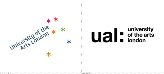
Established in 1986 and originally named the London Institute, University of the Arts London (UAL), as it was renamed in 2004, is a network of six colleges — Camberwell College of Arts, Central Saint Martins College of Arts and Design, Chelsea College of Art and Design, London College of Communication, London College of Fashion, and Wimbledon College of Art — devoted to art, design, fashion, and media offering courses at all levels from foundation and undergraduate to postgraduate and research. Spread throughout London, the six campuses serve over 20,000 students through approximately 1,200 staff. Last week, Creative Review was first to show a new identity for UAL designed by Pentagram partner Domenic Lippa, that led to a zesty range of mostly negative reader comments. Stating that UAL did not like its identity, specifically, its visual performance, Pentagram instituted an all-Helvetica approach. Kill me now.
Continue reading this entry

DATE: Jun.18.2012 POSTED BY: Armin
 CATEGORY: Education
  COMMENTS:

TAGS: helvetica, london, pentagram, university,


