


Online
- FPO (For Print Only) / Celebrating the reality that print is not dead by showcasing the most compelling printed projects.
- Art of the Menu / Cataloguing the underrated creativity of menus from around the world.
- Quipsologies / Chronicling the most curious, creative, and notable projects, stories, and events of the graphic design industry on a daily basis.
- Speak Up (2002 – 2009) / Discussing, and looking for, what is relevant in, and the relevance of, graphic design. Archives Only.
- Word It (2003 – 2010) / Encouraging creative diversity in the community through monthly, one-word challenges. Archives Only.
- Brand New Classroom (2010 – 2011) / Providing a space for critique and opinions on student identity work. Archives Only.
Publishing
- The 2010 Brand New Awards / 2011, self-published.
- Flaunt: Designing effective, compelling and memorable portfolios of creative work / 2010, self-published.
Events & Judged Competitions
- Brand New Conference / A one-day event on the development of corporate and brand identity projects by some of today’s most active and influential practitioners from around the world.
- Brand New Awards / Celebrating the best identity work produced around the world.
- FPO Awards / Celebrating the best print work from around the world.
Writing
- Graphic Design, Referenced: A Visual Guide to the Language, Applications, and History of Graphic Design / 2009, Rockport.
- Women of Design: Influence and Inspiration from the Original Trailblazers to the New Groundbreakers / 2008, HOW Books.
- The Word It Book: Speak Up Presents a Gallery of Interpreted Words / 2007, HOW Books.
Graphic Design
- Department of Design / Designing corporate and brand identities and full development of printed and digital matter for clients.

Guest Opinion from Sam Becker posted BY Brand New
Neutron
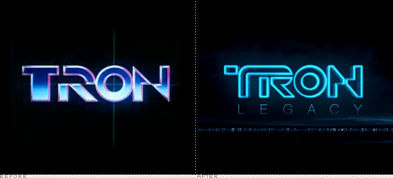
It might be called Legacy but this is not your grandmother’s Tron. When Steven Lisberger’s epic film came out in 1982 it was groundbreaking in its imagination and extensive in its use of computer-generated imagery. Tron leveraged the most cutting edge CG available to portray the intimate inner-workings of a vast network of computers. Inside these circuits were forgotten applications and wayward human beings battling each other for the amusement of a sinister mainframe overlord. Initial reviews accused the film of putting visual effects ahead of storyline: style above substance. The original logo supports this argument.
Continue reading this entry

DATE: Aug.04.2009 POSTED BY: Brand NewCATEGORY: Entertainment COMMENTS:

TAGS:

BY Armin
MTV International goes Bare
![]()
Last week Creative Review reported on what I think is one of the biggest brand stories of the year: The new look for MTV International headed by Universal Everything. It would be bigger than big had this new look also applied to MTV in the U.S. but, unless I got my 60-plus MTV channels confused, this change only applies to the MTV International Network, which is still a hell of a lot of channels for a hell of a lot of people. What makes this big, and at the core of this identity change, is that the MTV logo will no longer mutate to the whims of every and any designer and animator that gets his or her hands on it. No, the logo will now only appear in its original, black and white wordmark designed back in 1981. What’s funny though is that the designers never really intended for the MTV logo to be used as is, from the beginning it was seen as point of departure rather than a destination.
Continue reading this entry
DATE: Jul.06.2009POSTED BY: ArminCATEGORY: Entertainment COMMENTS:
TAGS:
BY Armin
Radio Ambigram
![]()
With over 40 stations covering all of Mexico, a handful across north of the border in the U.S., and over a dozen south of the border in Guatemala, Honduras, Costa Rica, Panama and Ecuador, EXA FM is one of the largest radio networks in Latin America. This month EXA presented a new identity that takes advantage of its amazing short name — anything with an “x” in it is awesome — to create a simple and bold ambigram. The final execution is a little wonky, I think the shapes (particularly the counterspaces) could have been better resolved but the design concept is exa-llent. (Sorry, couldn’t resist).
Thanks to Ramon M. for the tip.
DATE: Jun.30.2009POSTED BY: ArminCATEGORY: Entertainment COMMENTS:
TAGS:
BY Armin
How Visceral is too Visceral?
![]()
Okay, so you are all tired and bored of these corporate mergers and boring wordmarks with simpleton icons that could be done with children’s chalks, right? Fine. Let’s take it to the opposite end of the spectrum, shall we? Visceral Games is the newly minted name for EA’s Electronic Arts Redwood Shores (EARS) studio that has been responsible for gory, action-packed games like Dead Space. Its tagline — which follows the same premise as EA’s “It’s in the Game” — is the more heart-wrenching “It’s in our blood.” The identity has been designed by Venice, California based Arnson Communications in collaboration with Bill Dawson.
Continue reading this entry
DATE: Jun.11.2009POSTED BY: ArminCATEGORY: Entertainment COMMENTS:
TAGS:
BY Armin
Thunderous Pictures
![]()
Few Hollywood movie studios or production houses are as tied to a single film as RKO Pictures is to 1941’s Citizen Kane. Perhaps it’s simply the fact that it is one of the most widely celebrated movies of all time and the animated radio transmitter has been played over and over. It also seems that, despite RKO pictures and its logo being around since 1928, there has been no logo other than that nostalgic beep-beep-beeping, black and white rendition. The before logo shown above has been in use since 1997. Selective film and identity memory, I guess. Recently — and for anyone that might know if this is not so recent, feel free to let us know — RKO introduced a new, simpler logo.
Continue reading this entry
DATE: May.25.2009POSTED BY: ArminCATEGORY: Entertainment COMMENTS:
TAGS:
BY Armin
Música Muy Caliente
![]()
Available in the U.S., Latin America and Europe, HTV (Hispanic Television) is a music channel broadcasting the best Latin and Hispanic music videos. Launched in 1995, it was acquired in 2007, along with other channels, by Turner Broadcasting System Latin America. This past April, it launched a new identity designed by Turner’s own Latin in-house design group based in Argentina, InJaus. (In Spanish, that spelling would be pronounced as “in-house”.)
Continue reading this entry
DATE: May.18.2009POSTED BY: ArminCATEGORY: Entertainment COMMENTS:
TAGS:
BY Armin
Much Less for MuchMore
![]()
Launched a little over ten years ago as a companion to MuchMusic and now part of the bigger Much[Blank] network of Canadian music channels, MuchMoreMusic changed its name and logo this past March. The new name is just MuchMore, dropping the music, which is weird because “MuchMore” doesn’t mean, well, much without the “music” part. At least that’s what I found while Googling. But that’s not necessarily the driving point of this review. The new logo was apparently redesigned in-house by Vancouver Film School graduate Nicolas Alexander. The old logo was, of course, a mess of Garamondic proportions that lacked any sort of intention or interest. The new one, on the other hand, is striving hard for both intention and interest, but I’m not sure what either is. Maybe it’s explained in how the logo animates — not being in Canada, I can’t see the on-air applications and the animation group, Crush, that did the broadcast work does not have anything on their site — but I don’t get what the missing pieces of the “M”s and the “O” are supposed to be. Loading? More? Much more? What? Why just MMO get the slicing treatment? Nonetheless, it’s an improvement and it looks fun but, for me, not MuchMore positive things to say than that.
Thanks to Kyle Richmond for the tip.
DATE: Apr.13.2009POSTED BY: ArminCATEGORY: Entertainment COMMENTS:
TAGS:
BY Armin
Creepy Eyes Be Gone
![]()
One of the most infamous logos of 2008 — which not surprisingly made it to our worst section of 2008’s Best and Worst — is back for another round. WGN America, the only remaining “superstation” in the U.S. unveiled yesterday a new identity that attempts to put behind the weirdest eyes to pass as a logo in recent memory. Although, to be fair, they did drop the eye illustration at some point between its own unveiling and now. The new logo is equally baffling in its own right: Three rounded-edge squares, skewed to come together hold some poorly mishandled default slab serif on top of a clashing rounded geometric sans serif. Sigh. There is nothing pleasing about this logo with so many dissonant elements mixed together. Maybe, if they keep up this pace, third time is the charm a year from now? Further reading on this story can be found here.
Thanks to Jay Mann for first tip.
DATE: Apr.10.2009POSTED BY: ArminCATEGORY: Entertainment COMMENTS:
TAGS:
BY Armin
Mi Discovery Kids es su Discovery Kids
![]()
The Latin American edition of the Discovery Kids channel has redesigned their logo, leaving behind the globe-heavy visual language that used to dominate all of Discovery Communications’ logos that, in turn, have been slowly disappearing. No word on whether this identity will translate (pun!) for the main U.S. Discovery Kids, but it very well should. It is infinitely more energetic, playful and appropriate. It feels more like the logo for a cool science and children’s museum where you can interact with the topic, rather than a logo that looks like part of a monolithic media empire that happens to have a channel for kids. The “i” as an exclamation point is clichéd, there are far better type choices than VAG Rounded and the angled “s” is kind of weird, but overall it has just the right feel. Make sure you roll over the logo in the web site, it opens a world (pun!) of possibilities for this identity.
Thanks to Alberto G. Manuel for first tip.
DATE: Apr.07.2009POSTED BY: ArminCATEGORY: Entertainment COMMENTS:
TAGS:
BY Christian Palino
Gaming Logo on Demand
![]()
OnLive is a recently launched service providing games on demand. A vast selection of titles for rent or purchase, game trials, multiplayer capabilities, PC and Mac compatible —�all instantly accessible through a broadband connection. I just saw this over at the Game Developers Conference and its a pretty cool prospect for avid gamers that may pose a potential impact to the console wars. While their identity may employ all the cliches one might expect —�techy typography, a play symbol, dimensional circle with gradient shading and an animated light reflection — the overall feeling is appropriate and the limited black and gold color scheme feels cohesive (and not too much like the palette of Donald Trump’s bathroom!). Imagining the audience that Onlive has in mind, this is a successful, though slightly overplayed, visual approach. Images for the console and controller can be seen here
DATE: Apr.02.2009POSTED BY: Christian PalinoCATEGORY: Entertainment COMMENTS:
TAGS:


Books about logo design, the designers that create them and the meaning of branding.
