


Online
- FPO (For Print Only) / Celebrating the reality that print is not dead by showcasing the most compelling printed projects.
- Art of the Menu / Cataloguing the underrated creativity of menus from around the world.
- Quipsologies / Chronicling the most curious, creative, and notable projects, stories, and events of the graphic design industry on a daily basis.
- Speak Up (2002 – 2009) / Discussing, and looking for, what is relevant in, and the relevance of, graphic design. Archives Only.
- Word It (2003 – 2010) / Encouraging creative diversity in the community through monthly, one-word challenges. Archives Only.
- Brand New Classroom (2010 – 2011) / Providing a space for critique and opinions on student identity work. Archives Only.
Publishing
- The 2010 Brand New Awards / 2011, self-published.
- Flaunt: Designing effective, compelling and memorable portfolios of creative work / 2010, self-published.
Events & Judged Competitions
- Brand New Conference / A one-day event on the development of corporate and brand identity projects by some of today’s most active and influential practitioners from around the world.
- Brand New Awards / Celebrating the best identity work produced around the world.
- FPO Awards / Celebrating the best print work from around the world.
Writing
- Graphic Design, Referenced: A Visual Guide to the Language, Applications, and History of Graphic Design / 2009, Rockport.
- Women of Design: Influence and Inspiration from the Original Trailblazers to the New Groundbreakers / 2008, HOW Books.
- The Word It Book: Speak Up Presents a Gallery of Interpreted Words / 2007, HOW Books.
Graphic Design
- Department of Design / Designing corporate and brand identities and full development of printed and digital matter for clients.

A B-Side BY Armin
Vevo
![]()
About: (Est. 2009) “Vevo is a joint venture music video website operated by Sony Music Entertainment, Universal Music Group, and Abu Dhabi Media with EMI licensing its content to the group without taking an ownership stake. The videos on Vevo are syndicated across the web, with Google and Vevo sharing the advertising revenue.” (Source: Wikipedia).
Design by: Red Antler.
Ed.’s Notes: I like it. Bigger view of the logo, some motion graphics, and a couple applications below (or after the jump).
Relevant links: Red Antler case study.
Select quote: “We’ve introduced a streamlined, lowercase logotype, creating a brand that celebrates fans. expressive, in-your-face graphics, rich color, and strong typography reflect an infectious passion for music.”
Continue reading this entry

DATE: Apr.16.2013 POSTED BY: ArminCATEGORY: Entertainment The B-Side COMMENTS:


A B-Side BY Armin
AMC (TV)
![]()
About: (Est. 1984) “AMC is an American basic cable and satellite television channel that is owned by AMC Networks. The channel primarily airs theatrically released movies, along with a limited amount of original programming. The channel’s name originally stood for “American Movie Classics”, though since 2002, the full name has been deemphasized as a result of a major shift in its programming. AMC’s most successful original series include Mad Men, Breaking Bad, The Walking Dead, and Hell on Wheels.” (Source: Wikipedia)
Design by: Troika.
Ed.’s Notes: Not sure this was needed, but okay, I guess. The “gold” effect feels more cheap than premium and reminds me of some of the not so old on-air graphics of HBO.
Relevant links: Troika case study. Press Release.
Select quote: “AMC announced today a new look and brand positioning, ‘AMC: Something More,’ which reflects the network’s ongoing commitment to providing a place for original stories and characters that defy expectations. Now featured on-air and online, ‘AMC: Something More’ punctuates a refreshed graphic identity for the network. AMC’s new identity features an updated logo, with letterforms surrounded by a gold box which suggests both premium quality and popular appeal.”
Continue reading this entry
DATE: Apr.08.2013POSTED BY: ArminCATEGORY: Entertainment The B-Side COMMENTS:
Opinion BY Armin
Boom Goes the Logo
![]()
Established in 2010 in Sydney, Boom — originally Vid-id until late 2012 — is a social video advertising company that helps brands position and promote video campaigns so that they reach the most amount of targeted viewers for the longest period of time. With the name change came a new identity by Sydney-based Blow.
Continue reading this entry
DATE: Apr.04.2013POSTED BY: ArminCATEGORY: Entertainment COMMENTS:
A B-Side BY Armin
Spotify
![]()
About: (Est. 2008) “Spotify is an award-winning digital music service that gives you on-demand access to over 20 million tracks. Our dream is to make all the world’s music available instantly to everyone, wherever and whenever they want it. Spotify makes it easier than ever to discover, manage and share music with your friends, while making sure that artists get a fair deal. Spotify is available in 17 countries: USA, UK, Sweden, Finland, Norway, Denmark, France, Switzerland, Germany, Austria, Belgium, The Netherlands, Spain, Australia, New Zealand, Ireland and Luxembourg with more than 15 million active users, and over 4 million paying subscribers.”
Design by: N/A
Ed.’s Notes: From terrible logo to bad logo. A success of sorts, I guess.
Relevant links: N/A.
![]()
Thanks to Mark Johnson for first tip.
DATE: Mar.27.2013POSTED BY: ArminCATEGORY: Entertainment The B-Side COMMENTS:
TAGS: green, Sans Serif,
Opinion BY Armin
It’s Good to be the King
![]()
Established in 2003, King is one of the leaders in cross-platform, casual, social games with 150 exclusive titles available in 14 languages and has grown to become the second largest developer — behind powerhouse Zynga — of games on Facebook and a leader in mobile with over 108 million monthly players generating over 12 billion game plays per month. Interestingly, according to their advertising page, 75% of their players are women and 70% have children. King has offices in London, Stockholm, Barcelona, Bucharest, Hamburg, Malta, Malmo and San Francisco. Today, King introduced a new identity designed by London-based venturethree.
Continue reading this entry
DATE: Mar.27.2013POSTED BY: ArminCATEGORY: Entertainment COMMENTS:
TAGS: gaming, orange, script, venturethree,
A B-Side BY Armin
Vikings (TV Series)
![]()
About: “The HISTORY original series Vikings transports us to the brutal and mysterious world of Ragnar Lothbrok (Travis Fimmel), a Viking warrior and farmer who yearns to explore—and raid—the distant shores across the ocean. His ambition puts him at odds with local chieftain Earl Haraldson (Gabriel Byrne), who insists on sending his raiders to the impoverished east rather than the uncharted west. [&hellip] Vikings was created and written by Michael Hirst (Elizabeth, The Tudors).”
Design by: King and Country.
Ed.’s Notes: Really digging this. Plenty more below (or after the jump).
Relevant links: Bedow case study.
Provided quote:“The left side of the ‘V’ tells us about the lesser-known aspect of Vikings: family and life. It seamlessly blends three key elements of their character: the upper section is efficient and almost scientific, denoting how technologically advanced they were, especially in ship-building expertise; the middle section is a graphic representation of brotherhood and unbreakable bonds, featuring art reminiscent of tribal emblems; the lower section is about growth and life, with an illustration that is similar to a section of weaving tapestry, taking visual cues from a family crest or coat of arms. The right side of the ‘V’ tells the story of war — and the violence, death and conflict that were big parts of Viking society. Shaped like the blade of a sword, small chinks are hacked out of what would have been fastidiously hand-forged steel weaponry, stained from blood of the fallen.”
Continue reading this entry
DATE: Mar.21.2013POSTED BY: ArminCATEGORY: Entertainment The B-Side COMMENTS:
A B-Side BY Armin
CCTV9
![]()
About: (Est. 1856) “CCTV-9 is the documentary channel of the television network, CCTV in the People’s Republic of China. This channel has a local Mandarin Chinese edition called CCTV-9, and an international English language edition called CCTV-9 Documentary which is carried by more satellites.” (Source: Wikipedia)
Design by: Trollbäck+Company.
Ed.’s Notes: Lovely, moody motion work below (or after the jump).
Relevant links: Trollbäck+Company case study.
Select quote: “To express the scope of programming, T+Co created logo animations using six broad themes that reflect CCTV9’s range in natural history, human endeavor, illumination, arts, progress, and infrastructure. From the humid serenity of a bamboo forest just after the rain to the brand new Rem Koolhaas designed CCTV headquarters in Beijing, each ID allows the new multi-faceted cube logo to define its material properties in compliment to its environment.”
Continue reading this entry
DATE: Mar.12.2013POSTED BY: ArminCATEGORY: Entertainment The B-Side COMMENTS:
TAGS: cube, on-air, trollback and company,
A B-Side BY Armin
Space Channel
![]()
About: (Est. 1997) “Space is a Canadian Category A specialty channel owned and operated by Bell Media. It features science fiction, fantasy, horror, and paranormal programming including films, documentaries, scripted television series and more. SPACE originally used the subtitle The Imagination Station following its name; it is still sometimes used informally by fans today.” (Source: Wikipedia).
Design by: Bell Media Agency.
Ed.’s Notes: I don’t think the old logo was good (it wasn’t) but this new version is as dry as certain parts of earth. A brief montage of new shows shown below (or after the jump) hints at some potential though. A few more clips are available here
Relevant links: Long story on Marketing Magazine. Bell Media press release.
Select quote: “Space’s new logo reflects the channel’s more earthly focus, losing the previous galactic swirl in favour of all lowercase letters inside a sphere. In promo spots, the logo is placed on real-life items that relate to specific shows. For example, for Being Human, there’s a blood splatter with the Space logo on it.”
Continue reading this entry
DATE: Mar.06.2013POSTED BY: ArminCATEGORY: Entertainment The B-Side COMMENTS:
Opinion by Simon Wennberg Posted BY Brand New
Danish Broadcasting: Consistent much?
![]()
Known to all Danes simply as DR, the Danish Broadcasting Corporation is the official English name for Denmark’s public broadcaster. Founded in 1925 to operate the radio monopoly, it extended into television in 1951 when it launched Denmark’s first — and, for many decades, the only — TV network. Today it operates six national TV networks, ten national radio networks, eleven regional stations and a series of related services. This year DR is making major changes to its schedules and overhauling some of its TV channels and in January it revealed a refined logo as part of a new identity system designed mostly done in-house, spearheaded by Anders Thulin, DR’s design editor, who, along with typographer Elias Stenalt Werner created the new corporate logo, while custom typography for service logos was created with Copenhagen-based Kontrapunkt. In-house agency DR Design drew up guidelines and applied the new identity system for various media.
Continue reading this entry
DATE: Mar.06.2013POSTED BY: Brand NewCATEGORY: Entertainment COMMENTS:
TAGS: denmark, extended, logo system,
Opinion BY Armin
Follow-up: Telemundo
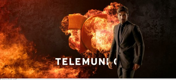
Way back in May of last year we reported on the new logo for Hispanic channel Telemundo, a division of NBCUniversal. Designed by New York, NY-based loyalkaspar the logo received middling reviews, mostly being “fine”. This January, Telemundo finally made an official introduction of the logo and new branding and on-air package — the latter designed by London-based DixonBaxi — with a splashy takeover of Times Square. (See photos of that here, on the sidebar.)
Continue reading this entry
DATE: Feb.27.2013POSTED BY: ArminCATEGORY: Entertainment COMMENTS:
TAGS: dixonbaxi, hispanic, loyalkaspar, on-air,


Books about logo design, the designers that create them and the meaning of branding.
