


Online
- FPO (For Print Only) / Celebrating the reality that print is not dead by showcasing the most compelling printed projects.
- Art of the Menu / Cataloguing the underrated creativity of menus from around the world.
- Quipsologies / Chronicling the most curious, creative, and notable projects, stories, and events of the graphic design industry on a daily basis.
- Speak Up (2002 – 2009) / Discussing, and looking for, what is relevant in, and the relevance of, graphic design. Archives Only.
- Word It (2003 – 2010) / Encouraging creative diversity in the community through monthly, one-word challenges. Archives Only.
- Brand New Classroom (2010 – 2011) / Providing a space for critique and opinions on student identity work. Archives Only.
Publishing
- The 2010 Brand New Awards / 2011, self-published.
- Flaunt: Designing effective, compelling and memorable portfolios of creative work / 2010, self-published.
Events & Judged Competitions
- Brand New Conference / A one-day event on the development of corporate and brand identity projects by some of today’s most active and influential practitioners from around the world.
- Brand New Awards / Celebrating the best identity work produced around the world.
- FPO Awards / Celebrating the best print work from around the world.
Writing
- Graphic Design, Referenced: A Visual Guide to the Language, Applications, and History of Graphic Design / 2009, Rockport.
- Women of Design: Influence and Inspiration from the Original Trailblazers to the New Groundbreakers / 2008, HOW Books.
- The Word It Book: Speak Up Presents a Gallery of Interpreted Words / 2007, HOW Books.
Graphic Design
- Department of Design / Designing corporate and brand identities and full development of printed and digital matter for clients.

In Brief BY Armin
Nickelodeon, an Exercise in Patience

Lest you think that I have lost my edge or immediate brand relevance, I have purposefully neglected to post the new Nickelodeon logo. I have never been eager to post scoops based on limited information. Nothing wrong with it, but it’s just not what we do. A new Nickelodeon wordmark, replacing the famous “splat” flexible identity, has appeared in a few random places but not yet on the main Nickelodeon site and it probably won’t until early Fall as new programming kicks in. You can feel free to comment about the new logo here on Brand New, but I’ll say that it would be premature. I’ve started a conversation with a couple of nice folks at Nickelodeon and I hope to have a fuller story in the coming weeks, if not months. In the meantime, you can visit idsgn, which has the best story on the change so far, or you can engage in some high-level brand and logo discussions over at Perez Hilton’s place.

DATE: Aug.05.2009 POSTED BY: ArminCATEGORY: In Brief COMMENTS:

TAGS:

In Brief BY Armin
Will the Real Waratah Please Stand Up?
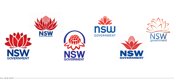
In other Australian news, the Government of New South Wales has released a new logo based on the state’s floral emblem, the waratah. The problem is, according to leading botanists and the public at large, that the logo depicts not a waratah but a lotus — and with a reported (staggering, OMG) price of $A4,600 (US$3,750) everybody feels robbed. The NSW Government web site shows the new logo and this story is the most complete. But it doesn’t end there. DesignBay, an Australian logo crowdsourcer, decided to offer up $A1,000 (US$815) for anyone that can design a better waratah logo. I guess a simple, boring wordmark wouldn’t be the most wrong way to go, huh?
Thanks to Daryl Prondoso for the tip.
DATE: Jul.23.2009POSTED BY: ArminCATEGORY: In Brief COMMENTS:
TAGS:
BY Armin
Graphic Design, Referenced
Before we proceed with our regularly scheduled opinions on identity I wanted to take a moment to inform all of our wonderful readers that our latest book, Graphic Design, Referenced is now officially on the market. This is a 400-page beast with way too much information and way too many great images on the dear subject of graphic design. For all you identity fiends, we have a special 20-page section on logos and identity programs, including obvious mentions like UPS, FedEx and Coca-Cola and perhaps some non-obvious inclusions like the New School identity, the peace symbol and a little logo for a certain U.S. Presidential candidate. If you buy our book and do a big logo project in the near future send it to us and we’ll give you a glowing review here on Brand New. (Not).
DATE: Jul.08.2009POSTED BY: ArminCATEGORY: In Brief COMMENTS:
TAGS:
BY Armin
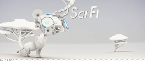
The Makers of Syfy

Possibly the last post on the evolving saga of Syfy as the channel officially switches identities today: London-based Proud Creative was the design firm responsible for creating the new Syfy identity. The victors of a four-way pitch, Proud Creative partnered with ManvsMachine for the onscreen graphics and with Chester Jenkins of Village to develop a bespoke type family. The results of the full package can be seen here. Will we have any converts that now like the new look?
DATE: Jul.07.2009POSTED BY: ArminCATEGORY: In Brief COMMENTS:
TAGS:
BY Armin
In Brief: Bye SciFi, Hi Syfy
DATE: Jul.03.2009POSTED BY: ArminCATEGORY: In Brief COMMENTS:
TAGS:
BY Armin
In Brief: Re-instituting the Institute
Thanks to Chad Kaufman for the tip.
DATE: Jun.24.2009POSTED BY: ArminCATEGORY: In Brief COMMENTS:
TAGS:
BY Armin
In Brief: 76ers, What’s Old is New Again
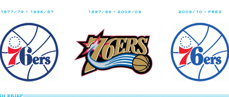
Continue reading this entry
DATE: Jun.24.2009POSTED BY: ArminCATEGORY: In Brief COMMENTS:
TAGS:
BY Armin
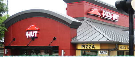
In Brief: Pizza Hut The Hut
DATE: Jun.19.2009POSTED BY: ArminCATEGORY: In Brief COMMENTS:
TAGS:
BY Armin
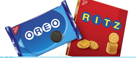
In Brief: Oreos and Ritz are Right on Target
DATE: Jun.16.2009POSTED BY: ArminCATEGORY: In Brief COMMENTS:
TAGS:
BY Armin
In Brief: Jello-O, What If…?
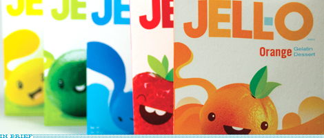
Thanks to Dawn H. Buscher for the tip.
DATE: Jun.16.2009POSTED BY: ArminCATEGORY: In Brief COMMENTS:
TAGS:


Books about logo design, the designers that create them and the meaning of branding.
