


Music Choice
Deutsche Welle
Transcontinental
Women at NBCU
City Grid Media
All B-Side Archives
Subscribe to B-Side RSS


Online
- FPO (For Print Only) / Celebrating the reality that print is not dead by showcasing the most compelling printed projects.
- Art of the Menu / Cataloguing the underrated creativity of menus from around the world.
- Quipsologies / Chronicling the most curious, creative, and notable projects, stories, and events of the graphic design industry on a daily basis.
- Speak Up (2002 – 2009) / Discussing, and looking for, what is relevant in, and the relevance of, graphic design. Archives Only.
- Word It (2003 – 2010) / Encouraging creative diversity in the community through monthly, one-word challenges. Archives Only.
- Brand New Classroom (2010 – 2011) / Providing a space for critique and opinions on student identity work. Archives Only.
Publishing
- The 2010 Brand New Awards / 2011, self-published.
- Flaunt: Designing effective, compelling and memorable portfolios of creative work / 2010, self-published.
Events & Judged Competitions
- Brand New Conference / A one-day event on the development of corporate and brand identity projects by some of today’s most active and influential practitioners from around the world.
- Brand New Awards / Celebrating the best identity work produced around the world.
- FPO Awards / Celebrating the best print work from around the world.
Writing
- Graphic Design, Referenced: A Visual Guide to the Language, Applications, and History of Graphic Design / 2009, Rockport.
- Women of Design: Influence and Inspiration from the Original Trailblazers to the New Groundbreakers / 2008, HOW Books.
- The Word It Book: Speak Up Presents a Gallery of Interpreted Words / 2007, HOW Books.
Graphic Design
- Department of Design / Designing corporate and brand identities and full development of printed and digital matter for clients.

A B-Side BY Armin
Accuweather
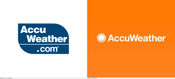
About: (Est. 1962) “AccuWeather is the World’s Weather Authority. They provide local forecasts for everywhere in the United States and over two million locations worldwide. They also provide products and services to more than 175,000 paying customers in media, business, government and institutions. AccuWeather headquarters are in State College, PA, home to the greatest number of forecast meteorologists in one location anywhere in the world.”
Ed.’s Notes: Forecast for this new logo: sunny!
Relevant links: Accuweather press release.
Select quote: “The updated identity system prominently features a sun icon along with the ‘AccuWeather’ name appearing in a warm orange tone. Orange was chosen as the new corporate color after extensive international research on color usage and meanings in various cultures. The orange tone is meant to reflect warmth, friendliness, and trust.”
Thanks to James I. Bowie for the tip.

DATE: May.15.2013 POSTED BY: ArminCATEGORY: The B-Side Media COMMENTS:


A B-Side BY Armin
Ef-Sharp
![]()
About: F# (or Ef-Sharp) “connects brands to consumers through the power of music in purposeful ads on social media platforms such as Spotify and Facebook. F# has worked with leading Fortune 500 brands to deliver some of the highest engagement rates in the industry. Brands and agencies choose F# because we design ads differently. We think banner ads suck. And, that the consumer is entitled to rewarding, content-enriched experiences from brands. Our platform provides brand-supported experiences that reward consumers.”
Design by: SquatDesign.
Ed.’s Notes: Never thought I would see a ligature involving the # symbol, and I like it! Sample applications below (or after the jump) and more images at the link.
Relevant links: SquatDesign project page.
Continue reading this entry
DATE: Feb.21.2013POSTED BY: ArminCATEGORY: Media The B-Side COMMENTS:
Opinion BY Armin
Demanding More
![]()
Established in 2006, Demand Media is a “leading digital media company that informs and entertains one of the Internet’s largest audiences, helps advertisers find innovative ways to engage with their customers and enables publishers to expand their online presence.” They manage the immensely popular sites eHow and Cracked as well as livestrong.com and indieclick.com, among other smaller sites and services. This month Demand Media introduced a new identity designed by San Francisco, CA-based Manual.
Continue reading this entry
DATE: Feb.12.2013POSTED BY: ArminCATEGORY: Media COMMENTS:
TAGS: colorful, gotham round, monogram,
A B-Side BY Armin
Boston.com
![]()
About: “Boston.com is a regional website that offers news and information about the Boston, Massachusetts area. Boston.com was launched in late October 1995 by Boston Globe Electronic Publishing Inc., the Internet subsidiary of the Boston Globe.” (Source: Wikipedia)
Design by: In-house.
Ed.’s Notes: This is not the most groundbreaking story but every time I visited Boston.com’s magnificent The Big Picture feature I cringed at the ridiculousness of that curved logo. Good riddance.
Relevant links: Boston.com Tumblr Post.
Thanks to Hal Tepfer for the tip.
DATE: Feb.06.2013POSTED BY: ArminCATEGORY: Media The B-Side COMMENTS:
TAGS: italic, Sans Serif,
Opinion BY Armin
Twitter Gives you the Bird
![]()
Launched in 2006, Twitter is, officially, “a real-time information network that connects you to the latest stories, ideas, opinions and news,” but we all know it as the current pulse of what is going on and keeping up-to-date with things you care about or didn’t know you cared about. Also, it’s a fucking time and attention gobbler — and I mean that as a compliment, I guess. As of most recent and public count, Twitter has 140 million active users that collectively push 340 million Tweets a day. On Tuesday, Twitter announced a new logo — a revision to Larry the Bird (named after NBA legend Larry Bird), the icon that has become synonymous with the service. In a blog post, Twitter’s creative director, Doug Bowman, explains: “There’s no longer a need for text, bubbled typefaces, or a lowercase ‘t’ to represent Twitter.”
Continue reading this entry
DATE: Jun.07.2012POSTED BY: ArminCATEGORY: Media COMMENTS:
Opinion BY Armin
Full-Court Press
![]()
Established in 1994 (originally as Internet Wire), Marketwire provides “global press release distribution, industry-leading social media monitoring and analytics, and a fully integrated marketing communications platform for content creation, optimization, distribution and measurement.” Many of the press releases we quote on Brand New come from Marketwire, as it serves more than 12,000 clients through 20 offices around the world. This week Marketwire introduced a new identity. No design credit given.
Update: Identity was done by Toronto, ON-based Compass360 in collaboration with the creative team at Marketwire.
Continue reading this entry
DATE: May.16.2012POSTED BY: ArminCATEGORY: Media COMMENTS:
TAGS: animation, overlay, Sans Serif,
A B-side BY Armin
Clear Channel Media and Entertainment
![]()
Previously known as Clear Channel Radio, Clear Channel Media and Entertainment as it has been renamed counts “With 238 million monthly listeners in the U.S., [and] has the largest reach of any radio or television outlet in America. Clear Channel Media and Entertainment serves 150 cities through 850 owned radio stations.” An alternate version of the logo below (or after the jump). More story here.
Continue reading this entry
DATE: Mar.28.2012POSTED BY: ArminCATEGORY: Media The B-Side COMMENTS:
TAGS: blue, radio, Sans Serif,
Opinion BY Armin
AP Joins the Twenty-First Century
![]()
Founded in 1846, the Associated Press (AP) is a not-for-profit global news network that provides coverage of world events in text, photos, graphics, audio and video that serve thousands of daily newspaper, radio, television, and online customers. AP counts with 3,700 employees (two thirds of them being “newsgatherers”) in more than 300 locations worldwide. Yesterday, AP introduced a new logo and identity system, the first change in 30 years, designed by Brooklyn, NY-based Objective Subject.
Continue reading this entry
DATE: Feb.24.2012POSTED BY: ArminCATEGORY: Media COMMENTS:
TAGS: monogram, newspaper, objective subject,
A B-Side BY Armin
Music Choice
![]()
Music Choice is a range of music channels provided by cable services like Comcast and Time Warner Cable. In January, they introduced a new logo designed by Siegel+Gale. Bigger view of the logo below (or after the jump).
Continue reading this entry
DATE: Feb.17.2012POSTED BY: ArminCATEGORY: Media The B-Side COMMENTS:
TAGS: custom, script, siegel+gale,
Opinion BY Armin
Men’s Journal Gets Manlier
![]()
First published in 1992, Men’s Journal, as its name implies is a lifestyle magazine for men with a circulation of more than 700,000 copies to an 84% male audience. Owned by Wenner Media, Men’s Journal is a sister publication to Rolling Stone and Us Weekly. Last week the magazine introduced a new logo designed by renown letterer Jim Parkinson — who previously drew one of the past versions of the logo — in collaboration with Men’s Journal art director Benjamen Purvis.
Continue reading this entry
DATE: Feb.16.2012POSTED BY: ArminCATEGORY: Media COMMENTS:
TAGS: condensed, custom, magazine, Sans Serif,


Books about logo design, the designers that create them and the meaning of branding.
