


Unifor
Government of Saskatchewan
Change.org
Groen
New Zealand Labour Party
All B-Side Archives
Subscribe to B-Side RSS


Online
- FPO (For Print Only) / Celebrating the reality that print is not dead by showcasing the most compelling printed projects.
- Art of the Menu / Cataloguing the underrated creativity of menus from around the world.
- Quipsologies / Chronicling the most curious, creative, and notable projects, stories, and events of the graphic design industry on a daily basis.
- Speak Up (2002 – 2009) / Discussing, and looking for, what is relevant in, and the relevance of, graphic design. Archives Only.
- Word It (2003 – 2010) / Encouraging creative diversity in the community through monthly, one-word challenges. Archives Only.
- Brand New Classroom (2010 – 2011) / Providing a space for critique and opinions on student identity work. Archives Only.
Publishing
- The 2010 Brand New Awards / 2011, self-published.
- Flaunt: Designing effective, compelling and memorable portfolios of creative work / 2010, self-published.
Events & Judged Competitions
- Brand New Conference / A one-day event on the development of corporate and brand identity projects by some of today’s most active and influential practitioners from around the world.
- Brand New Awards / Celebrating the best identity work produced around the world.
- FPO Awards / Celebrating the best print work from around the world.
Writing
- Graphic Design, Referenced: A Visual Guide to the Language, Applications, and History of Graphic Design / 2009, Rockport.
- Women of Design: Influence and Inspiration from the Original Trailblazers to the New Groundbreakers / 2008, HOW Books.
- The Word It Book: Speak Up Presents a Gallery of Interpreted Words / 2007, HOW Books.
Graphic Design
- Department of Design / Designing corporate and brand identities and full development of printed and digital matter for clients.

A B-Side BY Armin
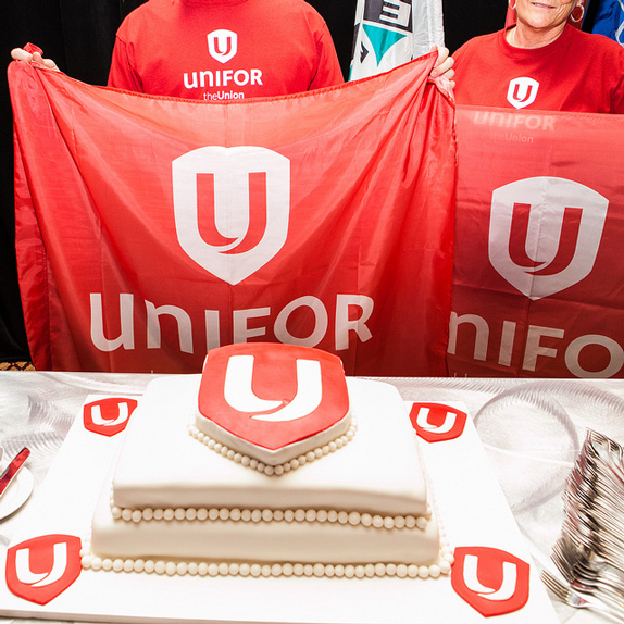
Unifor
![]()
About: (Est. 2013) “Two great Canadian unions — the Canadian Auto Workers union and the Communications, Energy and Paperworkers Union — are forming a new union with a modern, inclusive approach to serve members better and participate more effectively in our workplaces and communities. As the largest private sector union in Canada, Unifor will advocate for and defend the rights of working people, in more than 20 economic sectors and in communities across Canada. We will stand for safer workplaces, secure employment, wages and benefits that provide a decent standard of living, and dignity and mutual respect in the workplace.”
Design by: N/A.
Ed.’s Notes: The “U” looks like it’s a union of two “U”s, so well done there. The upper and lowercase wordmark is, as the genre demonstrates over and over, a fail. Bigger view of the logo and cake below (or after the jump).
Relevant links: Fact sheet about the new name and logo (PDF). Flickr set of launch event.
Select quote:“Members value the strength, protection and security that our union offers. The ‘shield’ logo speaks to that protection and the lower case ‘uni’ and upper case ‘FOR’ give the wordmark strength and momentum. Our new visual identity is strong, simple, clean and clear.”
![]()
Thanks to Pierre-Luc Gagné for the tip.

DATE: Jun.05.2013 POSTED BY: ArminCATEGORY: The B-Side Politics COMMENTS:


Opinion BY Armin
Dutch King Gets His Day in the Sun

On April 30, 2013, Willem-Alexander Claus George Ferdinand (Willem-Alexander to friends and press) became the King of the Kingdom of the Netherlands (the Netherlands to friends and bloggers) as his mother, Queen Beatrix, abdicated the throne after 33 years. Willem-Alexander is the first King to take the throne in 123 years. For his inauguration day and the days leading up to it, the City of Amsterdam worked with Amsterdam-based Koeweiden Postma on the “dressing” of the city to celebrate the occasion.
Continue reading this entry
DATE: May.07.2013POSTED BY: ArminCATEGORY: Politics COMMENTS:
TAGS: gradient, koeweiden postma, monogram, the netherlands,
A B-Side BY Armin
Government of Saskatchewan
![]()
About: “Saskatchewan became a province of Canada on September 1, 1905. Located between Alberta to the west and Manitoba to the east, its boundaries extend from the US border along the 49th parallel to the border with the Northwest Territories along the 60th parallel. Saskatchewan covers 6.5% of Canada, an area of 651,036 square kilometres. Of this, 591,670 square kilometres are land and 59,366 square kilometres are covered by water.” [Way more…].
Design by: Brace yourselves, “The newer logo was developed and tweaked by a number of agencies and organizations over the years, including Regina’s H.J. Linnen and the Phoenix Group, and government agency Enterprise Saskatchewan. The most recent adjustments were made by Saskatoon-based Kinetic design agency.”
Ed.’s Notes: This logo has sparked a controversy because (A) people seem to really really like the wheat sheaf icon; (B) it’s not just a new logo, but it’s a third logo that is used along with a seal and the wheat sheaf icon and there is a bunch of rules about which one is used where; and (C ) “The New Democrats are criticizing the provincial government’s new logo because it uses the Saskatchewan Party’s green-and-yellow colour scheme,” calling it sneaky and inappropriate. I’ll simplify things for all ya’ll Saskatchewans: the logo sucks, that’s why it’s controversial.
Relevant links: Design Edge story. CBC story. Huffington Post story.
Thanks to Aylwin Lo for first tip.
DATE: Jan.11.2013POSTED BY: ArminCATEGORY: Politics The B-Side COMMENTS:
TAGS: canada, controversy,
A B-Side BY Armin
Change.org
![]()
About: (Est. 2007) “Change.org is the world’s largest petition platform, empowering people everywhere to create the change they want to see.”
Design by: N/A.
Ed.’s Notes: Nice type selection and I like the use of the “c.” mark a little more — seen below (or after the jump). And their new website is slick.
Relevant links: N/A.
Continue reading this entry
DATE: Nov.16.2012POSTED BY: ArminCATEGORY: Politics The B-Side COMMENTS:
TAGS: lowercase, Sans Serif,
A B-Side BY Armin
Groen
![]()
Founded in 1982, Groen (“Green” in English) is the Flemish green political party in Belgium. After eight years with a bright green logo with an exclamation point at the end, Groen is aiming for a more modest logo. Press release here (in Dutch).
Thanks to Geert De Deckere for the tip.
DATE: Jan.13.2012POSTED BY: ArminCATEGORY: Politics The B-Side COMMENTS:
TAGS: green, Sans Serif,
A B-Side BY Armin
New Zealand Labour Party
![]()
Positioned centre-left, the New Zealand Labour Party is a political party in New Zealand. They have held the Prime Minister position 9 times since their inception in 1916. The new logo has been designed by Auckland-based Barnes, Catmur & Friends. Design Daily explains the relevance of the fern.
Thanks to John Moore for the tip.
DATE: Apr.19.2011POSTED BY: ArminCATEGORY: Politics The B-Side COMMENTS:
TAGS: ligature, new zealand, red, sans serif,
Opinion BY Armin
D-emocrats
![]()
With the upcoming election to the United States Senate this November it’s every political party for itself as 37 seats are up for grabs. We won’t go into nomination strategies on Brand New, but we can certainly get into the logo that the Democratic National Committee has nominated as its best candidate to carry the party and its cadre of politicos gunning for the seats in the upcoming primaries and beyond. The logo was unveiled yesterday and was designed by New York-based SS+K.
Continue reading this entry
DATE: Sep.16.2010POSTED BY: ArminCATEGORY: Politics COMMENTS:
TAGS: circles, gotham, monogram, sans serif,
Opinion BY Armin
McCain, Lesson Learned
If there is anyone that learned the branding lesson imparted by the Obama ’08 Campaign, it was John McCain. During the Presidential race there was simply nothing the McCain identity could do to help his chances, especially not Optima, not even at its boldest. Not long after the loss, McCain announced in November of 2008 that he would be running for re-election to his Senate seat in 2010 for the state of Arizona. Earlier this year, McCain presented a new identity for this particular campaign, created by Phoenix-based OVO. What a difference one lost Presidential race makes.
Continue reading this entry
DATE: Mar.11.2010POSTED BY: ArminCATEGORY: Politics COMMENTS:
TAGS:
This is page 1 of 1
Or jump to page


Books about logo design, the designers that create them and the meaning of branding.
