


Online
- FPO (For Print Only) / Celebrating the reality that print is not dead by showcasing the most compelling printed projects.
- Art of the Menu / Cataloguing the underrated creativity of menus from around the world.
- Quipsologies / Chronicling the most curious, creative, and notable projects, stories, and events of the graphic design industry on a daily basis.
- Speak Up (2002 – 2009) / Discussing, and looking for, what is relevant in, and the relevance of, graphic design. Archives Only.
- Word It (2003 – 2010) / Encouraging creative diversity in the community through monthly, one-word challenges. Archives Only.
- Brand New Classroom (2010 – 2011) / Providing a space for critique and opinions on student identity work. Archives Only.
Publishing
- The 2010 Brand New Awards / 2011, self-published.
- Flaunt: Designing effective, compelling and memorable portfolios of creative work / 2010, self-published.
Events & Judged Competitions
- Brand New Conference / A one-day event on the development of corporate and brand identity projects by some of today’s most active and influential practitioners from around the world.
- Brand New Awards / Celebrating the best identity work produced around the world.
- FPO Awards / Celebrating the best print work from around the world.
Writing
- Graphic Design, Referenced: A Visual Guide to the Language, Applications, and History of Graphic Design / 2009, Rockport.
- Women of Design: Influence and Inspiration from the Original Trailblazers to the New Groundbreakers / 2008, HOW Books.
- The Word It Book: Speak Up Presents a Gallery of Interpreted Words / 2007, HOW Books.
Graphic Design
- Department of Design / Designing corporate and brand identities and full development of printed and digital matter for clients.

A B-Side BY Armin
Mediabistro
![]()
About: (Est. 1996) “Mediabistro is a website that publishes various blogs and job listings for journalists. The site was founded in 1993 by Laurel Touby as ‘a gathering place for professionals in journalism, publishing and other media-related industries in New York City’, mediabistro.com has since grown into an international resource for media professionals. […] mediabistro.com is also home to a number of industry-specific blogs including TVNewser (covering broadcast and cable news), GalleyCat (book publishing), UnBeige (design), AgencySpy (advertising), PRNewser (public relations) and MobileContentToday (mobile apps).” (Source: Wikipedia).
Design by: N/A.
Ed.’s Notes: When people ask “how do you tell bad typography from good typography?” show them this logo and say “This is bad typography”. Then they will understand. If they don’t, and ask for elaboration, just walk away. Bigger view below (or after the jump).
Relevant links: Blog post about the change (no mention about the logo).
Continue reading this entry

DATE: Jun.14.2013 POSTED BY: ArminCATEGORY: The B-Side Publishing COMMENTS:

TAGS: lowercase, Sans Serif,

A B-Side BY Armin
Road & Track
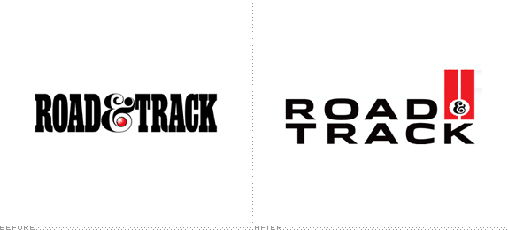
About: (Est. 1947) “Road & Track is the longest-running and most trusted automotive magazine brand in the United States. Its content is geared to the passionate auto enthusiast and contains information about the latest models, industry news and auto shows blended with wide-ranging feature stories, technical insights and coverage of the vintage car scene and motorsports.”
Design by: N/A
Ed.’s Notes: Very nice update. I especially like the R&T monogram version shown below (or after the jump) along with a video and before/after images of the magazine’s cover.
Relevant links: Cover Introduction/a>. Revival Issue Preview. Editor’s Letter .
Continue reading this entry
DATE: Apr.09.2013POSTED BY: ArminCATEGORY: Publishing The B-Side COMMENTS:
TAGS: ampersand, extended, magazine, Sans Serif,
A B-Side BY Armin
WSJ Magazine
![]()
About: (Est. 2008) “WSJ Magazine features the business of luxury and discerning lifestyle content. It is relevant to the [Wall Street] Journal’s readers, who are the world’s most powerful and influential consumers. It acts as an escape and inspiration for their diverse and sophisticated lives. Reaching the largest number of affluent consumers globally, WSJ. Magazine is the World’s Largest Luxury Magazine.”
Design by: In-house.
Ed.’s Notes: Not as famous as the recently B-Sided T magazine but in the same magazine-inside-a-newspaper realm, here is the Wall Street Journal’s own redesign. Magazine covers below (or after the jump).
Relevant links: News story about the new direction of the magazine under the direction of Kristina O’Neill.
Continue reading this entry
DATE: Feb.27.2013POSTED BY: ArminCATEGORY: Publishing The B-Side COMMENTS:
A B-Side BY Armin
T Magazine
![]()
About: (Est. 2004) “T: The New York Times Style Magazine is a perfect-bound magazine dedicated to fashion, living, beauty, holiday, travel and design coverage. The magazine was launched in August 2004. It is published 15 times a year and distributed within the Sunday edition of The New York Times newspaper. Since December 2007, an international edition has been distributed with the weekend edition of the International Herald Tribune. Stefano Tonchi was editor until 2010; his replacement was Sally Singer. Singer left in 2012 and was replaced by Deborah Needleman. T is not a supplement of The New York Times Magazine, but a distinct publication with its own staff.” (Source: Wikipedia)
Design by: In-house.
Ed.’s Notes: It’s sad to see the iconic, blackletter “T” go, but perhaps this will give the magazine its own wings to be considered separate of The New York Times. Before/After of the cover below (or after the jump).
Relevant links: Fishbowl mention.
Continue reading this entry
DATE: Feb.20.2013POSTED BY: ArminCATEGORY: Publishing The B-Side COMMENTS:
A B-Side BY Armin
Wiley
![]()
About: (Est. 1807) John Wiley & Sons, Inc. “is a global provider of content and content-enabled workflow solutions in areas of scientific, technical, medical, and scholarly research; professional development; and education. Our core businesses produce scientific, technical, medical, and scholarly journals, reference works, books, database services, and advertising; professional books, subscription products, certification and training services and online applications; and education content and services including integrated online teaching and learning resources for undergraduate and graduate students and lifelong learners. Wiley’s global headquarters are located in Hoboken, New Jersey, with operations in the U.S., Europe, Asia, Canada, and Australia.”
Design by: N/A.
Ed.’s Notes: Nice update, wish there was more to this story. Bigger view of the logo below (or after the jump).
Relevant links: N/A.
Continue reading this entry
DATE: Feb.14.2013POSTED BY: ArminCATEGORY: Publishing The B-Side COMMENTS:
TAGS: black, serif, small caps,
Opinion BY Armin
Harvard University Press Ditches Veritas
![]()
Established in 1913, Harvard University Press is a “leading publisher of convergent works in the sciences, humanities, and social sciences” and, as its name implies, it is the imprint of Harvard University. Facing challenges with making the transition to apps, digital reading devices, and web browsers using its previous identity — an honorable and traditional shield — Harvard University Press has introduced a new logo designed by New York, NY-based Chermayeff & Geismar.
Continue reading this entry
DATE: Jan.31.2013POSTED BY: ArminCATEGORY: Publishing COMMENTS:
TAGS: chermayeff and geismar, icon, red, university,
A B-Side BY Armin
Langenscheidt
![]()
About: (Est. 1856) “Langenscheidt is a privately held German publishing company, specialising in language resource literature. As well as producing monolingual dictionaries, Langenscheidt also produces bilingual dictionaries and travel phrase-books, as well as maps and atlases.” (Source: Wikipedia)
Design by: KW43 Branddesign.
Ed.’s Notes: Now that is how you build a logo with structure (below or after the jump). German engineering at its best!
Relevant links: Exclusive images at Corporate Identity Portal.
Continue reading this entry
DATE: Jan.24.2013POSTED BY: ArminCATEGORY: Publishing The B-Side COMMENTS:
A B-Side BY Armin
News Life Media
![]()
Formerly News Magazines, News Life Media is one of Australia’s largest print and online publishers with renown magazine brands like Vogue and GQ. The new logo to reflect the new name was designed by gen.a.
DATE: Dec.14.2011POSTED BY: ArminCATEGORY: Publishing The B-Side COMMENTS:
Opinion BY Armin
La Presse gets Squared Away
![]()
Established in 1884, La Presse is one of the largest newspapers in Montréal, Québec with a circulation of over 200,000 copies and a reported “reach” of over 800,000 a week, and, like all newspapers, La Presse has online and mobile counterparts that further extend its reach. This week, the newspaper introduced a new logo and a unified look and naming across print and online media.
Continue reading this entry
DATE: Oct.28.2011POSTED BY: ArminCATEGORY: Publishing COMMENTS:
TAGS: canada, newspaper, red, Sans Serif,
Opinion BY John J Custer
Beautiful Ball Terminals
![]()
Reaching seven million readers every month, House Beautiful is known as the publication of American home design and decoration. Since being founded in 1896, House Beautiful remains the oldest continuously published shelter magazine in the United States. In 1936, House Beautiful was purchased by Hearst Corporation, who continues to publish the magazine. In September, the magazine rolled out a new editorial design and an updated wordmark crafted by Jeremy Mickel.
Continue reading this entry
DATE: Sep.14.2011POSTED BY: John J CusterCATEGORY: Publishing COMMENTS:


Books about logo design, the designers that create them and the meaning of branding.
