


 The Winners of the 2011 Brand New Awards are now available for purchase as a book or website.


Orlando Venues
Rent.com
Raine & Horne
Brixmor
Disney Vacation Club
All B-Side Archives
Subscribe to B-Side RSS


Online
- FPO (For Print Only) / Celebrating the reality that print is not dead by showcasing the most compelling printed projects.
- Art of the Menu / Cataloguing the underrated creativity of menus from around the world.
- Quipsologies / Chronicling the most curious, creative, and notable projects, stories, and events of the graphic design industry on a daily basis.
- Speak Up (2002 – 2009) / Discussing, and looking for, what is relevant in, and the relevance of, graphic design. Archives Only.
- Word It (2003 – 2010) / Encouraging creative diversity in the community through monthly, one-word challenges. Archives Only.
- Brand New Classroom (2010 – 2011) / Providing a space for critique and opinions on student identity work. Archives Only.
Publishing
- The 2010 Brand New Awards / 2011, self-published.
- Flaunt: Designing effective, compelling and memorable portfolios of creative work / 2010, self-published.
Events & Judged Competitions
- Brand New Conference / A one-day event on the development of corporate and brand identity projects by some of today’s most active and influential practitioners from around the world.
- Brand New Awards / Celebrating the best identity work produced around the world.
- FPO Awards / Celebrating the best print work from around the world.
Writing
- Graphic Design, Referenced: A Visual Guide to the Language, Applications, and History of Graphic Design / 2009, Rockport.
- Women of Design: Influence and Inspiration from the Original Trailblazers to the New Groundbreakers / 2008, HOW Books.
- The Word It Book: Speak Up Presents a Gallery of Interpreted Words / 2007, HOW Books.
Graphic Design
- Department of Design / Designing corporate and brand identities and full development of printed and digital matter for clients.

A B-Side BY Armin
Citi Habitats
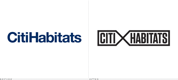
About: Citi Habitats is a real estate agency in New York.
Design by: Ammirati
Ed.’s Notes: Sample applications below (or after the jump).
Relevant links: Ammirati case study. News story.
Continue reading this entry

DATE: Nov.02.2012 POSTED BY: ArminCATEGORY: The B-Side Real Estate COMMENTS:

TAGS: condensed, New York, Sans Serif,

A B-Side BY Armin
Orlando Venues
![]()
Orlando Venues is a company devoted to the marketing and promotion of all the events for various venues in Orlando, FL, which include the Orlando Magic’s home at Amway Center, as well as the Bob Carr Performing Arts Centre, Florida Citrus Bowl, Tinker Field, Leu Gardens, and the Mennello Museum. Orlando-based Great Big Circle recently redesigned their logo, keeping the “OV” monogram that they’ve been using for over 20 years. I can’t help myself: the new logo is the equivalent of Donald Trump’s hair — where is the combover of the “V” coming from?
DATE: Jun.05.2012POSTED BY: ArminCATEGORY: Real Estate The B-Side COMMENTS:
A B-Side BY Armin
Rent.com
![]()
Launched in 2000, Rent.com is the largest Internet listing site in the U.S. with more than 25,000 listed properties. After the purchase of Rent.com by Primedia from eBay, a revised logo was introduced in April, designed by Casey Fluster.
DATE: May.02.2012POSTED BY: ArminCATEGORY: Real Estate The B-Side COMMENTS:
TAGS: Sans Serif,
Opinion BY Armin
One World Trade Center’s Tip
![]()
Set to open in 2013, One World Trade Center (also known as 1WTC and previously Freedom Tower) is the flagship building of the thoroughly chronicled, scrutinized, and troubled development of the new World Trade Center complex, that includes four other skyscrapers, the National September 11 Memorial & Museum, 550,000 square feet of retail space, and a Performing Arts Center. One World Trade Center is the design of David M. Childs of Skidmore, Owings & Merrill, rising a symbolic 1,776 — the year of the United States independence — feet and boasting 2.6 million square feet of space to be filled by the likes of Condé Nast, one of the first big name tenants to sign a major lease. One World Trade Center is developed by the Port Authority of New York and New Jersey and developer The Durst Organization. Yesterday, the logo for the building was introduced, designed by London-based Wordsearch, a design firm specializing in branding and communications for real estate and architecture across the world.
Continue reading this entry
DATE: Apr.12.2012POSTED BY: ArminCATEGORY: Real Estate COMMENTS:
TAGS: blue, gotham, New York, real estate,
A B-Side BY Armin
Raine & Horne
![]()
Established in 1883, Raine & Horne is an Australian property firm. From the press release: “At the core of the new identity is a unique hand-crafted bespoke ampersand symbol representing Raine & Horne’s brand ideal, ‘Positive Partnerships’.” The new logo was designed by Idea Works.
Thanks to Tricia Ho for the tip.
DATE: Jan.23.2012POSTED BY: ArminCATEGORY: Real Estate The B-Side COMMENTS:
TAGS: ampersand, Sans Serif, yellow,
A B-Side BY Armin
Brixmor
![]()
Brixmor is the new name for the now independent U.S. division of Centro Properties Group, an Australian company established in 1985. Purchased by Blackstone Group LP, Brixmor “manages a national portfolio of 585 properties aggregating approximately 92.0 million square feet of gross leasable area”, mostly for retail shopping centers. The new logo was designed by Denver, CO-based Monigle Associates. Bigger view of the logo below (or after the jump).
Continue reading this entry
DATE: Oct.06.2011POSTED BY: ArminCATEGORY: Real Estate The B-Side COMMENTS:
TAGS: Sans Serif, uppercase,
A B-Side BY Armin
Disney Vacation Club
![]()
The Disney Vacation Club is a membership program for people who purchase real estate interest in a Disney Vacation Club Resort and build points based on the size of the real estate interest as well as vacations taken to Disney places. A new logo, featuring DIN of all things (nothing says Disney like German transportation signage), was introduced earlier this month. The Disney Parks blog has the story.
Thanks to Andrew D. Lewandowski for the tip.
DATE: Jun.30.2011POSTED BY: ArminCATEGORY: Real Estate The B-Side COMMENTS:
TAGS: disney, globe, sans serif,
BY Christian Palino
A Bridge to Nowhere
![]()
My only interaction with Grubb & Ellis, one of the world’s largest commercial real estate services, took the form of receiving notices about ongoing construction work around the office of the software company I was working for briefly. I knew what they did, given the information they were providing and the fact that their collateral materials communicated “Property Solutions Worldwide”. Certainly the circular icon they were using was rather abstract and nondescript compared to the identifiable bridge in their new mark — although I’m not sure this new icon speaks to what they do. Granted, their offering has diversified through mergers and acquisitions to include management, consulting and investment services, but its unclear how they help one get “From Insights to Results.”
Continue reading this entry
DATE: Jun.17.2009POSTED BY: Christian PalinoCATEGORY: Real Estate COMMENTS:
TAGS:
BY Brand New
House Arrest
![]()
Guest Editorial by James Bowie
Redfin, a Seattle-based online real estate service, was content with its little house-in-a-circle logo until Move.com threatened to sue to protect its house-in-a-circle mark. So Hornall Anderson Design Works was enlisted to create Redfin’s new identity, which features, in addition to a stronger wordmark, a more elaborate logo. It shows an aspiring homeowner (clearly a graduate of the Dallas Independent School District) reaching to pluck his ideal house out of the crowded market. And the whole thing looks like a tree!
Continue reading this entry
DATE: May.11.2007POSTED BY: Brand NewCATEGORY: Real Estate COMMENTS:
TAGS:
This is page 1 of 1
Or jump to page


Books about logo design, the designers that create them and the meaning of branding.
