


Online
- FPO (For Print Only) / Celebrating the reality that print is not dead by showcasing the most compelling printed projects.
- Art of the Menu / Cataloguing the underrated creativity of menus from around the world.
- Quipsologies / Chronicling the most curious, creative, and notable projects, stories, and events of the graphic design industry on a daily basis.
- Speak Up (2002 – 2009) / Discussing, and looking for, what is relevant in, and the relevance of, graphic design. Archives Only.
- Word It (2003 – 2010) / Encouraging creative diversity in the community through monthly, one-word challenges. Archives Only.
- Brand New Classroom (2010 – 2011) / Providing a space for critique and opinions on student identity work. Archives Only.
Publishing
- The 2010 Brand New Awards / 2011, self-published.
- Flaunt: Designing effective, compelling and memorable portfolios of creative work / 2010, self-published.
Events & Judged Competitions
- Brand New Conference / A one-day event on the development of corporate and brand identity projects by some of today’s most active and influential practitioners from around the world.
- Brand New Awards / Celebrating the best identity work produced around the world.
- FPO Awards / Celebrating the best print work from around the world.
Writing
- Graphic Design, Referenced: A Visual Guide to the Language, Applications, and History of Graphic Design / 2009, Rockport.
- Women of Design: Influence and Inspiration from the Original Trailblazers to the New Groundbreakers / 2008, HOW Books.
- The Word It Book: Speak Up Presents a Gallery of Interpreted Words / 2007, HOW Books.
Graphic Design
- Department of Design / Designing corporate and brand identities and full development of printed and digital matter for clients.

A B-Side BY Armin
Mountain Equipment Co-Op
![]()
About: (Est. 1971) “An outdoor retail co-operative, MEC exists to encourage and inspire Canadians to live active outdoor lifestyles. From backcountry trails to city streets, MEC supports a range of outdoor activities, including climbing, hiking, camping, snowsports, watersports, cycling, running and yoga. Well known for selling high-quality well-designed products that offer great value, MEC employs outdoor enthusiasts who possess a strong service ethic to provide its members with an authentic and accessible customer experience. MEC has more than 3.5 million members across Canada, whom it serves through 17 stores in 6 provinces as well as mec.ca and the Shop MEC iPhone app. Anyone can join MEC by purchasing a $5 individual lifetime membership in the Co-op.”
Design by: Concrete.
Ed.’s Notes: Wow, major downgrade, going from clearly an outdoors company to some generic pharmaceutical company. Using the logo-as-window maneuver as shown in the video below (or after the jump) does not make it any better.
Relevant links: MEC press release.
Select quote: “The redesigned logo is simple yet bold, and now features the acronym MEC instead of the full name, with the mountain removed, to reflect MEC’s geographical reach across the country, and its wider range of backcountry and urban activities. Vibrant imagery and compelling language complement the new logo as cornerstones of a new brand platform.”
Continue reading this entry

DATE: Jun.19.2013 POSTED BY: ArminCATEGORY: The B-Side Retailers COMMENTS:


Opinion BY Armin
The Beer Store Called and they are Running out of You
![]()
Established in 1927, the Beer Store is a chain of retail outlets in Ontario, Canada that sells over 350 different kinds of beers across more than 430 stores. This year, four of those locations are in a pilot program to test a new concept store that includes a revised logo, identity, and interior and exterior redesigns, that have all been designed by Toronto-based Jackman.
Continue reading this entry
DATE: Jun.13.2013POSTED BY: ArminCATEGORY: Retailers COMMENTS:
TAGS: beer, canada, retail, sans serif, slab serif,
Opinion BY Armin
Double-dip This
![]()
Established in 1979 making small batches of chocolate for Easter, Chocolats Favorites is now one of the premier destinations for chocolate aficionados since opening its first retail store in 1996 in Lévis, Quebec where they started offering melted chocolate for dipping ice cream in along with chocolate bars and other confections. With three retail locations in Quebec, Chocolats Favoris recently opened its fourth location with a whole new retail experience, identity, and packaging designed by lg2boutique. For an inside peek at the store I recommend browsing through this review of someone who attended the opening.
Continue reading this entry
DATE: May.28.2013POSTED BY: ArminCATEGORY: Retailers COMMENTS:
A B-Side BY Armin
Mercado Libre
![]()
About: (Est. 1999) “MercadoLibre.com (literally “free market” in Spanish) or MercadoLivre in Portuguese (Brazil, Portugal) is a website dedicated to e-commerce and online auctions. It is eBay’s Latin American partner. MercadoLibre is Latin America’s number-one e-commerce site. It is currently present in Argentina, Brazil, Chile, Colombia, Costa Rica, Dominican Republic, Mexico, Ecuador, Peru, Portugal, Panama, Uruguay and Venezuela.” (Source: Wikipedia)
Design by: Imaginity.
Ed.’s Notes: No es bueno. Exposed grid and step-by-step devolution of Helvetica below (or after the jump).
Relevant links: Imaginity case study. News story about their $10-million media buy.
Select quote: “We have refreshed and modernize the identity whilst retaining the inherent equity held in the current look and feel. We took some of the current brand elements to reflect the heritage and also support the brand for the next phase of the company’s growth. You will still see the iconic handshake but the typography and colours have been updated.”
Continue reading this entry
DATE: May.22.2013POSTED BY: ArminCATEGORY: Retailers The B-Side COMMENTS:
TAGS: custom, hands, helvetica, latin america,
A B-Side BY Armin
Pearle Vision
![]()
About: (Est. 1961) “Pearle Optical is an American chain of eye care stores. It was founded by Stanley Pearle, an optometrist in Savannah, Georgia, USA in 1961. He also founded Pearle Vision (market name in the United States) and its express store, Pearle Express, in the same year. The company’s European division, Pearle Europe, is now owned by the Dutch firm HAL Investments, also the parent company of Atasun Optik, Lensmaster and GrandVision. The North American Pearle Vision stores are owned by parent company Luxottica.” (Source: Wikipedia)
Design by: LPK.
Ed.’s Notes: Wow, never would have thought about it: a pair of eyeglasses as a logo for an eyeglasses company. Wonder what kind of proprietary brand process led to that?
Relevant links: VisionMonday story. New national TV spot.
Select quote: “The new Pearle Vision logo reflects the theme ‘Genuine Eyecare’ and reinforces the history of the brand, established in 1961, and takes on what Zarkin describes as ‘almost an apothecary’ message in its eyeglass graphic.”
Thanks to Elevatorman for the tip.
DATE: Apr.22.2013POSTED BY: ArminCATEGORY: Retailers The B-Side COMMENTS:
TAGS: sans serif,
Opinion by Paul Vickers Posted BY Brand New
Bonjour Mon’op
![]()
Established in 1932, Monoprix is an mid/upper-market department store and convenience store chain in France with a turnover in excess of 3.3 billion euros through 400 stores — many of them Monoprix proper but there are also smaller specialty stores called Monop’, Monop’ Beauty, Monop’ Daily, and Monop’ Station. An institution, Monoprix has traded under the “M” in a red lozenge symbol and a classic serifed uppercase typestyle for over 80 years. A new identity by British design agency Lewis Moberly was launched earlier this month. A comprehensive PDF covers all the changes, from the logo to the store to the uniforms and more.
Continue reading this entry
DATE: Apr.09.2013POSTED BY: Brand NewCATEGORY: Retailers COMMENTS:
TAGS: apostrophe, france, serif, store,
Opinion BY Armin
Blackletter by the Bay
![]()
Established in 1670 — making it North America’s “longest continually operated company” — Hudson’s Bay Company (HBC) is the parent company of one of Canada’s most recognizable and visited department stores, Hudson’s Bay, with 90 locations across the country, known and identified simply as The Bay since 1965. In 2008, HBC was acquired by U.S. private equity firm, NRDC Equity Partners, owner of department store Lord & Taylor. Although the new wordmark for Hudson’s Bay has been circulating since late last year, last week HBC officially announced that the department store would change its name from The Bay (La Baie in French) to Hudson’s Bay (La Baie d’Hudson) and confirmed the new wordmark designed by New York-based Lipman as well as a revival of its original coat of arms drawn by Canadian scratchboard artist Mark Summers.
Continue reading this entry
DATE: Mar.12.2013POSTED BY: ArminCATEGORY: Retailers COMMENTS:
A B-Side BY Armin
Buy.com
![]()
About: (Buy.com Est. 1997 / Rakuten Est. 1997) “Buy.com joined the Rakuten family in 2010, making the joint businesses combined into one of the world’s largest online retail marketplaces. We offer consumers more than 90 million products from 38,500 merchants around the globe. Buy.com becoming Rakuten.com Shopping is the next step of that relationship as the Rakuten Group increasingly unifies its brand internationally. This transition will open up the Rakuten.com Shopping (formerly Buy.com) marketplace to customers globally, as well as introducing merchants and retailers from around the world to its North American customer base. Both its merchants and its consumers will benefit from this open, global market. We are excited at the possibilities to come, and we hope you continue to join us in our global growth.”
Design by: N/A.
Ed.’s Notes: This isn’t so much a logo before/after but a brand before/after and the effects of corporate ownership. Buy.com didn’t have much of a logo before and Rakuten doesn’t have much of a logo either, just an “R” inside a circle that has been passed off to Buy.com. The real problem here is going from the über simple “Buy.com” to the utterly unmemorable and confusing “Rakuten.com Shopping”. If that weren’t enough, there is a video, below (or after the jump) that makes all the employees shown look as humiliated as the old Buy.com logo probably feels.
Relevant links: Buy.com is now Rakuten.com Shopping.
Continue reading this entry
DATE: Mar.04.2013POSTED BY: ArminCATEGORY: Retailers The B-Side COMMENTS:
TAGS: icon, sans serif,
Opinion BY Sam Becker
Vitamin V
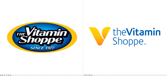
Founded in 1977 in New York City, The Vitamin Shoppe has grown to be one of the largest purveyors of nutritional supplements in North America with over 500 stores and 20,000 unique SKUs. According to their website, The Vitamin Shoppe is the "first and only choice of people seeking to fulfill their health and wellness needs."
Continue reading this entry
DATE: Feb.07.2013POSTED BY: Sam BeckerCATEGORY: Retailers COMMENTS:
A B-Side BY Armin
The Co-op
![]()
About: (Est. 1958) “The Co-op has been around since 1958, when a bunch of students founded the University Co-operative Bookshop (in a garden shed!). Today, [it is] Australia’s largest member-owned retailer, with 50+ stores and 1.6 million members.”
Design by: Uberbrand.
Ed.’s Notes: Yeah… that’s not gonna do it for me.
Relevant links: The Co-op blog post.
Select quote: “Shawn Carter changed his (to Jay-Z). So did Katheryn Hudson (to Katy Perry) and Lizzie Grant (Lana Del Rey). Now, we’ve changed our name, too. From The Co-op Bookshop, to… (drum roll)… The Co-op.”
Thanks to Ben Ennis Butler for the tip.
DATE: Jan.25.2013POSTED BY: ArminCATEGORY: Retailers The B-Side COMMENTS:


Books about logo design, the designers that create them and the meaning of branding.
