
A B-Side BY Armin
IZIBUILD
IZI is a Portuguese home improvement store owned by PreBuild. In 2011 EuroRSCG rebranded IZI, now known as IZIBUILD. Prebuild’s Margarida Calvinho explains (as translated by Google) “the new graphic identity reinforces the strength, experience and credibility that characterized the group Prebuilt.”
Thanks to Rodolfo Foitinho for the tip.

DATE: Jan.27.2012 POSTED BY: Armin
 CATEGORY: Retailers The B-Side
  COMMENTS:


Opinion BY Armin
jcpenney Nails the American Look
As you might remember, jcpenney landed in the top three of my 2011 Worst list for its bake-off approach to designing the last iteration of their logo, so it was with both high and low expectations that I approached a highly public company reimagining announced yesterday. If you don’t mind, I’ll repeat the same introduction from last year: First opened as a dry-goods store named the “Golden Rule” in Kemmerer, Wyoming by James Cash Penney in 1902, JCPenney today is a publicly-traded company with 1,100 department stores across the U.S. and Puerto Rico, mostly in shopping malls. Providing fairly decent middle-of-the-road merchandise, JCPenney is an extremely popular destination for finding affordable items without the top brand names attached — they develop many of their own brands. / End recycled intro. / “Every initiative we pursue,” starting February 1, reads the press release, “will be guided by our core value to treat customers as we would like to be treated — fair and square.” New store designs, new brand names, new spokesperson partner in Ellen DeGeneres, and — yay — new logo and identity will be rolled out. No design firm is credited (leads anyone?).
Continue reading this entry

DATE: Jan.26.2012 POSTED BY: Armin
 CATEGORY: Retailers
  COMMENTS:

TAGS: blue, gotham, jcpenney, red, sans serif,

A B-side BY Armin
Biedronka
Biedronka, Polish for ladybug, is “the largest retail network in Poland with more than 1,800 stores in over 750 locations.” The company unveiled their recent metamorphosis on January 16, 2012. As the press release indicates, beyond a refreshed aesthetic, the new identity represents permanent inscription of the slogan, “Everyday low prices,” into the company’s business model and a focus on the slogan as a more integral part of the Biedronka brand.
Thanks to Jakub Świadek for the tip.

DATE: Jan.25.2012 POSTED BY: Armin
 CATEGORY: Retailers The B-Side
  COMMENTS:

TAGS: grocery, ladybug, poland, sans serif,

A B-Side BY Armin
TreeHouse

Opened last week in Austin, TX, TreeHouse is a 25,000-square-foot store dedicated to sustainable and healthy-living products for home improvement. Home Depot with an environmental conscience if you will. The new logo was designed by Austin-based McGarrah Jessee. Press release of the opening here and a video with an inside look at the store here.
Thanks to Cole Baldwin for the tip.

DATE: Oct.26.2011 POSTED BY: Armin
 CATEGORY: Retailers The B-Side
  COMMENTS:

TAGS: austin, green, icon, sans serif,

Opinion BY Armin
Infinite Mountain

First opened in 1987 in New Zealand, Kathmandu is a specialty retailer and manufacturer of clothing and equipment for the adventuresome, outdoorsy audience. Kathmandu has 116 stores across New Zealand, Australia, and the UK. Their sales are 95% of Kathmandu-branded products, but they also carry popular brands like Keen, Teva, and Salomon. In September Kathmandu introduced a new logo, identity, and packaging system designed by Strategy Design & Advertising.
Continue reading this entry

DATE: Oct.26.2011 POSTED BY: Armin
 CATEGORY: Retailers
  COMMENTS:

TAGS: icon, new zealand, packaging, retail, sans serif,

Opinion BY Armin
Ben There, Done That
Founded in 1963 in Brighton, UK by Ben Sherman (neé Arthur Benjamin Sugarman), Ben Sherman is one of the most iconic clothing brands in both the UK and the world. Best known for its defining button-down shirts, Ben Sherman has maintained cult status for a remarkable five decades, transcending whatever the fashion of the moment is. Since July (or perhaps June) the Ben Sherman website has been showing a simple sans serif logo but acknowledging that the site was an interim version to a brand new site, so it seemed as if the logo was not a definite change. But this past September, with the opening of a new concept store in their flagship location on Carnaby Street, it remains no doubt that this is the new look for Ben Sherman. Designed in-house, the logo and identity have been brought to life in a retail environment by Brinkworth.
Continue reading this entry

DATE: Oct.24.2011 POSTED BY: Armin
 CATEGORY: Retailers
  COMMENTS:

TAGS: retail, sans serif, uk,

Opinion BY Armin
All Work and No Play

Established in 1998, Play.com started as an online retailer of DVDs in the UK and has since grown to offer over 8 million items including CDs, books, video games, toys, electronics, and MP3 downloads. After Amazon, it is the second leading online retailer in the UK. In August, Play.com introduced a new identity and a whole new website. There is also a U.S.-based version of Play.com that hasn’t changed logo or web design, probably because no one here considers anything but Amazon.
Continue reading this entry

DATE: Sep.06.2011 POSTED BY: Armin
 CATEGORY: Retailers
  COMMENTS:

TAGS: rounded sans serif, uk,

Opinion BY Armin
Petco Unleashes Unhealthy Logo
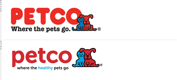
Originally established in 1965 as a mail-order veterinary supply business, Petco opened its first retail store in 1976. Today, Pecto has more than 22,000 employees at 1,000 stores across the U.S. carrying up to 10,000 “different pet-related items for dogs, cats, fish, reptiles and amphibians, birds and small animals.” They also sell basic pets like fish, hamsters, and snakes — we sometimes use it as a mini zoo for our daughters. Yesterday Petco announced revisions to its logo and tagline, taking it from “where the pets go” to “where the healthy pets go”. Unhealthy pets can go fuck themselves. Apologies for the harsh language but I find the tagline change completely obnoxious. On to the logo.
Continue reading this entry

DATE: Aug.18.2011 POSTED BY: Armin
 CATEGORY: Retailers
  COMMENTS:

TAGS: mascot, sans serif,

A B-Side BY Armin
Celadon
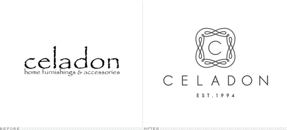
Established in 1994, Celadon provides “an innovative, eclectic, fresh take on home furnishings” to customers in South Carolina. Local firm J Fletcher Design has redesigned the identity, ridding it of Papyrus. You can see the full identity here.

DATE: Aug.03.2011 POSTED BY: Armin
 CATEGORY: Retailers The B-Side
  COMMENTS:

TAGS: monogram, packaging, sans serif,

A B-Side BY Armin
Golf Galaxy
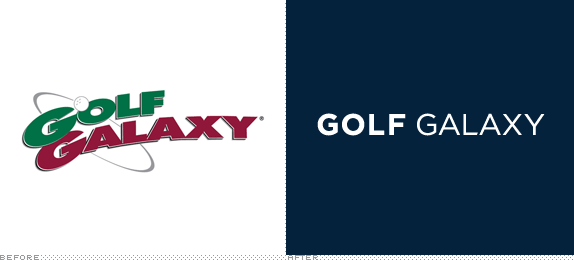
First opened in 1997, Golf Galaxy is a chain of 15,000-square-feet golf stores throughout the U.S. and a comprehensive online store. Sometime in May they changed to a new logo.

DATE: Jun.28.2011 POSTED BY: Armin
 CATEGORY: Retailers The B-Side
  COMMENTS:

TAGS: golf, sans serif,


