
Opinion BY Armin
US Speedskating Shields Itself
US Speedskating is a non-profit organization that serves as the governing body for the sport of speedskating in the United States and responsible for getting athletes to the Winter Olympic Games. The US Speedskating team has won an impressive 85 Olympic medals. Last year they introduced a new identity and uniforms designed by Salk Lake City, UT-based Struck.
Continue reading this entry

DATE: Mar.08.2012 POSTED BY: Armin
 CATEGORY: Sports
  COMMENTS:

TAGS: olympics, sans serif, struck,

A B-Side BY Armin
Turkish Basketball Federation
Established in 1959, the Turkish Basketball Federation is the governing body of basketball in Turkey. Earlier this month TBF introduced a new identity designed by Wakefiled, UK-based Our Agency. Story here. Full brand manual here.
Thanks to Günes Ülker for the tip.

DATE: Feb.28.2012 POSTED BY: Armin
 CATEGORY: Sports The B-Side
  COMMENTS:

TAGS: basketball, turkey,

Opinion BY Armin
USA Hoops’ New Looks
Established in 1974 as the Amateur Basketball Association of the United States of America, USA Basketball — renamed as such in 1989 when FIBA modified its rules to allow professional basketball players to participate in international competitions — is a non-profit organization that acts as the governing body for men’s and women’s basketball in the U.S., responsible for selecting and training the teams that participate in events like the Olympics and FIBA World Championships. This week USA Basketball introduced a new logo that replaces the current version, in use since 1989 and made world famous by the original Dream Team at the 1992 Summer Olympics in Barcelona.
Continue reading this entry

DATE: Feb.28.2012 POSTED BY: Armin
 CATEGORY: Sports
  COMMENTS:

TAGS: basketball, nike, olympics,

Opinion BY Armin
Brandiose is Grandiose

Established in 2000 as Plan B Branding by life-long friends Jason Klein and Casey White, Brandiose, as the new company has been named, is a branding firm focused on designing official logos and uniforms for Minor League Baseball teams with awesome names like the Lehigh Valley Iron Pigs and the Richmond Flying Squirrels. Having been called to the Majors, they also revitalized the Cincinnati Reds logos and uniforms. With the new name comes a new identity with lettering by Ken Barber.
Continue reading this entry

DATE: Feb.09.2012 POSTED BY: Armin
 CATEGORY: Sports
  COMMENTS:


A B-Side BY Armin
Pensacola Blue Wahoos
Pensacola, Florida just got their own Minor League Baseball team — the Blue Wahoos. Unveiled in November 2011, the team identity was designed by Brandiose, and you can see the baseball cap version of the logo after the jump.
Continue reading this entry

DATE: Jan.31.2012 POSTED BY: Armin
 CATEGORY: Sports The B-Side
  COMMENTS:


Opinion BY Armin
I Tawt I Taw a Panther Tat
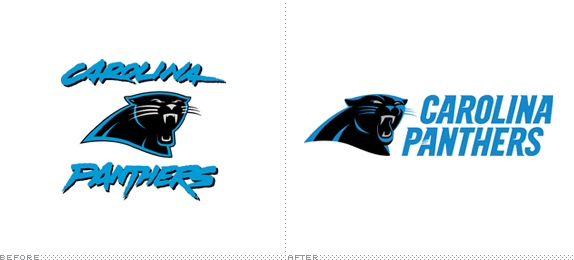
Joining the NFL as an expansion team in 1995, the Carolina Panthers have a total record of 131 wins and 150 losses and have even made it to the Super Bowl (XXXVIII in Houston) in which they lost to the New England Patriots. Over the weekend, which happened to be Pro Bowl weekend, the Panthers introduced a new logo designed by the NFL’s creative department.
Continue reading this entry

DATE: Jan.31.2012 POSTED BY: Armin
 CATEGORY: Sports
  COMMENTS:


A B-Side BY Armin
Rio 2016 Paralympic Games

The emblem for the 2016 Paralympic Games in Rio was unveiled this Saturday. It was designed by Tátil, the same firm that designed the Olympics logo. Press release here. Detail of the logo and video presentation below (or after the jump).
Continue reading this entry

DATE: Nov.28.2011 POSTED BY: Armin
 CATEGORY: Sports The B-Side
  COMMENTS:


Opinion BY Armin
Hi Hi Birdie
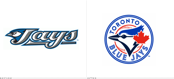
The Toronto Blue Jays joined the Eastern Division of Major League Baseball in 1977 and are two-time World Series winners (1992 and 1993). With the departure of the Montreal Expos to Washington, the Blue Jays are the sole Canadian team in the MLB. Last week, the Blue Jays announced new uniforms and a new logo for the 2012 season, designed by the MLB’s Design Services, that take them back to their original look
Continue reading this entry

DATE: Nov.23.2011 POSTED BY: Armin
 CATEGORY: Sports
  COMMENTS:


A B-Side BY Armin
ESPN College Basketball
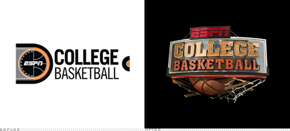
Airing on ESPN, in one form or another, since its introduction in 1979, ESPN College Basketball is exactly what the name implies, growing ever more comprehensive and ambitious over the years. Troika, who also redesigned ESPN College Football, have designed a new logo and on-air package for ESPN around the them of Mayhem. Detail view of the logo and animation package below (or after the jump). A little more story here.
Continue reading this entry

DATE: Nov.22.2011 POSTED BY: Armin
 CATEGORY: Sports The B-Side
  COMMENTS:

TAGS: animation, basketball, espn, troika,

A B-Side BY Armin
Baltimore Orioles
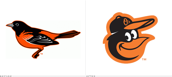
Based in Baltimore since 1954, the Orioles are an American League baseball team in Major League Baseball. Chris Creamer reports on the new uniforms for the 2012 season and the return (and evolution) of the cartoon oriole to replace the more realistic oriole as the insignia on the cap.
Thanks to Gavin Hribar for the tip.

DATE: Nov.18.2011 POSTED BY: Armin
 CATEGORY: Sports The B-Side
  COMMENTS:


