


Bill and Hillary Clinton National Airport
Spaceport America
Uber
Agero
Jetstream Freight Forwarding
All B-Side Archives
Subscribe to B-Side RSS


Online
- FPO (For Print Only) / Celebrating the reality that print is not dead by showcasing the most compelling printed projects.
- Art of the Menu / Cataloguing the underrated creativity of menus from around the world.
- Quipsologies / Chronicling the most curious, creative, and notable projects, stories, and events of the graphic design industry on a daily basis.
- Speak Up (2002 – 2009) / Discussing, and looking for, what is relevant in, and the relevance of, graphic design. Archives Only.
- Word It (2003 – 2010) / Encouraging creative diversity in the community through monthly, one-word challenges. Archives Only.
- Brand New Classroom (2010 – 2011) / Providing a space for critique and opinions on student identity work. Archives Only.
Publishing
- The 2010 Brand New Awards / 2011, self-published.
- Flaunt: Designing effective, compelling and memorable portfolios of creative work / 2010, self-published.
Events & Judged Competitions
- Brand New Conference / A one-day event on the development of corporate and brand identity projects by some of today’s most active and influential practitioners from around the world.
- Brand New Awards / Celebrating the best identity work produced around the world.
- FPO Awards / Celebrating the best print work from around the world.
Writing
- Graphic Design, Referenced: A Visual Guide to the Language, Applications, and History of Graphic Design / 2009, Rockport.
- Women of Design: Influence and Inspiration from the Original Trailblazers to the New Groundbreakers / 2008, HOW Books.
- The Word It Book: Speak Up Presents a Gallery of Interpreted Words / 2007, HOW Books.
Graphic Design
- Department of Design / Designing corporate and brand identities and full development of printed and digital matter for clients.

A B-Side BY Armin
Avinor
![]()
About: (Est. 2003) “Avinor is responsible for planning, developing and operating the Norwegian airport network. Avinor operates 46 airports in Norway, thereof 12 in cooperation with the armed forces. Operations also include air traffic control towers, control centres and technical infrastructure for aircraft navigation. […] The ownership is administered by the Ministry of Transport and Communications.”
Design by: Snøhetta.
Ed.’s Notes: Both old and new logos are fine on their own; new one might be a tad too abstract and minimal, but it’s nice. Video introduction below (or after the jump).
Relevant links: Snøhetta case study.
Select quote: “The consolidated statement in the logo and logo symbol describes Avinor’s public service mission. From north to south, tying Norway together — and Norway together with the world. The specially designed typeface and the unique symbol Avinor helps to cement their position in the market as a full-service provider in the aviation industry and strongly supports the strategic change in the organization.”
Thanks to Mathias Haddal Hovet for the tip.
Continue reading this entry

DATE: Jun.11.2013 POSTED BY: ArminCATEGORY: The B-Side Transportation COMMENTS:

TAGS: airport, norway, Sans Serif, uppercase,

A B-Side BY Armin
Transdev

About: Transdev (Est. as Société centrale pour l’équipement du territoire in 1955) and Veolia Transport (Est. 1876) have merged to become “Transdev. A subsidiary of Caisse des Dépôts and Veolia Environnement, Transdev is a world leader in public transport. From pre-project to daily operations of public transport systems to project management assistance, Transdev provides consulting and support to local communities. With 101,000 employees in 27 countries and operating 60,000 vehicles and 24 tram networks, Transdev generated revenues of 7.6 billion euros in 2012.”
Design by: W&Cie.
Ed.’s Notes: If one must use a neutered sprite in a logo this is as good as it gets. It’s really not that bad; could have done without the gradient. The wordmark is questionable. Bigger view of the logo and a couple of applications below (or after the jump).
Relevant links: W&Cie blog post. Press release (French). Merger FAQ.
Select quote: “Commenting on the new identity of the group, Jean-Marc Janaillac said: ‘Transdev and Veolia Transport are two known brands, recognized and appreciated by our clients for more than twenty years, which is why we chose the name of one and the color of the other.’ The Transdev name is preserved and given a new identity. Red, an open and visible color, synonymous with passion, empowers the logo while anchoring the history of the group.”
Continue reading this entry
DATE: Jun.06.2013POSTED BY: ArminCATEGORY: The B-Side Transportation COMMENTS:
A B-Side BY Armin
Budget Car Rental
![]()
About: (Est. 1958) “Budget Car Rental is one of the world’s best-known car rental brands with more than 3,000 locations in more than 120 countries. Budget is an industry leader in providing vehicle rental services to value-conscious travelers and also operates the second-largest truck rental business in the United States, through a network of more than 2,100 locations. Budget is owned by Avis Budget Group, Inc.”
Design by: N/A.
Ed.’s Notes: Not bad and it goes better with the redesigned logo of its parent company, Avis. An alternate lock-up with the road graphic on the side is below (or after the jump).
Relevant links: N/A.
Continue reading this entry
DATE: May.13.2013POSTED BY: ArminCATEGORY: The B-Side Transportation COMMENTS:
TAGS: lowercase, Sans Serif,
Opinion BY Armin
Follow-up: Fiji Airways
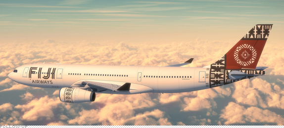
Back in August of this year we reported on the new logo for Fiji Airways, the national carrier airline of Fiji that is completing a full rebrand to be set in motion in 2013. At the time of the logo reveal, Fiji Airways preemptively announced that its livery would be introduced on October 10, Fiji Day. Here it is.
Continue reading this entry
DATE: Oct.23.2012POSTED BY: ArminCATEGORY: Transportation COMMENTS:
A B-Side BY Armin
Tulsa International Airport
![]()
Established in 1929, the Tulsa International Airport is the airport for Tulsa, Oklahoma. A new logo was introduced earlier this month. It is remarkably nice, for airport logos. Story here. Design by Walsh Branding. Bigger view view of the logo below (or after the jump.)
Continue reading this entry
DATE: Sep.17.2012POSTED BY: ArminCATEGORY: The B-Side Transportation COMMENTS:
A B-Side BY Armin
Omnitrans
![]()
Established in 1976, Omnitrans is a public transportation agency in San Bernardino County, California, serving 15 cities with a fleet of 196 fixed route vehicles. Last month, Omnitrans introduced a new logo and livery for its buses. No design credit given. Story and images here. Saddest part of this: that old logo was capital-A Awesome.
Thanks to Hank for the tip.
DATE: Sep.04.2012POSTED BY: ArminCATEGORY: The B-Side Transportation COMMENTS:
A B-Side BY Armin
Air New Zealand
![]()
Established in 1940, Air New Zealand is one of the largest domestic and international passenger transport and cargo airlines in New Zealand, with over 100 airplanes in its fleet. In July, Air New Zealand announced a revised logo and a new, all-black livery designed by local firm Designworks in collaboration with type designer Kris Sowersby — who has chronicled his process on this project here. Press release quote and livery images below (or after the jump).
Continue reading this entry
DATE: Aug.02.2012POSTED BY: ArminCATEGORY: The B-Side Transportation COMMENTS:
TAGS: airline, black, livery, new zealand,
A B-Side BY Armin
Bill and Hillary Clinton National Airport
![]()
First built in 1931, Little Rock National Airport serves around 150 flights each day to and from Little Rock, Arkansas. This past March, the airport was renamed as Bill and Hillary Clinton National Airport, in honor of the former Arkansas governor and former United States president Bill Clinton and his wife, current United States Secretary of State Hillary Clinton. The new logo, introduced this week, was designed by local ad agency Eric Rob & Isaac. Story here. (Mr. Clinton sure likes his C-shaped swooshes, see: Clinton Foundation logo).
Thanks to James I. Bowie for the tip.
DATE: Jul.25.2012POSTED BY: ArminCATEGORY: The B-Side Transportation COMMENTS:
A B-Side BY Armin
Spaceport America
![]()
Located in Las Cruces, NM, and managed by the New Mexico Spaceport Authority, Spaceport America is “the world’s first purpose-built, commercial spaceport, designed to enable affordable, efficient and effective space access and unlock the potential of space for everyone.” A new logo, nicknamed “Spirit”, was introduced on July 4. Press release here. No design credit is given, which is probably for the best because whoever stretched the shit out of Gotham deserves to be put into space and left there. Bigger version of the logo below (or after the jump).
Continue reading this entry
DATE: Jul.16.2012POSTED BY: ArminCATEGORY: The B-Side Transportation COMMENTS:
Opinion BY Armin
SFMTA’s Spec Logo Doesn’t Suck
![]()
Established in 1912, the San Francisco Municipal Transportation Agency (SFMTA) is responsible for the transit system in the Bay Area, the seventh largest in the United States, that encompasses pedestrians, bicycling, transit, traffic and parking and regulates the taxi industry. SFMTA is responsible for the city’s popular cable cars and Muni. In April of this year, in collaboration with ImproveSF — an initiative sponsored by the City and County of San Francisco that allows anyone to contribute ideas to improve the city’s government — SFMTA launched a contest to redesign its logo as it neared its 100th year. From about 45 submissions, the judges selected a design submitted by Paul Miller, creative director at Method, Inc., one of the leading firms in San Francisco.
Continue reading this entry
DATE: Jun.20.2012POSTED BY: ArminCATEGORY: Transportation COMMENTS:
TAGS: contest, icon, method, san francisco,


Books about logo design, the designers that create them and the meaning of branding.
