

NOTE: This is an archived version of the first incarnation of Brand New. All posts have been closed to comments. Please visit underconsideration.com/brandnew for the latest version. If you would like to see this specific post, simply delete _v1 from the URL.
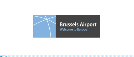
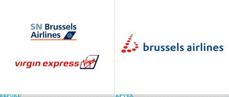
Recently, Brussels Airport clarified their name to be, well, “Brussels Airport” and added a tagline. Also, SN Brussels Airline, who took control of Virgin Express last year, and also uses Brussels Airport as a hub has just announced that the new, single airline brand will be Brussels Airlines.
What I find interesting here is more than the shared namesake, but the imagery that they chose for their logos. I guess it is similar to Continental’s globe (which serves them well) but both of these entities chose generic airport metaphors which could easily be swapped with one another. The airline uses runway lights and the airport uses travel routes. The key here is that they were both smart enough to not stop there
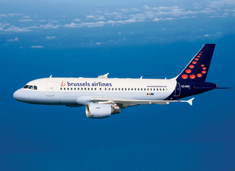
Brussels Airlines does have added layers. The runway lights make a “b” and that’s fine except that the day when a logo meant making something out of the first letter of the company name came and went years (maybe decades) ago. What I do like is that the “b” seems to have been designed with the tail in mind. A “b” in perpective italics which can perhaps change angles depending on the size of the jet and shape of the tail is smart. The website is also well done.
Brussels Airport is well-done technically, and I do like the tagline which, when coupled with a route map showing them as a major destination, is smart. The website is horrible, but who goes to an airport’s website anyway. I’m curious how the real estate will be treated. Anyone live in Belgium?


Jump to Most Recent Comment
Paul D’s comment is:
I think both the name and tagline are rather dumb, considering "Brussels" is not the name of the city in either of Belgium's two main languages.
On Nov.15.2006 at 09:53 PM
Tim O'Connor’s comment is:
I like the airport logo because of the very subtle curves on the lines. On one level it's, as you said, a route map, but the subtle curves make it clear that it's also the longitude lines on a globe. The curves suggest a huge sphere that we only see a small part of.
On Nov.15.2006 at 10:53 PM
Lester’s comment is:
I'm curious to know what the other side of the plane looks like. What happens to the "b" on the side that doesn't fit the shape so well?
On Nov.15.2006 at 11:53 PM
Denis’s comment is:
I was curious to see the logo on the other side of the tail too :-)
On Nov.15.2006 at 11:54 PM
Lester’s comment is:
Thanks for that, Denis!
On Nov.16.2006 at 12:12 AM
Andrew Kopietz’s comment is:
Maybe i'm just... calling attention to the mundane, but in the re-branded logo, is the red of the dotted 'B' a nod to the red found in Virgin's logo or is it just a contrasting color entirely separate from Virgin's logo?
On Nov.16.2006 at 12:56 AM
kpi’s comment is:
@Paul D:
'Brussels' isn't the name of the capital in Dutch of French, but one cannot underestimate the major power of Brussels as the European hub par excellence. As an entity and identity, Brussels is far more important than Belgium. In and around Brussels, companies are coming to stay, the whole 'Brussels-thing' is booming. Brussels is the place to be—not just Belgium. So I understand why they choose the international name to build their identity on.
On Nov.16.2006 at 03:16 AM
kenson’s comment is:
Lose the tail!
On Nov.16.2006 at 05:56 AM
Yves’s comment is:
'Antwerp Airways', sounds better too and no tail issue!
On Nov.16.2006 at 06:11 AM
Aaron’s comment is:
Regardless of any debate on the naming of the airport, I am a fan of the logo. The colors, in my opinion, work well in conveying stability and importance. The latitude and longitude lines of the left side of the logo make me want see more. I also love the way the white lines double as plane route markers and the visible convergence into a single point do well to portray Brussels as a stopping point and main destination.
On Nov.16.2006 at 06:14 PM
Teo’s comment is:
Using Brussels makes sense with their tagline. As the center of the EU, they can assert themselves as the center of Europe, at least from a tourist point of view. London will always be the quickest hop-over, but to reach the mainland Brussels makes a lot more sense. Should they have gone with, say, French? Maybe to reach more Europeans, sure. But who else needs to be welcomed to Europe other than non-Europeans, and English (unfortunately?) dominates as a business-universal language.
I dig the crossing jetstreams and the idea of a flight map from a center destination, but after reading the press release, I see it more as looking into an umbrella. Still a very clean and strong refocusing of a brand.
On Nov.17.2006 at 01:10 AM
Kosal Sen’s comment is:
Brussels airport, nice. This tagline-in-logo trend is, excuse my pun, taking off pretty well. In this logo, it definately helps clarify the meaning of the lines. I'm surprised the traffic pattern concept isn't overdone within the airline industry.
With brussels airlines, I can't help seeing a flat symbol (musical notation). Conveying the experience of an airline through a runway lights is very narrow and utilitarian. What's going on here? The shapeshifting of the b is forced. Especially when you see both bs together on one side of the plane.
On Nov.17.2006 at 02:02 AM
robert’s comment is:
please check the logo at this url http://www.hannover-airport.de/
not soooooo far away from the brussels airlines logo…
On Nov.18.2006 at 07:17 AM
Xavez’s comment is:
Well, I must say, I really hated the Airlines logo the very first glimpse I got of it :). That skewed "b" is just so damn ugly and unnaturally placed aside the "brussels airlines" text. I also find it to be a bit of a problem that the "b" is not capitalized! I think that about every Latin-alphabet languague writes cities' names with the first letter cap'd :). The Airlines website makes things a right just a tiny bit. But the Brussels Airlines commercial is just brilliant!
The Airport logo is very nice! Too bad their website is a piece of total crap :).
@robert: the typography and color schemes are quite different ;). Though I must admit the general idea of the skewed "H" and "b" are quite the same :).
On Nov.19.2006 at 01:07 PM
Greg Pin’s comment is:
I'm born in Brussels, I now live in Canada and work as a graphic designer. I really like simplicity of the symbol - lines crossing forming a center point works perfectly in respect to what the city represents in Europe.
I'm not too excited about the typography but it's balanced enough that I don't mind it.
FYI
In Europe, Brussels is known as the political capital of Europe - it is the home of the European Commission, the Council of the European Union, and European Parliament.
Brussels is also the political seat of NATO, the North Atlantic Treaty Organisation, the Western European Union (WEU) and EUROCONTROL, the European Organisation for the Safety of Air Navigation.
http://en.wikipedia.org/wiki/Brussels
I hope this helps shine some light on the word!
Cheers.
Steve Woodruff’s comment is:
The tagline works very well as a bold positioning statement - tying in the simple graphic which combines the notions of "hub" and "global", Brussels has proclaimed itself to be the gateway to Europe. Whether true or not, it's very effective.
On Nov.20.2006 at 10:08 AM
DesignMaven’s comment is:
David:
I vaguely see the connection between the new Brussels Identity, and Old Continental Airlines Identity Designed by Saul Bass nor the Redesigned Continental Airlines Identity Designed by Roger van den Bergh as Designer / Consultant to Lippincott & Margulies.
The Bass Designed Continental Identity Represented Flairing Contrails.
Roger van den Bergh's Redesigned Continental Identity Represent a Globe.
Brussels airport Identity is a Milestone in Brevity and Wit.
In Minimalism it is a Tour de Force embracing the theory Less is More.
What I see today is Brevity in Identity Design and not much Wit. Meaning, Intelligent and Poignant Solutions that challenge our intellect to visualize the secondary imagery or inner meaning which Signify the Identities Message.
These Identities are Simple but not Simplistic.
1. The Original AT&T Identity, Signified Communication Lines Encircling the Globe.
2. IBM, Vacuum Tube Lines of a Computer Monitor
3. International Paper, A Spruce Tree formed with the Initials "I" and "P".
4. CBS, Eye on the World Identity.
Others to numerous to mention.
Brussels Airport Identity Signify crossing jet streams and routes. The secondary or inner message also suggest the structure of a Capitial Dome.
Brussel Airlines:
A Fresh Identity Solution not new or Groundbreaking by any stretch of the imagination.
The Dot or Circle Motif has been done to Death and lives in many incarnations of Identity.
Yet G2's Identity Solution definitely address these Benchmarks of Great Identity Design.
1. Originality
2. Memorability
3. Usability
4. Livability
5. Propriety,
6. Uniqueness
7. Visual Impact
8. Imaginative
It's always Great to witness new Life Breathed into Showing an Old Thing in a New Way and a New Thing in an Old Way.
DM
On Nov.21.2006 at 11:36 AM
DesignMaven’s comment is:
Follow Up:
Apologies, the Brussels Airline Identity was not Developed and Designed by G2.
I was thinking about posting in Pantone Identity Editorial while writing my commentary and analysis for Brussel Airlines. G2 is credited with the ReDesign of Pantone's Identity.
DM
On Nov.21.2006 at 12:51 PM
Ben’s comment is:
I really like the airport logo, but I don't like the tagline 'Welcome to Europe'. To me, it sort of ostracizes the intra-European travelers, which might make 'em feel less important as a guest. Maybe something focusing more on the central location and role of Brussels (although I guess the current one arguably does that).
The airline? Eh. I might have stolen its type choice and used that for the airport logo.
On Nov.25.2006 at 05:25 PM
rykodisc’s comment is:
the airport logo is only a landmark in being late to the party. this is another in a line of logos 'inspired' by the sfo identity redesigned a few years back:
here
rykodisc’s comment is:
and does it rain a lot in brussels? looks like a big golf umbrella covering the city.
On Nov.29.2006 at 11:53 AM
Xavez’s comment is:
Well how about that. They've decided to change the b-logo because of the stupid fact that it consists out of thirteen elements. Apparently some people found this disturbing enough to complain :). Pretty lunatic if you ask me :).
On Dec.20.2006 at 10:14 AM
Sten49736’s comment is:
I just don't have much to say these days, but so it goes. Today was a total loss. I guess it doesn't bother me.
On Jan.06.2007 at 01:56 PM
Lode’s comment is:
Some updates: as Xavez notes, the (ugly, imho) Brussels Airlines logo is going to be modified slightly, because it consists of 13 elements. Superstitious American travelers are "blamed" for this change.
Meanwhile, Brussels airport has updated its website. The ugly dark blue website from the BIAC days was replaced with a much nicer site.
On Jan.16.2007 at 06:08 AM
Bryony’s comment is:
More on the superstitious change (thanks to S Harley-Mills).
On Feb.22.2007 at 12:39 PM
Alexobb’s comment is:
On Nov.14.2007 at 07:31 PM
Alexobb’s comment is:
On Nov.14.2007 at 07:31 PM
Alexbqd’s comment is:
On Nov.14.2007 at 07:31 PM
Alexbqd’s comment is:
On Nov.14.2007 at 07:31 PM
balabo_iz’s comment is:
Sorry, but what is kimerikas?
Jane.
On Mar.27.2008 at 09:32 PM
creakereoboro’s comment is:
Hello my friends :)
;)
denis’s comment is:
who wants to suck my dick???
On Jan.26.2009 at 07:58 PM
lester’s comment is:
i will suck up so good god im horney
On Jan.26.2009 at 08:01 PM
lester’s comment is:
i will suck up so good god im horney
On Jan.26.2009 at 08:02 PM
Olgunka-kd’s comment is:
On Apr.27.2009 at 05:21 PM
Olgunka-vp’s comment is:
On Apr.27.2009 at 10:33 PM
Comments in Brand New, V1.0 have been closed.


