


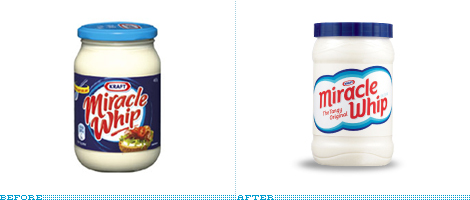
Miracle Whip, the zingy alternative to mayo, has apparently seen better days in terms of mayo-alternative ubiquity and has re-entered the market positioning itself to the 18-to-34-year-old demographic. Which typically means some sort of social application, in their case Zingr, but that’s the least interesting part of this. The new label and logo are remarkably Old School, reversing the order of Before/Afters in consumer packaging by ditching the swirls and overly friendly and loopy typography for an almost disarming simplicity. Apparently all the thrift shopping of vintage stuff by the 18- and 34-year-olds has finally paid off and that oldish look can feel new again. Fingers crossed, this will be the first of many consumer brands to revert back from the crazy scripts and wild backgrounds.
Continue reading this entry![]()
As if we needed any more proof that the venerable patron saint of mass consumer design, Target, attracts designers, my inbox has been jumping with designer e-mails about the new look and name of its private label brand: Up & Up. The chunky arrow logo is replacing Target’s red bulls eye in all the products in the health and beauty care category, from diapers to sunscreen lotions. As CNNMoney, one of the first to pick up the story, reports, the new design is just beginning to be rolled out and by the end of the year there will be 800 Up & Up products, which are typically priced 30% below brand names. And in this rough economic times, 30% less to pay for anything is, well, right on target. One of our undisclosed tipsters says the design has been done by Wolff Olins, who has Target listed in their clients page, so it may just be right — of course, a hundred other design firms have Target listed in their client page, but still.
Continue reading this entry![]()
One of the worst things about being sick to your stomach — whether it was because of some bad fish tacos or exposure to an ugly logo — is the prospect of having to take Pepto-Bismol to cure it. Sure, you could take other things, but somehow Pepto-Bismol is a default, widely available, mainstream choice that is easy to recognize either in your medicine cabinet or as you sweat your way through the aisles looking for a cure. Pepto-Bismol looks like pink goo, it smells like pink goo, it tastes like pink goo. It is pink goo. Magical pink goo that more often than not works. Or, like a match that you light to overpower a powerful Number Two, it at least makes you think of what an awful thing you have just swallowed and allows you to forget your upset stomach for a few seconds. As if the product itself wasn’t enough of a reminder of its pinkish gooeyness a new logo and packaging have been designed to emphasize that the stuff you are about to intake is pink and gooey. The logo now oozes, its typography melting at the mere sight of the pink goo that lies beneath it. Pink. Goo. Everywhere.
Continue reading this entry![]()
There are a few reasons why I thought covering this redesign would be helpful, since it falls somewhat outside of our regular coverage: It’s for a brand few of us have probably heard of, for a product we likely don’t need, and it wasn’t done by a fancy design firm. ESS, or Eye Safety Systems for long, is an 11-year-old company that “creates advanced eye protection systems for military, law enforcement, and fire/rescue professionals.” Definitely not your hip aviator sunglasses. This past January they launched their new identity, designed in-house and led by Ian Griffiths, who was brought on board to redesign the whole brand and its related materials.
Continue reading this entry![]()
The United Kingdom’s Sunny D is now made with 70% fruit juice, apparently no longer turns kids yellow and has a new look to boot, designed by the brand consultancy Elmwood. This is one of those redesigns that while not doing anything worse, isn’t doing anything better. I remember way back when, the original packaging was just some green and white type on a plastic bottle — which let the shape and the that-can’t-be-natural color do most of the branding work. The new packaging is certainly vibrant, but I’m not so sure about the ominous fruit up in the clouds (which is strangely reminiscent of this Monty Python moment) or that plastic-looking wannabe surf typography. But hey, “It’s got healthy junk!”
Continue reading this entry![]()
When the e-mail popped into my inbox with the subject “Packard Bell” I was magically transported to my early teenage years, maybe even younger or, at least, to a time before Apple ruled the earth and beige expensive beige PCs were the household norm. I don’t know much about Packard Bell and, all things considered, it’s a brand that is as memorable as the pigeon waddling outside the window of the coffee shop I am writing this from. But I do remember the one kid in my class who had the Packard Bell at home. I can’t remember what brand we had at our home. I know it wasn’t Packard Bell. Because this kid’s computer, a Packard Bell, sucked. Big time. We couldn’t play any games on this computer. It was slow and it was dull. Poor kid. Apparently Packard Bell has a whole other appreciation of its brand.
Continue reading this entry![]()
Established in 1984 in the state of Washington as Hart Brewing, the small microbrewery has grown quite a bit in the last quarter century — I could have said 25 years, but “quarter of a century” adds so much more drama, but anyway… — gathering awards for their specialty flavored and uniquely concocted beers as well as running three full-production breweries in Seattle, Berkeley and Portland and four, probably delicious, alehouses. Hart Brewing changed its name to Pyramid Breweries in 1996. This month, they will start selling their beer in newly designed bottles and boxes and introducing a new logo.
Continue reading this entry
Walmart has taken some of their 250 billion dollars in sales and invested it in improving their own line of products. This initiative has involved extensive product and consumer testing, the introduction of new formulas and products, a staffed number for consumers’ product inquiries, the ability to rate and review their products on on their site, and of course new packaging.
Continue reading this entry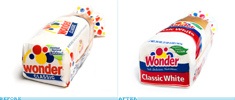
While attending the International Balloon Race at the Indianapolis Speedway in 1921, as the story goes, Vice President of the Taggart Baking Company, Elmer Cline, came up with the name — which subsequently inspired the logo — of their soon-to-be-introduced loaf of bread as he was struck in wonder by the sight of the balloons in the sky. And for more than eighty years, Wonder Bread has been an icon of all things American, and, more yummily, of all things sandwich. Few things are as delicious as a peanut butter and jelly sandwich in classic white wonder bread as it sticks to the top of your mouth. Just don’t count the calories. But back on track: With an increasing number of products and SKUs that were growing inconsistent in their design, Wonder has just redesigned the complete line of packaging and has modified its logo. In charge of the redesign was Kansas City-based Willoughby Design, who was been working with Wonder since the late 1990s.
Continue reading this entry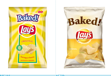
Unlike your run of the mill, delicious chips that are fried in fatty goodness, Frito Lay’s Baked! chips — exclamation point theirs — are, as the name exclamingly implies, baked for the health-conscious consumer. Where most chips contain 10 grams of fat, Baked! touts only 1.5 grams. I don’t buy chips often, only when I’m road-tripping and that has happened, like, three times in the past five years so I somewhat embarrassingly admit that I had no idea of the existence of Baked! Lay’s, which have been on the market since 1996. I must be a sucker for pretty things but I have to say that seeing this new packaging does tempt me to look for them on my next road trip or, more likely, on my next trip to the grocery store.
Continue reading this entryNext Page
(Total Number of Pages in Consumer products: 4)


