

NOTE: This is an archived version of the first incarnation of Brand New. All posts have been closed to comments. Please visit underconsideration.com/brandnew for the latest version. If you would like to see this specific post, simply delete _v1 from the URL.
![]()
Duane Reade, the most ubiquitous pharmacy and umbrella-seller-on-a-rainy day in New York with close to 250 stores — one seemingly on every corner and across a Starbucks — has begun rolling out a new upscale identity. In general we don’t cover many local redesigns with limited exposure but given that Duane Reade is sort of an institution around these parts I feel obligated to cover it. The first sights of the new logo were spotted back in early November and a few more stores have updated since. Their web site indicates nothing about the change, and I had hoped that by now something more concrete would be available. So the best we have is a faux-official logo above first cobbled together by Paul Sahner, as well as plenty of citizen brandjournalism on Flickr.
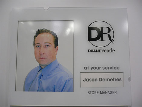
Photo: Flickr user arvindgrover
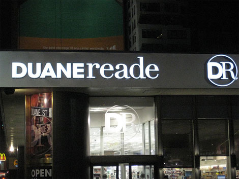
Photo: Flickr user vernnyc
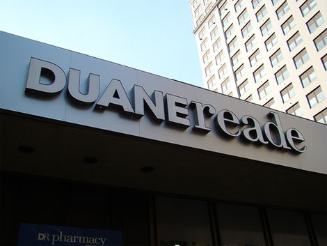
Photo: Flickr user rolando.pujol
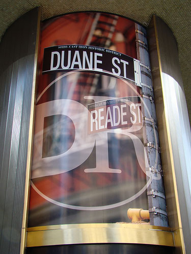
Photo: Flickr user rolando.pujol
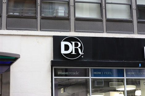
Photo: Flickr user nrw206
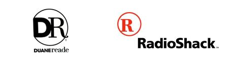
The old logo has always felt weird to me, I like how the D and R joined but the crossbar of the R is just somehow wrong. Though the peculiarities of the old logo are really not important: Duane Reade was instantly recognizable from Walgreens and CVS pharmacy through its logo and blue and red combination. The new look is a higher-end black and white approach that will also set it apart from its competitors, although someone looking for a Sephora store might accidentally end up buying toilet paper and Mucinex. Also, it’s left to see whether the store experience will step up to the look, as they are typically raggedy old stores that you just want to get in and out of. The new logo is too sterile and medicinal, like a prescription logo that you should take three times a day. The cut-off circle is very annoying and poorly executed, while the typography is at least properly done. I’m usually a fan of combining serifs with sans serifs, and this one does it nicely, plus it serves as a nice reminder that the store was originally between these two New York streets, Duane and Reade. It’s a nice, needed upgrade overall but the the DR monogram could have been better.


Jump to Most Recent Comment
Gavan M.’s comment is:
Wow, Store Manager Jason Demetres looks so impressed with the redesign!
On Jan.28.2009 at 07:28 AM
Ben’s comment is:
That monogram is a bit dodgy.
Why have the cut off circle at all?
Is it to emphasize the D?
There are so many better ways to execute that monogram.
FYI - Jason Demeteres will eat your soul!
On Jan.28.2009 at 07:37 AM
R Berger’s comment is:
wow. The UC 'DUANE' and lc 'reade' just don't go together. It looks like a college student's first attempt at "that cool juxtaposition between serif and sanserif typefaces".
And the cutoff circle has been previously mentioned, but what about the circle cutting through the right side of the 'R'?
Plus, why is the 'R' in the DR monogram capitalized when it is lowercase in the logotype? This new design reminds me of the store– trying to be nicer and high-end, but something is just off.
On Jan.28.2009 at 08:14 AM
Alice ’s comment is:
Oh, Duane Reade new branding, how do I love thee? Let me count the ways.
I love thee to the depth and breadth and height .. . *ahem*
Gorgeous serif R, strong sans-serif D --- lovely circle, lovely wordmark...
And loving the folks on flickr too! flickr for the win!
sincerely,
alice
On Jan.28.2009 at 08:20 AM
Meghan’s comment is:
This has nothing to do with the logo... but has anyone seen the movie Gummo? The Store Manager Jason Demetres looks like the little boy from the movie... all grown up.
On Jan.28.2009 at 08:52 AM
Daniel’s comment is:
Funny you should mention that it looks sterile and medicinal, as the cutoff circle seems to make a nice Rx prescription symbol. Personally, I love that touch.
On Jan.28.2009 at 09:01 AM
Ed’s comment is:
lowercase 'r' then uppercase 'R'. does not compute.
Using the D to create the right portion of the circle in the logo offends my sense of geometric oughtness.
On Jan.28.2009 at 09:06 AM
Ben Thoma’s comment is:
Hmm…
Duane Radio Shack, anyone?
On Jan.28.2009 at 09:13 AM
BK’s comment is:
I was just going to say the same thing about the Rx prescription symbol. I was thinking its almost DRx (Doctor/Prescription)
There is a disconnect between the monogram and the logotype that bothers me slightly when they're together, mostly with the previously mentioned capital/lowercase 'R'
On Jan.28.2009 at 09:21 AM
Paul’s comment is:
The 'R' totally looks like RadioShack's R.
Also, I don't like it. At least the old logo matched the contents of the store. This new one looks like I should be walking into an Apple store, and I'm guessing the ceilings/floors will still be water-stained and the store will have that weird smell.
On Jan.28.2009 at 09:31 AM
Jeffry Pilcher’s comment is:
It's Radio Shack with a "D" added.
I see no measurable improvement.
I'd bet if you asked 100 people who were unfamiliar with this brand which logo was the new one and which was the old one, you'd get 50/50 answers.
On Jan.28.2009 at 09:34 AM
Mark’s comment is:
nonononononononono.
ECH!
this mixed typeface thing looks BAD! When did mixing radically different typefaces look good?
What were the faults with the old logo? please name them. I couldn't see any.
The alignment with the circle look arbitrary.
On Jan.28.2009 at 09:35 AM
Rodrigo Müller’s comment is:
don't get it.
On Jan.28.2009 at 09:40 AM
Chris Herron’s comment is:
In terms of graphic design and brand recognition, this is one giant step backwards.
On Jan.28.2009 at 09:49 AM
Mark’s comment is:
OKay,Okay at second look the wordmark doesn't look that bad, but the monogram? utter disaster!
First off the big bold D and the thin serif R just look like they don't go together. They don't fit right. The D is too bold, to fit with the the R, and the R is so damn thin and serif that it can't fit with the the D. I'm seeing two radically opposite elements fighting for my attention, that it is impossible to seem to fit together. Plus it looks like something badly done in paint.
Secondly the circle looks like an afterthought. The way it is designed it looks like it was placed at the last minute. It doesn't even look like a symmetrical circle, it looks off. The placement is arbitrary, it doesn't enhance any of the other elements. It just looks like it was added on at the last minute without any thought at all.
On Jan.28.2009 at 09:49 AM
Mark’s comment is:
OKay,Okay at second look the wordmark doesn't look that bad, but the monogram? utter disaster!
First off the big bold D and the thin serif R just look like they don't go together. They don't fit right. The D is too bold, to fit with the the R, and the R is so damn thin and serif that it can't fit with the the D. I'm seeing two radically opposite elements fighting for my attention, that it is impossible to seem to fit together. Plus it looks like something badly done in Paint.
Secondly the circle looks like an afterthought. The way it is designed it looks like it was placed at the last minute. It doesn't even look like a symmetrical circle, it looks off. The placement is arbitrary, it doesn't enhance any of the other elements. It just looks like it was added on at the last minute without any thought at all. Plus the thinness of it makes it look cheap.
On Jan.28.2009 at 09:51 AM
Rodrok’s comment is:
Hey Doc! Why the hell they are making these stores more dry and boring and without personality, BRING COLORS TO OUR LIVES!!
come on you can do something elegant and serious looking with a little more of color
next time I go to to DR because I'm sick I'm just going to get more sick when I see this logo
On Jan.28.2009 at 10:09 AM
Serviceburo’s comment is:
I can deal with the mixing of fonts on the wordmark, but I have to agree with the other postings about the monogram - it is the opposite of gestalt. None of the elements are working in support of each other and the resulting logo just looks like it's fighting with itself. I can only assume that the "designer" who made it threw in the circle to attempt to counterbalance the weight of the D relative to the R, however this was not successful.
On Jan.28.2009 at 10:11 AM
danny’s comment is:
NOOOOO!
There are certain cultural icons that should not be messed with. Duane Read's logo is one of them.
I will miss the lowercase Serif Gothic dearly.
And, more to the point, if you do have to redesign an old school logo like Duane Read's, do it well, and let it honor what came before it. DO NOT however, give it a crappy cut off D and truncated Circle monogram and call it a day.
Disappointing. I feel the same way about this update as I do about live action feature length summer blockbusters of 80's cartoons. Stop! you're ruining my cultural heritage!
On Jan.28.2009 at 10:21 AM
sreiny’s comment is:
Not defending the old logo from a design standpoint, but it does kind of get what the store is. Overly bright, a bit tacky, cheap, everywhere. It has a feeling of just always having been there. The new mark feels like it's trying to be something it's not.
On Jan.28.2009 at 10:33 AM
Leland Witter’s comment is:
I know that they're the same height, but the "R" looks far taller to me than the "D" and the proportions just seem all off to me.
On Jan.28.2009 at 11:18 AM
Dale Campbell’s comment is:
This doesn't say upscale to me.
making something black and white, and adding a serif letter doesn't make it upscale.
On Jan.28.2009 at 11:41 AM
G. Sassoverde’s comment is:
Desperate Housewives, anyone?
On Jan.28.2009 at 11:46 AM
Mark’s comment is:
DROP THE MONOGRAM.PLEASE!!!!!
it's not needed and it looks horrible.
On Jan.28.2009 at 11:49 AM
Kellie Schroeder’s comment is:
I would say that the redesign fits much more appropriately with it's environment (NYC). As long as they back up the brand overhaul with the product offerings, store design and shopper experience... they should be in great shape for the future.
Closing stores might actually be a good thing for the rebrand...in the long run...because they'll be able to focus on overhauling the interiors (away from those nasty, dirty white shelves).
Just don't tell that store manager...Jason Demtres...he looks like he's already having a bad day.
On Jan.28.2009 at 12:05 PM
Neil’s comment is:
The logo doesn't work at all. However, I do like the typography and I personally think the logo isn't necessary at all. I think you could probably get away with just a word mark.
On Jan.28.2009 at 12:18 PM
jRod’s comment is:
Yeah, not a fan of that icon at all. i think that i would rather not have one at all than have that one.
On Jan.28.2009 at 12:20 PM
dale’s comment is:
I gasped at how bad the new monogram is. Truly amateur design. Also: Whereas I never had this problem with the cheesy old logo,this one clearly reads as "DR" as in "Doctor"....which may be where you're getting "medicinal."
On Jan.28.2009 at 12:26 PM
Robin’s comment is:
Yeah, it definitely screams Radioshack to me, too. I'm a fan of pairing serif and sans serif typefaces together — but not like this!
On Jan.28.2009 at 12:41 PM
Brian’s comment is:
Yes, echoing what many have said. Duane Shack
damon’s comment is:
radio shack is nicer than that logo.
I seriously dislike this one.
On Jan.28.2009 at 01:05 PM
Eli’s comment is:
umm... i think i just threw-up in my mouth a little. there was no reason for DR to change their old logo. the clipped corners on the D are terrible and switching to black and white makes it look like they only sell mascara. I know it's New York, but tone it down a bit...
On Jan.28.2009 at 01:16 PM
Yeison Agudelo’s comment is:
i dont like it at all i cant picture new york anymore haha
On Jan.28.2009 at 01:19 PM
thomas’s comment is:
its a big step but unfortunately in the wrong direction. i agree with the suggestion to lose the monogram. lose the "DR" all together. it reads "doctor" and i feel that is a bad thing for this store. and seriously, wtf is up with the cut off circle?
On Jan.28.2009 at 01:19 PM
BJN’s comment is:
I agree that this looks like the Radio Shack logo with a fat "D" addition. I don't like the termination of the circle element with the corners of the D - makes the D look like a balloon font at a glance.
On Jan.28.2009 at 01:51 PM
Matt Barnes’s comment is:
The third picture from the top makes it look like Duane Reade Memorial Hospital, or something. Very cold and institutional.
On Jan.28.2009 at 01:51 PM
Derrick’s comment is:
It's extremely '90s and not in a good way.
On Jan.28.2009 at 01:58 PM
ChrisM70’s comment is:
This new logo looks makes me think of an optical store, and not a pharmacy.
On Jan.28.2009 at 02:12 PM
Nick Irwin’s comment is:
Nice wedding monogram...wedding branding is huge right now!!
they will make such a nice couple...
...o...its a pharmacy
my b
On Jan.28.2009 at 02:23 PM
julia’s comment is:
I saw this over a month ago on 34th street en route to penn station at 5 in the AM. It ruined my day. The recent NEED to combine serifs and san serifs really irks me, it was cool the first few times, and it still has the potential to be cool when there's some thought involved, but this is just not cutting it.
I agree with everyone on the serif being way too thin and it being way to reminiscent of the radio shack logo. I would go as far as to say that if they have stolen the radio shack R it may have looked a bit better... but the contrast makes it read funny...
Not to mention that of alllll the drug stores we have at our disposal, duane reade SOMEHOW manages to overcharge for absolutely everything- just pick an item up at cvs and compare it to duane reade, I've sometimes seen things for double at duane reade. I personally miss Genovese because it was also New York based but family owned for a LONG time.
annnd right as I was previewing my post I scrolled through everything again and as I quickly passed by the monogram it looked like Kirby to me... as if he got punched in the face.
On Jan.28.2009 at 02:25 PM
Filipe’s comment is:
Duane reade looks nice, DR doesn´t...
On Jan.28.2009 at 02:34 PM
Spencer Cross’s comment is:
The recent NEED to combine serifs and san serifs really irks meMore like the "The re-emerging trend of combining serifs and san serifs." The first thing I think of when I see serif/sans serif combos are the opening titles of the 90's sitcom Mad About You. It seemed to me like that combo was everywhere back then, at least in the studio I worked in. On Jan.28.2009 at 03:25 PM
Stephanie’s comment is:
Wow, their website is just sad, really hoping the new logo brings forth a better site design.
I've always confuse Rite Aid with Duane Reade because of their colors, both were red and blue, the new differentiation will help. However, I agree that the black and white will not be attractive in a dim, foggy day like today's weather in NYC.
Overall, I am disappointed in the direction they chose for their new look. Why couldn't they try to be a little more fun and friendly, instead of a stern, corporate look that makes me feel like I will get yelled at by old man Demetres if I accidentally dropped one of their $1 DR-brand pasta cans (which will be interesting to see the new packaging design)?
On Jan.28.2009 at 03:55 PM
Adam’s comment is:
Haha, Duaneshack...but seriously, yawn.
On Jan.28.2009 at 03:55 PM
Nick’s comment is:
Oy, I'm sorry but this rebrand is just painful to look at.
On Jan.28.2009 at 05:13 PM
Mark’s comment is:
hmmmm. I think Demetres doesn't like us or our opinions. He looked like he's about to punch us in the face.
Demetres: "Don't piss me off."
Demetres: "I will break you"
Demetres: "Are talking at me?"
Demetres: "I don't like being the butt of jokes"
Demetres: Don't piss him off, he hates working there.
On Jan.28.2009 at 08:11 PM
Glenn Sakamoto’s comment is:
Weak.
On Jan.29.2009 at 12:39 AM
Joe M’s comment is:
readeioshack
On Jan.29.2009 at 12:45 AM
Yves’s comment is:
Client: Make our logo cooler.
Agency: Ok, how about a mix of serif and sans-serif?
Client: Ok, but can you make it COOLER?
Agency: Lower case letters?
Client: Nice, but try even cooler!
Agency: Mmm... maybe a mix of upper case and lower case?
Client: Cooleeeer...
Agency: ...that would be touching each other without spacing?
Client: (sigh) Can you make it more like the iPod?
Agency: White on black?
Client: Now we're going somewhere. Any thoughts on how to make it really original?
Agency: We could have the "R" cross the circle line, to express the "Rx" symbol?
Client: Yeah yeah, whatever... Anything else?
Agency: Maybe we could cut the circle into a strange disturbing shape, just like the hidden arrow in the FedEx logo or something?
Client: I love it!
By the way, the old version was already inconsistent with uppercase+uppercase in the monogram logo and lowercase+lowercase in the wordmark. Now they are 3/4 uppercase, and just one lowercase left for coolness purposes. Better luck next time.
On Jan.29.2009 at 06:25 AM
Scott’s comment is:
Hooray for NYCentricism!
Maybe we could do McClure gas (since there's a ton of those across the Rust Belt) ... or The Pantry or Kerr Drug since there's a ton of those across the Southeast.
Or El Rodeo ... every town has a Mexican joint named El Rodeo.
Just yankin' your chain, since you did warn us about the regionalism ...
Tim Horton's, anyone?
On Jan.29.2009 at 08:48 AM
Chris Raymond’s comment is:
Agree with Mark--there are way too many contrasts in the letterforms of the D and R to look like a felicitous marriage. Yes, combining serif and sans can look lovely, but only if the pair is carefully selected to have some similarities, like X height, or thickness of stroke, along with contrasts.
Yuk.
And the new trade dress black and white apparently doesn't match the actual stores.
The word mark works, but the rest is bad.
On Jan.29.2009 at 09:33 AM
NYC Brad’s comment is:
Looks like a comination of Dunkin' Donuts and Radio Shack, and not in a good way.
http://www1.whdh.com/images/news_articles/389x205/dunkin_donuts_logo.jpg
Maybe those who don't like the black and white need to be patient. The Duane Reade on 10th Ave and 57th Steet has the new white logo with a LIME GREEN background. When it's lit up at night it looks even worse.
On Jan.29.2009 at 10:19 AM
Chad’s comment is:
I will say, the store here across from Penn Station did an upgrade when the new identity was rolled out.
It's much cleaner, and a little more hi-tech.
On Jan.29.2009 at 11:12 AM
Chris’s comment is:
I love the differentiation this system gives the brand. Good leap for them in my opinion. Execution is nice, but, man, that mark is bad. The circle, the "D" and the "R" all creating visual tension in different ways just makes my eyes go nuts.
On Jan.29.2009 at 11:16 AM
Brad McCall’s comment is:
I actually prefer the previous version (though the italic slant and colors could be improved). I agree with the comments that the new "R" doesn't match up with the written version that starts with "r". Doesn't seem to match up.
On Jan.29.2009 at 12:44 PM
dglassdes’s comment is:
I thought they were going in the right direction with their "Express" logo:
http://flickr.com/photos/27298961@N00/2837405083/
but this b&w design is looking a little too first-student-logo-design.
On Jan.29.2009 at 01:33 PM
Frank’s comment is:
They could've achieved the same upscale-effect by using the previous version but de-italizing (is that a word ?)it, reworking the horizontal "R" stem and make it b/w.That way they would have achived some upscaling while maintaing brand recognition.
On Jan.29.2009 at 02:27 PM
Joseph Maguire’s comment is:
I dislike this brand update for the Left side of the D looks amateur at best and the inverted white on black makes the mark really stark and depressing. It looks urban, stark, and cold. That being said the icon is secondary in importance to it's updated typeface. Which I generally enjoy. I'd suggest calming that Icon down a bit and really using it as a more secondary element throughout the whole of the brand.
On Jan.29.2009 at 03:52 PM
Gavan M.’s comment is:
De-italisising — Perhaps 'romanising' would suit? but I'm not sure that that is a word either…
For all that some of these may have some perceived faults, people are wayyy to eager to throw the word 'amateur' around here on Brand New. What an UNBELIEVABLE coincidence it would be if it were true that the only people who knew how to kern / set type / conceptualise / execute / design were the people who merely sat around commenting on the work that is actually out there and getting noticed.
On Jan.29.2009 at 04:07 PM
Anonymous’s comment is:
* Actually, I'm going to retract that bit about being unsure.
I'm sure you can use the word Romanise in that situation, so let's just run with it.
On Jan.29.2009 at 04:42 PM
alice’s comment is:
I second Gavin's main points... and love use of word Romanize.
People need to get off the negative bandwagon a little here, methinks. IMHO.
On Jan.29.2009 at 04:59 PM
Marcio’s comment is:
"...typography is at least properly done"
Are you out of your mind?!
who writes this?
Sean’s comment is:
"Gorgeous serif R, strong sans-serif D --- lovely circle, lovely wordmark..."
haha, that was the best post on here. lovely circle, indeed. is it a circle? it's a mystery.
boo.
On Jan.30.2009 at 01:46 AM
Justin Hill’s comment is:
Does the previous logo remind you of the '80s Bank of America "BA" logo?
On Jan.30.2009 at 05:48 AM
LL’s comment is:
When I visited New York last year, the old logo read like a sports-shoe store at first glance.
The new logo, while a step in the right direction, seems more like an optician's logo. Unless they're going seriously upscale, it doesn't seem like a good fit.
On Jan.30.2009 at 09:54 AM
Cam’s comment is:

ghazaleh’s comment is:
It's beautiful but it now sounds and looks like a designer label more than it does a pharmacy. Like an Eddie Bauer, you could be wearing a Duane Reade.
On Feb.02.2009 at 09:53 PM
Jeff’s comment is:
nooooooooooooooooooooooo!
On Feb.03.2009 at 10:45 PM
Elle Delcourt’s comment is:
I agree with dglassdes comment, I thought they were going in the right direction with their "Express" logo:
http://flickr.com/photos/27298961@N00/2837405083/
I was waiting to see what comes next and this horrible new look! what gives, i know we are going through hard economic time but spend some money and hire a designer to do this properly.
I’d also love to know…who is the so-called “talent” behind this monstrosity??
I like the interior and color palate they used in the stores, love the one close to me on 57th (express)
I hope the company new strategy is better than their new logo.
On Feb.05.2009 at 01:03 PM
bruce’s comment is:
When I first noticed the new logo, I started looking at every Duane Reade store to see if they were updated. Funny enough in a short cab ride I saw at least 4 different versions used in signage. None were impressive.
I agree with the comment that this looks very much like student work. Mixing the serifs and sans serifs might be a nice theoretical approach, but this was executed poorly at best.
It hurts to look at, a definite downgrade.
On Feb.06.2009 at 03:03 PM
lucid’s comment is:
more suckage!
On Feb.06.2009 at 07:48 PM
Mongoose’s comment is:
I love the D! I love the R! ... and then they're put in a clipped circle and.. and..
There's not a single reason I can think of to eliminate the back part of the circle behind the 'D'. None. The R in the circle faintly echoes the traditional 'Rx' for pharmacy, as many have noted; it also heavily echoes Radio Shack.
I can't even talk about 'DUANEreade', which would be acceptable if I could get past the horror of Dunkin' Shack Pharmacy.
Duane Reade gets a big D. A nice attempt to upscale and stylize, but it's not better, not at all.
On Feb.08.2009 at 11:33 PM
Randy Hill’s comment is:
More horrific crap.
On Feb.20.2009 at 03:35 PM
Carmine’s comment is:
The new logo is awful. Disconcerting. And that's really the crux of it for me. It's so off-putting and uncomfortable - quite the opposite feeling you want at a drug store. Then again, if you're familiar with the Duane Reade experience, it's spot on: "Get me outta here."
I am always saddened when iconic brands (and let's face it - in NYC, Duane Reade is iconic) try to update themselves and end up jettisoning their entire brand equity. Let's see where they are 40 years from now. My guess? Gone.
On Mar.08.2009 at 11:04 AM
Mark’s comment is:
I wonder if the same people who redesigned Jack In The Box redesigned THIS one as well ;)
On Mar.08.2009 at 11:04 PM
Feliks’s comment is:
I am designer who did all those signs |but new logo has different author|, so I see many commentators are dramatically wrong and can not recognize a simple concept.
On Mar.23.2009 at 05:31 PM
Lynn’s comment is:
Hey, Duane Reade can do whatever it wants.
As long as they...
give me my $5 coupon every time I spend $100
have an endless supply of nail polish and moisturizer
put the Tampax on sale occasionally
keep the bottles of Poland Spring coming
...they can screw around with their logo!
On Apr.25.2009 at 04:37 PM
name’s comment is:
can you do thi for me,
On Jul.29.2009 at 10:45 PM
name’s comment is:
Very interesting sites.,
On Jul.30.2009 at 02:06 AM
name’s comment is:
Great,
On Jul.30.2009 at 05:28 AM
Comments in Brand New, V1.0 have been closed.


