

NOTE: This is an archived version of the first incarnation of Brand New. All posts have been closed to comments. Please visit underconsideration.com/brandnew for the latest version. If you would like to see this specific post, simply delete _v1 from the URL.
![]()
Since I travel at least once a year to Mexico and more often than not Mexicana offers the lowest price tickets I regularly find myself in their more-cramped-than-usual seats surrounded by an overall aging identity and look. The old Mexicana logo also suffered in that it resembled its biggest competitor, Aeromexico which, overall, has built a much stronger and sophisticated visual identity. Last week, Mexicana unveiled a remarkably different identity to separate it from its competitor.
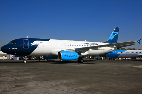
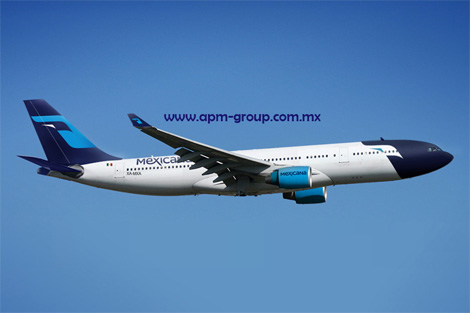
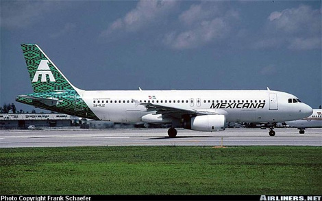
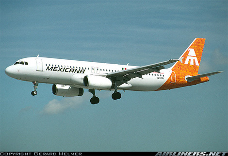
New livery schemes.
The new logo features free-flowing letters that transmit the hospitality and flexibility of an airline dedicated to customer service, while the eagle has been preserved as a symbol of the brand’s essence, reflecting the stability, consistency and solidity that have characterized Mexicana during the 90-odd years it has been operating on the domestic market. The graphics and fonts have been designed to complement each other visually, building on Mexicana’s roots and projecting it toward the future as an airline that is proud to represent Mexico on international markets.
— Press Release
I believe the new identity was designed by Design:Success, a group I had never heard of. The logo is interesting, I don’t think it’s particularly great, but it really feels contemporary and airplane-y. The eagle icon may be a little too stylized, with its eye being barely visible at times… well, barely visible on-line for example, but extremely clear in the livery. I actually thought painting the tip of the plane as the face of the eagle was pretty awesome and one of the biggest challenges of airline logos is making sure it works in both directions when placed on the airplane’s tail and this one succeeds nicely. The typography is both good and bad: The mixing of upper and lower case looks kind of silly but I do like the “ex” ligature and even how the “x” cuts the “i”, which helps to emphasize “mex”, the airport code for Mexico City’s international airport. The icon and typography together also form the silhouette of an airplane, whether that’s clever or corny is certainly up for discussion.
A good improvement overall with a livelier color palette, but most important was creating an individual identity that established it as a Mexican carrier (yay for eagles!) and apart from Aeromexico. I will, however, miss these old tails with some great Mexican patterns.
Thanks to Christian Ganzo for first tip.


Jump to Most Recent Comment
Josh’s comment is:
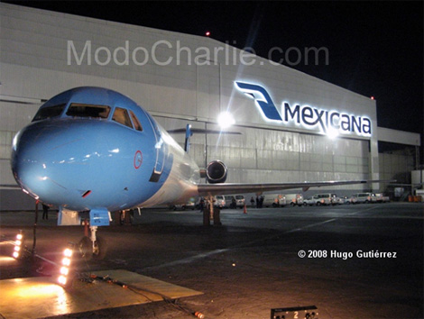
While the little eagle image is awkward on the logotype, it looks nice when applied to the front of the jet, and I enjoy the application on the hangar bay...
On Dec.01.2008 at 07:38 AM
Lame’s comment is:
... hawkward
On Dec.01.2008 at 07:54 AM
David Sanchez’s comment is:
I can simply write... BRAVO. Beautiful evolution.
Design:Success is lead by Kim Norland one of Europe's leading marketing innovators and conceptual developers.
Plamen’s comment is:
Clever use of negative space, but not sure if blue is the best choice for colour
On Dec.01.2008 at 08:15 AM
Tomasz Ronda’s comment is:
I love it :)
On Dec.01.2008 at 08:20 AM
Andrew Sabatier’s comment is:
The old corporate identity may be dated but I have to say the old livery looks great. The symbol reversed out of the patterns are striking (and probably quite meaningful). Overall the old identity is clean and fresh, easy to manage as a system and as a customer I would know what I was getting.
The new identity is a mess from beginning to end. Confusing. And I also have to say, extremely naive. The symbol has a stab at looking contemporary but it still has a long way to go. What is it? A wedge of air in front of the eagle? Why?
Not only is the type having an identity crisis, it's contorted and inelegant. There are too many ideas, none of which appear to have any reason to exist.
The livery looks bandit-like and poison-tipped.
Someone was robbed of the opportunity to do a nice piece of work.
On Dec.01.2008 at 08:22 AM
lodenmuse’s comment is:
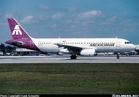
I remember when Mexicana's logo was pink and orange (?), and the change to all-blue brought a giant amount of professionalism to their identity.
Unfortunately, they erased too much here. This type is more current, but in a "discount party ship" way. And why give up all the old logo's associations with Mayans, pyramids, and "M" for a weak "First Bank of Wherever" eagle?
The eye seems like an afterthought--I thought it was a piece of dust on my monitor. The X is trying too hard. With the long tail, the more I stared at it, it began to read "AMeRicaNa"--not so good.
I do agree with Andrew--the old livery is amazingly beautiful.
On Dec.01.2008 at 09:54 AM
osfa’s comment is:
The use of negative space seems a bit awkward and the e-x ligature could use a bit more work.
On Dec.01.2008 at 09:55 AM
danny’s comment is:
while yes it looks updated, far too corporate.. the former, especially the mexican patterns on the plane, had a far more personal and human feel, relating to the folk culture that is mexico. now it just looks like an angry jet blue...
On Dec.01.2008 at 09:57 AM
felix sockwell’s comment is:
complete crap.
bird is being blown away by wind. type is meager.
On Dec.01.2008 at 10:02 AM
Adam’s comment is:
The little wedge in the negative space of the eagle gets lost...especially in small sizes
On Dec.01.2008 at 10:06 AM
jason’s comment is:
I like it.
On Dec.01.2008 at 10:30 AM
Ricky Irvine’s comment is:
Major bummer. The old identity was exciting. This new stuff is … not.
On Dec.01.2008 at 10:51 AM
John Mindiola III’s comment is:
hmm. i'd be scared to fly on this plane, what with its tipsy, too-much-tequlia typography. and the bird? um, yeah . . .
On Dec.01.2008 at 11:22 AM
Macu’s comment is:
wow I'm shocked.. isn't common look for this change at an mexican airlines, as I said I'm shocked but I really like it... fresh image to an old but lovely mark
On Dec.01.2008 at 11:44 AM
Nigel Sielegar’s comment is:
It's much softer and much more inviting definitely. But I feel it's taking away the "Mexico" feel of it, and turn it into something that feels like modern corporation.
On Dec.01.2008 at 11:55 AM
Rodrigo’s comment is:
The new identity is extremely suggestive of Finnair:
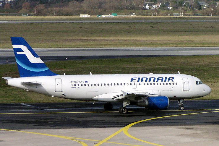
Frankly, while the livery needed to be brought out of the 90s, I don't feel that this is a good direction to take. I agree that there was too much value in the links with Mexican culture that the old logo maintained, and that this new one is too far too generic. Sadly, this "eurowhite" trend in airline liveries is here to stay; Mexicana could've done much better than this, instead of looking like a staid european charter. Mexico's two biggest airlines will now be impossible to tell apart from a distance, with their white fuselages and dark blue tails.

Glenn Sakamoto’s comment is:
Weak type, awkward mark. Not an improvement.
On Dec.01.2008 at 01:22 PM
damon’s comment is:
I don't like the glyph that much, but I like the type ok...the A's are kinda rad but they seem a bit out of place.
and it does resemble that the finnish logo as well.
On Dec.01.2008 at 01:28 PM
Chaac’s comment is:
I really liked the fact that it shapes an airplane. I find it clever although a little too playful.
On Dec.01.2008 at 01:54 PM
Emily Charette’s comment is:
my my, that does make a handsome plane!
I love how easily the mark flexes from eagle head to spread-winged eagle to airplane ... so elegant and so strong. nice work!
On Dec.01.2008 at 03:29 PM
Amanda’s comment is:
Mexico (design wise) has a way to go to catch up to the rest of the world. In fact, many aspects of the culture are far behind our own, so the approach on this doesn't surprise me. Not a horrific attempt, but I don't particularly care for this.
On Dec.01.2008 at 03:32 PM
TFHackett’s comment is:
Maybe it's the small size at the top of the entry and the juxtaposition with the old logo: I saw an eagle but it had a light blue head and neck and was facing left. I didn't see the white, negative form until I looked at the larger samples. The birdie's tiny eagle-eye is problematic. Typographically I think the logo is an improvement.
On Dec.01.2008 at 03:35 PM
Oscar SL’s comment is:
As a mexican, I find it sad to see the Mexicana "eagle" symbol go as it's been around for decades. The wordmark on the other hand should have been updated years ago. I'm not happy with the new symbol, and I think the wordmark works. I like the fact that the type's unicase.
On Dec.01.2008 at 06:21 PM
Gary’s comment is:
I'm sorry, that type is awful.
On Dec.01.2008 at 07:36 PM
Gary Keller’s comment is:
Hello Gary, Good seeing you in Haines. Bought two of your DVDs for the grandchildren. Let me know when you will be in the Bay Area. Best Regards, Preston
On Dec.01.2008 at 07:36 PM
Gary’s comment is:
Sorry Rodrigo, but other than using blue and sweeping shapes (not exactly unheard of in aeronautical branding) how does this bear any resemblance to Finnair? To quote Jerry K, think twice, post once.
On Dec.01.2008 at 07:41 PM
Red’s comment is:
at least Mexicana's new logo isn't similar to the new one of Correos de Mexico, hahaha with the friendly pigeon and the "folklorique" colors
On Dec.01.2008 at 07:58 PM
Rodrigo’s comment is:
Well Gary, they're not identical, but I do feel that there's more than just a passing resemblance. Without going too far, I can see the shape of an eagle in the negative space of Finnair's "F". Now, move the letterform forward, extend the crossbar down to the bottom, add an "eye", and voila! Mexicana logo! Just an interesting link between the two.
On Dec.01.2008 at 10:19 PM
Nisio’s comment is:
I prefer the old logo, maybe it could have been updated slightly and the applications improved. There was something very nice about the Aztec temple 'M' topped by an eagle, it had a sense of foundation, history, regality and culture.
It's the first time I've seen either of these marks, but I can draw the old logo by memory, I drew an 'F' when trying to draw the new logo
On Dec.02.2008 at 04:16 AM
koyo’s comment is:
It's kinda wired, in some ocations I don't like it but in others I do. Son I think that feeling is cause the brand it's no totally well done. The new identity it's nice, but have some issues like the hidden eagle. So if you don't see the plane application, you don't see it.
On Dec.02.2008 at 06:03 AM
Ray’s comment is:
The "ex" ligature definitely looks weird.
On Dec.02.2008 at 06:04 AM
jrmm’s comment is:
I saw the logo on the new advertisements... and I think it's great...
On Dec.02.2008 at 10:49 AM
Antonio Serrano’s comment is:
I hate the type; it feels as if it's trying too hard. The eagle bit works fine on the tail, I think, but not as good anywhere else. I like the fact that the whole thing looks like a plane.
Lately, we seem to be showcasing Mexico's worst though…
On Dec.02.2008 at 01:37 PM
Bruce’s comment is:
I'm not overly impressed by the mark or the type, and agree that the eagle's eye disappears. But the livery looks great, and is the best part of the new identity.
On Dec.02.2008 at 02:42 PM
Yeison Agudelo’s comment is:
i like it much softer and cleaner
On Dec.02.2008 at 03:23 PM
George - LogoDesign.org’s comment is:
I really,, really like it. Much cleaner, flows much better and that typeface is pretty awesome. It seems I'm in the minority here but I think they're doing a great job of rebranding!
On Dec.02.2008 at 03:45 PM
jRod’s comment is:
the only thing that bothers me about it is the eagles eye. needs to be smaller. otherwise it is a modern step up from the previous logo. now if they can just teach the plane to swoop down over water and snag a large fish with its talons/landing gear. it would help reinforce the brand a bit.
On Dec.02.2008 at 04:25 PM
Dan’s comment is:
The colours are awful, especially the light blue (look at the engines!)they should have used dark green instead of that awful light blue. The old livery was way better than this. At least they could have chosen better colours. It honestly looks like something a five year-old would draw, maybe if the design isn't as popular as expected they will do something about it but I doubt it
On Dec.03.2008 at 03:36 AM
AL’s comment is:
Weird symbol. Not an improvement overall.
On Dec.03.2008 at 04:47 AM
Philip’s comment is:
What's with all the haters? I think it's a great improvement.
(Leaves thread without giving any valid reasoning behind the support of the new design)
On Dec.03.2008 at 08:17 AM
Steve’s comment is:
I like the font. Not so sure about the symbol. I always remember the "M" in the previous symbol. It reminded me of the Mayan temples. Hmm...
On Dec.03.2008 at 03:27 PM
roberto’s comment is:
Why fix something that wasn't broken?
On Dec.04.2008 at 02:07 AM
Mark’s comment is:
nice.
I like the paint scheme so unique and clean.
It's hard to get on a white background though, couldn't tell what it was at first.
works better on a dark background.
On Dec.04.2008 at 12:18 PM
Mark’s comment is:
lodenmuse’s comment is:
I remember when Mexicana's logo was pink and orange (?), and the change to all-blue brought a giant amount of professionalism to their identity.
an example from that phase

On Dec.05.2008 at 06:21 AM
ri_thompson’s comment is:
eh.. not sure about the e-x ligature. with that aside, it's a nice update.
On Dec.06.2008 at 07:31 PM
Henry’s comment is:
As a designer I think this is a great scheme.
It will surely be eye-catching and the lettering
above the wings placed towards the back is
genius, as there will be more visability than in the front.
Very sexy, sheik and different.
Kudos to the designers. I understand they are the same group that does Coca Cola.
On Dec.07.2008 at 10:07 AM
Randy Hill’s comment is:
I like it.
On Dec.07.2008 at 02:02 PM
Diego Frausto’s comment is:
Simply disgusting.... It really sucks out all the history that this airline had before, it makes it look new and corporate instead of Professional and Mexican. AeroMexico continues the awesome look that reminds us of the good days of airlines flying, deep blue and plush leather seats make it all the better. This light blue colour is vomit inducing... And their website sucks now... I was checking their prices but after their new Logo, I will opt for AeroMexico, at least I can tell what their logo is.. Caballero Aguila. A TRUE MEXICAN LOGO.
On Dec.08.2008 at 02:12 AM
Micah Slavens’s comment is:
This is another example of a company going from something distinct to something completely generic and forgettable. The new eagle is fine, but it looks like everything else out there. Sure it looks a little better on the tail of the airplane, but it might as well be on a sports team Jersey.
On Dec.09.2008 at 01:19 PM
Daniel’s comment is:
Typical example coming from a combination of an uncultured designer and a "malinchista" client.
On Dec.11.2008 at 07:48 PM
Mongoose’s comment is:
Pretty much, I'd be just echoing Armin here, except for the livery. It's crisp on the tail of the airplane, but the blue front is just.. ugh. It looks like a Bic pen cap on the front of the plane.
Like the eagle, mixed on the typography, like the overall rebrand, livery needs work, adds up to a B-.
On Dec.15.2008 at 09:07 PM
nohablodanes’s comment is:
My first comment is that design:success is a totally unexperienced agency, which tries to hard to get its hands on any kind of assignment selling itself as the holy-grail of danish design and innovation methodologies. Although is does not have a single danish client, and its danish offices have been closed in Copenhagen
I wonder how the client went ahead and gave the contract to them, maybe they could have taken a little bit of time to check their website http://designsuccess.com
Have a look a their website their identity etc... and honestly ask yourselves if you would give this company such a big project
?,000,000 usd, when you can not even see a single piece of solid work on their website.
They dont even take the time to showcase the mexicana rebranding project, together with all those other wonderful projects they have made for all these amazing companies.
You can also notice the love to put a trademark subscript on almost every word. They sure love themselves.
daniel's comment is right on!!
"Typical example coming from a combination of an uncultured designer and a "malinchista" client."
On Jan.02.2009 at 09:32 AM
Ant-LOX’s comment is:
I like the look of the plane, and the new logo. The color scheme is a bit odd though.
On Jan.03.2009 at 01:35 PM
Armin’s comment is:
> "Typical example coming from a combination of an uncultured designer and a "malinchista" client."
For whatever it's worth... The designer of the logo was Gabriel Martinez Meave in collaboration with design:success. I just learned this a few days ago.
On Jan.04.2009 at 08:46 PM
Daniel’s comment is:
Check it out, i heard Interbrand was on-board as well, ummhhh...
On Jan.07.2009 at 01:12 PM
ARt. ’s comment is:
Gabriel Martinez Meave, I heard, was the one that created the font for the logo, but the main guy there was Eduardo Nieto, a pretty interesting designer and an excellent teacher.
On Mar.10.2009 at 01:36 PM
Andrew Sabatier’s comment is:
The professionals were hired too late. It appears that Interbrand was robbed of the opportunity to create a world-class identity for Mexicana.
Interbrand's positioning: A breath of fresh air
Mexicana should have consulted Interbrand right from the start for the positioning. Interbrand would have furnished them with a top-notch identity to demonstrate the new positioning. Instead Mexicana worked with amateurs and got a ridiculously naive brandmark and livery. I expect Mexicana realised they couldn't abandon their new identity without loosing face, and this then forced Interbrand to position them as best they could under the circumstances.
I pity the creatives at Interbrand who had to contend with this wretched piece of work. Hats off to them for their efforts. They must have negotiated a premium rate to ease the pain of trying to make the best of an abysmal identity.
Positioning work has the best opportunity to be effective when it also determines the identity of the brand.
A.
André’s comment is:
It is SUPER nice! way to go Mexicana!
On Jun.04.2009 at 10:23 AM
Chris’s comment is:
I dont like it at all..
it's a shame! they have so many other talented and capable agencies in Mexico and they have to pick that.
definetly.. I couldn't tell that was an eagle, I first thought the shape looked like a can opener...
way to go Mexicana.. from being one prestigious airline because your services, now you look low budget because your corporate image.
On Jun.25.2009 at 02:13 AM
Comments in Brand New, V1.0 have been closed.


