

NOTE: This is an archived version of the first incarnation of Brand New. All posts have been closed to comments. Please visit underconsideration.com/brandnew for the latest version. If you would like to see this specific post, simply delete _v1 from the URL.
![]()
When it comes to cell phone providers I feel like you fall in one of two camps: iPhone users with AT&T (aka, the cool people) and Verizon users (aka, the lame people that will ask “Can you hear me now?” when they are not on their cell phone). Well, apologies for the perhaps offensive simplification of the matters but, let’s face it, Verizon has never had an ounce of cool to its name. Particularly among designers who, to my knowledge, all would rank the Verizon logo as one of the worst. And apparently Verizon has taken notice and is ready to make some identity and brand changes as it nears its first ten years in business.
Sample print advertisement.
With the recent purchase of Alltel, cementing its position as the largest cell phone company in the U.S., ahead of competitor AT&T, Verizon is embarking on a timely campaign that establishes Verizon Wireless as, simply, the very best and will attempt to lure even more customers. The campaign also marks the launch of a new identity that replaces the graphic speed logo that is now almost ten years old.
— Press Release
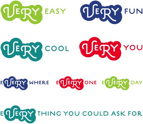
The logo change seems to be tied to this new campaign that revolves around the word “Very,” and while it’s not clear whether it will replace the popular “Test Man” and his army of technicians, this campaign is vastly different from anything Verizon has done. The campaign won’t launch until next July apparently, so I’m not sure how the samples I received are actually meant to be used, if they are print or banner ads or billboards or a combination of all.

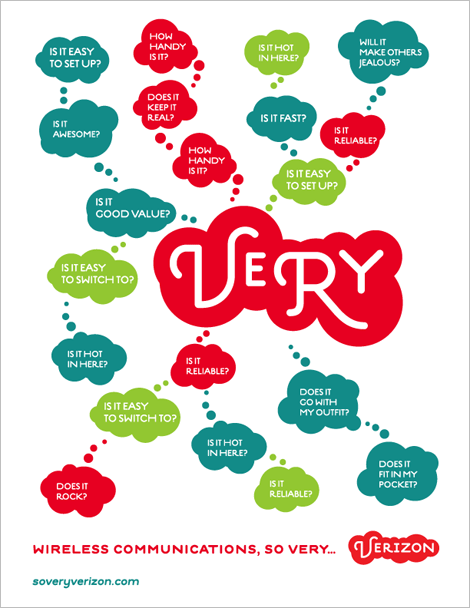
Sample brand imagery. [Click to see bigger image]
The brand visuals and messaging that Verizon will use are actually kind of clever and allow for a lot of alternatives and perhaps even more customization of messages. Not sure if the “Very” graphic will stay the same all the time, if so, it might become a little too tiring after a while; it might be interesting if they did different configurations of the circles but maybe not, since the whole identity and the logo itself is so full circles. Which brings us, well, full circle to the logo, which was, oddly enough, designed by London-based design firm johnson banks
“Customers no longer take heed of concepts of speed, or breadth of network - they just assume those as a given. Our new idea stems from several directions, that everyone’s words, text and pictures let them share universal thoughts, together. In addition, we’ve been developing the crucial new concept of a ‘wireless cloud’ and that comes over most strongly in the new word-marque.”
![]()
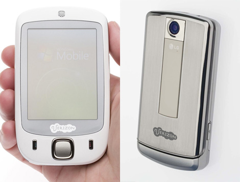
I want to like the new logo, even with its dumb “wireless cloud” nickname, simply because I detested the old one with all its angled gradients, specially as it mocked all of New York from its towering headquarters on Lower Manhattan. It is definitely much more interesting and dynamic and it is very in tune with the kind of work that johnson banks is known for — I must say that it’s nice to have an outsider design perspective on this American brand — but maybe it’s a little too soft and delicate. Overall it feels like a cohesive, and drastic, new look that should help Verizon capture some consumers from the cool camp.
Thanks to Lester Ram for the link.


Jump to Most Recent Comment
Wobin’s comment is:
It's fishy isn't it ?
On Apr.01.2009 at 06:13 AM
Vavoom’s comment is:
Does it remind you of Skype?
On Apr.01.2009 at 06:17 AM
Mike’s comment is:
wait. is this april fools?
On Apr.01.2009 at 06:24 AM
Plamen’s comment is:
Happy April Fools' Day!
On Apr.01.2009 at 06:40 AM
designscene’s comment is:
The old one seemed meaningless and the new one looks as meaningless, in a different direction. The 'very' angle is interesting, but the form and font don't match the product/service, or even what the product aspires to.
On Apr.01.2009 at 06:49 AM
Tommy’s comment is:
Nice April Fools..
i couldn't find anything on Johnson Banks' site about this.. (cant really find anything on that ridiculously hard to navigate site)
and...
the domain "soveryverizon.com" was registered 2 days ago using GoDaddy.. to someone who's homepage is: "10000reasons.org"
yeah.. i'll believe this logo when i see it on TV ;)
i don't think Verizon would be behind that. ;)
On Apr.01.2009 at 06:56 AM
designscene’s comment is:
April Fool?
On Apr.01.2009 at 06:58 AM
Sanjay Basavaraju’s comment is:
it is fishy. I am happy that Brand New could go all the way to create these graphics just to make us react fool's day.
BTW, the "Very" concept has potential. I am not sure about the representation though. The thought behind it is to make the brand lively. Strangely, the blotch reminds me of network congestion.
Great day!
On Apr.01.2009 at 07:00 AM
Conor W’s comment is:
Bennett Dae
b.dae@soveryverizon.com
hmmm, taking the piss methinks
Erik at Logo Critiques’s comment is:
Happy April Fools. I knew right away, sorry :(
Verizon does have a terrible logo though.
On Apr.01.2009 at 07:07 AM
Lauren’s comment is:
I'll be very impressed the day Verizon gets Scott Schuman to shoot their print ads. :p
On Apr.01.2009 at 07:23 AM
Tamim’s comment is:
This relly looks like a candy store Logo. Sorry Verizon but Fail.
On Apr.01.2009 at 07:29 AM
Jose Nieto’s comment is:
Good one, Armin, Bryony. Happy April 1st!
On Apr.01.2009 at 07:30 AM
Tamim’s comment is:
Though i like the : So very Verizon.
On Apr.01.2009 at 07:31 AM
Josh’s comment is:
You had me until I reached the comments, I'll admit.
On Apr.01.2009 at 07:31 AM
Tamim’s comment is:
Happy April 1st.
On Apr.01.2009 at 07:32 AM
Alex’s comment is:
Looks like the logo for a jellybean company.
On Apr.01.2009 at 07:36 AM
Myles Dumas’s comment is:
Ha I fell for the FORD prank last year, not gonna get me this time. Happy April Fool's day.
On Apr.01.2009 at 07:44 AM
Jeff’s comment is:
I'm starting the slow clap.
On Apr.01.2009 at 07:51 AM
Jordan Koschei’s comment is:
Verizon supplied phones for the Bourne movies. Can you imagine any hardcore action hero running through the streets with that logo on their phone?
On Apr.01.2009 at 07:52 AM
Mike’s comment is:
It'd be funny also if it really were true. Though after someone suggested it could be a prank, some things make sense...
On Apr.01.2009 at 07:59 AM
Rainer’s comment is:
April Fool.
If anyone is interested: The font used is Estilo/Estilo Script from Dino dos Santos. http://www.identifont.com/show?HYT
On Apr.01.2009 at 07:59 AM
Mrs. M’s comment is:
Methinks it's a gag, but...?
What an elaborate gag, if so!
On Apr.01.2009 at 08:04 AM
John McCollum’s comment is:
I'm not sure it's as nice as the one they designed for Ford...
On Apr.01.2009 at 08:10 AM
Beau Brummel’s comment is:
This must be an April Fools joke. That logo is heinous, check that, "Very" heinous.
On Apr.01.2009 at 08:17 AM
Buzz’s comment is:
Copy, paste, change colour, change font. Cheque please.
![]()
Jon’s comment is:
Verizon is the Microsoft of the cell phone industry... they just don't get it!
On Apr.01.2009 at 08:19 AM
Simon’s comment is:
It'll be interesting to see how something so aggressively European fares in the States. Pat on the back to Verizon for taking the risk.
On Apr.01.2009 at 08:26 AM
Lucas Human’s comment is:
It would be really sad if this wasn't an April Fools… seeing as how most are taking to that as the explanation.
On Apr.01.2009 at 08:30 AM
Simon’s comment is:
It's a gag? No pat on the back for Verizon then. But one for Johnson Banks for going to such trouble.
On Apr.01.2009 at 08:31 AM
awesomerobot’s comment is:
Haha, this is less believable than Ford's rebranding from last year - but well done, Bravo.
On Apr.01.2009 at 08:37 AM
Andrew Sabatier’s comment is:
Okay, I'll take the bait despite the April fools Ford review of last year. The samples shown here demonstrate a relevant depth of thought, even though this appears to be a spoof. Times are challenging for brand consultancies and I'd be seriously perturbed if Johnson Banks has this much resource available for jokes.
The concept of the cloud is very relevant to Verizon, I've explored the same idea for a major Middle Eastern telco recently. Cloudware is a peripheral term at the moment but it won't be long before we find it centre stage, along with thin-client and off-site computing. Despite Apple's Mobile Me and Skype, the cloud is still up for grabs in the telecommunications business. And why not Verizon? Verizon's previous identity is a veritable dog's breakfast from the most embarrassingly untalented.
The concept is strong and despite the consumer-centric nature of the business the execution is too playful and fluffy for such a heavy-weight corporate brand. The type is overstyled and lacks gravitas. 'Very' is an interesting derivative of the brandmark. As Armin points out it will probably become a tiring device. It is more of a one-off campaign application rather than a core brand identity strategy.
Great concept, questionable execution and unfortunate strategic roll-out date considering Accenture did a very clever 01.01.01 and 3 did a 03.03.03.
Someone has to be a little serious despite the Brand New / Johnson Banks collusion.
A.
Jacob’s comment is:
This is an audacious rebranding--just about as brave as the step Ford took. I believe that was announced around this time last year, but I haven't begun seeing the signage at dealerships yet. Must be because of all the problems automakers are going through.
On Apr.01.2009 at 08:43 AM
M.’s comment is:
Prank or no, it's an improvement.
It looks good in print, but crappy as a small badge on a handset. A bit too powerpuff there.
Nice work and/or prank.
On Apr.01.2009 at 08:47 AM
Fish’s comment is:
April Fools.
On Apr.01.2009 at 08:50 AM
neil’s comment is:
Dammit-- this is the first april fool's joke to get me today. Good one.
On Apr.01.2009 at 08:51 AM
M.’s comment is:
Registered yesterday at GoDaddy and hosted at Dreamhost? Hmmmm... You would think Verizon had their own servers, weird. :-)
Domain Name: SOVERYVERIZON.COM
Registrar: GODADDY.COM, INC.
Whois Server: whois.godaddy.com
Referral URL: http://registrar.godaddy.com
Name Server: NS1.DREAMHOST.COM
Name Server: NS2.DREAMHOST.COM
Name Server: NS3.DREAMHOST.COM
Status: clientDeleteProhibited
Status: clientRenewProhibited
Status: clientTransferProhibited
Status: clientUpdateProhibited
Updated Date: 30-mar-2009
Creation Date: 30-mar-2009
Expiration Date: 30-mar-2010
Joe Sites’s comment is:
With all the established brands changing up their logos (pepsi, kraft foods, walmart to name a few) I am unsure whether this is really an April 1st joke or not. I wouldn't put something like this past Verizon.
On Apr.01.2009 at 08:52 AM
JaySticLe’s comment is:
You know what this reminds me of? An April Fools prank. Thankfully, it is!
On Apr.01.2009 at 08:54 AM
Matt Hunsberger’s comment is:
This is becoming a tradition. Love it.
On Apr.01.2009 at 08:56 AM
Matt Gavenda’s comment is:
April fools!
On Apr.01.2009 at 09:05 AM
Joel Herman’s comment is:
Well, I four one was expecting a more convincing design from a company like Verizon, especially in this particular day and age. I think the fools at Verizon will end up doing the same as Tropicana, and after the wave of public outcry that is sure to come, will return to their old logo.
On Apr.01.2009 at 09:06 AM
Zan’s comment is:
APRIL FOOLS!!! I have to say I prefer this April Fools logo than last years Ford redesign. Comes all included with a well thought out look and feel. Great job!!!! :D
On Apr.01.2009 at 09:08 AM
Tim’s comment is:
The Ford logo 365 days ago was great, but extra kudos for the effort on this one.
(Logo + print ad + custom domain + a lil' flash) x numerous visitors fooled = epic win.
On Apr.01.2009 at 09:09 AM
Andy’s comment is:
But Johnson Banks have made a whole blog post about it:
http://www.johnsonbanks.co.uk/thoughtfortheweek/index.php?thoughtid=443
..with a link to a pre-launch website: http://www.soveryverizon.com/
I don't think any studio would go to such an effort for an April Fool's joke...
Whether it is a joke or not, I kinda like it. I did think of Skype when I saw it, though.
Scott’s comment is:
It looks so. very. British.
Love the ad campaign. Hate the way it looks on the equipment. Hate, hate, hate it. Hence, you know this is an April Fools ...
And they're going to roll it out "next July" ...?
As in the one 3 months from now, or the "next" one after that, 15 months from now ;)
TFHackett’s comment is:
Nice prank, so very nice!
On Apr.01.2009 at 09:12 AM
LB’s comment is:
Yes, there is the domain registration, and the fact that Johnson Banks' blog says, "And, although we’re not sure how they got hold of it so quickly, there’s a already a piece on US-based branding blog, Brand New, here."
Hmmm...yeah, I wonder how they got it so quickly. I can't imagine. ;)
On Apr.01.2009 at 09:12 AM
Efren’s comment is:
The first thing I said was: "no!", but then, I say April's 1. Whew. Ford last year, Verizon this year.
On Apr.01.2009 at 09:17 AM
Natalie’s comment is:
You really had me going.... until I realized that I recognized all of the photos from the sample ads from The Sartorialist's blog.
On Apr.01.2009 at 09:23 AM
Carl’s comment is:
Hmmmm . . .
Checking calendar . . .
AHHA . . .
April Fools!
On Apr.01.2009 at 09:28 AM
T Lees’s comment is:
This sucks.
On Apr.01.2009 at 09:33 AM
Jay’s comment is:
Yeah they did this with Ford last year and got me. Ford was definitely better.
On Apr.01.2009 at 09:46 AM
Don’s comment is:
The Ford one was too obvious, but this one got me until I saw the logos on the phones.
On Apr.01.2009 at 09:47 AM
marnie’s comment is:
Oh, you clever monkeys.
The funniest part about this, for me, is that for the Very to work with Verizon, you have to say it in an Elvis voice.
On Apr.01.2009 at 09:53 AM
Dan’s comment is:
I understand it's an april fool's joke...
But am I really the only one that loves Verizon's current logo? It really exhibits strength with its color contrast and simplicity.
On Apr.01.2009 at 09:53 AM
JonSel’s comment is:
But am I really the only one that loves Verizon's current logo? It really exhibits strength with its color contrast and simplicity.
Yes.
On Apr.01.2009 at 09:59 AM
Matt’s comment is:
Wow, to me it looks something that would appeal to some girly tween and looks like it should be colored pink. Especially when you see it on the actual cell phones.
On Apr.01.2009 at 10:02 AM
Jeremy’s comment is:
This is nearly as good as the Ford Motor "rebrand" you did last April Fools. Nicely done.
On Apr.01.2009 at 10:07 AM
Russel Evan Pryor’s comment is:
It is, indeed, very Skype-ish.
On Apr.01.2009 at 10:10 AM
Anton Andreasson’s comment is:
Got me.. And I made a pretty nice fool out of myself spamming the mailing list at work.. :P
On Apr.01.2009 at 10:14 AM
Chris’s comment is:
The current Verizon logo is poor on a functional level (the gradients are hard to reproduce, particularly on a black background, as seen on TV), and on an economy of design level (the check mark and Z are visually and conceptually redundant). They should have abandoned the check mark and gradients long ago.
On Apr.01.2009 at 10:20 AM
Anonymous’s comment is:
April Fools or not, this is a huge improvement over the original.
I kinda like the the Skype / Indian vibe. Kudos for giving this bland brand identity a new personality!
On Apr.01.2009 at 10:21 AM
karen’s comment is:
i call shenanigans! good work, armin. all day yesterday i was wondering what you'd come up with to trump last year's ford identity.
On Apr.01.2009 at 10:30 AM
Andrew Meyer’s comment is:
clearly april fools. :)
On Apr.01.2009 at 10:50 AM
felix sockwell’s comment is:
april fools? who cares. its a great mark. i hope verizon takes notice.
On Apr.01.2009 at 10:51 AM
Leland Witter’s comment is:
Is it Awesome? Very.
On Apr.01.2009 at 10:55 AM
hellfire’s comment is:
its sadly an april fools joke...but it would've been nice if it werent' (even given its skype-yness). the current verizon logo and branding is just terrible.
On Apr.01.2009 at 11:15 AM
Jordan’s comment is:
This has to be an April Fools joke..lol.
On Apr.01.2009 at 11:16 AM
debbie millman’s comment is:
I hope you got at least a million dollars for this. Fantastic!
On Apr.01.2009 at 11:17 AM
Stuart P. Bentley’s comment is:
It took me until halfway through the photos of the sample brand imagery to get it. Nice job.
It's a shame Verizon couldn't actually make a drastic brand shift like this because they engrave their current one into the back of every phone, but I think for a communications infrastructure provider it suits them just fine.
On Apr.01.2009 at 11:22 AM
Camryn’s comment is:
Yeah, I wish this was true. I really can't stand their current logo to such an extent that it makes me unwilling to own or use a device or service that would bring me into greater contact with it.
People are saying this look would be too girly or Euopean, but the current one looks like the official mobile communications provider to Nazi Germany. Middle ground wouldn't hurt.
The faux-justification is actually more insightful than the reasons usually provided for real re-brands too. Less people care about 'the network' now, yet Verizon keeps hammering away on it.
On Apr.01.2009 at 11:25 AM
Bob’s comment is:
Man, do I hate April Fool's Day.
On Apr.01.2009 at 11:28 AM
andrew’s comment is:
I knew it was a joke immediately, but I still allowed myself to hope for a little while. Thank you.
On Apr.01.2009 at 11:28 AM
Rick’s comment is:
Great April fools joke! But I believe a more accurate description of the two carriers would be: AT&T (the handsets everyone wants on crap service) and Verizon (crap handsets with the service everyone wants)
On Apr.01.2009 at 11:34 AM
Darrel’s comment is:
Yes! Verizon had to be one of the worst corporate logos out there!
No! They've forever tainted the fine Estilo Script!
On Apr.01.2009 at 11:36 AM
Carlo’s comment is:
An April-fools blog entry - so original!
On Apr.01.2009 at 11:38 AM
Arnold Porras’s comment is:
I am not falling for this on 2009. New Ford logo last april 1st was good. But im not falling for the same thing 2 years on a row.
ITS APRIL 1ST KIDS!
On Apr.01.2009 at 11:39 AM
drewdraws2’s comment is:
Well done Armin, including the Johnson Banks link. Nice.
As for the branding, I think that even as a joke it highlights just how bad Verizon's brand really is. From the "Evil Empire" color scheme to the unreproducible "pew pew" laser beam, Verizon has been a huge mess since the day it was born. I would welcome this change with open arms.
On Apr.01.2009 at 11:42 AM
Kalani’s comment is:
Nice. I see you keep up to date with the Sartorialist.
On Apr.01.2009 at 11:43 AM
Thomas Vanhuyse’s comment is:
Two of those pictures are from The Sartorialist aren't they? That's how I knew it was fake.
On Apr.01.2009 at 11:58 AM
oscar’s comment is:
So very suckered...
Nicely done.
On Apr.01.2009 at 12:10 PM
Nicole’s comment is:
my initial thoughts are that it's not sustainable... the typeface already looks slightly dated. the "very" has merit but treating it the same as the logo mark just seems overkill.
On Apr.01.2009 at 12:11 PM
Rico’s comment is:
Love it.
On Apr.01.2009 at 12:14 PM
Trish’s comment is:
I know it is a joke, which is unfortunate because this is such an improvement over what they currently have. I've always hated the Verizon brand. I hope they do change it up! Maybe the clouds is not the way to go, but everything else about this mock brand is GREAT!
On Apr.01.2009 at 12:16 PM
Casey Auve’s comment is:
Very cool. Nice work! I fell for it too! Ford and Verizon, what's next? NBC, GE, Apple?
By the way, Verizon isn't Verizon Wireless. Verizon Wireless is a completely separate entity owned jointly by Verizon and Vodafone. Verizon didn't buy Altel, Verizon Wireless did. A cell phone wouldn't have a Verizon logo on it, it would have to say 'Wireless' afterward... to accurately represent that difference.
I love your site!
On Apr.01.2009 at 12:16 PM
robert’s comment is:
i'm no fool.
On Apr.01.2009 at 12:17 PM
jRod’s comment is:
Dang, man...
Lots of effort for an April Fools Day joke, huh? And as much as I would like Verizon to change their logo (i live in Little Rock, the city where Alltel is getting acquired) i would have to say that this is a bit of a stretch. There is no way Verizon would adopt such a bubbly, cartoon network typeface.
you burned me once last year, and you can count on me being extremely wary on 4/1 for just such a thing as this.
On Apr.01.2009 at 12:20 PM
stupidgit’s comment is:
Oh damn it, I actually really like this. I was hoping we'd finally never see that stupid Verizon man and their crappy music in those commercials ever again.
On Apr.01.2009 at 12:21 PM
Matt’s comment is:
Cute...bashful...a little cheeky? Can't be Verizon. But then you're reminded that it's totally inappropriate for such a large corporate brand and all of a sudden you're not so sure. So confused...head hurts...
On Apr.01.2009 at 12:23 PM
William’s comment is:
Great job! You TOTALLY had me! I was honestly deliberating if I liked the design and why Verizon felt they had to make such a drastic change. I was actually think to myself that Verizon was pretty cool for being so gutsy. I started reading in the comments and then realized it was an AF joke. BTW—this one is WAY better than the Ford one last year!!!
On Apr.01.2009 at 12:26 PM
JeanC’s comment is:
Nice job! I almost believed it!
On Apr.01.2009 at 12:28 PM
Von K’s comment is:
Nice one. Good job on the mark/fake executions. I figured it was a prank, but the Crocs let me know for sure.
Still, it's miles better than Verizon's real mark! D'oh!
On Apr.01.2009 at 12:33 PM
Justine’s comment is:
This is by far my favorite April Fools prank. It really was the Scott Schuman photos that gave it away for me because I follow his blog obsessively. However I think they are desperately in need of a rebrand, but being the second most popular wireless company in the country, it will most likely never happen. Though it is true that the iphone was pitched to verizon first but they rejected it due to apple's terms and conditions on it and thats how AT&T took it up.
On Apr.01.2009 at 12:43 PM
mixedmedia’s comment is:
Has a Virgin Mobile feel...
http://www.virginmobileusa.com/phones/catalog.do
On Apr.01.2009 at 12:45 PM
Kurt’s comment is:
do a who is search on the domain...happy April fools
On Apr.01.2009 at 12:49 PM
Works Collective’s comment is:
Well done, very well done. I love the supplemental materials, and sample brand imagery. Follow through makes all the difference with an April Fools day prank.
On Apr.01.2009 at 12:51 PM
kirk’s comment is:
now their logo sucks as much as their service.
can you see me now?
lol, nice joke.
On Apr.01.2009 at 12:58 PM
BJN’s comment is:
Verizon expands into new markets:
Inflatable beds, ice cream snacks, and I understand they've acquired Crocs.
Nicely done April One.
On Apr.01.2009 at 01:10 PM
Kim’s comment is:
The fact that this is undoubtedly an April Fools prank does nothing to change the fact that I like the new branding much better. D:
On Apr.01.2009 at 01:10 PM
Hibryd’s comment is:
Now that you've done all this work for them, why not try to sell it to them? They could certainly use the update.
Oh, and someone please tell Verison that those "network" ads (where customers have a slavish army of technicians following them everywhere) are a little creepy.
On Apr.01.2009 at 01:10 PM
Carmine’s comment is:
I'll tell ya, ya almost got me. It was only when I imagined how ridiculous this logo would look atop their Downtown Manhattan tower that I suspected anything. Great job! :)
On Apr.01.2009 at 01:30 PM
Paul Lloyd Johnson’s comment is:
If this isn't an April Fools, then Verizon just changed their branding to various poo shapes. Nice.
On Apr.01.2009 at 01:40 PM
Ben A.’s comment is:
Between this and MyFonts' "interview" with Eric Gill (Sans), I've decided that designers are some of the best April Foolers around.
Way to put the effort into developing all the sample material. It looks better put-together than most real-life identities out there. It's a little puffy, but the cloud idea is clutch.
I say this tops last year's Ford post, if only because it's arguably an improvement.
Thanks, Armin.
On Apr.01.2009 at 01:41 PM
Kyle T. Webster’s comment is:
Kerning between the 'R' and the 'I' drives me nuts, though I know there is little that can be done about it.
On Apr.01.2009 at 01:42 PM
Kyle T. Webster’s comment is:
Oh crap. ODG got punked. Nice one, Armin... how long did it take to put this all together? Pretty elaborate.
On Apr.01.2009 at 01:44 PM
Mark’s comment is:
first reaction is...
no no no no!!!!!!
second reaction is hmmm, it's on April Fools day,so maybe it's an April Fools joke. HOPEFULLY!
if it is a joke it's the best one you came up with, looks COMPLETELY real.
On Apr.01.2009 at 01:45 PM
Mark’s comment is:
it IS a joke but damn better done than the Ford one last year, there was know mention of it being a joke, except the date!
well played Armin, well played...
On Apr.01.2009 at 01:49 PM
Mark’s comment is:
it IS a joke but damn better done than the Ford one last year, there was no mention of it being a joke, except the date!
well played Armin, well played...
On Apr.01.2009 at 01:50 PM
koyo’s comment is:
Are you Kidding me? It's for real?
This new identity looks older and so much "un-technologic" that the first one. Bad selection of tipography, bad resolution of drawing, lack of creativity and cero Graphic Design.
Reminds me to CLARO logo here in my country.
![]()
What happened, people... they got NO ideas???
Oh God... UGLY
For Good Design! Koyo
On Apr.01.2009 at 02:01 PM
koyo’s comment is:
And Where is the Re Design? Not now... not before.
Never was a "desing". Both are pieces for teaching what not to do when you create a brand logo.
![]()
chris’s comment is:
Nice pitch. Maybe they will pick it up. Great 04/01 thingy!!
On Apr.01.2009 at 02:07 PM
koyo’s comment is:
Sorry... but I'm tired of looking bad design, made by people who call themselves "designers".
:-P
On Apr.01.2009 at 02:09 PM
N.S.’s comment is:
Armin! This is great! I was totally fooled until I started reading comments! You have gotten me every time for the last 3 years. I thought I had learned by now.
I actually like it a lot. You should send it to them. Maybe they will use it or get inspired to change their hideous logo to SOMETHING else.
On Apr.01.2009 at 02:12 PM
christy’s comment is:
*golf clap*
Well done.
On Apr.01.2009 at 02:16 PM
koyo’s comment is:
Ohhh... Come ON! Okay Okay... you Punk'd Me!
Here is a Fool from Argentina!
We celebrate that day on 28 of December: "El día de los inocentes" and we make jokes like this.
jaja
Cheers. Koyo
On Apr.01.2009 at 02:24 PM
Jonathan’s comment is:
Nice spoof! You totally had me until I saw the logo on the phones! That would just be awful...
Verizon does desperately need a redesign and also desperately needs the iphone. Not willing to compromise good service for it yet though. Verizon has the best service.
On Apr.01.2009 at 02:28 PM
Joseph Maguire’s comment is:
Elaborate but happy april fools to you too
On Apr.01.2009 at 02:46 PM
Pookie’s comment is:
Seriously, that any of you were fooled, is ridiculous. I came on here, JUST to see what the joke would be this year. In 2009, how can ANYBODY be tricked by April 1st, with all of the f-ing Internet warnings??!!!!!!
On Apr.01.2009 at 02:58 PM
Craig Karcher’s comment is:
I came here expecting the April Fool's, and seeing the ad with the Croc's in it, pretty much confirmed that this was indeed and April Fool's joke!
On Apr.01.2009 at 03:11 PM
Jim’s comment is:
April Fools!
April Fools!
April Fools!
April Fools!
April Fools!
He got us last year with the Ford logo redesign.
April Fools!
April Fools!
April Fools!
April Fools!
April Fools!
Dan’s comment is:
Casey Auve is exactly right with the differences between Verizon and Verizon Wireless (owned only partly by Verizon), but the phones do only have the "Verizon" logo (which I'm sticking by, I do love it).
On Apr.01.2009 at 03:56 PM
Scott S.’s comment is:
Nice. Two nice pranks in two years.
On Apr.01.2009 at 04:11 PM
Christina’s comment is:
Gross. Whoever did this has no real world idea of branding in general let alone telecommunications branding.
On Apr.01.2009 at 04:28 PM
the macho man’s comment is:
this is totally an april fools joke
a big company using godaddy?
use two things
a) your brain
b) common sense
Christina’s comment is:
Doesn't matter. It's still ugly.
On Apr.01.2009 at 04:41 PM
Jonathan’s comment is:
APRIL FOOLS!!!!
On Apr.01.2009 at 04:55 PM
freddygirl’s comment is:
totally awesome! you had me until the Sart pics... those were a dead giveaway (although advertisers would be smart to use his work, it's brilliant).
On Apr.01.2009 at 05:01 PM
Hernan Valencia’s comment is:
Happy April Fool's Vit
On Apr.01.2009 at 05:05 PM
katelynn martin’s comment is:
Good one! I almost wish this was true, I gag every time I turn my phone on. It seems like their gradient eyesore is almost worse when animated.
On Apr.01.2009 at 05:24 PM
Amanda Habbershaw’s comment is:
My jaw dropped when I saw this. Then I remembered it was April Fool's day. Good one.
On Apr.01.2009 at 05:28 PM
Mark Canavan’s comment is:
NOT an April fools!
http://www.johnsonbanks.co.uk/thoughtfortheweek/
Very refreshing for me.
Not a fan of Web 2.0 logos such as Skype but love this.
This logo has a soft touch but is very adaptable and strong.
On Apr.01.2009 at 05:54 PM
Ross’s comment is:
I wish this weren't an april fool's joke. This is just so much better than their current marketing
On Apr.01.2009 at 06:13 PM
Mark’s comment is:
oh man this is WORSE, it's NOT an April Fools??? you sure?
geez well um,uh err it's a...different...
but please A CLOUD? for a cell phone company?WHY? just WHY? what is the logical reason for this? ok they merged with Alltel,but did they HAVE to go with cutesy? it looks weak.
I'm going to have to take a LONNNNG time to get used to this, a very long time. I'm really trying to be as polite as possible here,really. geez is this going to be on their phone books as WELL??
I'm still astonished.
On Apr.01.2009 at 06:18 PM
Ryan Platte’s comment is:
To me it's a refreshing update of a 1950's sensibility. I actually like the way it looks on the equipment.
Thanks for doing this.
On Apr.01.2009 at 06:22 PM
Char’s comment is:
Ahahahaha this is great. I love how people post their opinion specially after it's obvious that this is an April fools joke. It tells how people don't read at all and go straight to comment. I'd actually dare Verizon to go in this direction. Hahahaha. Thanks, Armin. This was fun.
On Apr.01.2009 at 06:40 PM
Mark’s comment is:
so is this an April Fools or not?
anyone? ANYONE????
On Apr.01.2009 at 06:50 PM
b.r.o.o.d.y.’s comment is:
Armin,
You are simply awesome beyond words.
On Apr.01.2009 at 06:51 PM
Mark’s comment is:
Okay I ain't believing this, not until I see real proof on my TV in July, and further proof on reputable sites.
On Apr.01.2009 at 06:56 PM
emily’s comment is:
Well. Verizon has just taken any inherent feelings of credibility it inspired through brand recognition and threw it out a fiftieth-story window in favor of appealing to the four and under crowd.
Starting off with a 'V' that looks so weak probably wasn't the wisest of choices either. While the old logo was generic, the redesign does not feel like Verizon (or any reliable phone or service company).
However! When we get the phone bill I'm going to giggle seeing that at the top of the page!
On Apr.01.2009 at 06:58 PM
emily’s comment is:
...And this is why I need to check the date before posting.
Good joke though!
On Apr.01.2009 at 07:01 PM
Mark’s comment is:
Yip
Defo April fools!
http://www.zoom-in.com/blog/design/tess-salalac/verizon-logo-change-truly-madly-stupid
On Apr.01.2009 at 08:14 PM
Kim’s comment is:
I wish the new Pepsi logo were an April Fool...yecch! No fifty-page manifesto will convince me that the emperor isn't naked. And while we're at it, would someone please fix Colonel Sanders' hair?
On Apr.01.2009 at 09:10 PM
Xav’s comment is:
Outstanding work guys, very convincing. Well done!
On Apr.01.2009 at 11:12 PM
Mark’s comment is:
it IS April Fool!
Phew! that WAS close.
On Apr.01.2009 at 11:17 PM
Mongoose’s comment is:
Grade time:
If this is an April fools: A++
If this is for real: B+, it's too puffy and floaty but would be such an improvement. One color, clean, readable, and no ugly Z.
--Mongoose
On Apr.01.2009 at 11:26 PM
rick Valicenti’s comment is:
joke or no joke... i like it! kinda wish i did it.
On Apr.01.2009 at 11:47 PM
cmh_geek’s comment is:
The obvious amount of effort put into this one made me think it might be true...but I have the feeling that if it were true, we'd get some sort of confirmation from Armin, instead of just keeping us guessing.
As far as April Fool's jokes go, this one is so very elaborate. Well played, sir!
On Apr.01.2009 at 11:48 PM
cmh_geek’s comment is:
I think this branding would work well for a small cell phone company, or the prepaid division of a larger wireless company, but not for a huge telecom company like Verizon. I tend to think of Verizon the same way I think of AT&T: They provide cell phones, internet access, and (in some places) pay phones and home phone service, and a lot of internet infrastructure. They could definitely rebrand their wireless division, but the name "Verizon" just doesn't work with this logo for me.
As a side note, I notice that when the "before" logo is rendered as signs on buildings, the gradient in the "Z" is often ditched in favor of tapering z's "tail." I can't recall how the other gradients are handled...
On Apr.01.2009 at 11:56 PM
John Colucci’s comment is:
I am quite bummed, I wish this was real - it is incredible actually. Only comment is it's a bit effeminate, a hypermasculine might not like it
On Apr.02.2009 at 12:28 AM
Anonymous’s comment is:
Is it funny? Very.
(Wait, shouldn't the punchline read "Veri"?)
On Apr.02.2009 at 12:43 AM
B. Moore’s comment is:
AAAAAAAAAAA
you suck.
still love your site.
thanks for the april fools.
:P
On Apr.02.2009 at 01:04 AM
Ron’s comment is:
I love it. Great work. :)
On Apr.02.2009 at 01:40 AM
Chuck Spidell’s comment is:
Bastards. I got fooled too. Maybe this will wake up some executives at Verizon and rethink the brand.
On Apr.02.2009 at 03:45 AM
Tim’s comment is:
April Fool's or not - the new logo is so ballsy and naive at the same time that I like it much, much more than the real one.
On Apr.02.2009 at 08:26 AM
Joe’s comment is:
Great job on this one! Even going the extra mile with the custom domain. Classy!
On Apr.02.2009 at 09:22 AM
Sarah’s comment is:
Nice work. The optimist in me was impressed to see such a big corporation make such a daring move.
Although on initial glance of the first picture - the guy against the blue background - it looks like he's not wearing any pants!
On Apr.02.2009 at 09:28 AM
CJ’s comment is:
Shows how bad the old logo is when an April Fools joke is such a vast improvement!
Bravo!
On Apr.02.2009 at 10:13 AM
Felipe Dário’s comment is:
The sample "Sample brand imagery" people came from Sartorialist! VERY good!
On Apr.02.2009 at 12:17 PM
chopshopstore’s comment is:

Billy’s comment is:
i'm going to continue Jeff's slow clap. Very good guys...
On Apr.02.2009 at 12:27 PM
Amanda B’s comment is:
I think my favourite part has got to be the "Is it hot in here?" VERY!
Very fun prank, I love it!
On Apr.02.2009 at 12:45 PM
Chad Garrett’s comment is:
It wasn't until I figured out that THIS was an April Fool's day prank, that I FINALLY realized that last year's Ford logo redesign was a fake too.
On Apr.02.2009 at 12:55 PM
Anonymous’s comment is:
This made me smile..and I did think it was true.
On Apr.02.2009 at 02:12 PM
JC’s comment is:
We here at Landor would just like to make it clear that we had nothing to do with this logo redesign.
On Apr.02.2009 at 02:15 PM
Cooper’s comment is:
Haha Nice One :]
This Looks EXACTLY like the Skype logo tho!
greenerist’s comment is:
I think Verizon should rebrand, their current logo looks like something from the 90's. Maybe they should have stuck w/the the AirTouch logo.
On Apr.02.2009 at 04:32 PM
Jeffrey Hamilton Smith’s comment is:
With what I've been witness to during these dark days of mal-design and poor branding judgement (Pepsi, Tropicana, etc.), it wouldn't surprise if they approached the creator(s) with a fee in hand for this. That said, people get it; no need to make "VERY" so literal. You should have used "VERI".
On Apr.02.2009 at 05:06 PM
henry’s comment is:
this is actually so much better than anything verizon could think up. i think you should let them have it.
On Apr.02.2009 at 05:07 PM
Jarrod’s comment is:
"iPhone users with AT&T (aka, the cool people)"
bzzrt, at&t is just as lame as verizon. just because it's an iphone doesn't make up for that.
On Apr.02.2009 at 06:06 PM
Quinn’s comment is:
am I the only one who thinks this could actually have potential? Seriously, verizon, take a hint and do some of this!
On Apr.02.2009 at 10:26 PM
John Colucci’s comment is:
oh yeah wait, jonas brothers as the launch? that threw me off right there. cause nothing says verizon like prepubescent teens
On Apr.03.2009 at 02:18 AM
Tom at Ai of Portland’s comment is:
2nd year in a row that I bought it.
Well done, sir, well done.
On Apr.03.2009 at 04:20 AM
Justin Hill’s comment is:
Maybe Rick Astley will become spokesperson for Verizon in the UK with the new branding. XD
So VERY Rickrollish this April Fools joke.
Philip’s comment is:
Justin Hill, sorry to burst your bubble, but Verizon (thankfully) doesn't operate here in the UK. :P
On Apr.05.2009 at 07:04 AM
Justin Hill’s comment is:
You have to understand that I was just joking.
On Apr.05.2009 at 08:01 PM
Spale’s comment is:
I dont like it at all
On Apr.07.2009 at 02:21 AM
Rodrok’s comment is:
wow this is huge~! Not very happy with the look and feel... looks very childish to me... Doesn't look to tech like... but definetelly looks more friendly and less corporate...
i just hope the don't squeeze to much the "VERY" idea...
On Apr.07.2009 at 10:47 AM
ZUU’s comment is:
HORRIBLE!!!
On Apr.09.2009 at 12:21 PM
Gentleman Agitator’s comment is:
It was April fools people! Though if a company ever needed a new name and logo....well, Verizon is it. Names like Verizon, that mean nothing, always remind me of the 70's British sitcom, "Fall and Rise of Reginald Perrin." The infamous product in that program that was nothing and did not do anything called Grot. Reggie named it to sink his career and instead Grot was a sensation and made him famous.
On Apr.10.2009 at 12:27 PM
Todd’s comment is:
looks childish
On Apr.13.2009 at 04:21 PM
Mandir Thiam’s comment is:
Very Fanny !
On May.01.2009 at 12:17 AM
name’s comment is:
Thank you,
On Jul.30.2009 at 12:35 AM
name’s comment is:
I want to say thanks!,
On Jul.30.2009 at 03:55 AM
Comments in Brand New, V1.0 have been closed.


