
![]()
![]()
CLIENT
An international biennial event created with the purpose of celebrating the importance of public space for the quality of life and social equity in cities, debating public-space related themes, and presenting good practices from all over the world on the creation, management, and enjoyment of public spaces.
BRIEF
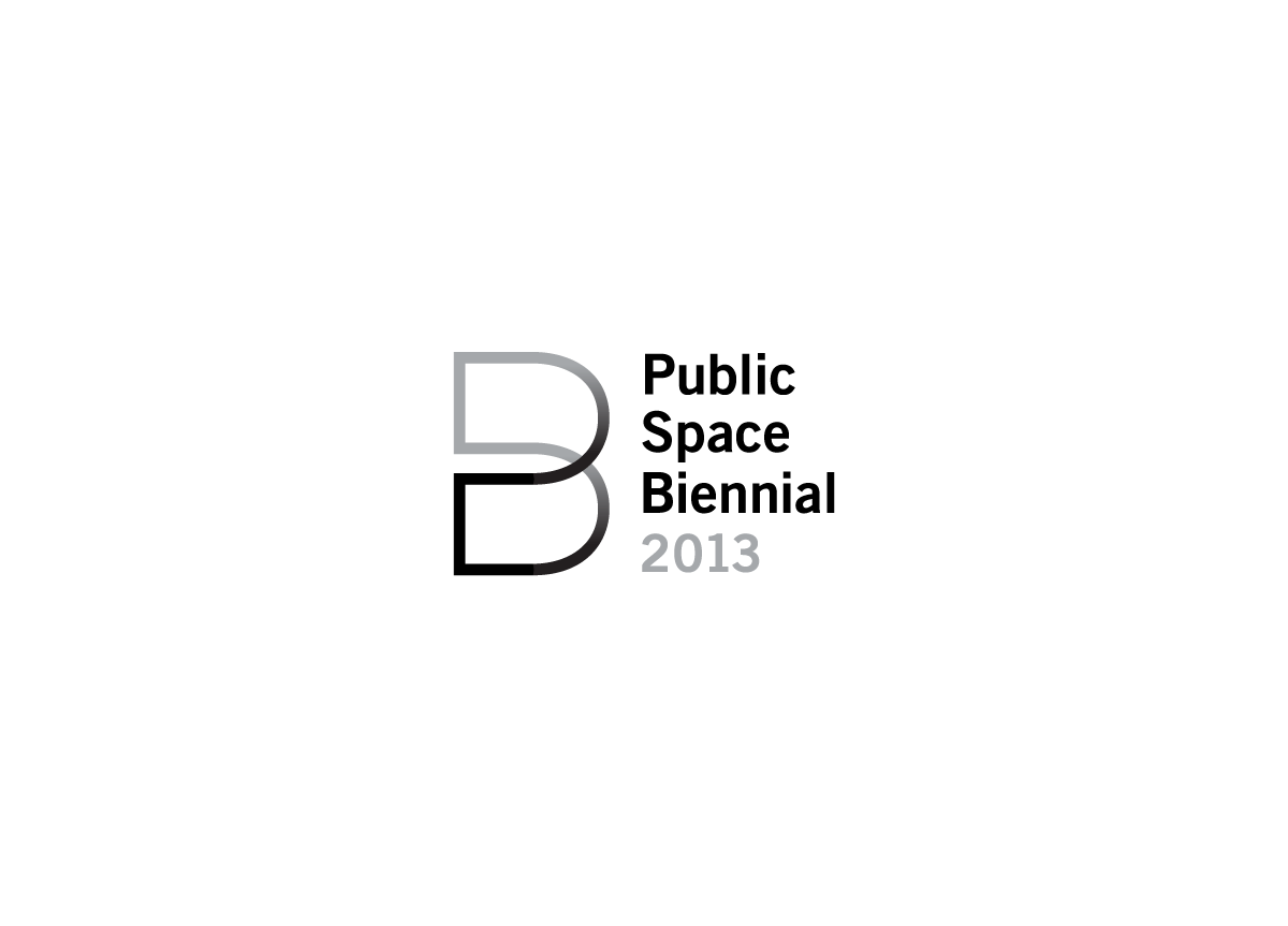
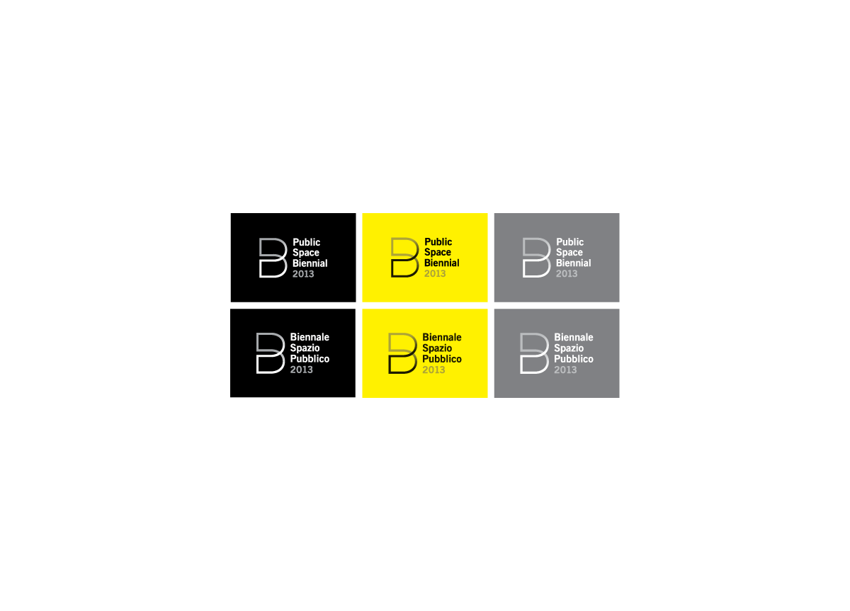
Zago was asked to create a unique and distinguishing mark to symbolize the Biennale. Considering its multilingual audience, the logo had to be read in Italian and English, and the symbol had to encompass the notion of space while maintaining three-dimensionality.
APPROACH
The logomark was created from the foundation of the B that starts Biennale. The B forms one continuous line symbolizing inclusion and community. The shape of the B has been designed to give the illusion of space and three-dimensionally with a gradient effect. We created a logo that was truly distinctive and sustainable with the ability to be adapted for future use.


