
![]()
![]()
CLIENT
A large Danish construction and real estate company.
BRIEF
The assignment was to rebrand the company due to internal change in company structure, and design a new visual identity. The client asked for a complete makeover.
APPROACH
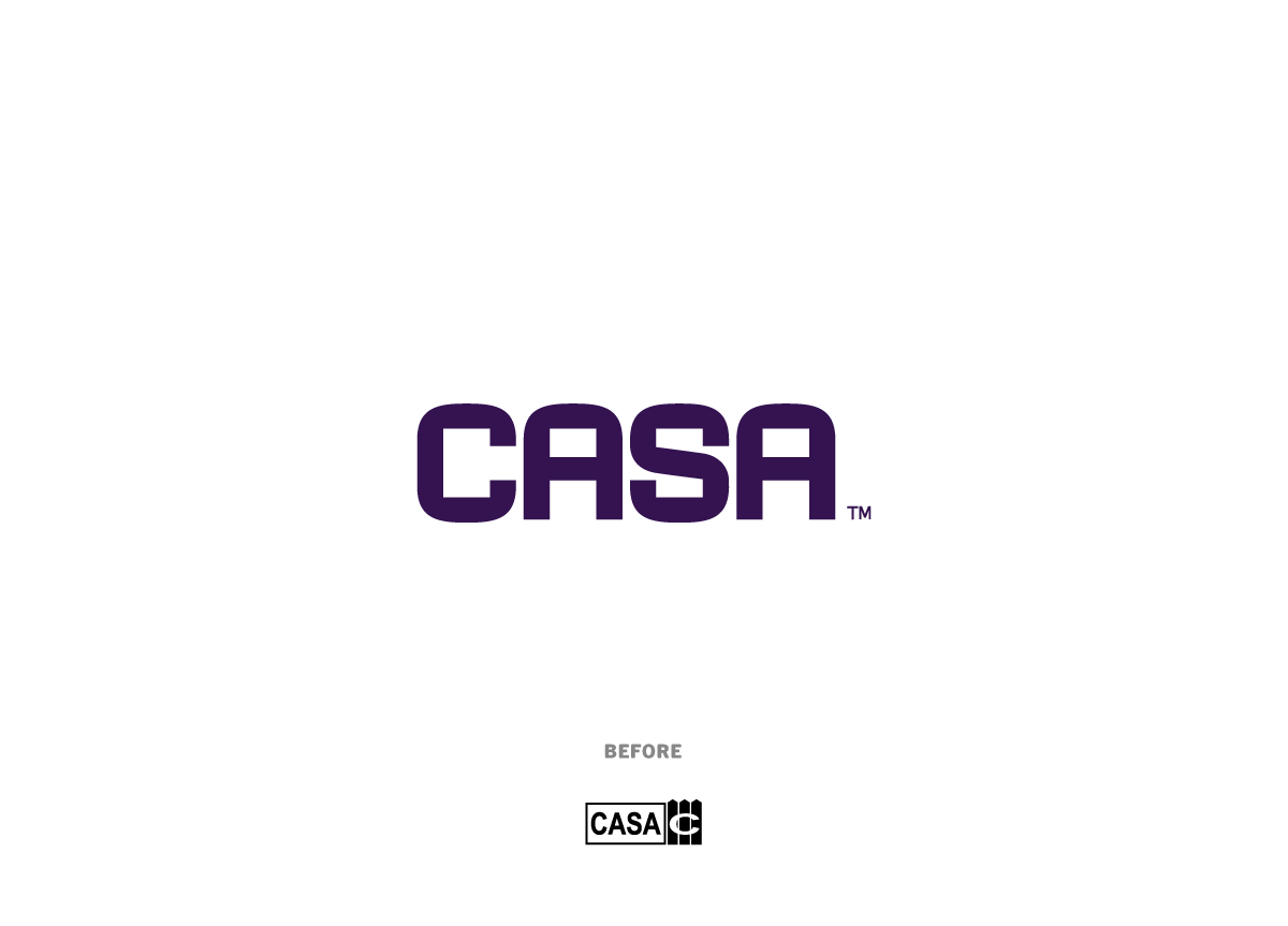
The concept of the new logo was to communicate the same thing as the previous logo (building and construction) but in a more indirect way—not by showing actual buildings but by using elements aesthetically connected to building and construction. The new custom logotype is inspired by architectural drawings and the heavy weight of the type adds the desired amount of construction feel. One of the most obvious characteristics of the identity design is the purple color which—for a Danish construction company—is a daring choice in a field where most companies are blue and conservative. We call it “a blue with a twist”.


