


Cambridge by Shi-Min Chin

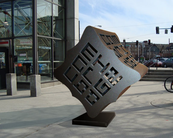
We were asked to choose a city and brand it, carrying the brand throughout a series of deliverables of our choice that would best emphasize our concept, and that had to include a logo, signage, print piece, website, and 3D sculpture. It had to be a city we could visit, get a feel for, and take our own pictures of.

New England School of Art & Design
Boston
Grad Studio 2
Eike Wintzer
Approach
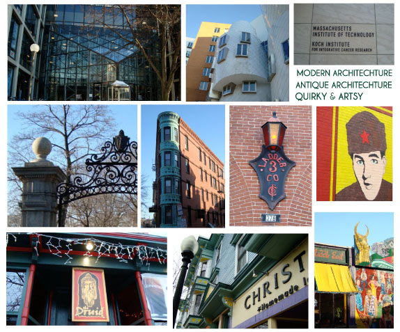
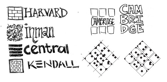
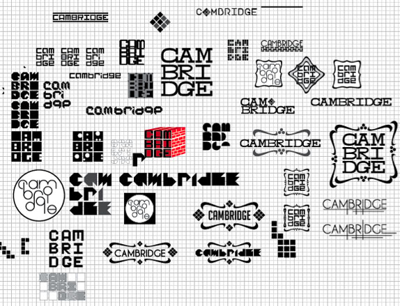
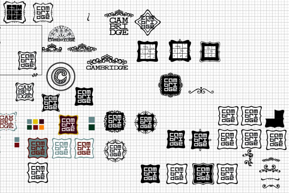
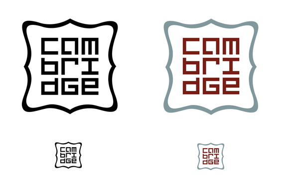
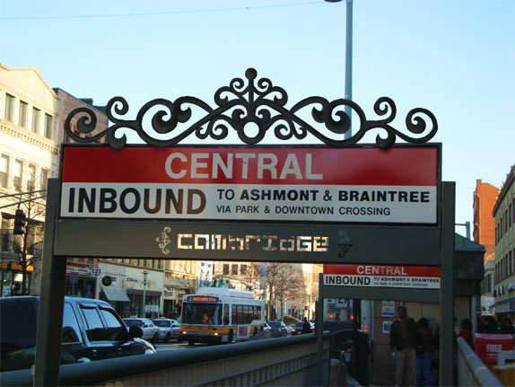
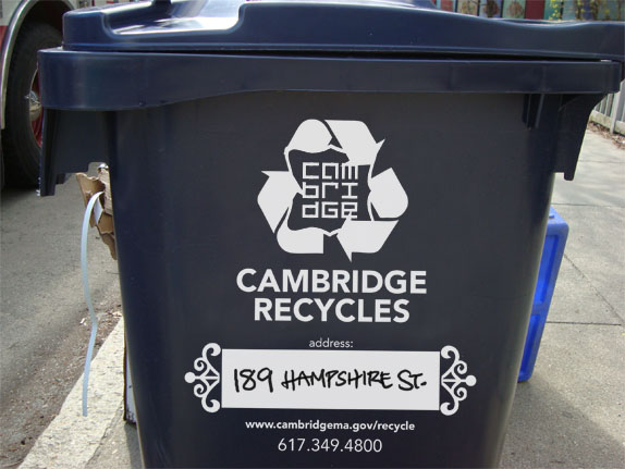
I chose to brand the city of Cambridge, Massachusetts. I researched its history, demographics, geography, and visited all its neighborhoods. In my research, I discovered the following (which I made my positioning statement): Cambridge is a crossroads of old and new, past and future. It has managed to hold onto its antiquity while still being a center of learning and at the forefront of technology. Cambridge has many facets and personalities in each of its squares and areas, yet it all comes together as one unified city. Cambridge is both historical and hip, antique and youthful, traditional and quirky, all at the same time. For the logo, I wanted to create a mark using a custom grid typeface, as the city itself was laid out in a grid when it was first founded. I combined a modern looking block typeface with an old-fashioned, curly cartouche in order to reflect the unification of Cambridge’s opposites.
Sketches and Process
Solution
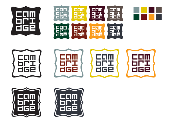
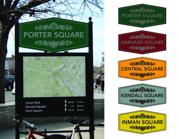
The color palette was chosen with regards to the multiple facets and personalities for Cambridge and firstly based for the five major squares. Kendall Square = Steel blue-gray for industry and technology. Central Square = Marigold for the vibrant murals and the arts. Harvard Square = Brick red for history and defining brickwork. Porter Square = Dark green for the pastoral landscape and estate (that used to be there). Inman Square = Mustard yellow for independent business..
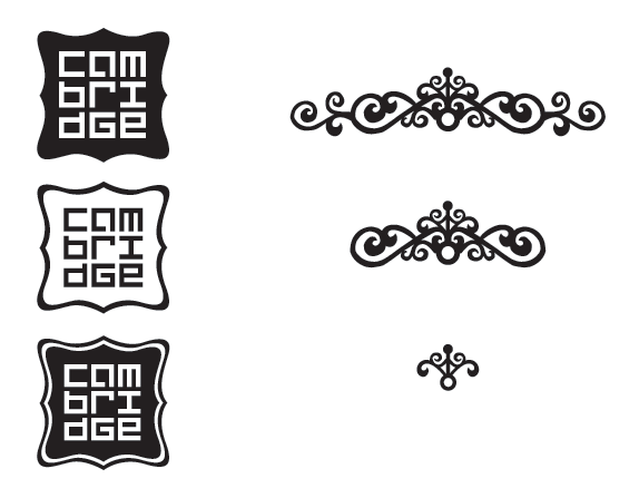
The logo is intended to be dynamic. It has several levels of complexities and can be used with the full color palette depending on application. The wrought iron curlicues can be used as embellishments or frames.
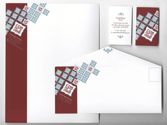
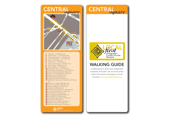
This is a double-sided template for a printed walking guide to Cambridge’s independent businesses in each square, because Cambridge is unique in that it is almost completely walkable and strongly supports its local economy. There are 5 squares in Cambridge, and this template could be used to create separate, double-sided cards, or put them all together into a pamphlet or foldable map.
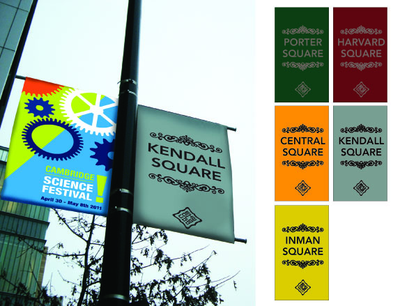
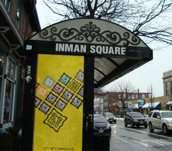
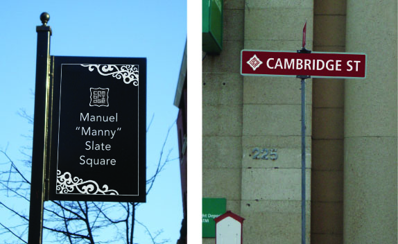
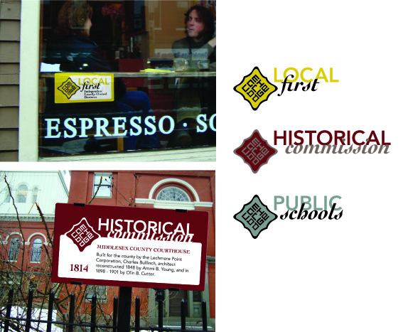
These matching logos give a unifying look to Cambridge’s many organizations, bringing them all together.
Shi-Min Chin’s Website


DATE: Jun.07.2011 POSTED BY: Lauren DickensCATEGORY: Destination COMMENTS:


Celebrating the reality that print is not dead by showcasing the most compelling printed projects.

Corraling the most relevant and creative on- and off-line bits that pertain to the design community — and said community is openly invited and encouraged to add their hard-earned links.

Describing, tracking and explaining culture, commerce, politics, media, sports, brands — everything possible, really — through design.

Discussing, and looking for, what is relevant in, and the relevance of, graphic design. [Archives Only]

Encouraging creative diversity in the community through monthly, one-word challenges. [Archives Only]

Designing corporate and brand identities and full development of printed and digital matter for clients and us.