


Children’s Playhouse by Ryan Simpson

Largely self-directed, this capstone course presents students an extraordinary opportunity to identify and and investigate an area of interest, using small client branding as the vehicle through which to present their findings. During the semester each student develops and completes an identity system for a small non-profit organization, the result of which is a coordinated campaign consisting of 5 projects carried from conception to final comprehensive.

Appalachian State University
Boone, NC
Graphic Design V
Dr. Marilyn Smith
Approach
Client Overview
The Children’s Playhouse is an informal creative play space and hangout for younger children and their parents, located in downtown Boone, North Carolina. It is a place where natives and newcomers, out-of-towners and locals, experienced parents, eager first-timers, and people of all ages are brought together to share the joy of playful learning with their children. The Playhouse offers a variety of stimulating art and science based activities, classes and programs. They also offer enticing play areas, exhibits, and informative parenting resources.
Prior Identity Overview
The Playhouse’s identity was not a unified or cohesive unit; the established message was one of fun and excitement, yet the execution was overly elementary and boring. The logo, in particular, limited the wider scope of the Playhouse’s intended mission and target audience. While the identity attempted to reflect the company’s connection to children, it ended up speaking entirely to that connection and neglected the idea that the Playhouse is a place for parents as well. The problem with the prior company identity was that its childlike style established an unwanted amateur and unprofessional tone. The identity did not successfully establish the nature of the company’s fun and unique services for children and their families, nor did it establish itself as unique to the competition.
Research Process
Before beginning the design process, I went through a detailed research process including a series of competitive audits and an extensive design brief. The importance of the research process cannot be underestimated. From the beginning, I established a distinct direction and a clear set of goals for the new identity to meet, ensuring no time was wasted. The research process ensured that the final result would be appropriate and effective within the Playhouse’s target audience.
The goals for the new identity were:
– Establish a visual cohesiveness and clarity to the company portfolio in order to strengthen brand recognition among potential customers
– Establish a cohesive visual campaign that makes The Children’s Playhouse more memorable by emphasizing their creative and imaginative nature
– Establish a new identity that increases the company’s potential user base without jeopardizing current users
Design Process
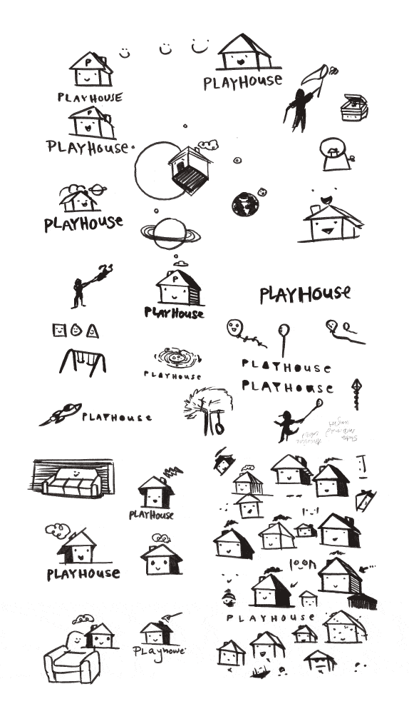
1. Exploration: I began each individual design project by developing and exploring an extensive variety of rough concepts and ideas using a range of creative thinking exercises including word and image games.
2. Development: From there, I narrowed the list of concepts into the ones which were most appropriate, worked the best, and had the most potential after receiving feedback from members of the Playhouse’s target audience. I continued developing each of the selected concepts.
3. Refinement: After further developing each concept, I retested them, selected the top two or three, and further refined them based on the feedback they received.
4. Finalization: After receiving further feedback, I selected the single best concept and continued to further refine and apply finishing touches to the final design.
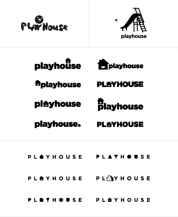
Logo
After the research process, one of the first things I decided to do was shorten the title of ‘The Children’s Playhouse’ to ‘Playhouse’. This was an important initial step in the rebranding process for a few reasons:
1. The Playhouse’s is what the organization is known as among its user base and people familiar with the organization. It serves as the organization’s nickname, which even they informally refer to themselves as.
2. The title ‘The Children’s Playhouse’ creates the unwanted assumption that the organization operates solely for children, contradicting one of the Playhouse’s main goals: to encourage parent interaction and involvement.
3. Having “children’s” in the title was simply unnecessary. The word playhouse alone already generates the assumption that the organization is related to children.
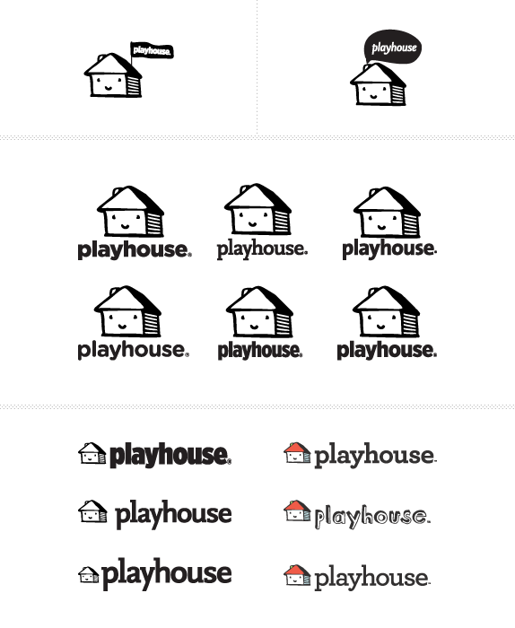
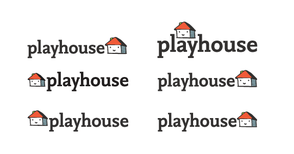
The main goal of the new logo was to be friendly and inviting. I wanted it to feel new and fresh but, also established and trustworthy. During the research process, one of the trends I noticed within companies related to the Playhouse, was that some of the biggest, most immediately recognizable brands—brands which are established and trustworthy in the eyes of the consumer—tended to use sans serif typefaces for their logo. The serif style, because of its more traditional look and feel, tends to create this established, trustworthy tone among consumers and I wanted to take advantage of that in the new logo for the Playhouse. On the other hand, a lot of contemporary branding campaigns will use a sans serif typeface in an attempt to establish a younger, more modern, and contemporary tone—something I also wanted to achieve in the new logo. To achieve this fresh and modern, yet trustworthy and established tone, I selected a typeface which is a mix between a serif and sans serif in order to take advantage of some of the feelings and connotations of each style, without feeling overly traditional or overly contemporary.
Also within the logo, an icon establishes a friendly, inviting mascot for the Playhouse. This mascot became a jumping off point for other pieces in the Playhouse’s identity and acts like a kind of friendly spokesperson for the organization.
Poster
While designing the new logo, I began exploring a wide variety of different concepts and ideas for a poster design. The direction needed to emphasize the Playhouse’s creative and imaginative nature. To be successful, the poster had to work on a few different levels: from a distance, from a few feet away, and up close. It had to have enough visual impact to draw someone in if they were passing by, then if they stopped and walked closer, it needed to reward them with more detail and interest. Finally, it needed to give the viewer some basic information and direct them to where they could find out more about the Playhouse.
For my final poster design, I decided to use an illustrative style, reminiscent of children’s story and coloring books. This was an important step in establishing the imaginative atmosphere I wanted to convey. In the poster you first see the larger tag line “come imagine with us”, a play on the prior tag line “come play with us”, with the intent of drawing a passing viewer in. As the viewer steps closer, they begin to see all of the whimsical and imaginative illustration, all emerging out of the little Playhouse mascot in the bottom right. Then, hopefully, they will be interested enough in reading the brief bit of information in the bottom left, which introduces them to the Playhouse and directs them to where they can find out more.
Booklet
Even though brochures are very practical, cheap, and an established form of communication between organizations and consumers, generally, brochures are quickly scanned over and forgotten about moments later. For this reason, I wanted to design something that would take the place of a brochure, but would be interesting or valuable enough for the viewer to want to keep and take with them. I approached this by designing a booklet that includes information about the Playhouse organization but, also has an additional useful function besides just feeding someone information about the Playhouse. The booklet is titled, “Playhouse at your house” and it includes a few creative activities families can try at home. Each activity has a short list of supplies that they will need—things people typically have around their house—a simple set of directions, and an illustration that mimics the same illustrative style in the poster. Designing something with enough value that someone will take home to use establishes a baseline of trust and credibility between the organization and the viewer.
Website
While developing the Playhouse website, I kept in mind the potential goals people visiting this website would have. These visitors would have likely been directed to the website from some other source related to the Playhouse; whether that be a friend who recently visited, a Playhouse booklet or poster they saw, or even a Google search for local children’s entertainment. Generally, everyone visiting the Playhouse website will have a clear purpose, seeking answers to specific questions.
Sketches and Process
After the research process, one of the first things I knew I wanted to do was shorten the title of ‘The Children’s Playhouse’ to ‘Playhouse’. I felt this was an important initial step in the rebranding process for a few reasons; one being, this is what the organization is known by amongst it’s user base. ‘The Playhouse’ is the organization’s nickname which even they informally refer to themselves as. Another reason was because the title ‘The Children’s Playhouse’ creates the unwanted assumption that the organization operates solely for children, contradicting one of the Playhouse’s main goals: to encourage parent interaction and involvement. The last reason for my decision was because I felt having ‘children’s’ in the title was simply unnecessary, the word playhouse alone already generates the assumption that the organization is related to children.
Solution
The main goal of the new logo was to be friendly and inviting. I wanted it to feel new and fresh but, also established and trustworthy. During the research process, one of the trends I noticed within companies related to the Playhouse, was that some of the biggest, most immediately recognizable brands—brands which are established and trustworthy in the eyes of the consumer, tended to use sans serif typefaces for their logo. The serif style, because of it’s more traditional look and feel, tends to create this established, trustworthy tone among consumers and I wanted to take advantage of that in the new logo for the Playhouse. On the other hand, a lot of contemporary branding campaigns’ will use a sans serif typeface in an attempt to establish a younger, more modern, and contemporary tone—something I also wanted to achieve in the new logo. To achieve this fresh and modern, yet trustworthy and established tone, I selected a typeface which is a mix between a serif and sans serif (FF Nexus Mix) in order to take advantage of some of the feelings and connotations of each style, without feeling overly traditional or overly contemporary.
Within the logo I developed an icon which establishes a kind of mascot for the Playhouse. This mascot became a jumping off point for other pieces in the Playhouse’s identity and acts like a kind of friendly spokesperson for the organization.
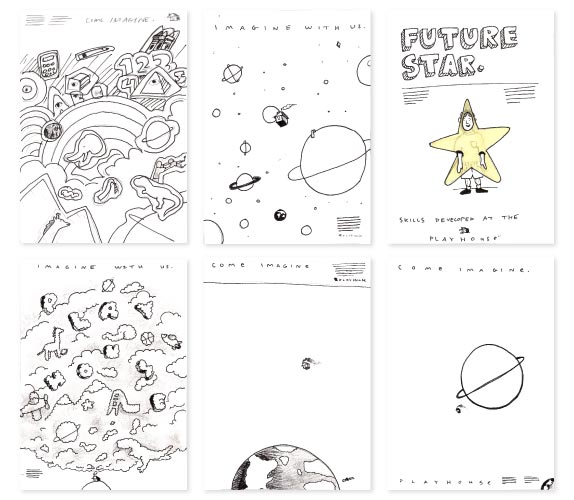
While I was designing the new logo, I began exploring different concepts and ideas for a poster design. The direction I wanted to take with the poster was one that really emphasized the Playhouse’s creative and imaginative nature. To be successful I knew the poster had to work on a few different levels: from a distance, from a few feet away, and up close. It had to have enough visual impact to draw someone in if they were passing by, then if they stopped and walked closer it needed to reward them with more detail and interest, and finally it needed to give the viewer some basic information and direct them to where they can find out more about the Playhouse.
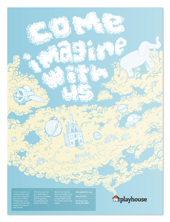
For my final poster design, I decided to use an illustrative style reminiscent of children’s story and coloring books. I felt this was an important step in establishing the imaginative atmosphere I wanted to convey. In the poster you first see the larger tag line “come imagine with us”, a play on the prior tag line “come play with us”, with the intent of drawing a passing viewer in. As the viewer steps closer they begin to see all of the whimsical and imaginative illustration, all emerging out of the little Playhouse mascot in the bottom right. Then, hopefully, they will be interested enough in reading the brief bit of information in the bottom left, which introduces them to the Playhouse and directs them to where they can find out more.
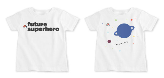
The goal of the t-shirts, like everything else in the identity, was to emphasize the imaginative and creative nature of the organization. When I was designing the t-shirts I thought about the unique and imaginative responses some children give when they are asked what they want to be when they grow up. I decided to emphasize and play on this idea with a series of t-shirts I designed to be customizable to any child’s future aspirations. The idea was that the child could tell the Playhouse what they wanted to be when they grew up and the Playhouse would print that particular thing, barring it being inappropriate, on a t-shirt.
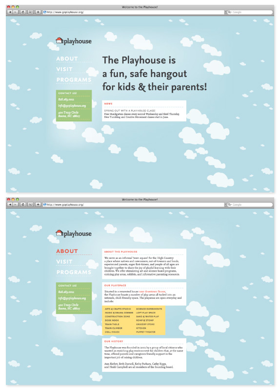
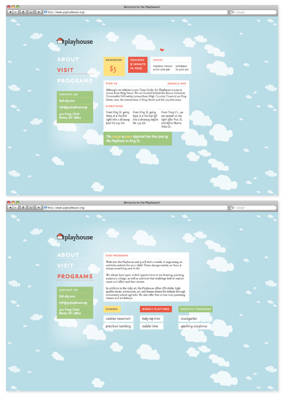
While I was developing the Playhouse website, I made an effort to keep the potential goals, people visiting the website might have, in mind. The most likely scenario I concluded, was that they will have been directed to the website from some other source related to the Playhouse, whether that be a friend who recently visited, a Playhouse booklet or poster they saw, or even a google search for local children’s entertainment. Generally speaking, everyone visiting the Playhouse website will have come for a clear purpose and to answer specific questions, so I addressed those which I felt were likely to be the most common in distinct, easy to navigate sections: about, visit, and programs. In the about section, more detailed information about the Playhouse can be found. There’s also more information about the different play areas the Playhouse offers, some of the activities which you can expect to find on a daily basis, and a brief history about who, when, and why the organization was founded. The visit section details specific information in relation to visiting the Playhouse, the admission price, the hours, directions. A bird flies in from the right and lands, subtly reinforcing the idea that members and infants get in free. There is a link to a google map and links to the specific Appalcart bus routes which pass by the Playhouse. The programs section, includes more detailed information about the different programs and classes the Playhouse offers outside of their everyday activities. You can rollover the specific program or class and find out more detailed information for each one. The navigation and contact information stay in the same place every time for easy access.
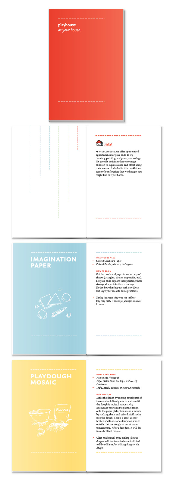
I decided to design a booklet in place of a traditional brochure. Even though brochures are very practical, cheap, and are a established form of communication between organizations and consumers, generally when people pick brochures up they quickly scan over them and forget about them moments later. For this reason I wanted to design something that would take the place of a brochure, but would be interesting or valuable enough for the viewer to want to keep and take with them. The way I approached this was to design a booklet that has an addition useful function besides just feeding them information about the Playhouse organization.
The booklet I designed is titled “Playhouse at your house” and it includes a few creative activities which you can try at your own home. Each activity includes a short list of supplies which you will need, things that someone would typically have around their house, and a brief easy to follow set of directions. There is also an illustration that mimics the same illustrative style in the poster for each activity. The idea was that by designing something with enough value that someone will want to take it home with them and actually use it you are establishing a baseline of trust and credibility between the organization and the viewer.
Ryan Simpson’s Website


DATE: Jun.02.2010 POSTED BY: BryonyCATEGORY: Culture COMMENTS:

TAGS: brand book, children's playhouse, exploration, icon, logo, posters, tshirt, website,


Celebrating the reality that print is not dead by showcasing the most compelling printed projects.

Corraling the most relevant and creative on- and off-line bits that pertain to the design community — and said community is openly invited and encouraged to add their hard-earned links.

Describing, tracking and explaining culture, commerce, politics, media, sports, brands — everything possible, really — through design.

Discussing, and looking for, what is relevant in, and the relevance of, graphic design. [Archives Only]

Encouraging creative diversity in the community through monthly, one-word challenges. [Archives Only]

Designing corporate and brand identities and full development of printed and digital matter for clients and us.