


Inzersdorfer by Michael Nagy
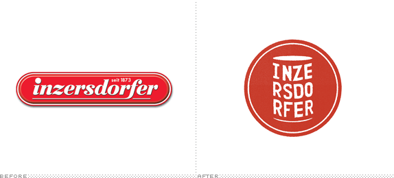
The assignment was to redesign the logo and packaging of Austrian canned food producer "Inzersdorfer" which is an iconic brand in Austria with its first factory built during the reign of the Austro-Hungarian Empire in 1870. Our deadline was 4 weeks after we had started the project.

dieGraphische
Vienna, Austria
Graphic Design & Communication Design
Martin Dunkl and Werner Gregori
Approach
My problem with canned food was that first of all, most of the logos and packaging looked very similar and hardly distinctive. Secondly it was trying to sell something on the package shot it didn’t contain. Healthy food that also looks good when being served. Everyone knows that canned food is jam-packed with preservatives and flavour enhancers.
So my approach was to position the brand as one that knows the fact it isn’t producing the most healthy and organic food but sees that as its strength and is proud of producing simple and cheap food. And since the brand has its origin in the time of industrialization where mass production has its roots that was a a perfect fit.
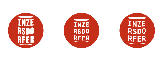
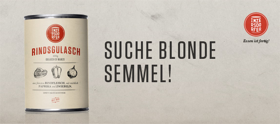
Looking at the competitors the main difference that struck my eye was that Inzersdorfer is mainly producing canned food whereas the competition “Knorr”, “Maggi” etc. have a very broad portfolio ranging from canned food to sauces, spices and so on. I saw that as my chance, my USP, to claim the can for my brand. I did that through various sketches but soon found a unique solution by creating the body of the can by the letters “INZERSDORFER” itself.
I was playing around with a lot of typfeaces and directions but because of the brand’s rich history it was clear for me that I had to look at typefaces from the past to further strengthen the image of being the first Austrian canned food producer. After looking at various art and advertising posters as well as packaging from 1870-1920 i drew up a few typefaces, scanned them in and vectorized my favourite.
Next up was packaging. Same approach as with the logo. Looking at a lot of vintage branding and decided that instead of putting a photograph of the finished meal on the package and leaving the consumer disappointed that his ready-meal wouldn’t look anything like on the packaging I’d put illustrations of the ingredients on it instead.
Sketches and Process
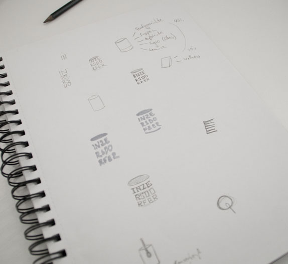
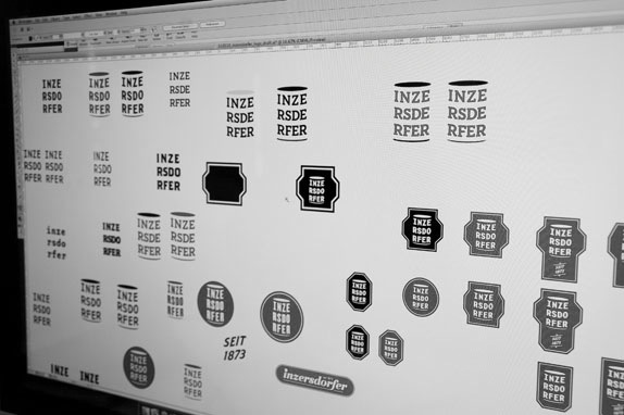
Rough sketches.
Possible font choices.
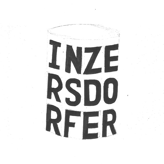
Rough hand drawn font inspired by Vintage Art Posters.
Solution
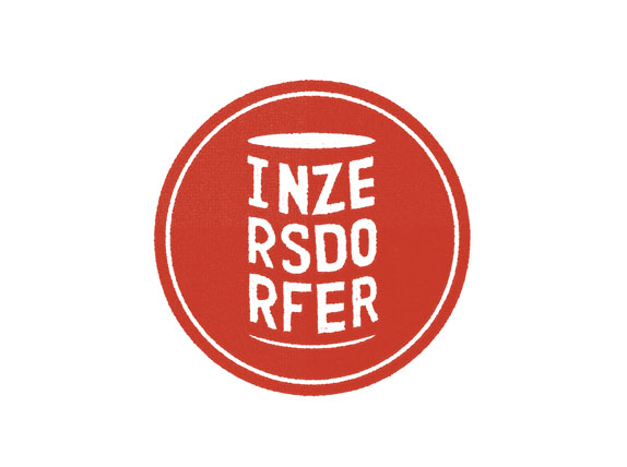
Solution.
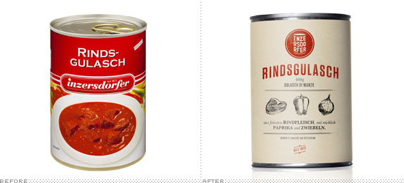
Packaging.
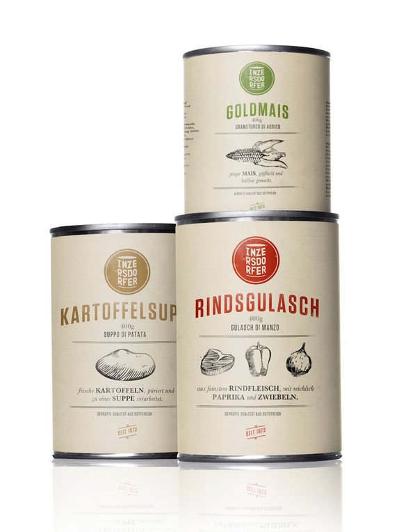
Various product divisions.
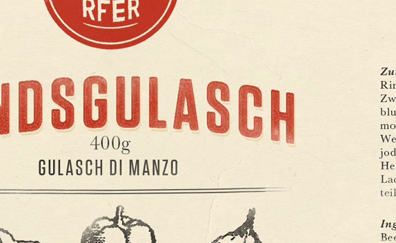
Close-up.
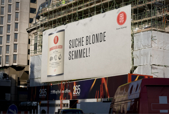
Billboard ad.
Michael Nagy’s Website


DATE: Oct.04.2010 POSTED BY: BryonyCATEGORY: Consumer Product COMMENTS:

TAGS: billboard, inzersdorfer, packaging, shape, typography,


Celebrating the reality that print is not dead by showcasing the most compelling printed projects.

Corraling the most relevant and creative on- and off-line bits that pertain to the design community — and said community is openly invited and encouraged to add their hard-earned links.

Describing, tracking and explaining culture, commerce, politics, media, sports, brands — everything possible, really — through design.

Discussing, and looking for, what is relevant in, and the relevance of, graphic design. [Archives Only]

Encouraging creative diversity in the community through monthly, one-word challenges. [Archives Only]

Designing corporate and brand identities and full development of printed and digital matter for clients and us.