


London 2012 by Joe Brust
ASSIGNMENT
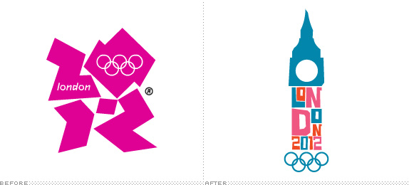
The assignment was to completely re-brand the 2012 London Olympics and produce a graphics standards manual. The resulting manual contains logo re-designs and specifications, a stationary package, brochure, print advertisement, billboard advertisement, and more.

The assignment was to completely re-brand the 2012 London Olympics and produce a graphics standards manual. The resulting manual contains logo re-designs and specifications, a stationary package, brochure, print advertisement, billboard advertisement, and more.
SCHOOL
Rensselaer Polytechnic Institute
Troy, NY
Rensselaer Polytechnic Institute
Troy, NY
COURSE
Designing for Corporate Identification
Designing for Corporate Identification
INSTRUCTOR
Sara Tack
Sara Tack
Approach
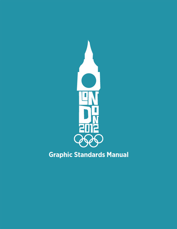
In order to re-brand the 2012 London Olympics, I wanted to design an identity that appropriately represents the city of London while still exploring its modern personality. I chose to blend an original abstract rendition of London’s Big Ben with popping colors that make a unique and memorable Olympic logo.
Solution
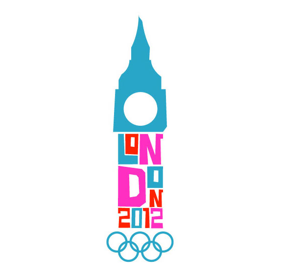
4-color primary logo
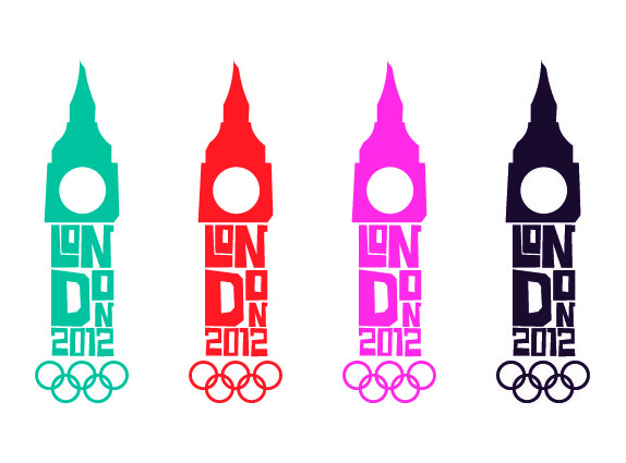
Secondary logos
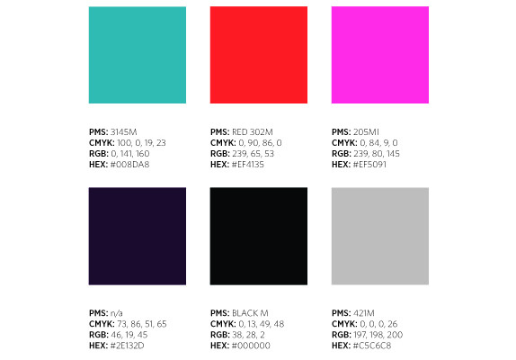
Color palette and values
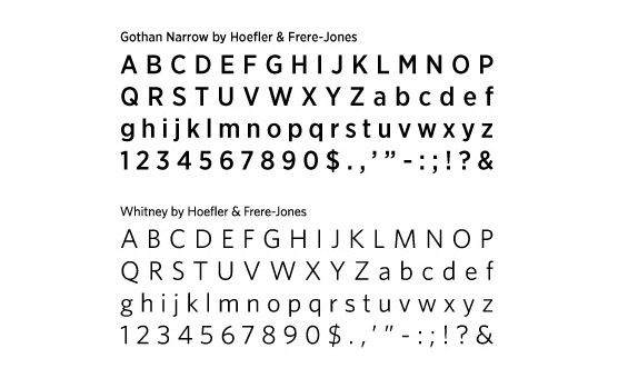
Font families used
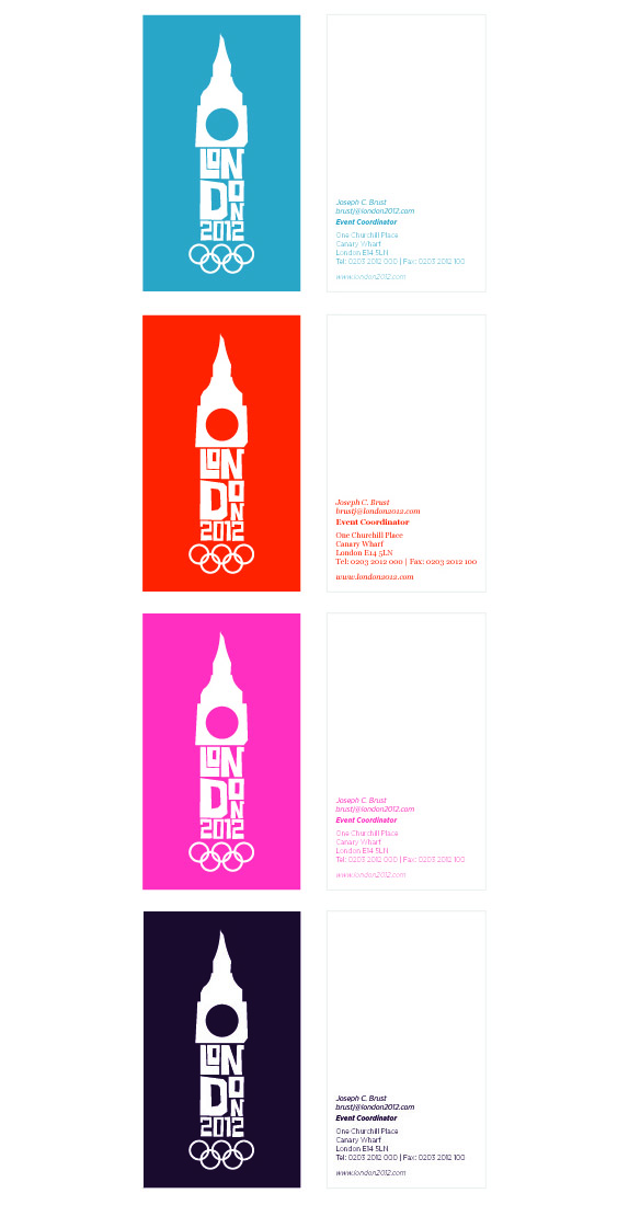
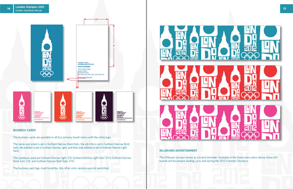
Business cards
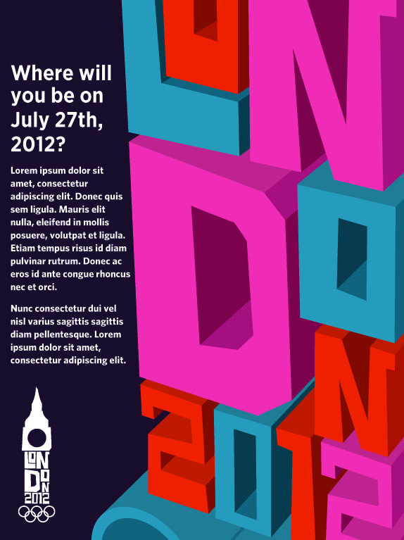
Magazine print advertisement

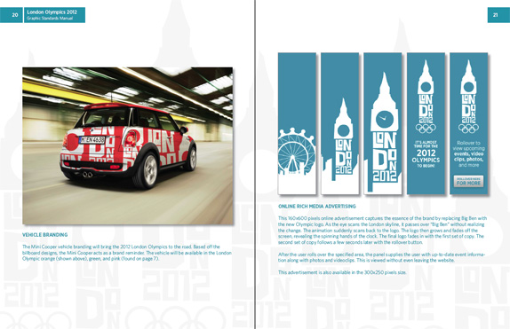
Mini Cooper vehicle advertisement
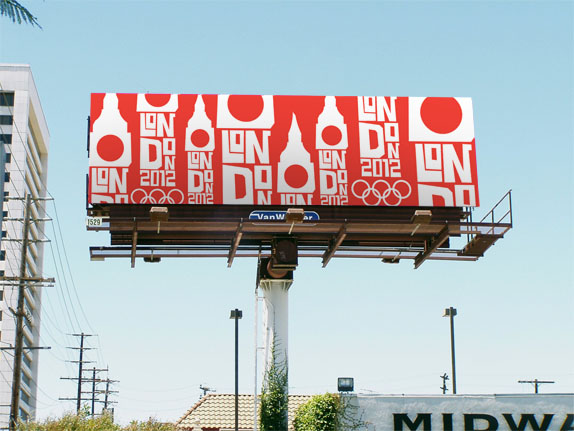
Billboard design
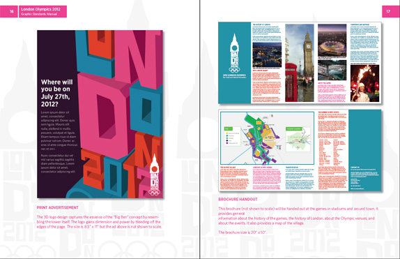
System manual
Joe Brust’s Website


DATE: Jul.21.2010 POSTED BY: BryonyCATEGORY: Sports COMMENTS:

TAGS: advertising, billboard, color palette, logo, london 2012, stationery, system manual, typography, vehicle,

Comments › Jump to Most Recent


Celebrating the reality that print is not dead by showcasing the most compelling printed projects.

Corraling the most relevant and creative on- and off-line bits that pertain to the design community — and said community is openly invited and encouraged to add their hard-earned links.

Describing, tracking and explaining culture, commerce, politics, media, sports, brands — everything possible, really — through design.

Discussing, and looking for, what is relevant in, and the relevance of, graphic design. [Archives Only]

Encouraging creative diversity in the community through monthly, one-word challenges. [Archives Only]

Designing corporate and brand identities and full development of printed and digital matter for clients and us.