


Netgear by Ognjen Topic
This was my thesis project. I was free to do showcase any project but I chose to rebrand an existing company since this is the field I love and will pursue.

William Paterson University
Wayne, New Jersey
Approach
I began by looking at existing companies which I thought would benefit from a re design. I went through many companies such as Americas Choice (a brand of a&p), Targus (a brand of Best Buy). After much research, I finally ended up choosing Netgear. I wanted to be thrown out of my comfort zone and I thought Netgear would give me the best challenge.
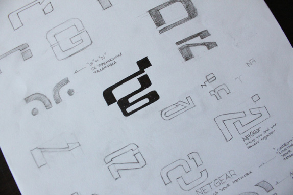
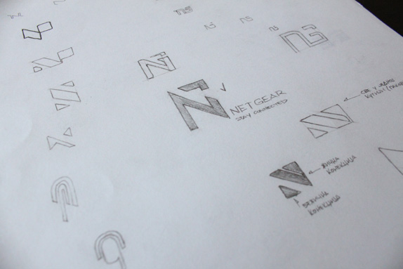
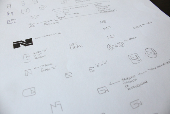
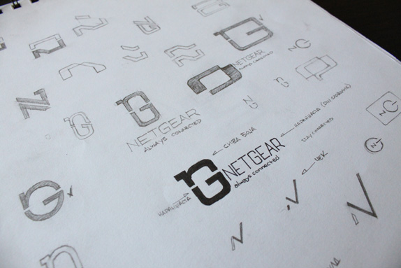
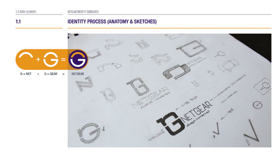
The process started with concepts for the new logo. I always believe that if a good concept is established than everything else will fall in place. I started with sketches, it took me a few weeks to come up with a solid concept that I was happy with.
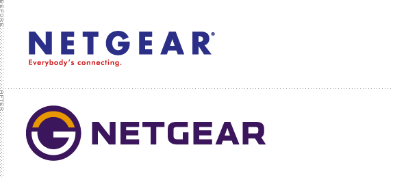
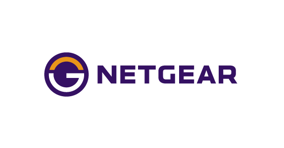
I knew I wanted to apply a mark for the new logo to help Netgear stand out from the rest of the companies. The mark incorporates the letters N and G together connecting which also tied the logo down to the tag line I came up with — Always Connected. I also redesigned the logotype, the current logotype that Netgear bears is a Futura bold font. At first I wanted to keep the logotype so the customers can relate to the old brand easier but after a while I got tired of looking at it and decide to take action. I redesigned the new logotype off of the font Klavika and came up with a very strong and balanced logotype.
After the logo was completely finalized I then chose my colors. This process didn’t take long as I took the color palette that Netgear utilizes and spiced things up a bit. Since the logo was completely redesigned I felt like I needed to keep the colors similar so customers wouldn’t forget who Netgear is.
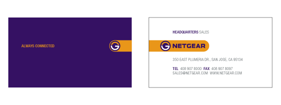
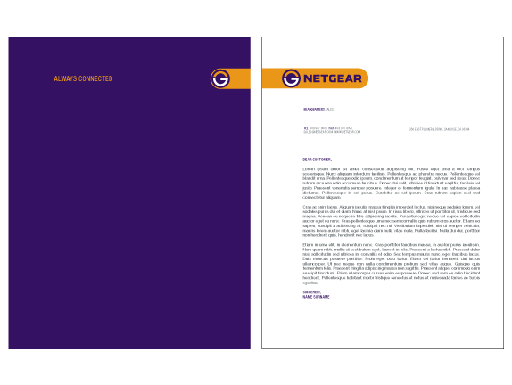
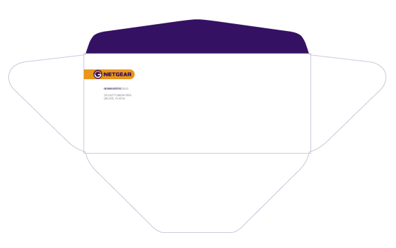
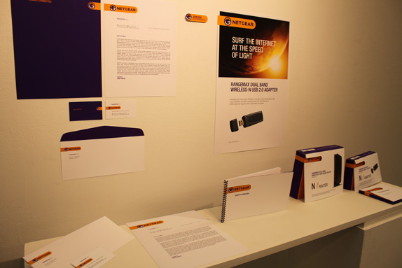
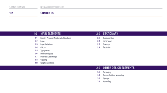
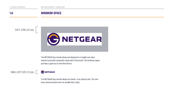
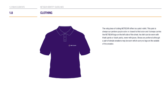
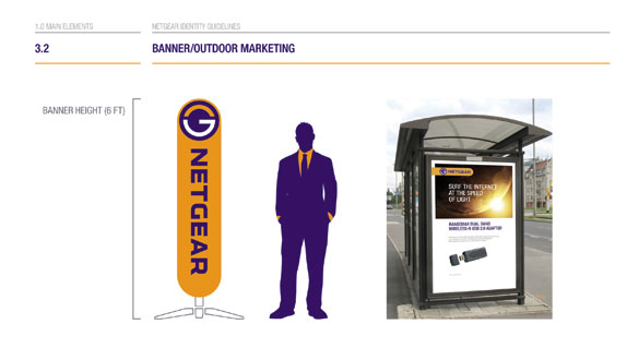
Once the hard work was done I began by creating the identity guidelines book which consist of 22 pages. This lead me into creating the stationary design, poster, two different package designs — one for the router, one for the adapter and an installation CD.
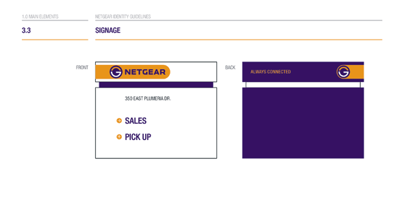
Explanation of the yellow bar:
The yellow bar that you see throughout the identity symbolizes the two marks connecting together. For example: On the business card, the front logo acts as a router, the business card it self acts as a wall and the mark on the back acts as an adapter picking up the signal which is than connected to the front logo by the yellow bar. Maybe too much of thinking on my part but I thought it was witty.
P.S. The mark has nothing to do with a power button, thank god right?
Sketches and Process
Solution
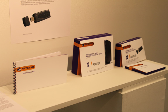
All packages included a die cut following the yellow connection bar, this helped the package to stand out plus it was more interactive with the customers.
Ognjen Topic’s Website


DATE: Sep.27.2010 POSTED BY: BryonyCATEGORY: Consumer Product COMMENTS:

TAGS: advertising, netgear, packaging, stationery, system manual, typography, uniform, website,


Celebrating the reality that print is not dead by showcasing the most compelling printed projects.

Corraling the most relevant and creative on- and off-line bits that pertain to the design community — and said community is openly invited and encouraged to add their hard-earned links.

Describing, tracking and explaining culture, commerce, politics, media, sports, brands — everything possible, really — through design.

Discussing, and looking for, what is relevant in, and the relevance of, graphic design. [Archives Only]

Encouraging creative diversity in the community through monthly, one-word challenges. [Archives Only]

Designing corporate and brand identities and full development of printed and digital matter for clients and us.