ABOUT THE IDENTITY
Moving away from New York is a big deal so we wanted to make sure to acknowledge this year's host city, Chicago, in the conference's identity. At first we thought of some of the obvious things we could derive visual elements from: the CTA and its iconic "L" subway map, or the "Ghost Signs" on brick buildings, or the logo on all of Chicago's album covers, or even (and gasp) the Chicago Cows on Parade. Needless to say, we were coming up short.
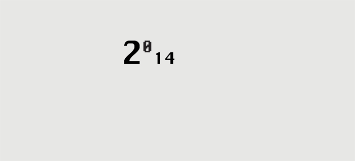
Because we are always obsessing about 1984 — the year, not the dystopian novel — one day our thoughts led us to the origins of the Mac, the venerable tool that allows most of us to make a living. This led to thinking about Susan Kare and her original family of fonts for the deliciously low resolution interface of the original Mac Operating System. Short of a dozen bitmap fonts, all were named after the world's greatest cities: New York, Athens, San Francisco, Monaco, among others. And, yes, Chicago.
A delightful bitmap font with a heavily accentuated contrast between its thicks and thins, Chicago was the main interface font in Mac's OS and decades later it was also the UI font of the original iPod. However, as the OS evolved and the resolution increased, Apple moved away from bitmap fonts and began introducing smooth-edged fonts in the interface; not ready to leave Chicago behind Apple commissioned Bigelow & Holmes to literally smooth out the original version, keeping the same structure but curving all the corners. The result could be considered one of the least appealing typefaces today and Apple slowly swept it under the rug; first decommissioning it from its UI use and later leaving it out completely of the OS.
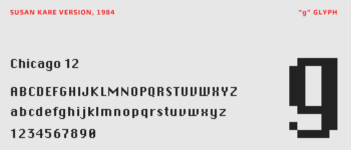
Comparison of bitmap and TrueType Chicago fonts.
This Dr. Jekyll and Mr. Hyde — or, well, more like Mr. Hyde and Mr. Hyde — double personality and the legacy of Chicago as a font in the Apple brand was very appealing and seemed like a good place to start exploring.
As usual, we are also thinking about trends — both the interesting and the ludicrous. One of the latter is the use of "Wiggles". That's right. Wiggles. They don't serve much of a purpose but they are festive. They also start to look like weather or forecast icons of some kind, particularly wind… hey, Chicago, is windy!
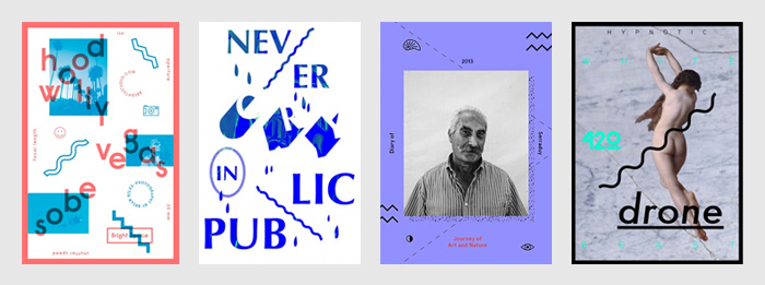
Samples of the "Wiggles" visual device.
Giving ourselves the liberty to go wiggle-crazy, a few other loose associations happened and more points of reference emerged.
The Midwest is cold, some people in the Midwest don't always have the best fashion sense and they willingly dress themselves in crazy cat-christmas-sweaters — this gave us the idea of doing some kind of heavy pixelated-slash-cross-stitch pattern.
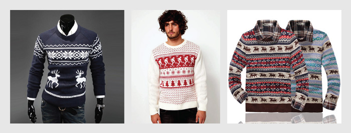
Crazy holiday sweaters.
What else is in Chicago? A stock exchange! Not every city has one of those and the image in our heads of all that data moving heavily across their boards also gave us some ideas — i.e., look at the top of our website.
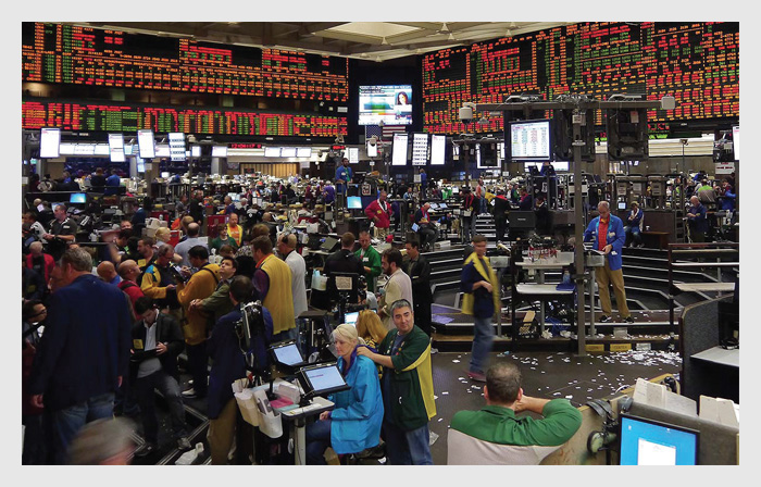
Trading floor at the Chicago Board of Trade.
So: Chicago bitmap, Chicago smooth, wiggles, patterns, strips of data… this is where we ended up:
The build of the logo and a few possible combinations.
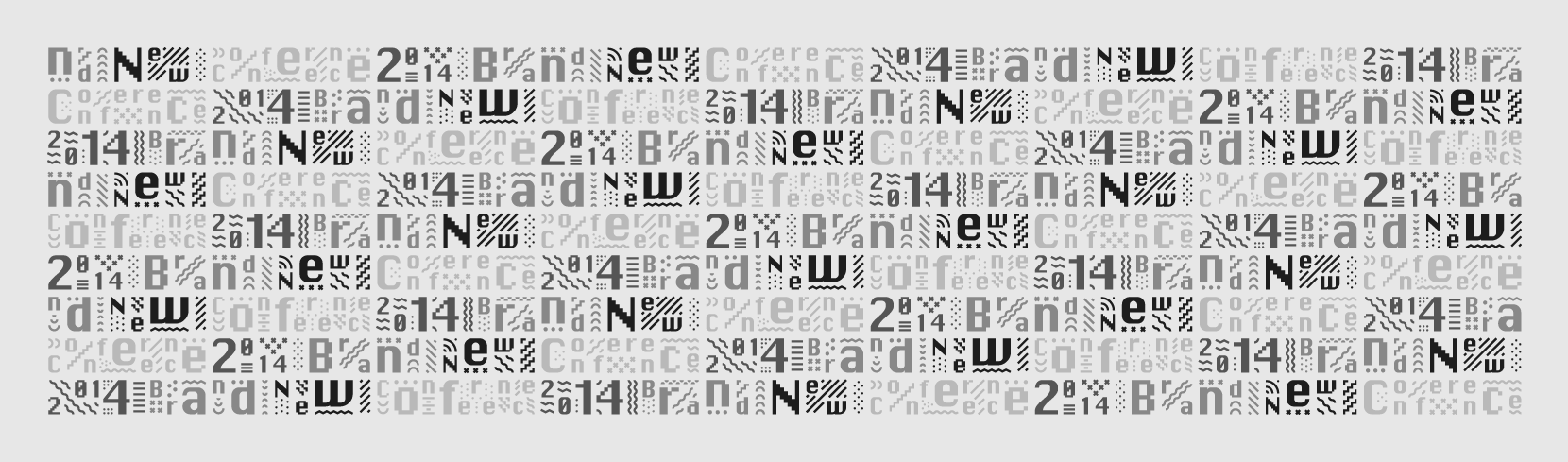
The full, tile-able pattern.
Pattern animation 01. (Make sure Vimeo HD is on).
Pattern animation 02. (Make sure Vimeo HD is on).
Nine possible logos in the 4:3 ratio and in different color variations.
Ditto but with the looooong:1 ratio version.
Starting to explore possible speaker name and portrait treatmens for program and stage slides.
And that's as far as we have gotten. Plus the website. The supporting typeface is the new Burlingame by Carl Crossgrove for Monotype (and served online through fonts.com). It has a hard-working, blue-collar feel to it that we feel goes well with the city and oddly enough pairs well (or really wrong) with Chicago, the font.
Now, to apply the damn thing.