About the Identity
Chicago is known for many things, from its epic skyline and unparalleled architecture to its elevated downtown train to its lakeside beaches to its seemingly endless cultural offerings but it is perhaps a culinary delicacy that sets it truly apart: Pizza. While that is a nearly undebatable fact, what does remain a contentious topic is what type of pizza is the one that defines Chicago’s pizza style. For many, specifically outsiders, the defining style is deep dish pizza, which Chicago can lay claim to having, if not invented, pioneered or, at the very least, marketed the hell out of as an unmissable attraction mastered by local chains like Giordano’s and Pizzeria Uno. For many others, specifically locals, the defining style is what’s known as tavern style pizza, which is the complete opposite of its more famous relative.
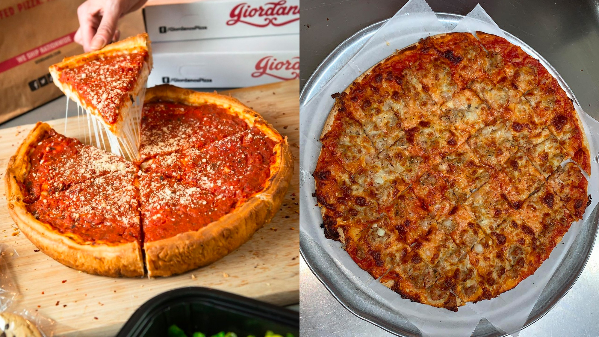
With a light serving of tomato sauce and a thin, crispy base with no puffy crust to hold the cheese and toppings from reaching the edges of the pie — as opposed to the more casserole-esque nature of deep dish — tavern style pizzas are cut into squares through three horizontal and three vertical cuts (although sometimes more cuts in one or both directions). The style’s name comes from its origins in the 1940s when pizza was served in taverns, often at no charge, by offering one salty square at a time — easily served on a napkin (requiring no dishware or utensils) — to keep patrons drinking before heading home and eating a more complete meal there. While the style actually first originated in New York it didn’t become the enduring, de facto approach to pizza making the way it did in Chicago where the style reigns supreme and where small, local, often family-run-for-generations pizza joints that have mastered it have become legendary. And it’s this sweet spot of unpretentious, no-frills, low-cost, craft-driven approach to pizza that we are celebrating in this year’s identity.
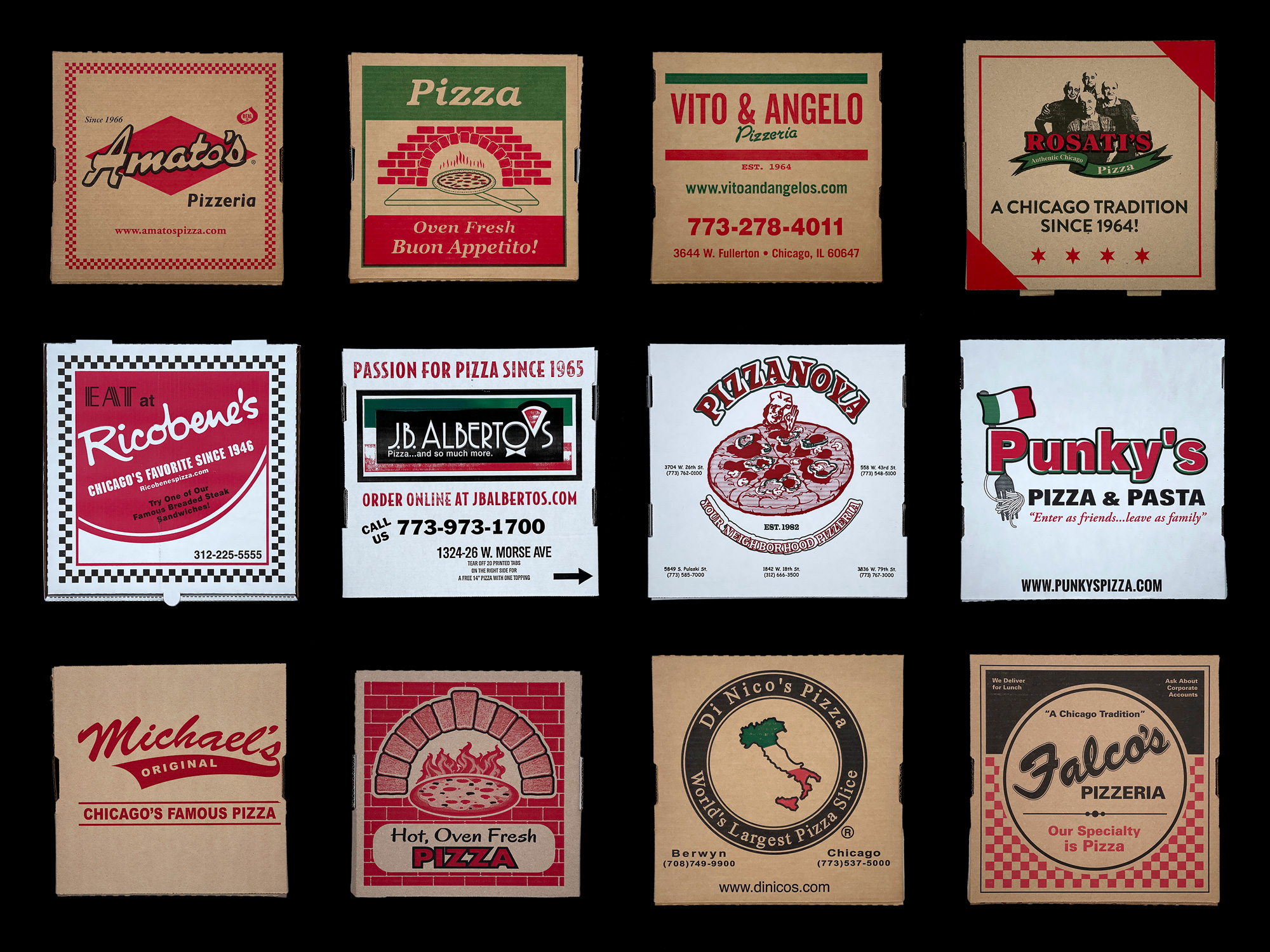
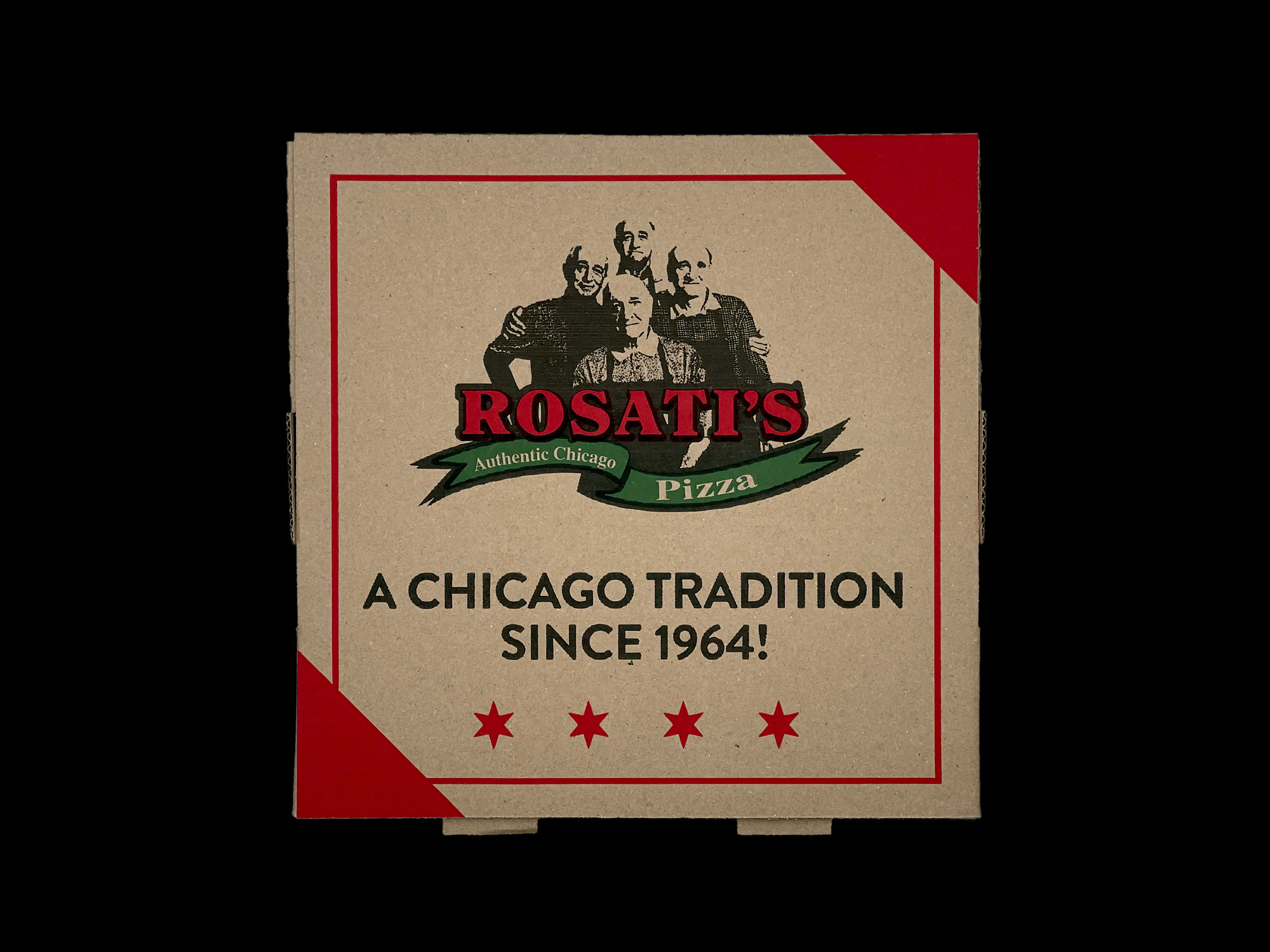
In our field research that took us to all far corners of Chicago, from the far South to the far North and deep into the West side, what we found were dozens of unassuming, unglamorous pizza joints — most of them with nowhere to sit and many of them with tiny sliding windows through which you ordered from as the only interaction with a human — with phones ringing constantly as orders poured in and kitchen crews bustling with activity as pie after pie entered and exited ovens humming at hundreds of degrees Fahrenheit. Most of these establishments sported exterior signs of what we might traditionally regard as “bad” design and in their unapologetic use of green, red, and white color palette — because Italy — what we would definitely label as clichéd. Typefaces we would normally avoid like Cooper Black, Algerian, and, Copperplate Gothic, unless used ironically or sarcastically, were the norm.
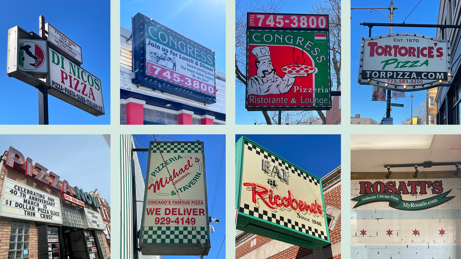
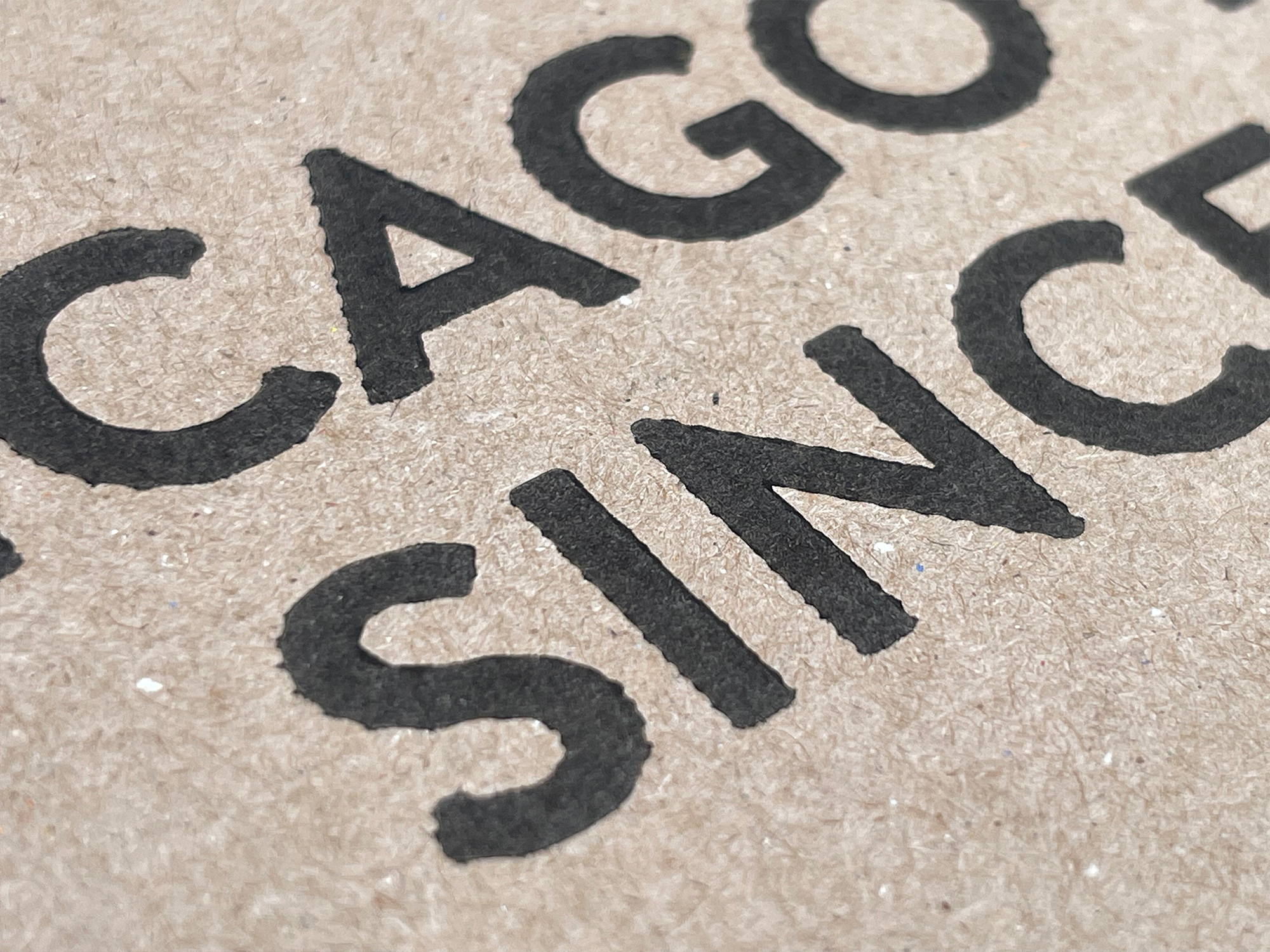
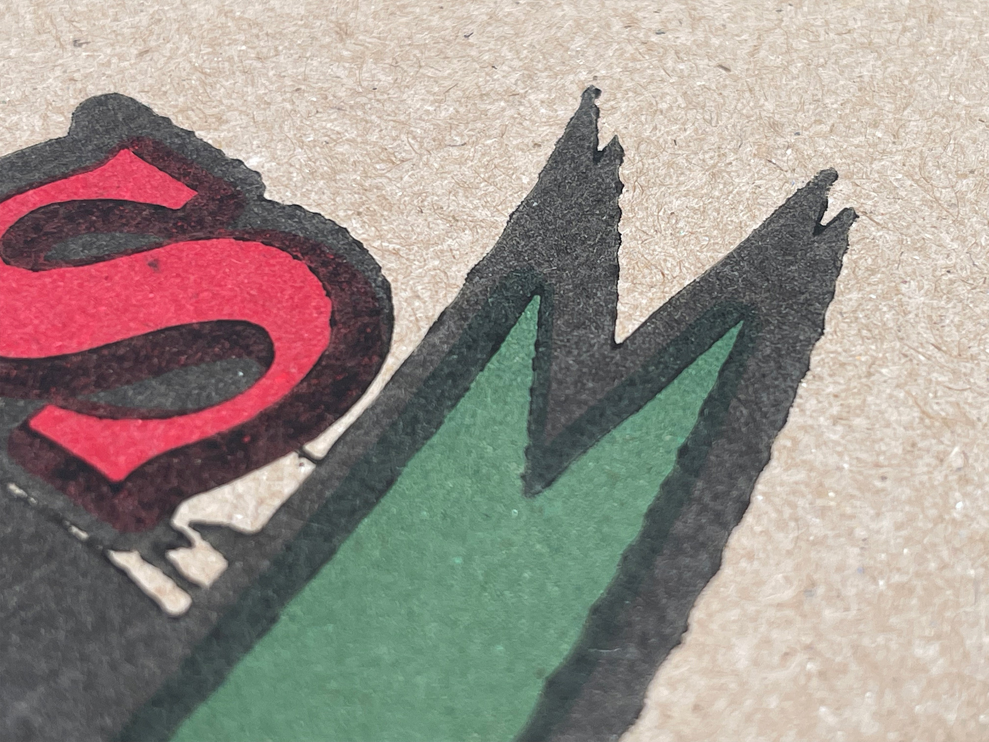
Strokes, drop shadows, and a seemingly endless array of borders, not to mention that classic red-and-white checkered tablecloth motif, were aplenty and most of these designs were, naturally, replicated unto the establishments’ takeout and delivery pizza boxes. Printed most often on natural corrugated Kraft paper — because white corrugated paper is exponentially more expensive — which isn’t the best conduit for fine printing, the artwork on the boxes is commonly printed off register and the permeability of the Kraft paper means the ink often spreads more than it should, yielding a finished product that is far from premium. And we couldn’t love it more.
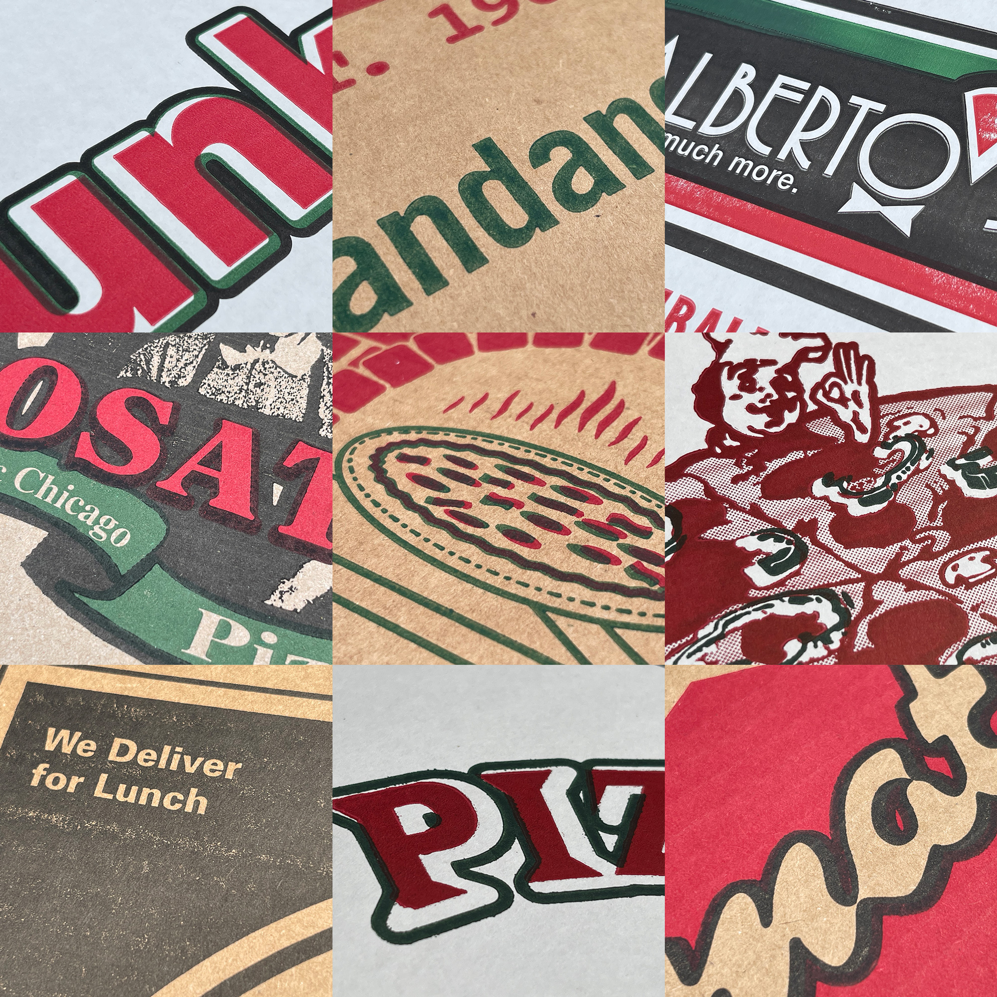
We started the identity by creating a dozen different pizza box artworks — celebrating that this is the Brand New Conference’s 12th year — for fake pizza joints all called “Brand New Conference” or “BNConf” that echo the designs of the many boxes we collected across Chicago (and that are reflective of the style and approach of thousands of pizza joints across the United States) with supporting typography that exalts the freshness of the contents inside, the location, and the attributes and adjectives that sets them apart from other pizza joints, all of which we were able to co-opt and re-adapt to making BNConf sound as appetizing as tavern-style pizza. No design is the same, only a couple of more than 20 typefaces are repeated, and they all vary in their quality of design. Some look as if they were designed without a budget or technical know-how by the owner using Microsoft Word and others are more purposely well designed as if the owner had hired a designer… at a not very expensive day rate.
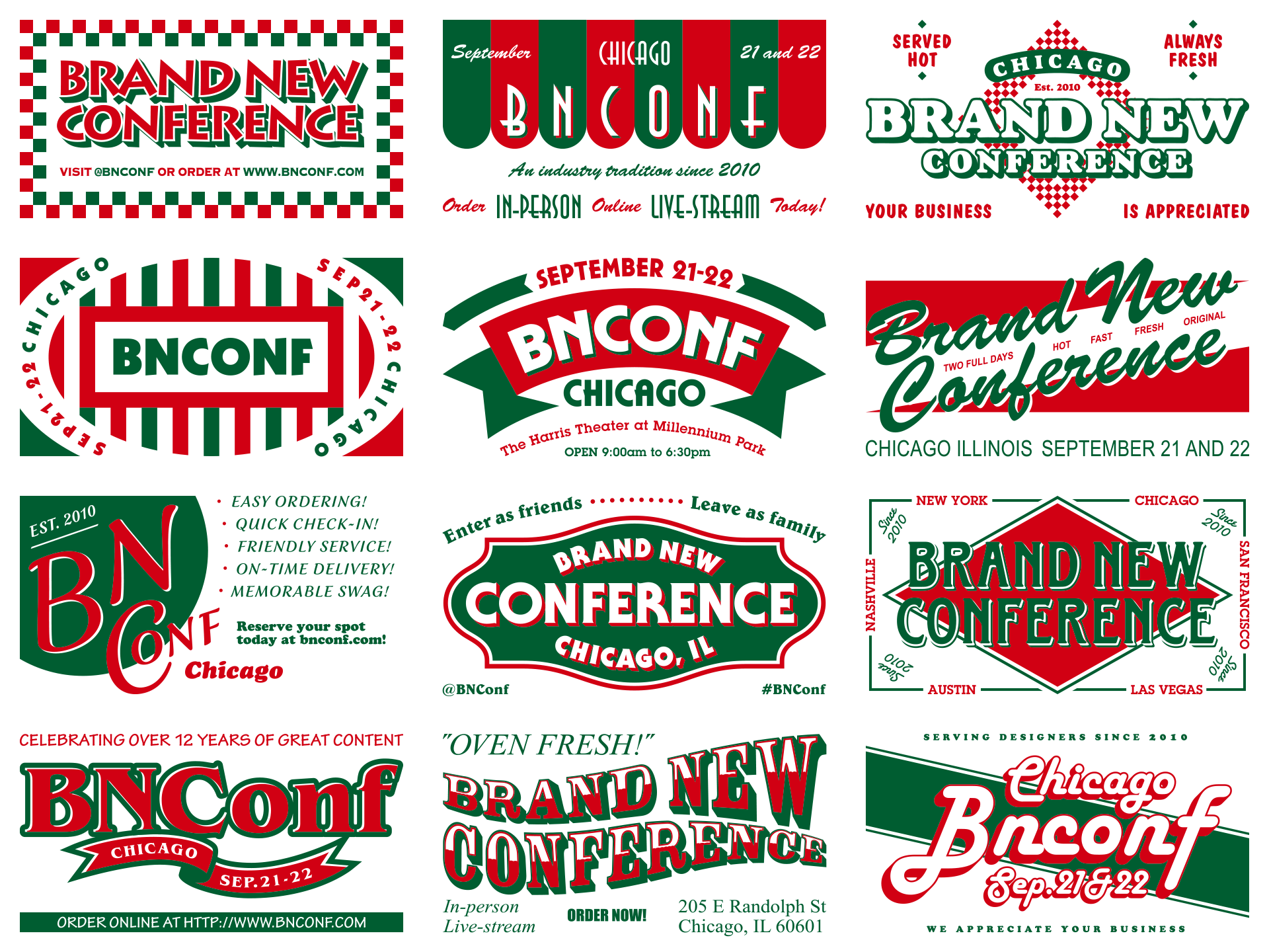
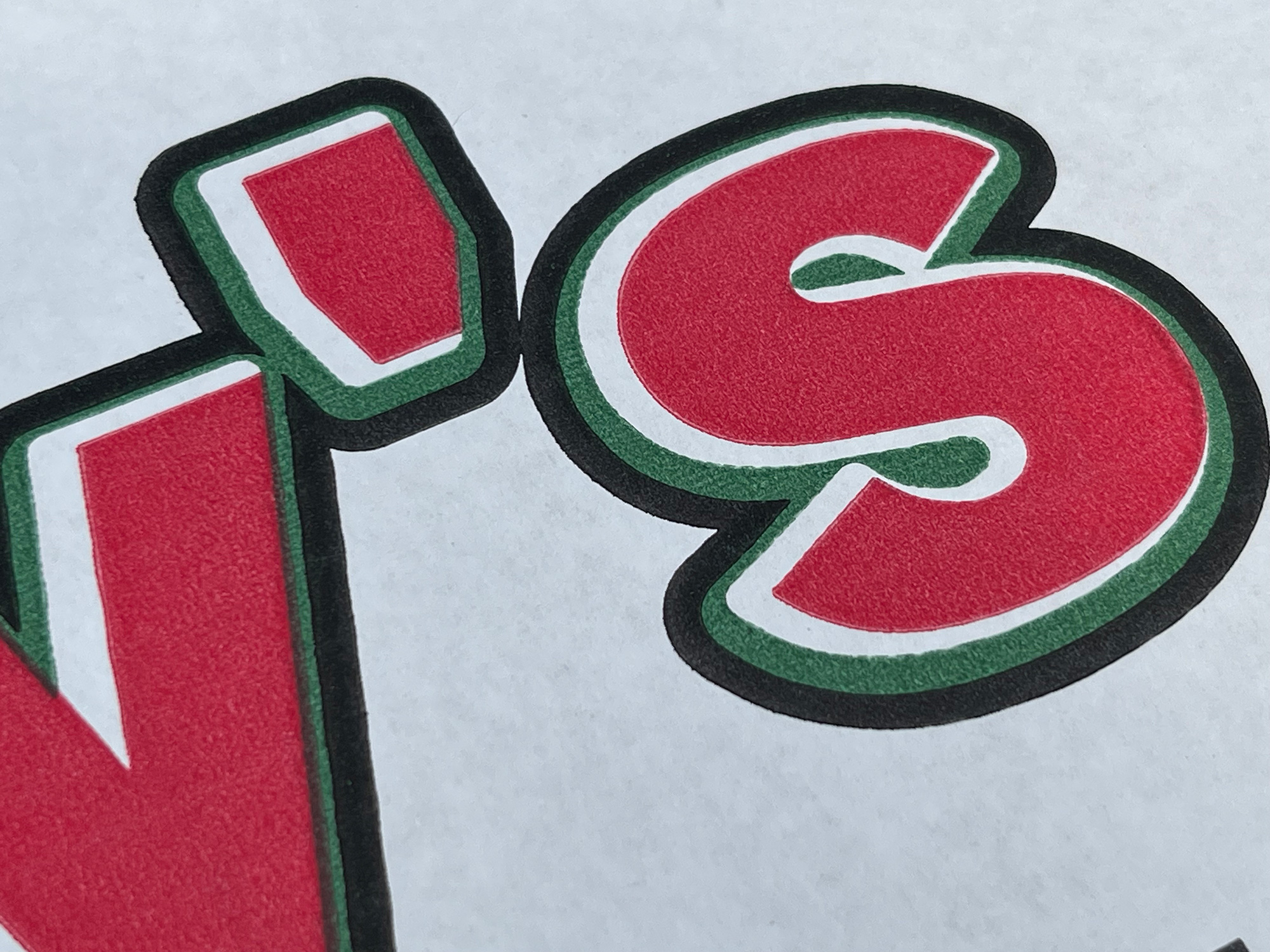
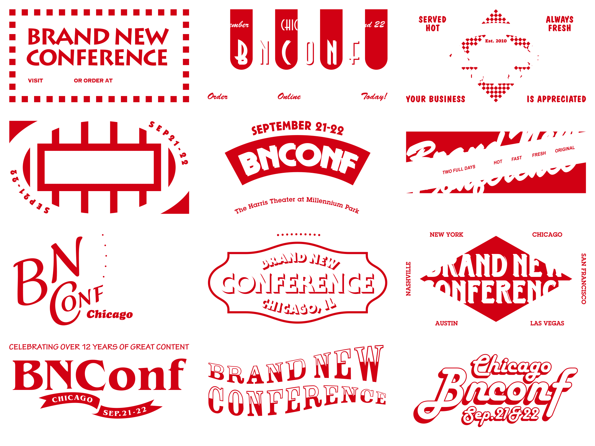
We embraced the traditional color palette of most pizza joints and are limiting the identity to green and red. We realize we also used green and red last year but, in our defense, we are going with what the concept demands and are at peace with repeating the same colors, which do happen to be different hues from last year. We are adding a heavy-handed dose of Kraft paper color and texture to complete the pizza box vibes. To reflect their real-life application as artwork on boxes, the two colors in the compositions — currently designed and presented in a 16:9 ratio for website and screen purposes — were properly translated into their own color separations that traditionally keep one color from incorrectly overprinting on the other one when doing simple two-color print jobs.
To translate the imperfectness of pizza box printing to digital applications we did some subtle Photoshop work to make the type look as if its ink was seeping into the kraft paper and all of their edges were made wobbly because printing on kraft never yields crisp printing. For both fun and a 1940s nostalgic patina we added a jittery, low-frame rate texture animation to each of the designs. You can open any of the images below in a new window/page to see the textural detail a little bit bigger.
We could have probably left these alone and used them as they are but we wanted to take those naive-like designs and lo-fi textures into overdrive as a way to infuse some unexpected personality and energy into the identity. We also wanted to find a way to highlight and exaggerate the over-printing effect so we went back to the 2022 well and tapped GEO to help us bring all these compositions to frenetic life.
From the main animation we can then extract looping animations for each design and use them for social media.
As a second layer to the identity that lives (sometimes literally) on top of all of the fake BNConf pizza brands and their kooky collection of typefaces is a more “neutral” typeface that ties everything together: Tempel Softland by Production Type. To be perfectly upfront about it, this wasn’t a fully rationalized, pre-meditated choice but rather a benefit of being subscribed to Production Type’s mailing list as an email from them came into our inbox in early February right as we were developing the fake pizza brands. Aside from being a super cool looking typeface on its own, it instantly made us think of one of Chicago’s nicknames: The “City of Broad Shoulders” because, well, look at it…
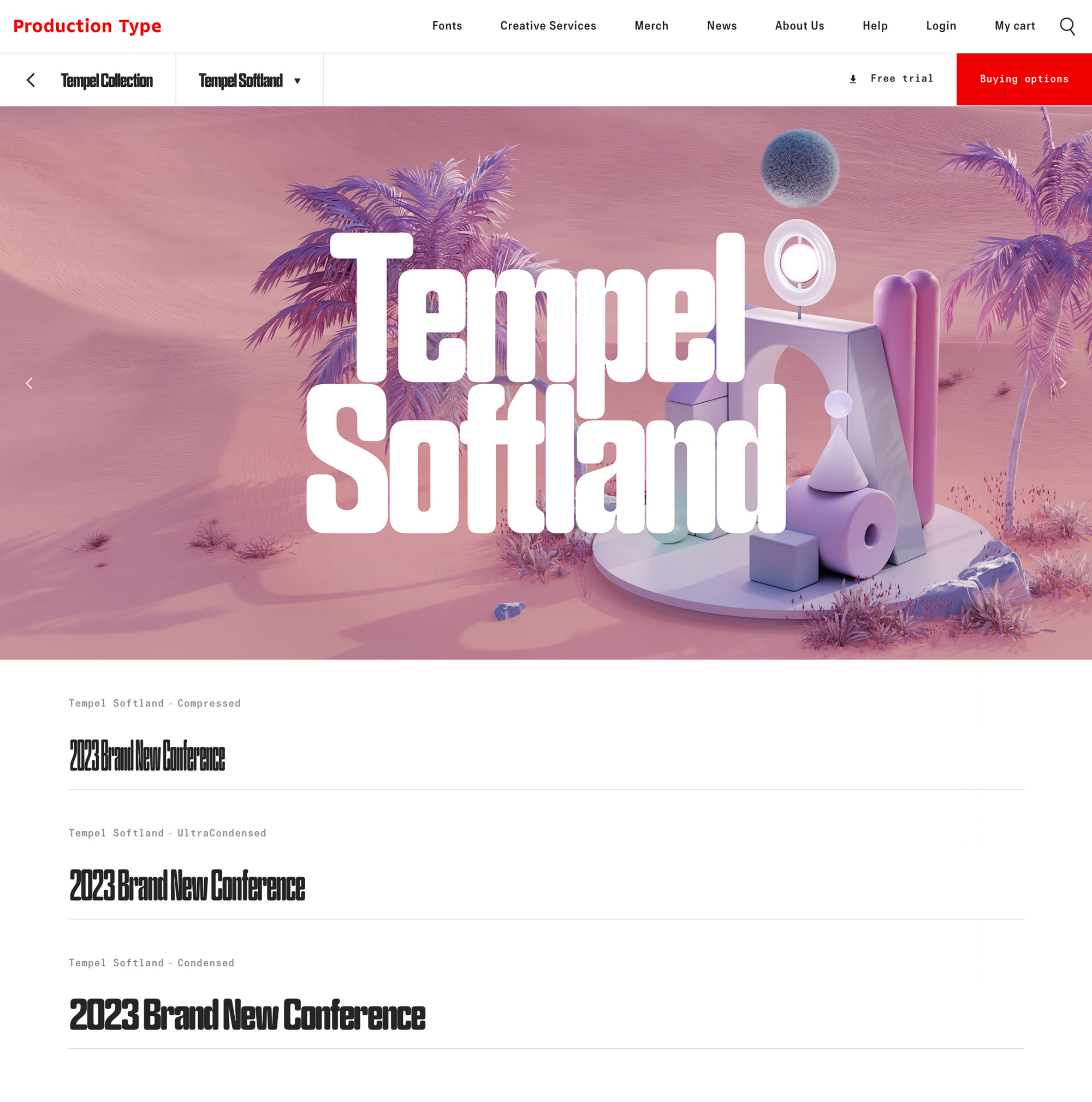
We downloaded the trial fonts and started playing with it to see if it could stand on top of all the various typography we already had going on and it showed promise but it wasn’t fully working for our needs so we reached out to Production Type to see if they had any urgent inclination in expanding Tempel Softland’s weights and widths. After some back and forth they were keen on the idea and they got to work in designing not just additional weights and widths but in developing it as a variable font, which would give us tremendous flexibility. So what you see throughout the website is a custom version of Tempel Softland that no one else has. For now. We hope Production Type can literally expand on the work done for us to bring a crazy-good variable version to the rest of the public.
One unexpected benefit of the variable version of Tempel Sofltand is that, on the website, we can animate rollovers to make it look as if the type was pizza dough and it gets expanded as if you were rolling it with a pin. As supporting typefaces we selected Aglet Slab and Aglet Sans from our newest sponsor, XYZ Type, which have a very charming and idiosyncratic construction that felt unique and fresh and their rounded corners matched those of Tempel Softland quite well. Bonus that both Aglet Slab and Sans also come in a variable flavor and can also be rolled over like pizza dough.
So these are all the ingredients we have to play with this year and, to be honest, it didn’t come easy, which we mention not as a bragging point but to highlight that we bang our heads against the wall more often than not. We had made the decision right after last year’s conference that we were going to focus on pizza as the main concept and we had one idea in mind that we dedicated a good 2 or 3 months, on and off, on R&D and we tried to make it happen but it was looking really bad in physical applications and had no supporting idea in digital for it.
Then we pivoted to a second idea that didn’t require as much R&D but that we invested A LOT of time in, thinking it was a sure-fire approach only to realize it wasn’t working either in the physical applications but that, at least, it did help pave the way for the digital version and for developing the fake pizza brands. We don’t know if this is the perfect solution or best concept but, based on a third round of many tests, we are pretty excited about what the final product will look like and where all the various ideas we’ve had over the last few months have come together in this kraft-infused identity. You’ll have to come to Chicago though to, literally, get a piece of the pie!