ADV @ UNDERCONSIDERATION Peek here for details
BROWSE
Client
Cornell University
Quantity Produced
13,000
Production Cost
US$17,000
Production Time
2 weeks
Dimensions (Width × Height × Depth)
13.25 in. × 19.0 in.
Page Count
28
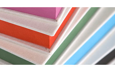
Paper Stock
Uncoated Lynx smooth 70 lb. text
Number of Colors
4-color CMYK + 1 spot color
Varnishes
–
Binding
Nested folios
Typography
Helvetica Neue
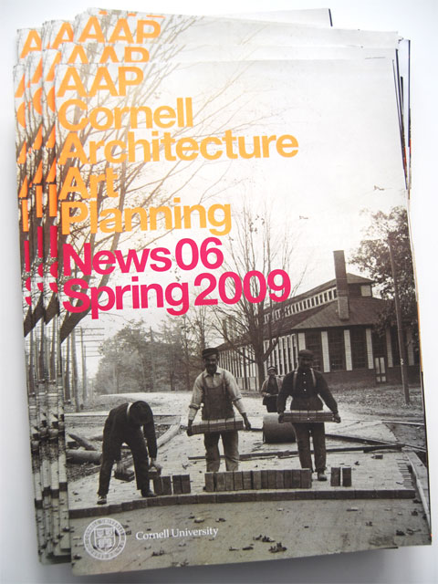
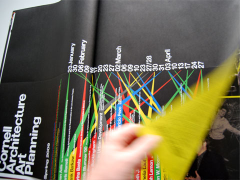
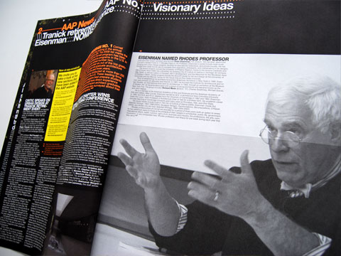
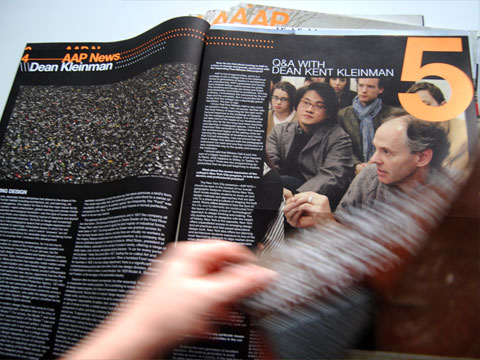
As part of their ongoing work for Cornell University’s College of Architecture/Art/Planning (AAP), Soulellis Studio has been producing its newsletter since 2006, when AAP tasked them with redesigning its alumni newsletter. Paul Soulellis explains:
It was copy-heavy, dense, small and difficult to read. We re-imagined the piece as an over-sized design magazine, with a focus on images, graphics and color.
We’ve designed six issues since — one every semester. Each issue features a different fluorescent color. We used Pantone 804 (neon orange) for Spring 2009, and the photos don’t do it justice! It’s super hot and really pops off of the page.
If you look up “Super Hot” in the dictionary you will find Pantone 804 as one of its definitions. Few things are hotter than neon orange in print, and the way it works in the AAP newsletter, along with the more editorial and photographic layout, creates a very nice balance of seriousness and vibrancy.
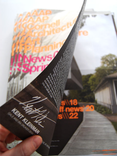
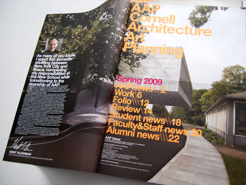
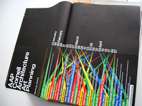
One thing to note in this project is the binding. Or, well, the lack of binding. The newsletter is held together simply by the folds of its pages, as it has no saddle-stitching. I like this newspaper-like effect with nice paper; it’s a nice experience. Plus, you can take some of the spreads apart and see them on their own… like the fourth image down, with all the colorful boxes. That would look super hot.

Cornell Architecture/Art/Planning Newsletter
Production Method
Offset
Design
Soulellis Studio
Creative Director: Paul Soulellis
Designer: Erik Vrielink
Printing
Monroe Litho
This post was published in the original layout of FPO so all images are smaller. Project descriptions as well as production lessons are quoted in the main content area.
Post Author
Armin

Armin Vit
Editor of FPO and co-founder of UnderConsideration LLC.
More: Online / On Twitter
Date Published
May 27, 2009
Filed Under
Newsletters
Offset
Tagged with
fluorescent
neon
nested folios


About
FPO (For Print Only), is a division of UnderConsideration, celebrating the reality that print is not dead by showcasing the most compelling printed projects.
FPO uses Fonts.com to render Siseriff and Avenir Next.
FPO is run with Six Apart’s MovableType
All comments, ideas and thoughts on FPO are property of their authors; reproduction without the author’s or FPO’s permission is strictly prohibited
Twitter @ucllc
Sign-up for Mailing List
Mailing list managed by MailChimp
Thanks to our advertisers
About UnderConsideration
UnderConsideration is a graphic design firm generating its own projects, initiatives, and content while taking on limited client work. Run by Bryony Gomez-Palacio and Armin Vit in Bloomington, IN. More…
blogs we publish
Brand New / Displaying opinions and focusing solely on corporate and brand identity work.
Art of the Menu / Cataloguing the underrated creativity of menus from around the world.
Quipsologies / Chronicling the most curious, creative, and notable projects, stories, and events of the graphic design industry on a daily basis.
products we sell
Flaunt: Designing effective, compelling and memorable portfolios of creative work.
Brand New Conference videos / Individual, downloadable videos of every presentation since 2010.
Prints / A variety of posters, the majority from our AIforGA series.
Other / Various one-off products.
events we organize
Brand New Conference / A two-day event on corporate and brand identity with some of today's most active and influential practitioners from around the world.
Brand Nieuwe Conference / Ditto but in Amsterdam.
Austin Initiative for Graphic Awesomeness / A speaker series in Austin, TX, featuring some of the graphic design industry's most awesome people.
also
Favorite Things we've Made / In our capacity as graphic designers.
Projects we've Concluded / Long- and short-lived efforts.
UCllc News / Updates on what's going at the corporate level of UnderConsideration.

Related entries
Postas de Pescada Publication
Mohawk Maker Campaign
Design*Sponge Summer 2011 Newspaper
Middletown Lumber Newsletter
Ziegler Family Newsletter