ADV @ UNDERCONSIDERATION Peek here for details
BROWSE
Client
House Industries
Quantity Produced
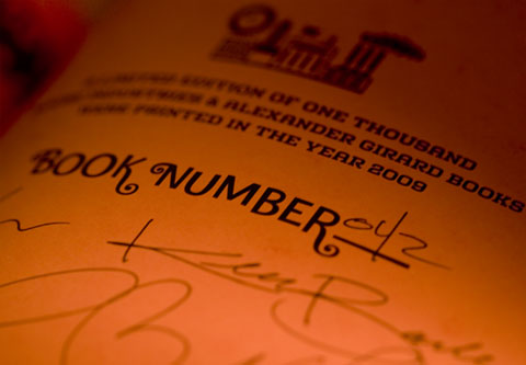
1,000 (hardcover)
Production Cost
Too much
Production Time
Ha!
Update: US$39,227 (source)
Dimensions (Width × Height × Depth)
8.5 in × 8.5 in
Page Count
64
Paper Stock
First signature: 80lb linen text
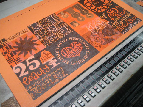
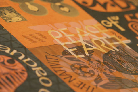
Second Signature: 80lb French Paper, butcher orange
Number of Colors
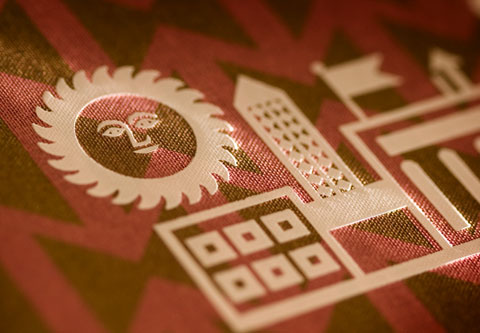
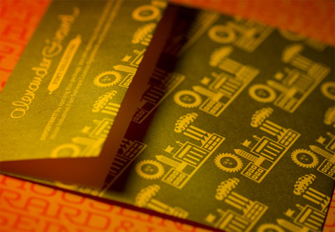
First signature: 4-color process plus metallic gold
Second signature: 3 spot colors (opaque white, orange and black)
Linen cover: 1 spot color (metallic gold)
Varnishes
First signature: Spot varnish
Binding
Smythe sewn
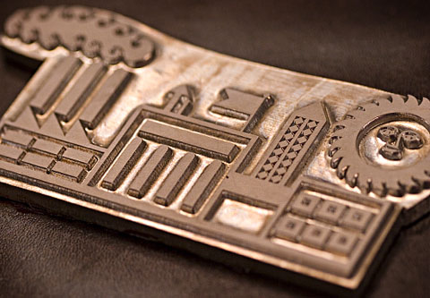
Once cover was glued to board it was foil stamped with the House/Girard factory logo in white (2 hits)
Typography
Girard Fonts by House Industries
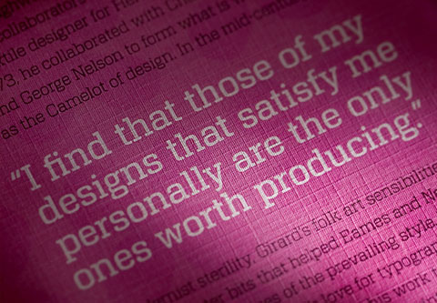
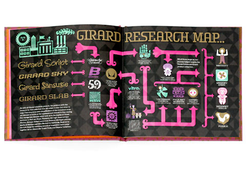
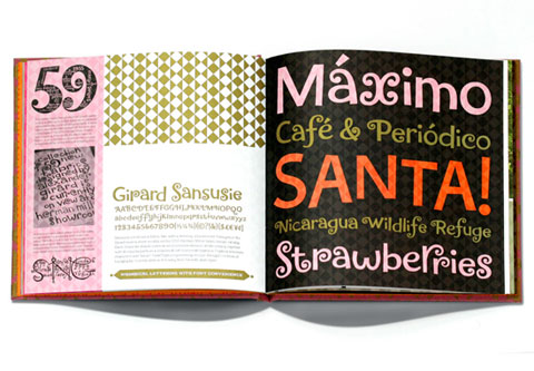
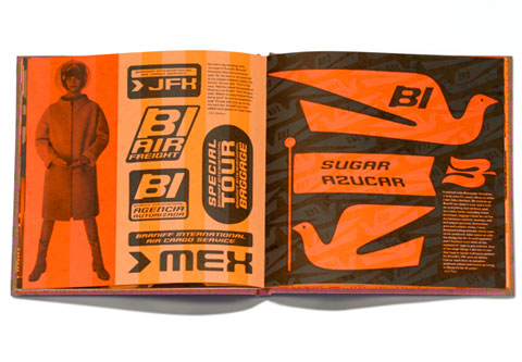
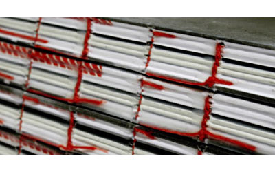
House Industries is most notably known for their innovative type design and their clever and unique packaging systems for their work; but an often overlooked aspect is their dedication to amazingly printed products. Whether it’s the packages themselves, the promotional catalogs or even their No. 10 envelopes, the House Industries crew knows how to take care of (printed) business. Their latest project is the wonderfully quirky and fresh collection of Girard Fonts, based on the illustrative and textural work of Alexander Girard. While the type families would be enough of a visual jolt, House Industries created a limited edition — only 1,000 copies — book with stuff from the 4-year-process of putting together this new collection. The book uses a lot of linen paper. Linen paper is hard to make look good. Much harder to make it look this good.
Co-founder Andy Cruz here expands on the “Other” production detail that made this book even more fun to produce:
For this project we got a bad batch of linen stock that decided to fan-out all over the press. After a valiant attempt to chase the 4/c process, metallic gold and spot varnish registration we decided to pull the job and kindly ask the paper supplier to send us a better skid of stock. When the job was off-press we had another chance to spend more/fix some things we screwed up on by adjusting a few traps and color builds that didn’t translate well once the job went from proof to the actual paper. We were back on press a few days later and the only surprise this time was how strong the varnish was once it dried. For the spot color pages we did the standard House Industries dense black, orange and opaque white overprinting extravaganza on the French Paper’s Orange Butcher. I wanted to find a linen stock for the cover that we could run offset but didn’t look like an execu-planner you’d find at Staples. After getting clearance from the bindery on adhesion, I asked the printer if they wouldn’t mind printing the paper on the glue side instead of the recommended print side. The glue side had a nicer color and more tactile finish. Fortunately It didn’t break the press.
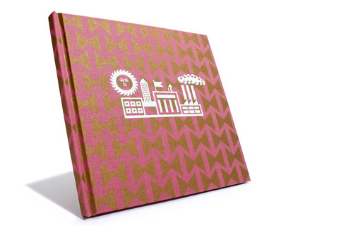

House Industries Alexander Girard Book
Production Method
Foil stamp
Offset
Design
Art Direction: Andy Cruz
Design: Andy Cruz, Bondé Prang
Photography: Carlos Alejandro, Herman Miller, Vitra, Wright Auctions, Coach Photography
Illustration: Alexander Girard, Marilyn Neuhart, House Industries
Typography: Kenny Barber, Ben Kiel, Hannes Famira, Laura Meseguer
Copy: Rich Roat
Printing
Printer: Hank Grabowski, DPCI
Bindery: Bindery Associates
This post was published in the original layout of FPO so all images are smaller. Project descriptions as well as production lessons are quoted in the main content area.
Post Author
Armin

Armin Vit
Editor of FPO and co-founder of UnderConsideration LLC.
More: Online / On Twitter
Date Published
May 7, 2009
Filed Under
Books
Foil stamp
Offset
Tagged with
double hit
foil stamp
linen
smythe sewn


About
FPO (For Print Only), is a division of UnderConsideration, celebrating the reality that print is not dead by showcasing the most compelling printed projects.
FPO uses Fonts.com to render Siseriff and Avenir Next.
FPO is run with Six Apart’s MovableType
All comments, ideas and thoughts on FPO are property of their authors; reproduction without the author’s or FPO’s permission is strictly prohibited
Twitter @ucllc
Sign-up for Mailing List
Mailing list managed by MailChimp
Thanks to our advertisers
About UnderConsideration
UnderConsideration is a graphic design firm generating its own projects, initiatives, and content while taking on limited client work. Run by Bryony Gomez-Palacio and Armin Vit in Bloomington, IN. More…
blogs we publish
Brand New / Displaying opinions and focusing solely on corporate and brand identity work.
Art of the Menu / Cataloguing the underrated creativity of menus from around the world.
Quipsologies / Chronicling the most curious, creative, and notable projects, stories, and events of the graphic design industry on a daily basis.
products we sell
Flaunt: Designing effective, compelling and memorable portfolios of creative work.
Brand New Conference videos / Individual, downloadable videos of every presentation since 2010.
Prints / A variety of posters, the majority from our AIforGA series.
Other / Various one-off products.
events we organize
Brand New Conference / A two-day event on corporate and brand identity with some of today's most active and influential practitioners from around the world.
Brand Nieuwe Conference / Ditto but in Amsterdam.
Austin Initiative for Graphic Awesomeness / A speaker series in Austin, TX, featuring some of the graphic design industry's most awesome people.
also
Favorite Things we've Made / In our capacity as graphic designers.
Projects we've Concluded / Long- and short-lived efforts.
UCllc News / Updates on what's going at the corporate level of UnderConsideration.

Related entries
Severe(d): A Creepy Poetry Collection by Holly Riordan
BOYCO Classpack® Book
Antes de Perder la Esperanza Book
Gunnel Wåhlstrand Exhibit Book
Szép versek & Körkép Book Covers