ADV @ UNDERCONSIDERATION Peek here for details
BROWSE
Client
Self Promotion
Quantity Produced
500
Production Cost
£1,100 (US$1,800)
Production Time
10 Days
Dimensions (Width × Height × Depth)
85 mm. × 55 mm. (3.5 in. × 2 in.)
Page Count
–
Paper Stock
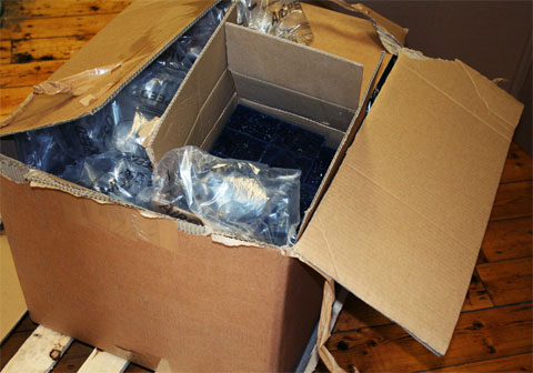
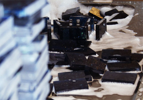
Confiscated illicit CDs crushed and then dispersed in a pale blue transparent polycarbonate recycled from blue water containers
Number of Colors
1 spot color
Varnishes
–
Binding
–
Typography
ITC Lubalin Graph, Trade Gothic Condensed
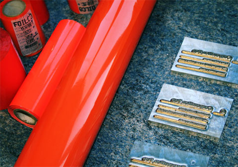
For most designers a 130 lb. cover business card is a glorious achievement in hefty weight, it becomes a card that gets noticed as it is handed and its, at most, eighth-of-an-inch thickness can be imposing. Manchester-based Corporation Pop has gone beyond any set of conventions for their business card and have produced an almost half-inch business card sculpted from a joyful concoction of crushed illicit CDs and water containers. As if that wasn’t enough for it to stand out, it is foil blocked (foil stamped) in the brightest orange this side of the sun. The only caveat is that you probably can’t fit more than, say, five in your wallet.

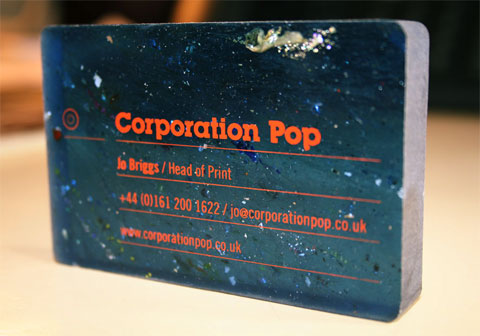
Corporation Pop Business Card
Production Method
Foil stamp
Design
Corporation Pop
Printing
Foil Blocking: Foilco
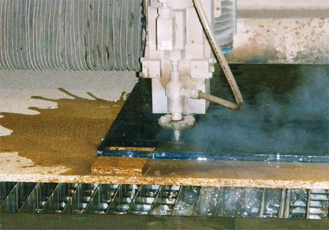
Waterjet Cutting: Gee Graphite
Sheet Material Supply: Smile Plastics
This post was published in the original layout of FPO so all images are smaller. Project descriptions as well as production lessons are quoted in the main content area.
Post Author
Armin

Armin Vit
Editor of FPO and co-founder of UnderConsideration LLC.
More: Online / On Twitter
Date Published
June 17, 2009
Filed Under
Business Cards
Foil stamp
Tagged with
fluorescent
foil block
foil stamp
thick
waterjet cutting


About
FPO (For Print Only), is a division of UnderConsideration, celebrating the reality that print is not dead by showcasing the most compelling printed projects.
FPO uses Fonts.com to render Siseriff and Avenir Next.
FPO is run with Six Apart’s MovableType
All comments, ideas and thoughts on FPO are property of their authors; reproduction without the author’s or FPO’s permission is strictly prohibited
Twitter @ucllc
Sign-up for Mailing List
Mailing list managed by MailChimp
Thanks to our advertisers
About UnderConsideration
UnderConsideration is a graphic design firm generating its own projects, initiatives, and content while taking on limited client work. Run by Bryony Gomez-Palacio and Armin Vit in Bloomington, IN. More…
blogs we publish
Brand New / Displaying opinions and focusing solely on corporate and brand identity work.
Art of the Menu / Cataloguing the underrated creativity of menus from around the world.
Quipsologies / Chronicling the most curious, creative, and notable projects, stories, and events of the graphic design industry on a daily basis.
products we sell
Flaunt: Designing effective, compelling and memorable portfolios of creative work.
Brand New Conference videos / Individual, downloadable videos of every presentation since 2010.
Prints / A variety of posters, the majority from our AIforGA series.
Other / Various one-off products.
events we organize
Brand New Conference / A two-day event on corporate and brand identity with some of today's most active and influential practitioners from around the world.
Brand Nieuwe Conference / Ditto but in Amsterdam.
Austin Initiative for Graphic Awesomeness / A speaker series in Austin, TX, featuring some of the graphic design industry's most awesome people.
also
Favorite Things we've Made / In our capacity as graphic designers.
Projects we've Concluded / Long- and short-lived efforts.
UCllc News / Updates on what's going at the corporate level of UnderConsideration.

Related entries
KitchenAid Limited Edition Cards
Black Sheep Studio Business Cards and Promotional Items
Seegno Business Cards
Fracas Productions Business Cards
Elegante Press Business card