ADV @ UNDERCONSIDERATION Peek here for details
BROWSE
Client
Kunstenaars&CO
Quantity Produced
1,000
Production Cost
€5.800 (US$8,100) plus vat/tax
€400 (US$560) for Guitar Picks
Production Time
3 – 4 Weeks
Dimensions (Width × Height × Depth)
16.5 cm. x 22 cm. (6.5 in. × 8.66 in.)
Page Count
44 plus cover
Paper Stock
Cover and Interior: Lessebo Design
Scratch-off Pages: Go! Silk
Number of Colors
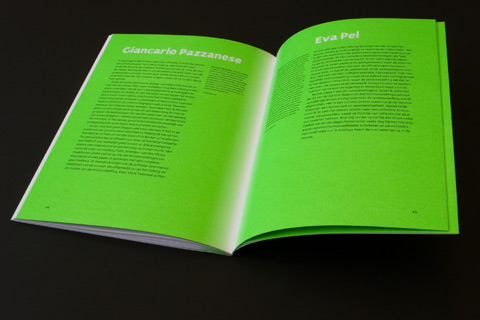
2 spots, black and fluorescent green
CMYK
Two scratch-off inks
Varnishes
Two kinds, and placed between the CMYK and the scratch off layers
Binding
Perfect bound
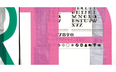
Typography
Actium [PDF] by Type Mafia
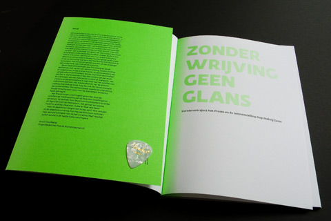
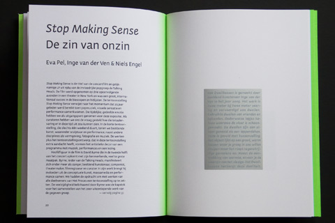
This book for Kunstenaars, Cultuur en Ondernemerschap (Artists, Culture and Entrepreneurship), a Dutch non-profit organisation that stimulates and supports artists in raising their levels of professionalism and developing new areas of work, focuses on an exhibition of the works produced at a workshop about exhibit design. The exhibit and the book had an unusual inspiration, as the book’s designer, Gerben Dollen, explains:
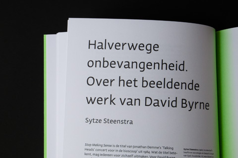
The curators of this exhibition based their concept on the work and thoughts of David Byrne. For this reason the design of the publication had also to be built upon this; this article [PDF] was a great help.
And on his design intentions, he offers:
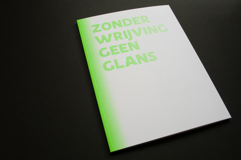
The show was held in a property located in the red light district of Amsterdam; I took that element as a starting point and turned it the other way round by putting a green light (red’s opposite) into the book’s spine.
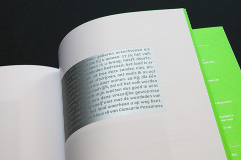
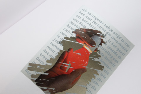
In the book images of the exposed art works are covered with a silver scratch-off ink layer, and, on top of that a text layer is printed. So the end user has to make an irrevocable choice: stay with the informal text about the artwork or scratch it off for an image of the art work itself. In addition it’s a collaboration between the designer, photographer and end-user of the booklet. And because David Byrne plays a Fender guitar, including Fender guitar picks would sure be best as it links both to the scratch-off layers as it does to Mr. Byrne.
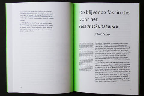
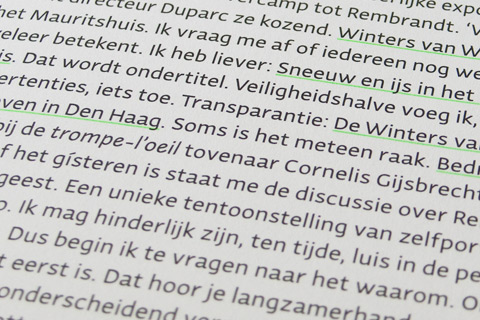
The book also uses Gerben’s own Actium [PDF] typeface, which paired with the simple layouts and awesomely fluorescent green makes this a truly energetic and contemporary publication. The scratch-off layers are indeed too nice and well laid out to encourage scratching off, but you are rewarded by very nicely photographed projects. Another aspect I really liked about this was the title, “Zonder Wrijving Geen Glans,” a Dutch saying that very roughly translates to “Without Polishing there is no Gloss.” A nice bit of life advice, if you ask me. Oh, and the Fender pick? It’s nice and pearly.
The green gradient in the spine seems easy to print well but actually it was difficult to print stepless. The experts at Calff & Meischke kindly printed a couple of samples on press in order to get that effect right and perfect.

The silver scratch off surfaces turned out to damage too easily during the mechanized production process, so in the end all booklets had to be fold and bounded by hand to leave it intact for the end-users/readers.
Zonder Wrijving Geen Glans Book
Production Method
Offset
Silkscreen
Design
Design: Type Mafia (Gerben Dollen)
Photography: Isolde Woudstra
Editor: Inge van der Ven
Printing
Offset: Calff & Meischke
Silk Screen: SilkScreen Holland BV
This post was published in the original layout of FPO so all images are smaller. Project descriptions as well as production lessons are quoted in the main content area.
Post Author
Armin

Armin Vit
Editor of FPO and co-founder of UnderConsideration LLC.
More: Online / On Twitter
Date Published
June 8, 2009
Filed Under
Books
Offset
Silkscreen
Tagged with
fluorescent
offset
scratch-off


About
FPO (For Print Only), is a division of UnderConsideration, celebrating the reality that print is not dead by showcasing the most compelling printed projects.
FPO uses Fonts.com to render Siseriff and Avenir Next.
FPO is run with Six Apart’s MovableType
All comments, ideas and thoughts on FPO are property of their authors; reproduction without the author’s or FPO’s permission is strictly prohibited
Twitter @ucllc
Sign-up for Mailing List
Mailing list managed by MailChimp
Thanks to our advertisers
About UnderConsideration
UnderConsideration is a graphic design firm generating its own projects, initiatives, and content while taking on limited client work. Run by Bryony Gomez-Palacio and Armin Vit in Bloomington, IN. More…
blogs we publish
Brand New / Displaying opinions and focusing solely on corporate and brand identity work.
Art of the Menu / Cataloguing the underrated creativity of menus from around the world.
Quipsologies / Chronicling the most curious, creative, and notable projects, stories, and events of the graphic design industry on a daily basis.
products we sell
Flaunt: Designing effective, compelling and memorable portfolios of creative work.
Brand New Conference videos / Individual, downloadable videos of every presentation since 2010.
Prints / A variety of posters, the majority from our AIforGA series.
Other / Various one-off products.
events we organize
Brand New Conference / A two-day event on corporate and brand identity with some of today's most active and influential practitioners from around the world.
Brand Nieuwe Conference / Ditto but in Amsterdam.
Austin Initiative for Graphic Awesomeness / A speaker series in Austin, TX, featuring some of the graphic design industry's most awesome people.
also
Favorite Things we've Made / In our capacity as graphic designers.
Projects we've Concluded / Long- and short-lived efforts.
UCllc News / Updates on what's going at the corporate level of UnderConsideration.

Related entries
Severe(d): A Creepy Poetry Collection by Holly Riordan
BOYCO Classpack® Book
Antes de Perder la Esperanza Book
Gunnel Wåhlstrand Exhibit Book
Szép versek & Körkép Book Covers