ADV @ UNDERCONSIDERATION Peek here for details
BROWSE
Dimensions (Width × Height × Depth)
5.25 in. × 8 in.
Page Count
128
Paper Stock
Uncoated, 80 lb. Text
Number of Colors
CMYK
Varnishes
Matte Aqueous
Binding
Half-bound Hardcover, Smythe Sewn
Typography
Trade Gothic, New Baskerville, Fenway Park
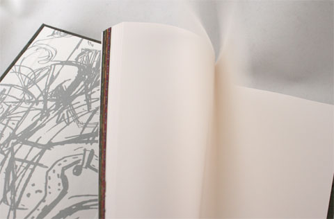
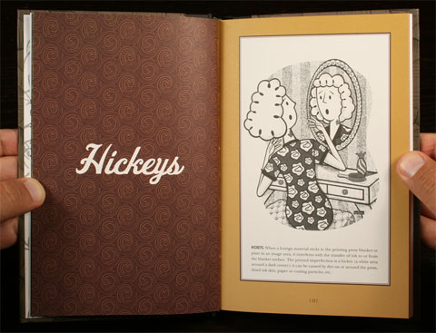
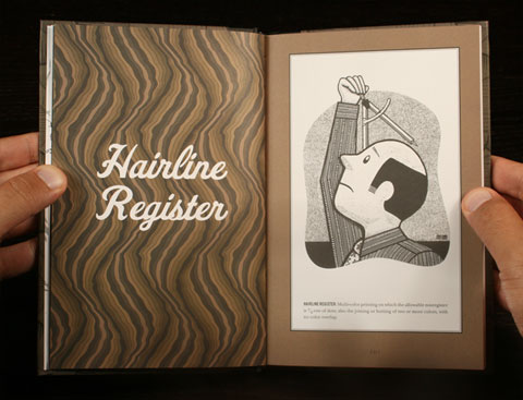
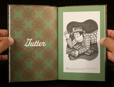
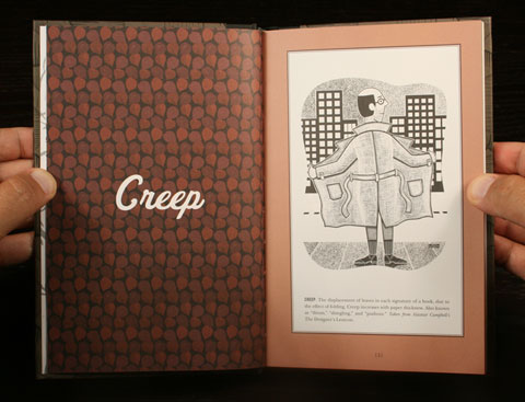
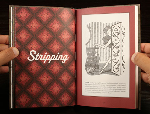
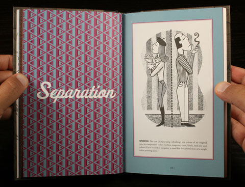
In this enjoyable promotion by Salem, Massachusetts based Deschamps Printing, illustrator Nick Ramos has interpreted some of the most common printing terms in humorous vignettes. Funnily enough, a lot of them have a sexual undertone: Creep, score, stripping, and hickeys are probably some that already make you snicker. Handsomely designed by Jose Nieto of Square Zero, the promotional uses only a few pages at the beginning to share the illustrations and explain the terms, while the rest of the uncoated pages serve as a sturdy notebook for sketching your next print job. The half-bound technique on the cover gives it a nice academic feel that is very well offset (pun!) by the fun combination of elegant patterns, Nick’s illustrations and the typeface Fenway Park, which always smells like vintage goodness.
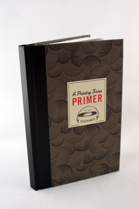

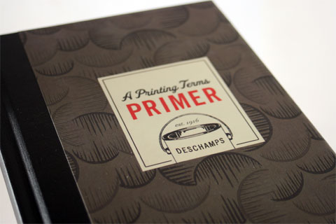
Deschamps’ A Printing Terms Primer
Production Method
Offset
Design
Design: Square Zero
Illustration: Nick Ramos
Copywriting: Jason Rubin
Printing
Deschamps Printing
This post was published in the original layout of FPO so all images are smaller. Project descriptions as well as production lessons are quoted in the main content area.
Post Author
Armin

Armin Vit
Editor of FPO and co-founder of UnderConsideration LLC.
More: Online / On Twitter
Date Published
July 8, 2009
Filed Under
Books
Offset
Tagged with
half-bound
pattern
printer promotion
smythe sewn


About
FPO (For Print Only), is a division of UnderConsideration, celebrating the reality that print is not dead by showcasing the most compelling printed projects.
FPO uses Fonts.com to render Siseriff and Avenir Next.
FPO is run with Six Apart’s MovableType
All comments, ideas and thoughts on FPO are property of their authors; reproduction without the author’s or FPO’s permission is strictly prohibited
Twitter @ucllc
Sign-up for Mailing List
Mailing list managed by MailChimp
Thanks to our advertisers
About UnderConsideration
UnderConsideration is a graphic design firm generating its own projects, initiatives, and content while taking on limited client work. Run by Bryony Gomez-Palacio and Armin Vit in Bloomington, IN. More…
blogs we publish
Brand New / Displaying opinions and focusing solely on corporate and brand identity work.
Art of the Menu / Cataloguing the underrated creativity of menus from around the world.
Quipsologies / Chronicling the most curious, creative, and notable projects, stories, and events of the graphic design industry on a daily basis.
products we sell
Flaunt: Designing effective, compelling and memorable portfolios of creative work.
Brand New Conference videos / Individual, downloadable videos of every presentation since 2010.
Prints / A variety of posters, the majority from our AIforGA series.
Other / Various one-off products.
events we organize
Brand New Conference / A two-day event on corporate and brand identity with some of today's most active and influential practitioners from around the world.
Brand Nieuwe Conference / Ditto but in Amsterdam.
Austin Initiative for Graphic Awesomeness / A speaker series in Austin, TX, featuring some of the graphic design industry's most awesome people.
also
Favorite Things we've Made / In our capacity as graphic designers.
Projects we've Concluded / Long- and short-lived efforts.
UCllc News / Updates on what's going at the corporate level of UnderConsideration.

Related entries
Severe(d): A Creepy Poetry Collection by Holly Riordan
BOYCO Classpack® Book
Antes de Perder la Esperanza Book
Gunnel Wåhlstrand Exhibit Book
Szép versek & Körkép Book Covers