ADV @ UNDERCONSIDERATION Peek here for details
BROWSE
Client
Recordings of Thin Consolation
Quantity Produced
500
Production Cost
€150 (US$210), cardborad processing
€56 (US$210), Silkscreen
€20 (US$28), rubber bands
€210 (US$295), Total
Production Time
2 weeks
Dimensions (Width × Height × Depth)
Folded: 17 cm. × 13.5�cm. (6.7 in. × 5.3 in.)
Flat: 17 cm. × 40 cm. (6.7 in. × 15.75 in.)
Page Count
–
Paper Stock
Standard grey cardboard, 450 g/m2 (grams per square meter).
Number of Colors
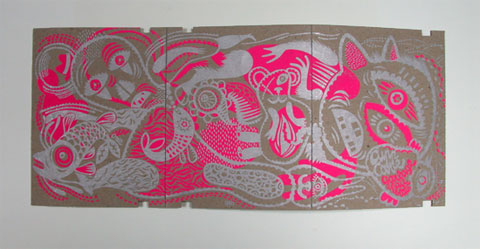
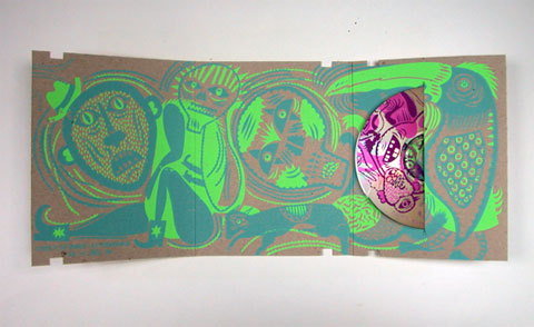
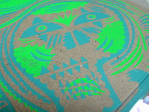
5 spot colors (cyan, purple, metallic silver, pink fluo, fluorescent green)
Varnishes
–
Binding
–
Typography
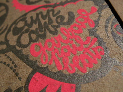
Hand-drawn type
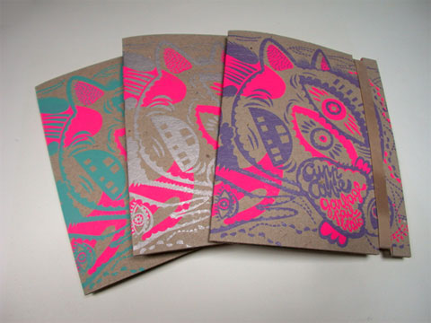
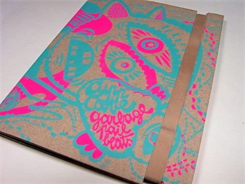
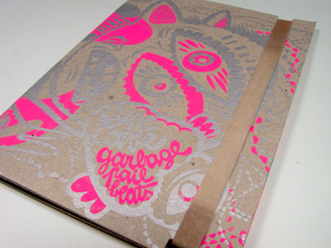
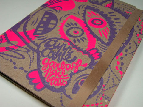
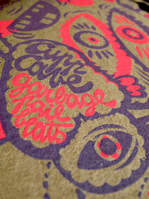
Working with the trippy and happy illustrations of Oreli, the design and print team at Recordings of Thin Consolation worked to create a package that matched the “rump-shaking, head-nodding, feet-shuffling slap in the face,” music of Cupp Cave’s “Garbage Pail Beats” album, striving for a “hip hop,” “crazy” and slightly “bling bling” look. While the illustrations certainly convey much of the mood of the package, the color selection helps take it to another extreme and while you would think it was all carefully premeditated it wasn’t. David at Recordings of Thin Consolation explains:
The colors choice was really difficult. Firstly, Oreli designed it to be in Gold and Black. We were not so convinced. Finally, fluorescent pink and green were picked for the “backgound” colors and we decided to print it with 3 different foreground colors: Silver, Purple and Cyan. Think video games, 1980s, Miami. We started with the silver for the bling-bling and fluo.
Part of the team wasn’t so convinced by the silver, but we had already printed 250 copies… Then we started to think to others colors, and we decided purple. Problem, we didn’t have enough purple to finish all the sleeves but there was a pullover of pink and cyan left in the print shop that was so cool!
With this “mistake”, we can make people 3 times more happy, they can choose the sleeve they like the most and we like to give a choice, and with screenprinting it’s so easy (and a bit less boring when you print) to change the colors, so why don’t do it?
Paired with the cardboard box, the color selections make these packages look extra juicy and fun. And the rubber band, holding the DVD-sized triptych together, gives it a contemporary feel as well. I’m sure the “Garbage Pail Beats” CD won’t have any problems making people happy.

This post was published in the original layout of FPO so all images are smaller. Project descriptions as well as production lessons are quoted in the main content area.
Post Author
Armin

Armin Vit
Editor of FPO and co-founder of UnderConsideration LLC.
More: Online / On Twitter
Date Published
July 28, 2009
Filed Under
Music Packaging
Tagged with
cardboard
fluorescent
silkscreen
variety


About
FPO (For Print Only), is a division of UnderConsideration, celebrating the reality that print is not dead by showcasing the most compelling printed projects.
FPO uses Fonts.com to render Siseriff and Avenir Next.
FPO is run with Six Apart’s MovableType
All comments, ideas and thoughts on FPO are property of their authors; reproduction without the author’s or FPO’s permission is strictly prohibited
Twitter @ucllc
Sign-up for Mailing List
Mailing list managed by MailChimp
Thanks to our advertisers
About UnderConsideration
UnderConsideration is a graphic design firm generating its own projects, initiatives, and content while taking on limited client work. Run by Bryony Gomez-Palacio and Armin Vit in Bloomington, IN. More…
blogs we publish
Brand New / Displaying opinions and focusing solely on corporate and brand identity work.
Art of the Menu / Cataloguing the underrated creativity of menus from around the world.
Quipsologies / Chronicling the most curious, creative, and notable projects, stories, and events of the graphic design industry on a daily basis.
products we sell
Flaunt: Designing effective, compelling and memorable portfolios of creative work.
Brand New Conference videos / Individual, downloadable videos of every presentation since 2010.
Prints / A variety of posters, the majority from our AIforGA series.
Other / Various one-off products.
events we organize
Brand New Conference / A two-day event on corporate and brand identity with some of today's most active and influential practitioners from around the world.
Brand Nieuwe Conference / Ditto but in Amsterdam.
Austin Initiative for Graphic Awesomeness / A speaker series in Austin, TX, featuring some of the graphic design industry's most awesome people.
also
Favorite Things we've Made / In our capacity as graphic designers.
Projects we've Concluded / Long- and short-lived efforts.
UCllc News / Updates on what's going at the corporate level of UnderConsideration.

Related entries
German Army’s Taushiro Records and Packaging
Lead Belly Box Set
Sound Changes Everything
Ssaliva - Sync Thrill
Ssaliva Record Cover