ADV @ UNDERCONSIDERATION Peek here for details
BROWSE
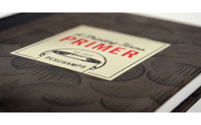
Client
Self Promotion
Quantity Produced
50
Production Cost
$250
Production Time
2 weeks
Dimensions (Width × Height × Depth)
18 in × 24 in
Page Count
–
Paper Stock
65 lb. Cover, Pop-Tone Wild Cherry by French Paper
Number of Colors
1 spot ink
Varnishes
–
Binding
–
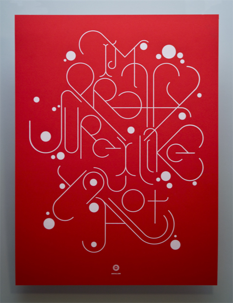
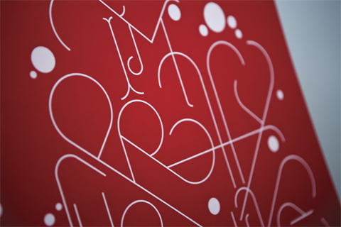
Typography
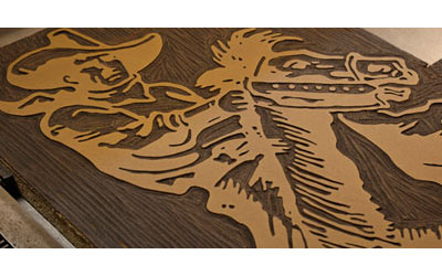
Custom type by Nick Schmitz
When we first received this project we were intrigued by a comment Nick Schmitz added to the end of his form:
If you’re going to print in your kitchen, have all your ducks in a row before you start; things can get awkward quickly.
So, of course, we had to ask him for more information:
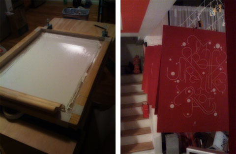
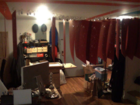
It really all had to do with workflow and knowing that workflow before you start. It had been a while since I had printed anything and I was stoked on the idea of getting into it again. So stoked that I neglected to go over with myself on how I was going to actually get this baby printed from start to finish; particularly since the piece is somewhat large to handle in the space (a relatively small Brooklyn apartment). The first run was a total disaster. Since my space was extremely limited and I didn’t have a drying rack, I quickly ran out of room to put the prints aside to dry, from there things went haywire. My focus quickly went from printing to space management which lead to ink drying in the screen, which lead to clogging, which lead to panic, which lead to a mess, which lead to about two dozen bad prints and a lot of frustration. All this because I didn’t plan well, I focused on the outcome too much and not enough on the process.
Lesson learned.
New day comes around and I sit down and make a plan, set-up a system step-by-step, I even constructed an impromptu dry rack (think of a clothesline except for your prints not for your shirts). Long story short, after some minor trial and error, the system runs pretty well now and from now on it’s happy printing!
We sure are glad to see a better system has been installed, since we look forward to numerous new prints in the future.

This post was published in the original layout of FPO so all images are smaller. Project descriptions as well as production lessons are quoted in the main content area.
Post Author
Bryony

Bryony Gomez-Palacio
Editor of FPO and co-founder of UnderConsideration LLC.
More: Online / On Twitter
Date Published
July 9, 2009
Filed Under
Posters
Tagged with
color paper
DIY
poster
self-promotion
silkscreen
white ink


About
FPO (For Print Only), is a division of UnderConsideration, celebrating the reality that print is not dead by showcasing the most compelling printed projects.
FPO uses Fonts.com to render Siseriff and Avenir Next.
FPO is run with Six Apart’s MovableType
All comments, ideas and thoughts on FPO are property of their authors; reproduction without the author’s or FPO’s permission is strictly prohibited
Twitter @ucllc
Sign-up for Mailing List
Mailing list managed by MailChimp
Thanks to our advertisers
About UnderConsideration
UnderConsideration is a graphic design firm generating its own projects, initiatives, and content while taking on limited client work. Run by Bryony Gomez-Palacio and Armin Vit in Bloomington, IN. More…
blogs we publish
Brand New / Displaying opinions and focusing solely on corporate and brand identity work.
Art of the Menu / Cataloguing the underrated creativity of menus from around the world.
Quipsologies / Chronicling the most curious, creative, and notable projects, stories, and events of the graphic design industry on a daily basis.
products we sell
Flaunt: Designing effective, compelling and memorable portfolios of creative work.
Brand New Conference videos / Individual, downloadable videos of every presentation since 2010.
Prints / A variety of posters, the majority from our AIforGA series.
Other / Various one-off products.
events we organize
Brand New Conference / A two-day event on corporate and brand identity with some of today's most active and influential practitioners from around the world.
Brand Nieuwe Conference / Ditto but in Amsterdam.
Austin Initiative for Graphic Awesomeness / A speaker series in Austin, TX, featuring some of the graphic design industry's most awesome people.
also
Favorite Things we've Made / In our capacity as graphic designers.
Projects we've Concluded / Long- and short-lived efforts.
UCllc News / Updates on what's going at the corporate level of UnderConsideration.

Related entries
36 Days of Type Poster
Ministry of Environment in Colombia Poster
National Parks Map
eBoy Poster
“Love Your Mother” Print