ADV @ UNDERCONSIDERATION Peek here for details
BROWSE
Client
Self Promotion
Quantity Produced
50+ and still counting
Production Cost
$A120 (US$97)
Production Time
2 weeks
Dimensions (Width × Height × Depth)
90 mm. × 50 mm. (3.54 in. × 1.96 in.)
Page Count
–
Paper Stock
Uncoated 350gsm
Number of Colors
1 spot, black.
Varnishes
–
Binding
–
Typography
Compacta BT Roman, Helvetica Neue 57 Condensed, and Helvetica Neue 77 Bold Condensed.
Some print jobs require many hours from its designers while on press, and some print jobs require its designer to sit at the kitchen table for hours on end creating a slew of business cards by carefully stamping each card with two stamps: one for the business name, and one for the contact information. From the photos provided, it looks like Chris has really good aim or a really good registration set-up, because those stamps look evenly placed!
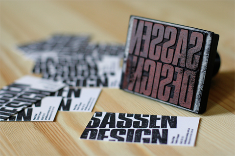

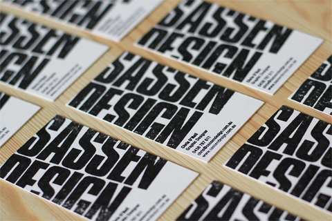
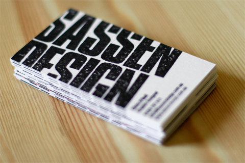
Sassen Design Business Card
Production Method
Design
Chris O'Neil, Sassen Design
Printing
Chris O'Neil, Sassen Design
This post was published in the original layout of FPO so all images are smaller. Project descriptions as well as production lessons are quoted in the main content area.
Post Author
Bryony

Bryony Gomez-Palacio
Editor of FPO and co-founder of UnderConsideration LLC.
More: Online / On Twitter
Date Published
July 22, 2009
Filed Under
Business Cards
Tagged with
black
business card
compacta
helvetica
stamp
uncoated


About
FPO (For Print Only), is a division of UnderConsideration, celebrating the reality that print is not dead by showcasing the most compelling printed projects.
FPO uses Fonts.com to render Siseriff and Avenir Next.
FPO is run with Six Apart’s MovableType
All comments, ideas and thoughts on FPO are property of their authors; reproduction without the author’s or FPO’s permission is strictly prohibited
Twitter @ucllc
Sign-up for Mailing List
Mailing list managed by MailChimp
Thanks to our advertisers
About UnderConsideration
UnderConsideration is a graphic design firm generating its own projects, initiatives, and content while taking on limited client work. Run by Bryony Gomez-Palacio and Armin Vit in Bloomington, IN. More…
blogs we publish
Brand New / Displaying opinions and focusing solely on corporate and brand identity work.
Art of the Menu / Cataloguing the underrated creativity of menus from around the world.
Quipsologies / Chronicling the most curious, creative, and notable projects, stories, and events of the graphic design industry on a daily basis.
products we sell
Flaunt: Designing effective, compelling and memorable portfolios of creative work.
Brand New Conference videos / Individual, downloadable videos of every presentation since 2010.
Prints / A variety of posters, the majority from our AIforGA series.
Other / Various one-off products.
events we organize
Brand New Conference / A two-day event on corporate and brand identity with some of today's most active and influential practitioners from around the world.
Brand Nieuwe Conference / Ditto but in Amsterdam.
Austin Initiative for Graphic Awesomeness / A speaker series in Austin, TX, featuring some of the graphic design industry's most awesome people.
also
Favorite Things we've Made / In our capacity as graphic designers.
Projects we've Concluded / Long- and short-lived efforts.
UCllc News / Updates on what's going at the corporate level of UnderConsideration.

Related entries
KitchenAid Limited Edition Cards
Black Sheep Studio Business Cards and Promotional Items
Seegno Business Cards
Fracas Productions Business Cards
Elegante Press Business card