ADV @ UNDERCONSIDERATION Peek here for details
BROWSE
Dimensions (Width × Height × Depth)
3.5 in. × 2 in.
Page Count
–
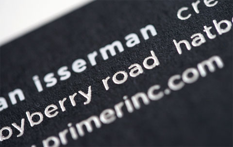
Paper Stock
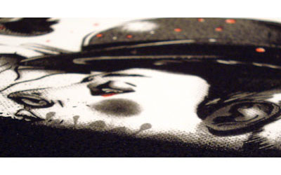
Carnival Vellum 80 lb. Cover, New Black
Number of Colors
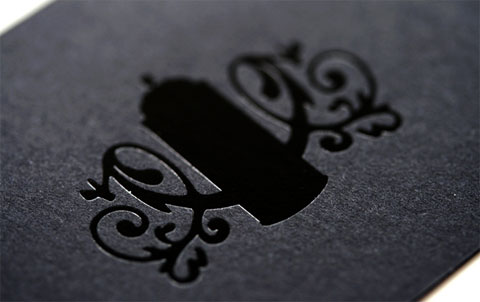
3 foils, white, silver and clear
Business cards are loved by designers and non-designers when nicely done. First impressions, memorable contacts and interesting conversations often start as one of these little pieces of paper are handed out. Brian Isserman and Lawrence O’Toole wanted to make sure they had a memorable card to put out—they started with a good vendor who helped them figure out what the best solutions were based on what they wanted to achieve. Here are a two valuable things they learned:
1. Using clear foil was a better solution than using black foil on black paper to mimic a high gloss texture.
2. Finding the exact combination of paper weight and stamp pressure ensures that no push through — when you can see the effects of the stamp on the other side of the paper — was created.
Finally, selecting a colored paper is no easy task, especially when it comes to black. So we asked Brian and Lawrence for a little guidance based on their particular needs:
The paper we selected for this project was ideal for foil stamping and fit the overall brand feel that we are trying to establish. We wanted to find a stock that was heavy and had a smooth finish while still having a bit of tooth. Another valuable aspect was the variety of companion papers and forms the Carnival Vellum stock came in. We wanted to plan ahead to make sure that the items we created in the future would match our existing paper choices. It is extremely important to think ahead when selected a stock to keep a brands identity consistent.
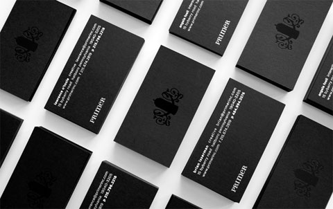

Primer Business Cards
Production Method
Design
Brian Isserman and Lawrence O'Toole
Printing
RoyerComm
This post was published in the original layout of FPO so all images are smaller. Project descriptions as well as production lessons are quoted in the main content area.
Post Author
Bryony

Bryony Gomez-Palacio
Editor of FPO and co-founder of UnderConsideration LLC.
More: Online / On Twitter
Date Published
August 13, 2009
Filed Under
Business Cards
Tagged with
black paper
business card
foil stamp


About
FPO (For Print Only), is a division of UnderConsideration, celebrating the reality that print is not dead by showcasing the most compelling printed projects.
FPO uses Fonts.com to render Siseriff and Avenir Next.
FPO is run with Six Apart’s MovableType
All comments, ideas and thoughts on FPO are property of their authors; reproduction without the author’s or FPO’s permission is strictly prohibited
Twitter @ucllc
Sign-up for Mailing List
Mailing list managed by MailChimp
Thanks to our advertisers
About UnderConsideration
UnderConsideration is a graphic design firm generating its own projects, initiatives, and content while taking on limited client work. Run by Bryony Gomez-Palacio and Armin Vit in Bloomington, IN. More…
blogs we publish
Brand New / Displaying opinions and focusing solely on corporate and brand identity work.
Art of the Menu / Cataloguing the underrated creativity of menus from around the world.
Quipsologies / Chronicling the most curious, creative, and notable projects, stories, and events of the graphic design industry on a daily basis.
products we sell
Flaunt: Designing effective, compelling and memorable portfolios of creative work.
Brand New Conference videos / Individual, downloadable videos of every presentation since 2010.
Prints / A variety of posters, the majority from our AIforGA series.
Other / Various one-off products.
events we organize
Brand New Conference / A two-day event on corporate and brand identity with some of today's most active and influential practitioners from around the world.
Brand Nieuwe Conference / Ditto but in Amsterdam.
Austin Initiative for Graphic Awesomeness / A speaker series in Austin, TX, featuring some of the graphic design industry's most awesome people.
also
Favorite Things we've Made / In our capacity as graphic designers.
Projects we've Concluded / Long- and short-lived efforts.
UCllc News / Updates on what's going at the corporate level of UnderConsideration.

Related entries
KitchenAid Limited Edition Cards
Black Sheep Studio Business Cards and Promotional Items
Seegno Business Cards
Fracas Productions Business Cards
Elegante Press Business card