ADV @ UNDERCONSIDERATION Peek here for details
BROWSE
Client
–
Quantity Produced
150
Production Cost
$60 spent on the cover stock, as all other materials were donated.
Production Time
10 months
Dimensions (Width × Height × Depth)
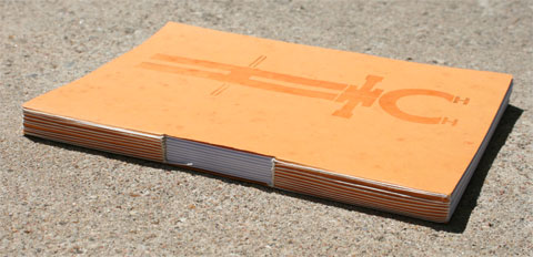
6.5 in. × 9 in. × .75 in.
Page Count
11 pages + 9 gatefolds
Paper Stock
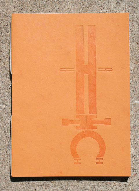
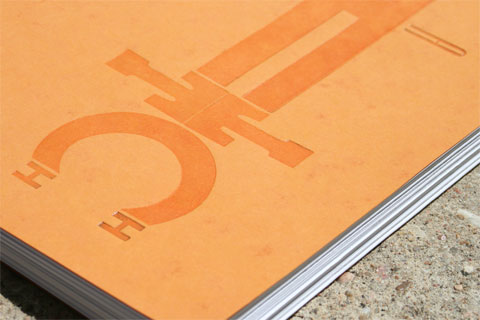
French Dur-O-Tone Orange Butcher 80lb. cover
Lynx Soft White 80lb. cover
Donated by B.W. Wilson, Richmond, Virginia.
Number of Colors
Each gatefold is different
Varnishes
Spot varnish on cover
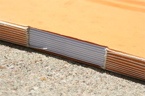
Binding
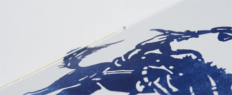
Buttonhole stitch, found in the book Volume I Non-Adhesive Binding: Books Without Paste or Glue by Keith Smith
Typography
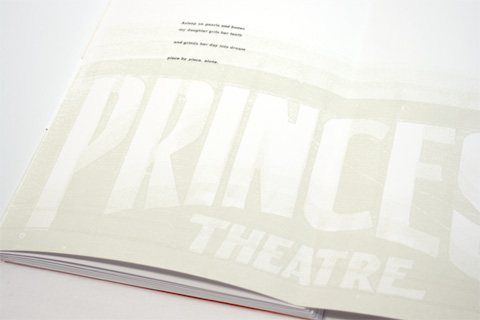
The cover and title page are created using various wood fonts. The introduction and credits are set in Bembo 14pt. English Monotype by The Letterfoundry of Michael & Winifred Bixler of Scaneateles, New York.
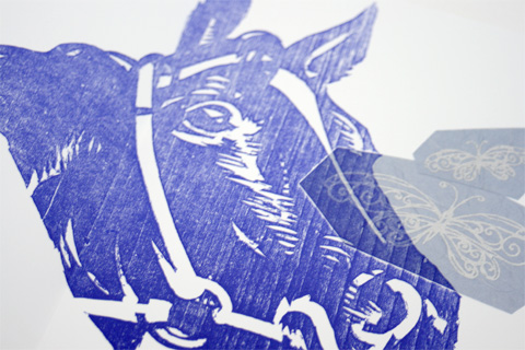
Instructor Jamie B. Mahoney set out to develop a unique project for her students at Virginia Commonwealth University. Along the way she asked her friend Jim Sherraden, from Hatch Show Print, to lend a hand—or, specifically, woodblocks.
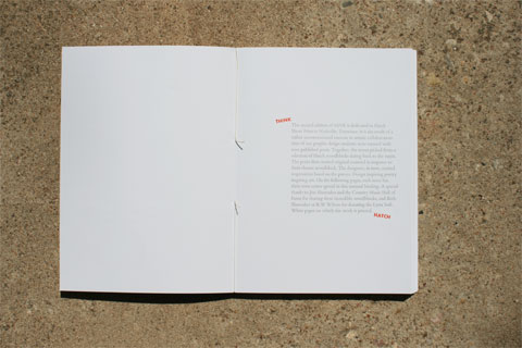
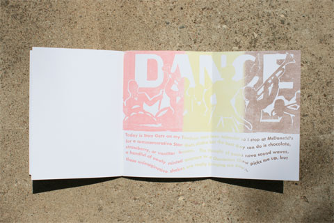
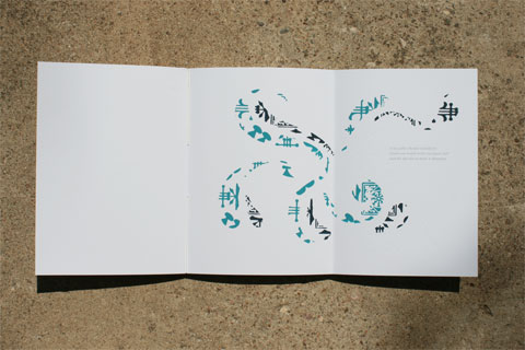
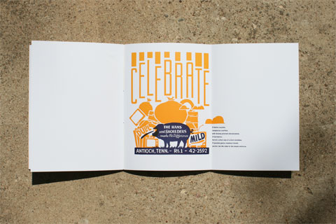
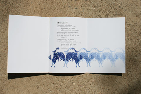
This, our second issue is dedicated to Hatch Show Print in Nashville, Tennessee. It is the result of a rather unconventional exercise in artistic collaboration: nine graphic design students were teamed with nine published poets. Together, the teams picked from a selection of Hatch woodblocks dating back to the 1930s. The poets then created original material in response to their chosen woodblock. The designers, in turn, created impressions based on the poems. Design inspiring poetry inspiring art.
Jamie and a handful of students have been slowly binding the books, stitching each book in teams of three in fifteen minutes or so. While only 150 copies are produced they are hoping the sale of these will help fund the materials they are needing in the studio: rollers for 2 presses, ink, paper and more wood type for starters.
This book is a rare beauty, one where personality is apparent from the moment you feel the paper, touch the letterpressed letters and study the binding. Further developed by the uniqueness of each gatefold, each student strongly voicing who they are—this is all brought together by continuing elements such as the titling of each work presented and the cohesiveness in structure. But it is possible that the most successful aspect of this project is the intangible, that which was discovered by Jamie over several months:
Designers and writers make a great team. It took a while for my students to understand that this relationship is much different than a client relationship. In the beginning they didn’t see themselves as having an equal say in the process but as soon as they understood the writer was their partner, the work got so much better.

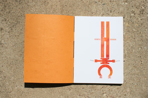
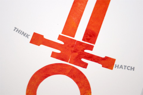
thINK Chapbook
Production Method
Design
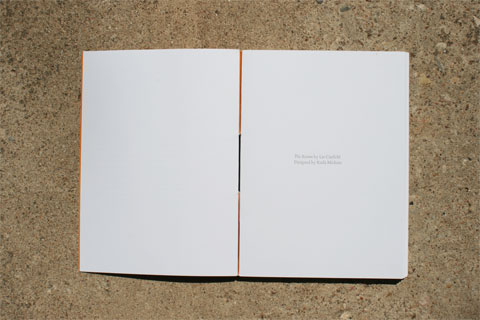
Book design, Jamie Mahoney VCUarts.
Student designers, Karla Mickens, Kelly Gasque, Rachel Gropper, Jordan Weaver, Jennifer Valenzuela, Eric Wolinsky, Sean O'Neill, Jordan Tropp, and Caitlin Martin.
Printing
Woodblocks by Hatch Show Print, Nashville, Tennessee.
Poetry spreads printed by graphic design students at VCUarts Bowe House Press, using a Vandercook 4 Hand Proof Press.
This post was published in the original layout of FPO so all images are smaller. Project descriptions as well as production lessons are quoted in the main content area.
Post Author
Bryony

Bryony Gomez-Palacio
Editor of FPO and co-founder of UnderConsideration LLC.
More: Online / On Twitter
Date Published
August 24, 2009
Filed Under
Books
Tagged with
book
dur-o-tone
hatch show
letterpress
woodblock


About
FPO (For Print Only), is a division of UnderConsideration, celebrating the reality that print is not dead by showcasing the most compelling printed projects.
FPO uses Fonts.com to render Siseriff and Avenir Next.
FPO is run with Six Apart’s MovableType
All comments, ideas and thoughts on FPO are property of their authors; reproduction without the author’s or FPO’s permission is strictly prohibited
Twitter @ucllc
Sign-up for Mailing List
Mailing list managed by MailChimp
Thanks to our advertisers
About UnderConsideration
UnderConsideration is a graphic design firm generating its own projects, initiatives, and content while taking on limited client work. Run by Bryony Gomez-Palacio and Armin Vit in Bloomington, IN. More…
blogs we publish
Brand New / Displaying opinions and focusing solely on corporate and brand identity work.
Art of the Menu / Cataloguing the underrated creativity of menus from around the world.
Quipsologies / Chronicling the most curious, creative, and notable projects, stories, and events of the graphic design industry on a daily basis.
products we sell
Flaunt: Designing effective, compelling and memorable portfolios of creative work.
Brand New Conference videos / Individual, downloadable videos of every presentation since 2010.
Prints / A variety of posters, the majority from our AIforGA series.
Other / Various one-off products.
events we organize
Brand New Conference / A two-day event on corporate and brand identity with some of today's most active and influential practitioners from around the world.
Brand Nieuwe Conference / Ditto but in Amsterdam.
Austin Initiative for Graphic Awesomeness / A speaker series in Austin, TX, featuring some of the graphic design industry's most awesome people.
also
Favorite Things we've Made / In our capacity as graphic designers.
Projects we've Concluded / Long- and short-lived efforts.
UCllc News / Updates on what's going at the corporate level of UnderConsideration.

Related entries
Severe(d): A Creepy Poetry Collection by Holly Riordan
BOYCO Classpack® Book
Antes de Perder la Esperanza Book
Gunnel Wåhlstrand Exhibit Book
Szép versek & Körkép Book Covers