ADV @ UNDERCONSIDERATION Peek here for details
BROWSE
Dimensions (Width × Height × Depth)
6.75 in. × 8.125 in.
Page Count
100
Paper Stock
Cover: Neenah Oxford Textured, Smoked, 100 lb. Cover
Branded Cover Page: Sappi Galerie Art Gloss, White, 100 lb. Gloss Cover
Body: Finch Opaque Vellum, Vanilla, 60 lb. Text
Label: Neenah Classic Crest, Natural White
Number of Colors
Opaque White (3 hits) + CMYK + 2 Spot colors (PMS 7531 and 3252)
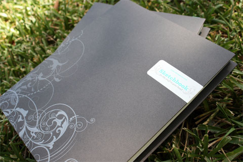
A simple item with various complicated details, including multiple paper stocks, different printing techniques and a tricky binding. This sketchbook caught my eye not only because of its perfect size, and the fact that the wire-o allows me to conveniently fold it over, but the paper color and the cover. Most sketchbooks tend to use white paper, or a more subtle cream color — I like the boldness of this vanilla tone. And the cover has a depth of texture and pattern derived from the use of a wrap-around label and three hits of opaque white ink:
I wanted the cover to be somewhat elegant and understated, and I knew I wanted to use a colored, textured stock to give it a nice tactile quality. The triple hit of white was not something I had done previously, but after consulting with Brad Scull from Yorke (the printer), it seemed a solution that would work with those two requirements, and the varying opacities of each pass gave the illustration some extra visual interest.
A successful goal that I will happily tote around in my bag.

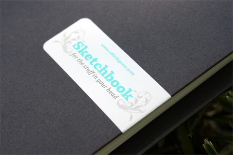
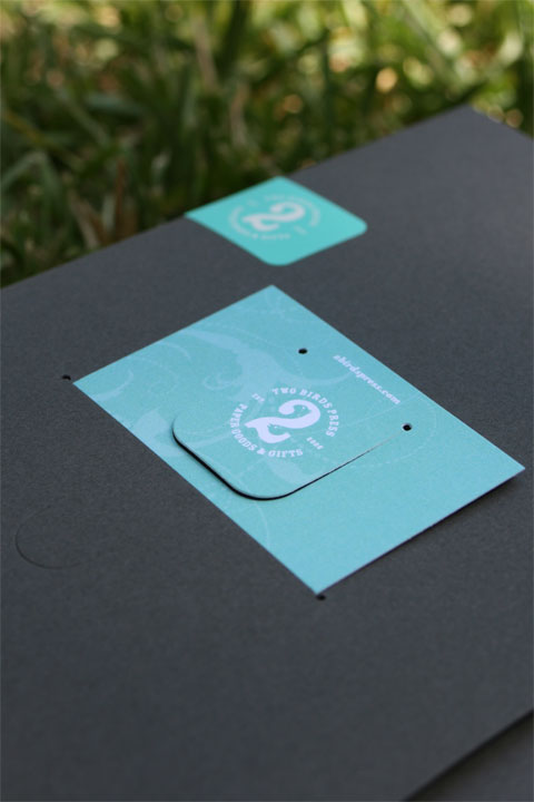
Wrap around sticker.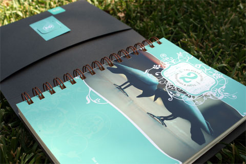
Slots for a bookmark, and other personal items.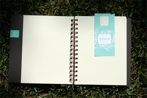
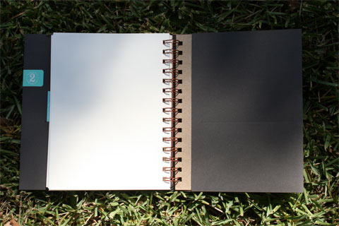

Detail of inside back cover slot where you can keep found items.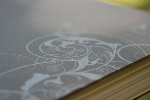
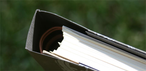
Here you can see every item needed for this hidden binding, including the thicker cardboard that provides a sturdy weight to the back cover for easier use.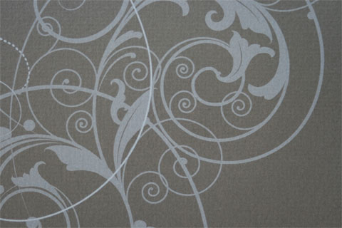
Triple hit of opaque white ink allows for various degrees of tone to create subtle changes in the pattern.
Two Birds Sketchbook
Production Method
Design
James Boborci, Emu Design Studio
Printing
Yorke Printe Shoppe
Bindery: Phoenix
Die Cutting: Intra-Cut
Label Production: MSA

This post was published in the original layout of FPO so all images are smaller. Project descriptions as well as production lessons are quoted in the main content area.
Post Author
Bryony

Bryony Gomez-Palacio
Editor of FPO and co-founder of UnderConsideration LLC.
More: Online / On Twitter
Date Published
August 18, 2009
Filed Under
Journals
Tagged with
blank
bookmark
CMYK
die-cut
label
sketchbook
triple-hit
wire-o


About
FPO (For Print Only), is a division of UnderConsideration, celebrating the reality that print is not dead by showcasing the most compelling printed projects.
FPO uses Fonts.com to render Siseriff and Avenir Next.
FPO is run with Six Apart’s MovableType
All comments, ideas and thoughts on FPO are property of their authors; reproduction without the author’s or FPO’s permission is strictly prohibited
Twitter @ucllc
Sign-up for Mailing List
Mailing list managed by MailChimp
Thanks to our advertisers
About UnderConsideration
UnderConsideration is a graphic design firm generating its own projects, initiatives, and content while taking on limited client work. Run by Bryony Gomez-Palacio and Armin Vit in Bloomington, IN. More…
blogs we publish
Brand New / Displaying opinions and focusing solely on corporate and brand identity work.
Art of the Menu / Cataloguing the underrated creativity of menus from around the world.
Quipsologies / Chronicling the most curious, creative, and notable projects, stories, and events of the graphic design industry on a daily basis.
products we sell
Flaunt: Designing effective, compelling and memorable portfolios of creative work.
Brand New Conference videos / Individual, downloadable videos of every presentation since 2010.
Prints / A variety of posters, the majority from our AIforGA series.
Other / Various one-off products.
events we organize
Brand New Conference / A two-day event on corporate and brand identity with some of today's most active and influential practitioners from around the world.
Brand Nieuwe Conference / Ditto but in Amsterdam.
Austin Initiative for Graphic Awesomeness / A speaker series in Austin, TX, featuring some of the graphic design industry's most awesome people.
also
Favorite Things we've Made / In our capacity as graphic designers.
Projects we've Concluded / Long- and short-lived efforts.
UCllc News / Updates on what's going at the corporate level of UnderConsideration.

Related entries
MANA Journal 2016
Self-Promotion Typographic Travel Journal
B|D Landscape Architects: Review Journal
“Cisma: Especial Haroldo de Campos” Journal
6400percent Journals