ADV @ UNDERCONSIDERATION Peek here for details
BROWSE
Client
Self-promotion
Quantity Produced
500
Production Cost
Not Disclosed
Production Time
3 weeks
Dimensions (Width × Height × Depth)
25 in × 21 in (× 2 sheets)
Page Count
–
Paper Stock
60 gsm Poster Paper, Grey Pulp Board and Thermal Paper
Number of Colors
CMYK + Pantone 804
Varnishes
–
Binding
–
Typography
Bauer Bodoni
Trade Gothic Condensed
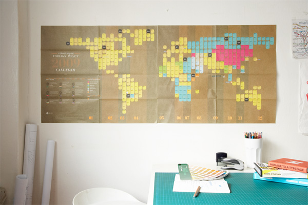
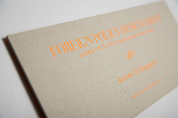
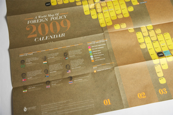
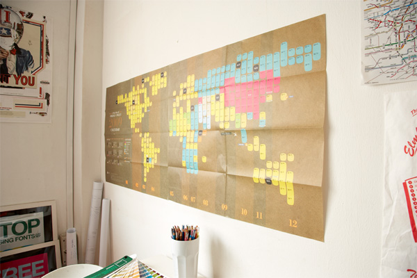
To let the world, or at least Singapore, know of their arrival in the city as a creative force to be reckoned with, the Foreign Policy Design Group decided to create a rather ambitious self-promotional calendar that blends together concepts of current and political affairs, maps, the world and its leaders. The result is an unconventionally arranged calendar that takes the shape of the countries of the world and is very groovily designed with a combination of classic typography and contemporary visual flair. Creative director Yah-Leng Yu provides some thorough insight:
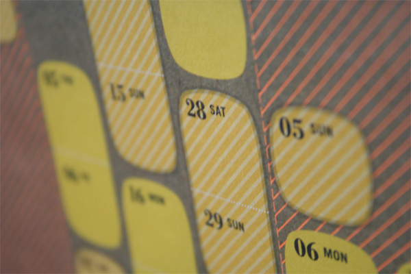
Usability: We wanted to do something unconventional, so we mapped the calendar into a world map. The challenge is to make this as intuitive as possible and have people getting used to learn a new ‘system’. We even brought in people to have them sit or stand in front of the calendar and ask/test them if they know or understand what it really is.
Dimension: Originally we had wanted the calendar to be in one sheet but for three reasons we had to print them in 2: a) usability and folding difficulty; b) the paper we wanted only come in a certain sizes; and c) giving the recipients an option to place the calendar horizontally, from left to right, or have it placed, one above the other, in a vertical arrangement should there be a wall space constraint.
Silkscreening the announcement card: We ran into some challenges in terms of the the thinnest parts of the Bodoni in the descenders, ascenders and serifs were not easy to silkscreen. We had to outline the text with an additional .5 point overall and it worked out.
Colors: The brown textured background needed a lot of calibration and tests so we could achieve as close as to what we wanted, since brown is really one of the most difficult colors to match.
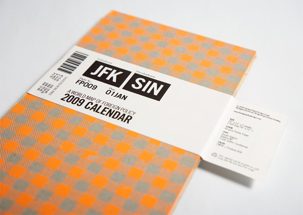
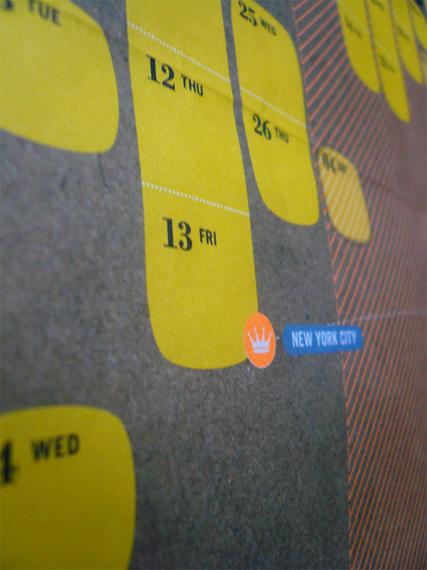
Label: We were trying to figure out how best, most efficient and flexible to produce the airline-tag-looking labels since we needed to send to different people with different addressesso we needed the flexibility, and we prefer to keep it looking like the airline tag almost. After some research, we chanced upon the Brother QL-550 which we needed for the office anyway. Worked out great as we could customize the look and feel of any labels we want from that little printer. It has like raw touch due to the imperfect thermal printing which sort of add to that airline tag feel even more.


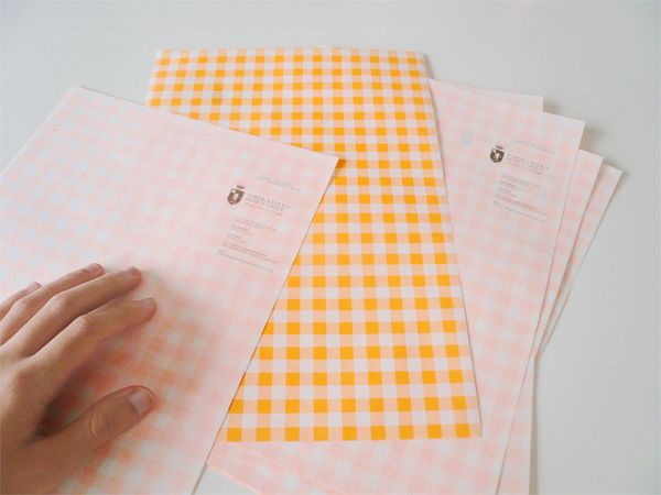
We were able to print some extra notepads & letterheads from the unused areas of the paper. That made us very happy too. :)
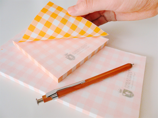
Foreign Policy 2009 Calendar
Production Method
Design
Foreign Policy Design Group
Creative Direction/Art Direction: Yah-Leng Yu
Design: TY Zheng
Writing: Arthur Chin
Printing
pH Productions
This post was published in the original layout of FPO so all images are smaller. Project descriptions as well as production lessons are quoted in the main content area.


About
FPO (For Print Only), is a division of UnderConsideration, celebrating the reality that print is not dead by showcasing the most compelling printed projects.
FPO uses Fonts.com to render Siseriff and Avenir Next.
FPO is run with Six Apart’s MovableType
All comments, ideas and thoughts on FPO are property of their authors; reproduction without the author’s or FPO’s permission is strictly prohibited
Twitter @ucllc
Sign-up for Mailing List
Mailing list managed by MailChimp
Thanks to our advertisers
About UnderConsideration
UnderConsideration is a graphic design firm generating its own projects, initiatives, and content while taking on limited client work. Run by Bryony Gomez-Palacio and Armin Vit in Bloomington, IN. More…
blogs we publish
Brand New / Displaying opinions and focusing solely on corporate and brand identity work.
Art of the Menu / Cataloguing the underrated creativity of menus from around the world.
Quipsologies / Chronicling the most curious, creative, and notable projects, stories, and events of the graphic design industry on a daily basis.
products we sell
Flaunt: Designing effective, compelling and memorable portfolios of creative work.
Brand New Conference videos / Individual, downloadable videos of every presentation since 2010.
Prints / A variety of posters, the majority from our AIforGA series.
Other / Various one-off products.
events we organize
Brand New Conference / A two-day event on corporate and brand identity with some of today's most active and influential practitioners from around the world.
Brand Nieuwe Conference / Ditto but in Amsterdam.
Austin Initiative for Graphic Awesomeness / A speaker series in Austin, TX, featuring some of the graphic design industry's most awesome people.
also
Favorite Things we've Made / In our capacity as graphic designers.
Projects we've Concluded / Long- and short-lived efforts.
UCllc News / Updates on what's going at the corporate level of UnderConsideration.

Related entries
36 Days of Type Poster
Ministry of Environment in Colombia Poster
National Parks Map
eBoy Poster
“Love Your Mother” Print