ADV @ UNDERCONSIDERATION Peek here for details
BROWSE
Client
The Art Institute of York Pennsylvania
Quantity Produced
175
Production Cost
$1,600
Production Time
2 weeks
Dimensions (Width × Height × Depth)
18 in × 23 in
Page Count
–
Paper Stock
Poptone 65 lb. cover, Whip Cream Uncoated by French Paper
Number of Colors
3 spot
Varnishes
–
Binding
–
Typography
Trade Gothic, Mrs Eaves, Snell Roundhand
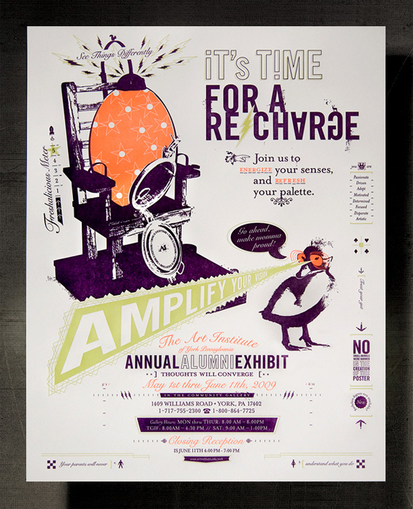
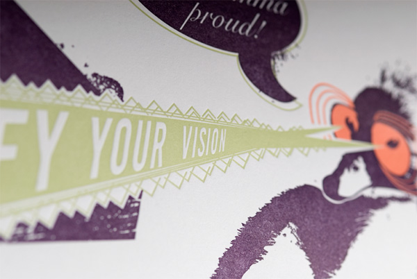
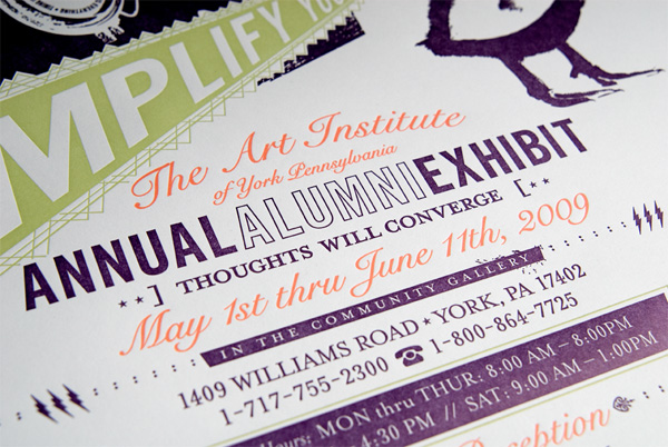
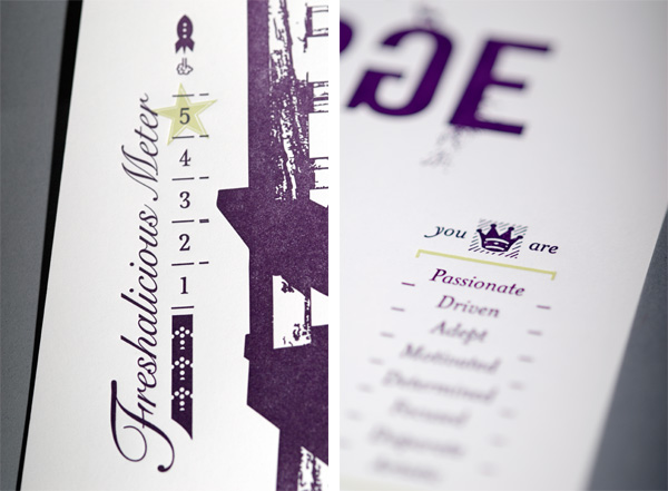
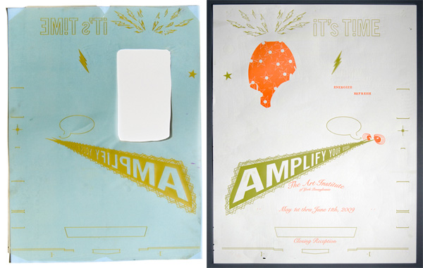
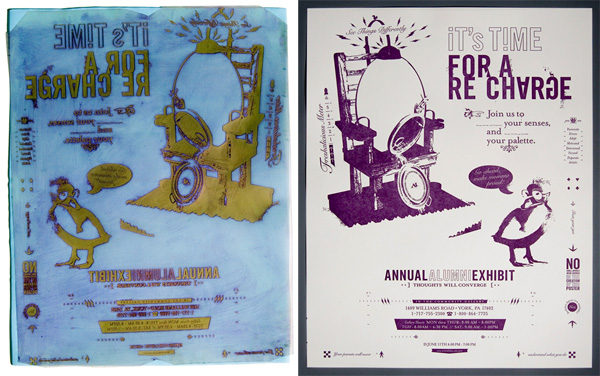
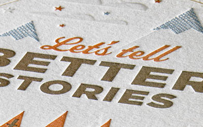
The crazy-eyed duck with inspiring musings shooting out of its eyes as it hatches from an electric chair charged egg, invites faculty, alumni, professionals and visitors alike to the annual alumni art exhibit at the Art Institute of York Pennsylvania. Designer Greg Bennett created a poster brimming with details around the concept of recharging for all those involved and present. Printed in letterpress, the poster is a great example of the method’s versatility showing off big solid blocks of color as well as small complicated details. Greg offers some tips on working with letterpress:
When selecting a letterpress printer be sure to request print samples that are representative of what you are trying to achieve. For example, if your piece has a lot of small type request samples with small type to see how well the printer can hold the legibility of small type. Other issues with small type you may encounter are how well the printer can hold small type that is being knocked of out solid areas of ink. Sometimes plugging may occur.
When printing letterpress you always want to be sure that a descent impression will be seen and felt once production is completed. Some paper takes the impression much better than others. This is not as much of a concern when printing with a 100% cotton paper such as Crane’s Lettra paper because it’s so soft. Sometimes clients cannot afford a premium of a grade of paper such as Crane so the designer must rely on the expertise of the print shop in recommending a paper that will take the impression well and still meet the client’s print budget.
Proper ink distribution with large blocks of solid color is always a concern when printing letterpress. You want to be sure your printer can distribute the ink evenly while staying true to your specified pms color(s). Watch for banding as well.

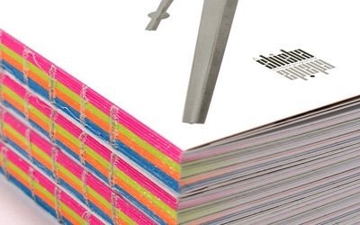
Above and below: Polymer plates (left) and the resulting color impression. Image above has a previous plate printed on it.

This post was published in the original layout of FPO so all images are smaller. Project descriptions as well as production lessons are quoted in the main content area.
Post Author
Armin

Armin Vit
Editor of FPO and co-founder of UnderConsideration LLC.
More: Online / On Twitter
Date Published
September 2, 2009
Filed Under
Posters
Tagged with
letterpress
typography


About
FPO (For Print Only), is a division of UnderConsideration, celebrating the reality that print is not dead by showcasing the most compelling printed projects.
FPO uses Fonts.com to render Siseriff and Avenir Next.
FPO is run with Six Apart’s MovableType
All comments, ideas and thoughts on FPO are property of their authors; reproduction without the author’s or FPO’s permission is strictly prohibited
Twitter @ucllc
Sign-up for Mailing List
Mailing list managed by MailChimp
Thanks to our advertisers
About UnderConsideration
UnderConsideration is a graphic design firm generating its own projects, initiatives, and content while taking on limited client work. Run by Bryony Gomez-Palacio and Armin Vit in Bloomington, IN. More…
blogs we publish
Brand New / Displaying opinions and focusing solely on corporate and brand identity work.
Art of the Menu / Cataloguing the underrated creativity of menus from around the world.
Quipsologies / Chronicling the most curious, creative, and notable projects, stories, and events of the graphic design industry on a daily basis.
products we sell
Flaunt: Designing effective, compelling and memorable portfolios of creative work.
Brand New Conference videos / Individual, downloadable videos of every presentation since 2010.
Prints / A variety of posters, the majority from our AIforGA series.
Other / Various one-off products.
events we organize
Brand New Conference / A two-day event on corporate and brand identity with some of today's most active and influential practitioners from around the world.
Brand Nieuwe Conference / Ditto but in Amsterdam.
Austin Initiative for Graphic Awesomeness / A speaker series in Austin, TX, featuring some of the graphic design industry's most awesome people.
also
Favorite Things we've Made / In our capacity as graphic designers.
Projects we've Concluded / Long- and short-lived efforts.
UCllc News / Updates on what's going at the corporate level of UnderConsideration.

Related entries
36 Days of Type Poster
Ministry of Environment in Colombia Poster
National Parks Map
eBoy Poster
“Love Your Mother” Print