ADV @ UNDERCONSIDERATION Peek here for details
BROWSE
Client
Arnie and Evan Harder
Quantity Produced
65
Production Cost
$100
Production Time
1 week
Dimensions (Width × Height × Depth)
5.25 in. × 8 in.
Page Count
–
Paper Stock
–
Number of Colors
2
Varnishes
–
Binding
–
Typography
Geometric Slabserif 712
Bodoni
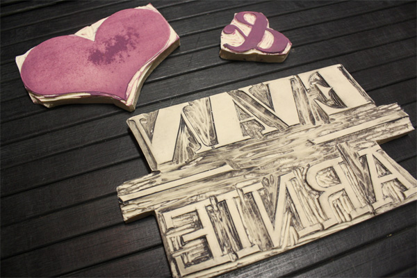
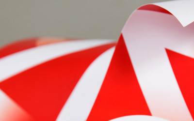
To create a handmade wrapper that held together the invitation, reply and direction cards and the envelopes for his brother-in-law’s wedding, David Senior decided to forego both the computer and a custom stamp and instead opted for carving out his own set of linoleum stamps. While the rest of the materials were handled by a print shop, David took matters into his own hands with the wrapper, reinforcing the attitude and hobbies of the couple: the outdoors, camping, rock climbing and otherwise any kind of activity that got their hands dirty. David sure got his own share:
My process was truly trial and error for this, just sort of winged it as I went along. I had never done linoleum carving before, I may have done one project in 7th or 8th grade art class, but really can’t remember if I did or not. I printed off the names, ampersand, and heart and then traced each of them onto another sheet of paper with a pencil, then transferred that to the stamps for a guide to cut with. Then just cut along the lines. I know you can purchase a stamp for pretty cheap, but I was set on getting the handmade quality for this, with the small imperfections that come along with that.
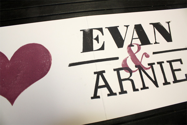
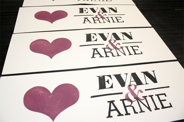
Once the stamps were done, I started to print with the water based inks that came with a set purchased for this project. I did a few test runs of the heart, and after letting it dry, realized that it wouldn’t work. The ink smeared to the touch even after drying for a few days. I read about oil based inks and bought some. These worked exactly like I envisioned, but they took forever to dry completely. Since the ampersand overlapped the names, the names needed to be stamped first, and it needed to dry before overlapping the eggplant color. After about 2 to 3 days drying time, which caused me to lose all my basement space as a makeshift drying rack, I was finally able to start on the second color. The hearts were stamped first, and then the ampersand was last. Each inking would yield 2 or 3 stamps before needing to be re-inked. A loose guide was set up to position the names because I wanted only a little bit of the left side of the names to be over the fold. It was basically just a piece of paper, the same length as the wrapper, taped to the work surface that had pencil marks where the fold was going to be. Lined up the wrapper to the guide paper, and then stamped a little to the left of the pencil mark, and centered top to bottom. The ampersand was small enough to see exactly where it was going, and the heart was basically dead center to that panel, so I didn’t bother with making guides for them.
I really like that all the wrappers are unique, depending on David’s aim and the ink density, and they certainly add a woodsy flair that would have been really hard to convey solely through typesetting. Plus, if any future clients of David need a heart or are named Evan and Arnie, he is all set.

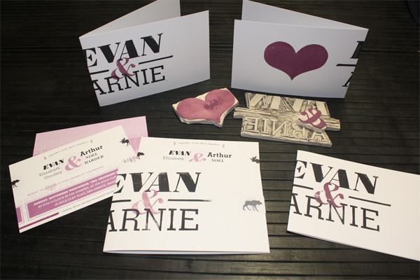
Arnie & Evan Wedding Invitation
Production Method
Design
David Senior
Printing
David Senior (outer wrapper only)
This post was published in the original layout of FPO so all images are smaller. Project descriptions as well as production lessons are quoted in the main content area.
Post Author
Armin

Armin Vit
Editor of FPO and co-founder of UnderConsideration LLC.
More: Online / On Twitter
Date Published
October 29, 2009
Filed Under
Invitations
Tagged with
carving
hand stamping
heart
invitation
linoleum


About
FPO (For Print Only), is a division of UnderConsideration, celebrating the reality that print is not dead by showcasing the most compelling printed projects.
FPO uses Fonts.com to render Siseriff and Avenir Next.
FPO is run with Six Apart’s MovableType
All comments, ideas and thoughts on FPO are property of their authors; reproduction without the author’s or FPO’s permission is strictly prohibited
Twitter @ucllc
Sign-up for Mailing List
Mailing list managed by MailChimp
Thanks to our advertisers
About UnderConsideration
UnderConsideration is a graphic design firm generating its own projects, initiatives, and content while taking on limited client work. Run by Bryony Gomez-Palacio and Armin Vit in Bloomington, IN. More…
blogs we publish
Brand New / Displaying opinions and focusing solely on corporate and brand identity work.
Art of the Menu / Cataloguing the underrated creativity of menus from around the world.
Quipsologies / Chronicling the most curious, creative, and notable projects, stories, and events of the graphic design industry on a daily basis.
products we sell
Flaunt: Designing effective, compelling and memorable portfolios of creative work.
Brand New Conference videos / Individual, downloadable videos of every presentation since 2010.
Prints / A variety of posters, the majority from our AIforGA series.
Other / Various one-off products.
events we organize
Brand New Conference / A two-day event on corporate and brand identity with some of today's most active and influential practitioners from around the world.
Brand Nieuwe Conference / Ditto but in Amsterdam.
Austin Initiative for Graphic Awesomeness / A speaker series in Austin, TX, featuring some of the graphic design industry's most awesome people.
also
Favorite Things we've Made / In our capacity as graphic designers.
Projects we've Concluded / Long- and short-lived efforts.
UCllc News / Updates on what's going at the corporate level of UnderConsideration.

Related entries
“An Evening onboard the HMS Victory” Invitation
Rainforest Alliance 2017 Annual Gala Invitation
The Nelson-Atkins Museum of Art Invitation
Victoria and Sasha Wedding Invitation
“Fast & Four” Skateboard Deck Invitation