ADV @ UNDERCONSIDERATION Peek here for details
BROWSE
Dimensions (Width × Height × Depth)
4.75 in × 4.75 in × .25 in
Page Count
–
Paper Stock
Packaging: 18pt Chipboard
Belly band: Red Canson
Number of Colors
2 spot (black and white)
As the one designer in his band, Lord Mandrake, Spencer Charles set out to design and produce their second album. Not happy with the somewhat cookie-cutter outcome of their first title which was laser printed, the band settled on silkscreen and the best choice for their aesthetic needs and budgetary restrictions — and they would, of course, do it themselves. But I will let Spencer tell you a little more about the experience:
I did the illustrations in Adobe Illustrator, exposed them on to the screens using a poorly built light table in my serial-killer basement, and did all the printing on my kitchen table. I encountered more problems than can be counted, but there are a couple of lessons I learned that I would like to share with anyone new to screenprinting:
- Be prepared to make big mistakes. It never goes as planned, make sure you are flexible and have many different options in case something goes wrong.
- Be prepared to spend most of your time planning/problem solving. The actual printing stage goes very quickly, it’s setting everything up to run smoothly that will take up the majority of your time.
- Have access to a pressure washer. Cleaning a screen by hand is next to impossible.
The amount of work involved in screenprinting can be staggering, but if you have the time and persistence, you can end up with a very cool, cost effective product.
By looking at the final result I do not get the sense of many problems encountered, so I have to give kudos to Spencer for finding ways to overcome his obstacles and put out a quality piece that does not reflect his troubles.
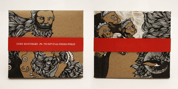

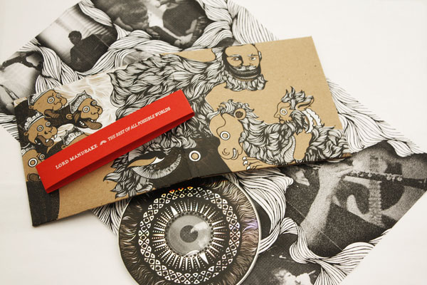
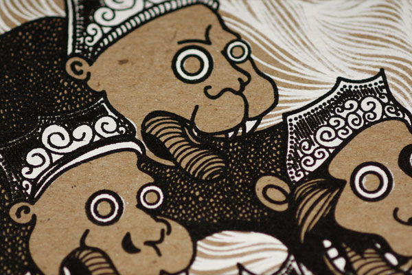
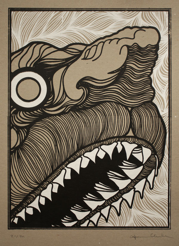
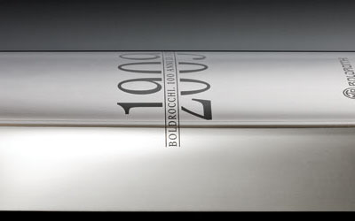
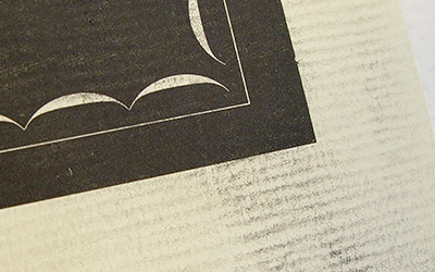
Lord Mandrake CD packaging
Production Method
Design
Illustration, design and typography: Spencer Charles
Illustrations heavily influenced by the work of Konrad Gessner
Printing
Spencer Charles
This post was published in the original layout of FPO so all images are smaller. Project descriptions as well as production lessons are quoted in the main content area.
Post Author
Bryony

Bryony Gomez-Palacio
Editor of FPO and co-founder of UnderConsideration LLC.
More: Online / On Twitter
Date Published
October 12, 2009
Filed Under
Music Packaging
Tagged with
canson
CD packaging
chipboard
DIY
filosofia
silkscreen


About
FPO (For Print Only), is a division of UnderConsideration, celebrating the reality that print is not dead by showcasing the most compelling printed projects.
FPO uses Fonts.com to render Siseriff and Avenir Next.
FPO is run with Six Apart’s MovableType
All comments, ideas and thoughts on FPO are property of their authors; reproduction without the author’s or FPO’s permission is strictly prohibited
Twitter @ucllc
Sign-up for Mailing List
Mailing list managed by MailChimp
Thanks to our advertisers
About UnderConsideration
UnderConsideration is a graphic design firm generating its own projects, initiatives, and content while taking on limited client work. Run by Bryony Gomez-Palacio and Armin Vit in Bloomington, IN. More…
blogs we publish
Brand New / Displaying opinions and focusing solely on corporate and brand identity work.
Art of the Menu / Cataloguing the underrated creativity of menus from around the world.
Quipsologies / Chronicling the most curious, creative, and notable projects, stories, and events of the graphic design industry on a daily basis.
products we sell
Flaunt: Designing effective, compelling and memorable portfolios of creative work.
Brand New Conference videos / Individual, downloadable videos of every presentation since 2010.
Prints / A variety of posters, the majority from our AIforGA series.
Other / Various one-off products.
events we organize
Brand New Conference / A two-day event on corporate and brand identity with some of today's most active and influential practitioners from around the world.
Brand Nieuwe Conference / Ditto but in Amsterdam.
Austin Initiative for Graphic Awesomeness / A speaker series in Austin, TX, featuring some of the graphic design industry's most awesome people.
also
Favorite Things we've Made / In our capacity as graphic designers.
Projects we've Concluded / Long- and short-lived efforts.
UCllc News / Updates on what's going at the corporate level of UnderConsideration.

Related entries
German Army’s Taushiro Records and Packaging
Lead Belly Box Set
Sound Changes Everything
Ssaliva - Sync Thrill
Ssaliva Record Cover