ADV @ UNDERCONSIDERATION Peek here for details
BROWSE
Dimensions (Width × Height × Depth)
11.6 in × 12 in
Page Count
–
Paper Stock
Enviro, 80 lb Cover, Uncoated
Number of Colors
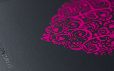
1 spot (Black)
As part of a larger project for Bodkin, a women’s clothing collection by designer Eviana Hartman, that included a look book, event and photography art direction the team at New York based Roanne Adams created a pretty funky invitation for an important event. Here is the concept.
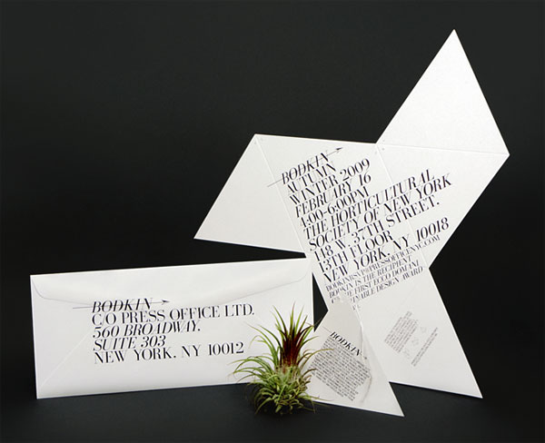
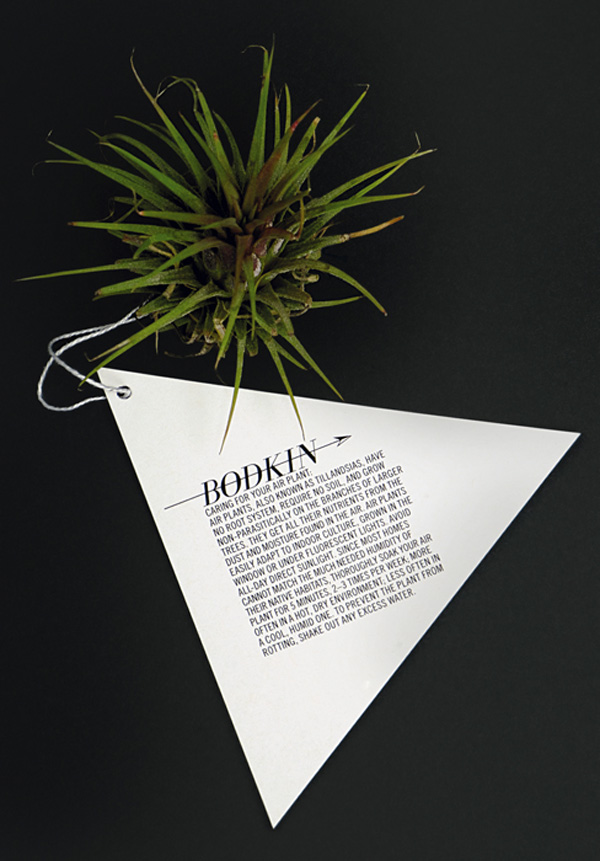
We chose to have the Bodkin Autumn/Winter ‘09 presentation at the Horticultural Society of New York. This location helped dictate the idea of sending out air plants to the attendees. Once that was decided we needed to create an invitation that could serve other purpose besides just inviting people, so we decided to create a container for the plant to be delivered in.
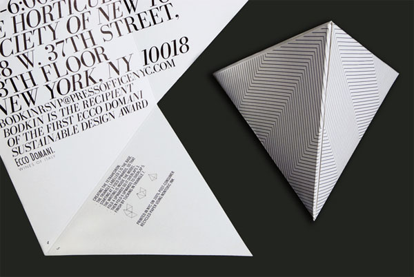
The concept for the invitation design came from various places ranging from the location of the presentation, Eviana’s sustainability ideologies, and her design influences, specifically geometry and architect Buckminster Fuller. Thus, the reason why we chose to have the invitation arrive in the form of a 100% post consumer tetrahedron containing an air plant with care instructions.
At first I had been attracted to this invitation by the nice typography, and odd shape of the invitation, but the concept and execution really brings this together and I can very well see people putting together the tetrahedron and caring for their air plant. I know I would, and I’m not the kind of guy that takes care of air plants.
It’s unique in that the invitation took on multiple uses and encompassed a few different layers of ideas. It was a container for a plant as well as a special geometric shape that emphasized the name behind the line — Bodkin is a dagger, hairpin, or sharp, slender instrument used for making holes in cloth. The invite was produced locally with 100% post-consumer recycled paper and eco-friendly inks.
And, of course, things get more complicated when you involve flora in your design specs.
It was quite challenging to get an eco-friendly printer to print a complicated shape in the extremely tight turn around & budget that we had. We were really nervous about the paper weight, we thought that if the paper was too thick it would be hard to fold into a tetrahedron but if it was too light it wouldn’t be strong enough to hold the air plant. We were also a bit concerned about the timing of the air plants. We ordered 200 air plants to arrive around the date that the printing would be complete. Although it was a risky design, everything seemed to turn out perfectly.

Bodkin Invitation
Production Method
Design
Roanne Adams
Creative Direction: Roanne Adams
Design: Cynthia Ratsabouth
Printing
Focal Print
This post was published in the original layout of FPO so all images are smaller. Project descriptions as well as production lessons are quoted in the main content area.
Post Author
Armin

Armin Vit
Editor of FPO and co-founder of UnderConsideration LLC.
More: Online / On Twitter
Date Published
November 5, 2009
Filed Under
Invitations
Tagged with
black and white
fold
invitation
offset


About
FPO (For Print Only), is a division of UnderConsideration, celebrating the reality that print is not dead by showcasing the most compelling printed projects.
FPO uses Fonts.com to render Siseriff and Avenir Next.
FPO is run with Six Apart’s MovableType
All comments, ideas and thoughts on FPO are property of their authors; reproduction without the author’s or FPO’s permission is strictly prohibited
Twitter @ucllc
Sign-up for Mailing List
Mailing list managed by MailChimp
Thanks to our advertisers
About UnderConsideration
UnderConsideration is a graphic design firm generating its own projects, initiatives, and content while taking on limited client work. Run by Bryony Gomez-Palacio and Armin Vit in Bloomington, IN. More…
blogs we publish
Brand New / Displaying opinions and focusing solely on corporate and brand identity work.
Art of the Menu / Cataloguing the underrated creativity of menus from around the world.
Quipsologies / Chronicling the most curious, creative, and notable projects, stories, and events of the graphic design industry on a daily basis.
products we sell
Flaunt: Designing effective, compelling and memorable portfolios of creative work.
Brand New Conference videos / Individual, downloadable videos of every presentation since 2010.
Prints / A variety of posters, the majority from our AIforGA series.
Other / Various one-off products.
events we organize
Brand New Conference / A two-day event on corporate and brand identity with some of today's most active and influential practitioners from around the world.
Brand Nieuwe Conference / Ditto but in Amsterdam.
Austin Initiative for Graphic Awesomeness / A speaker series in Austin, TX, featuring some of the graphic design industry's most awesome people.
also
Favorite Things we've Made / In our capacity as graphic designers.
Projects we've Concluded / Long- and short-lived efforts.
UCllc News / Updates on what's going at the corporate level of UnderConsideration.

Related entries
“An Evening onboard the HMS Victory” Invitation
Rainforest Alliance 2017 Annual Gala Invitation
The Nelson-Atkins Museum of Art Invitation
Victoria and Sasha Wedding Invitation
“Fast & Four” Skateboard Deck Invitation