ADV @ UNDERCONSIDERATION Peek here for details
BROWSE
Client
1.1 Architects
Quantity Produced
300
Production Cost
AUS$3,000 (US$2,725)
Production Time
7 Days
Dimensions (Width × Height × Depth)
210 mm × 297 mm (8.25 in × 11.6 in) with oversized cover
Page Count
–
Paper Stock
Stephen, Uncoated 110gsm by Spicers Paper
Number of Colors
Offset: 1 spot (black)
Digital: CMYK
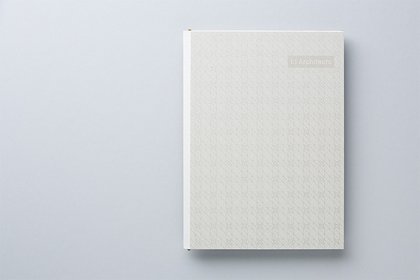
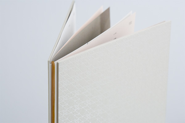
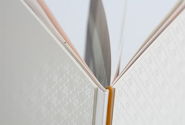
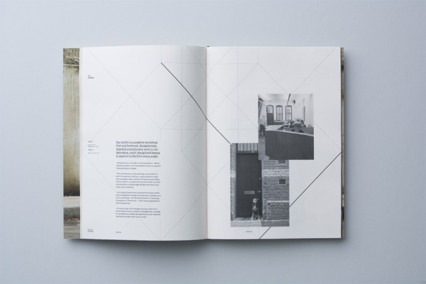
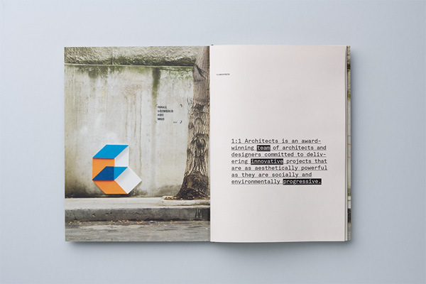
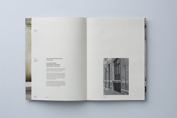
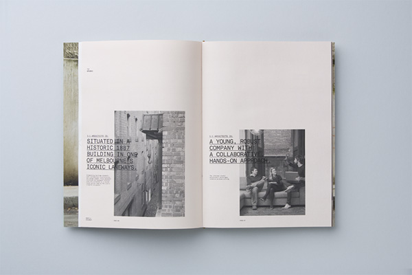
This brochure for Melbourne, Australia-based 1.1 Architects (pronounced One to One) is part of a bigger identity project designed by COÖP, also in Melbourne. The identity hinges on a three-dimensional photographic cube — or as they more lucidly explain, “based on the geometric principals of the tesseract (a four-dimensional cube) where imagination and varying inputs create many possible angles” — that lives in the outside world and is photographed against banal environments which in turn become the architecture firm’s brand imagery. From this magic cube, a patterning system was developed, and you can see it in action in the cover of the brochure, printed as a pearlescent foil on a nice thick layer. The guts of the brochure are printed in two different methods: in offset to have the standard information of the firm conveyed and then other spreads are printed digitally in color to be able to show different images as needed. The whole brochure comes together with an elastic band that acts as the binding method, keeping the cover and pages together, and exchangeable. It’s always great to see strong ideas, typography, photography and production come together in one nice package.


1.1 Architects Brochure
Production Method
Design
COÖPCreative Direction: Paul Fuog, Dan Honey
Design: Paul Fuog
Printing
Bambra Press
This post was published in the original layout of FPO so all images are smaller. Project descriptions as well as production lessons are quoted in the main content area.
Post Author
Armin

Armin Vit
Editor of FPO and co-founder of UnderConsideration LLC.
More: Online / On Twitter
Date Published
December 9, 2009
Filed Under
Brochures
Tagged with
brochure
elastic band
offset
pearlescent
varnish


About
FPO (For Print Only), is a division of UnderConsideration, celebrating the reality that print is not dead by showcasing the most compelling printed projects.
FPO uses Fonts.com to render Siseriff and Avenir Next.
FPO is run with Six Apart’s MovableType
All comments, ideas and thoughts on FPO are property of their authors; reproduction without the author’s or FPO’s permission is strictly prohibited
Twitter @ucllc
Sign-up for Mailing List
Mailing list managed by MailChimp
Thanks to our advertisers
About UnderConsideration
UnderConsideration is a graphic design firm generating its own projects, initiatives, and content while taking on limited client work. Run by Bryony Gomez-Palacio and Armin Vit in Bloomington, IN. More…
blogs we publish
Brand New / Displaying opinions and focusing solely on corporate and brand identity work.
Art of the Menu / Cataloguing the underrated creativity of menus from around the world.
Quipsologies / Chronicling the most curious, creative, and notable projects, stories, and events of the graphic design industry on a daily basis.
products we sell
Flaunt: Designing effective, compelling and memorable portfolios of creative work.
Brand New Conference videos / Individual, downloadable videos of every presentation since 2010.
Prints / A variety of posters, the majority from our AIforGA series.
Other / Various one-off products.
events we organize
Brand New Conference / A two-day event on corporate and brand identity with some of today's most active and influential practitioners from around the world.
Brand Nieuwe Conference / Ditto but in Amsterdam.
Austin Initiative for Graphic Awesomeness / A speaker series in Austin, TX, featuring some of the graphic design industry's most awesome people.
also
Favorite Things we've Made / In our capacity as graphic designers.
Projects we've Concluded / Long- and short-lived efforts.
UCllc News / Updates on what's going at the corporate level of UnderConsideration.

Related entries
Carta de Exploración Brochure
Paperless Post Wedding 2017 Promotion
Karipidis Winery Brochure
Neenah “Fresh Takes on Classic Type on CLASSIC® Papers” Promo
Faculty of Architecture, Art & Design Brochure