ADV @ UNDERCONSIDERATION Peek here for details
BROWSE
Client
Self-promotion
Quantity Produced
176
Production Cost
–
Production Time
8 days
Dimensions (Width × Height × Depth)
105 mm (4.13 in) × 148 mm (5.82 in)
Page Count
–
Paper Stock
200 gsm white uncoated
Number of Colors
Black + 1 (per postcard)
Varnishes
–
Binding
–
Typography
Millhouse
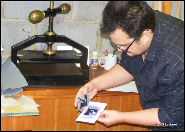
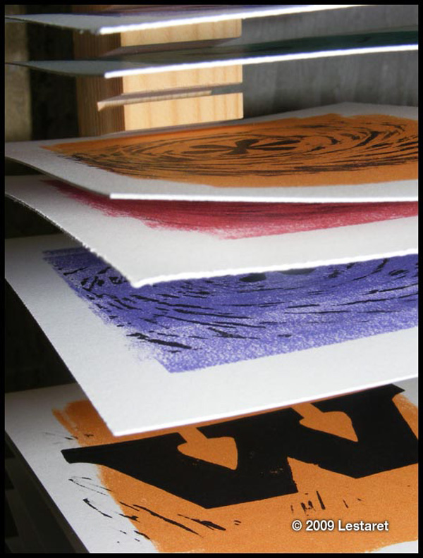
Christopher Skinner recently purchased an old nipping press, and while mostly interested in bookbinding he began experimenting with linocut printing.
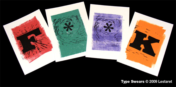
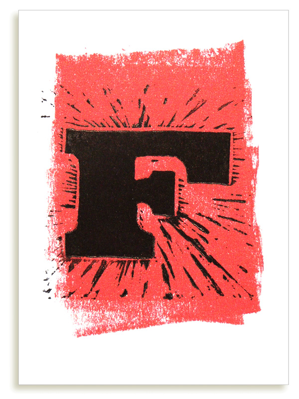
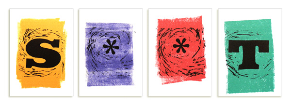
These cards came about as I was making small test pieces and enjoying the variation in quality, from over-inked to under inked and overpressed. It’s a ‘celebration’ if you like, of the vagaries and uniqueness of hand printing. The idea behind the postcards came from a genuine love of letterforms, and I had originally planned to do a series of letters in defunct victorian fonts. In the end, I decided that explore censored swear words as a means to celebrate the power of innocent symbols - if the pen is mightier that the sword, then the letterforms themselves are indeed, mightier than the pen, lead type, letraset, photocomposition, Mac etc, etc…
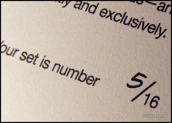
In a delicate size, these postcards are sure to impress upon the receiver a sense of humor and playfulness that many designers can relate to. Colorful and straightforward as the words they depict you can pick up a set — only 16 available — for your own use via Christopher’s online store. Note that each packet contains 10 postcards with the letters F, K, W, S, P, C, two Ts and two *s for your spelling delight.

This post was published in the original layout of FPO so all images are smaller. Project descriptions as well as production lessons are quoted in the main content area.
Post Author
Bryony

Bryony Gomez-Palacio
Editor of FPO and co-founder of UnderConsideration LLC.
More: Online / On Twitter
Date Published
December 1, 2009
Filed Under
Postcard
Tagged with
DIY
Hand pulled victorian nipping press
postcard


About
FPO (For Print Only), is a division of UnderConsideration, celebrating the reality that print is not dead by showcasing the most compelling printed projects.
FPO uses Fonts.com to render Siseriff and Avenir Next.
FPO is run with Six Apart’s MovableType
All comments, ideas and thoughts on FPO are property of their authors; reproduction without the author’s or FPO’s permission is strictly prohibited
Twitter @ucllc
Sign-up for Mailing List
Mailing list managed by MailChimp
Thanks to our advertisers
About UnderConsideration
UnderConsideration is a graphic design firm generating its own projects, initiatives, and content while taking on limited client work. Run by Bryony Gomez-Palacio and Armin Vit in Bloomington, IN. More…
blogs we publish
Brand New / Displaying opinions and focusing solely on corporate and brand identity work.
Art of the Menu / Cataloguing the underrated creativity of menus from around the world.
Quipsologies / Chronicling the most curious, creative, and notable projects, stories, and events of the graphic design industry on a daily basis.
products we sell
Flaunt: Designing effective, compelling and memorable portfolios of creative work.
Brand New Conference videos / Individual, downloadable videos of every presentation since 2010.
Prints / A variety of posters, the majority from our AIforGA series.
Other / Various one-off products.
events we organize
Brand New Conference / A two-day event on corporate and brand identity with some of today's most active and influential practitioners from around the world.
Brand Nieuwe Conference / Ditto but in Amsterdam.
Austin Initiative for Graphic Awesomeness / A speaker series in Austin, TX, featuring some of the graphic design industry's most awesome people.
also
Favorite Things we've Made / In our capacity as graphic designers.
Projects we've Concluded / Long- and short-lived efforts.
UCllc News / Updates on what's going at the corporate level of UnderConsideration.

Related entries
Younite Promotional Cards
Latitude Postcard
Oh Christmas Cards
The Department Postcards
Tinta de Verano - Solar Prints