ADV @ UNDERCONSIDERATION Peek here for details
BROWSE
Dimensions (Width × Height × Depth)
9.5 in × 12.5 in × 0.75 in
Page Count
144
Paper Stock
Cover: 1/8-in chipboard
Body: Mohawk Superfine, Smooth White, 100 lb Text
Number of Colors
CMYK + 1 Spot (PMS 109)
Varnishes
–
Binding
Perfect-bound
Typography
DIN
Clarendon Bold
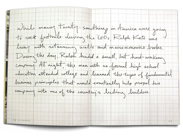
Kim Knoll's handwriting
To celebrate their 50th anniversary, the Midwest-based Korte Company commissioned Tom, Dick & Harry Advertising to create a book celebrating their efforts in building the best projects possible. Chicago-based designer Kim Knoll explains how the book came to be:
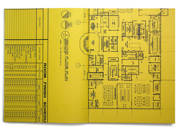
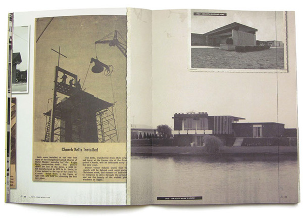
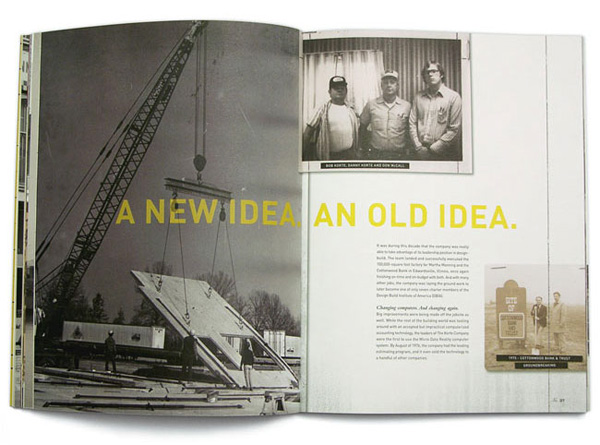
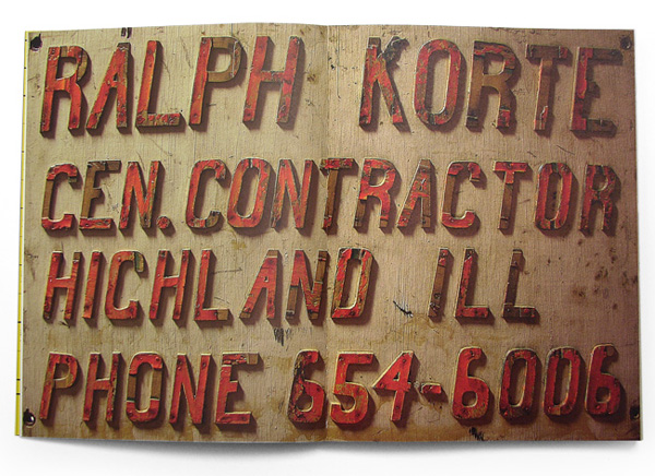
The client sent 8 large boxes full of loose photos, scrapbooks, files, photo albums and certificates… you name it, it was in one of those boxes. The contents pretty much covered every news clipping and photo the company had saved since 1950. After going through all the boxes, the idea was born. Why not create another scrapbook? But this time, it would be the highlights of every decade over the last 50 years. A good amount of time was spent going through everything and categorizing what was useful and what wasn’t. The good stuff was sorted into decades and scanned at 600dpi to get the best resolution to work with for sizing, printing, etc. The way the book was designed, each photo or article that runs off the page continues on the next page. So if you were to rip every page out of the book and line them up side by side, it would create a continuous 50-year timeline.
The result is — not to pigeonhole the aesthetic but… — is a very proud, rough Midwestern book oozing a vintage feel that is very hard to resist. I think my favorite part are the 2-color endpapers. And perhaps the team’s favorite part was the hardships:
This book took 10 months to put together and 3 months to print. Unfortunately, when the books were getting bound — all 1,800 of them — too much glue was used and it spread into the pages, making the pages stick together. Everything had to be reprinted, which is why the printing took longer than expected.
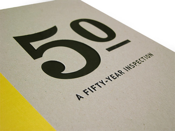

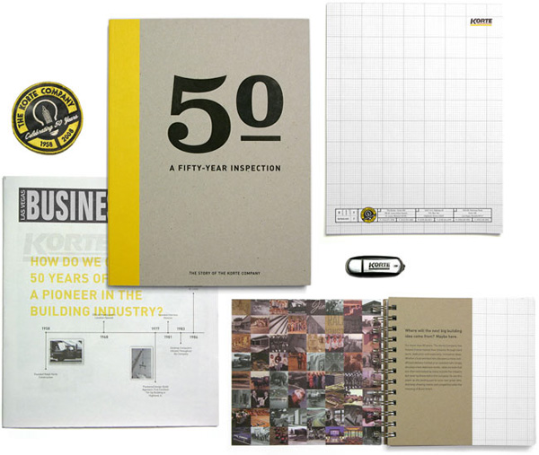
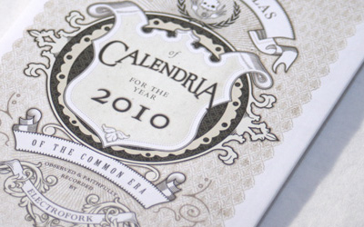
The Korte Company 50th Anniversary Book
Production Method
Design
Agency: Tom, Dick & Harry Advertising
Creative Director: David Yang
Writer: Michael Herlehy
Designer: Kim Knoll
Printing
–
This post was published in the original layout of FPO so all images are smaller. Project descriptions as well as production lessons are quoted in the main content area.
Post Author
Armin

Armin Vit
Editor of FPO and co-founder of UnderConsideration LLC.
More: Online / On Twitter
Date Published
December 11, 2009
Filed Under
Books
Tagged with
book
chipboard
foil stamp
offset


About
FPO (For Print Only), is a division of UnderConsideration, celebrating the reality that print is not dead by showcasing the most compelling printed projects.
FPO uses Fonts.com to render Siseriff and Avenir Next.
FPO is run with Six Apart’s MovableType
All comments, ideas and thoughts on FPO are property of their authors; reproduction without the author’s or FPO’s permission is strictly prohibited
Twitter @ucllc
Sign-up for Mailing List
Mailing list managed by MailChimp
Thanks to our advertisers
About UnderConsideration
UnderConsideration is a graphic design firm generating its own projects, initiatives, and content while taking on limited client work. Run by Bryony Gomez-Palacio and Armin Vit in Bloomington, IN. More…
blogs we publish
Brand New / Displaying opinions and focusing solely on corporate and brand identity work.
Art of the Menu / Cataloguing the underrated creativity of menus from around the world.
Quipsologies / Chronicling the most curious, creative, and notable projects, stories, and events of the graphic design industry on a daily basis.
products we sell
Flaunt: Designing effective, compelling and memorable portfolios of creative work.
Brand New Conference videos / Individual, downloadable videos of every presentation since 2010.
Prints / A variety of posters, the majority from our AIforGA series.
Other / Various one-off products.
events we organize
Brand New Conference / A two-day event on corporate and brand identity with some of today's most active and influential practitioners from around the world.
Brand Nieuwe Conference / Ditto but in Amsterdam.
Austin Initiative for Graphic Awesomeness / A speaker series in Austin, TX, featuring some of the graphic design industry's most awesome people.
also
Favorite Things we've Made / In our capacity as graphic designers.
Projects we've Concluded / Long- and short-lived efforts.
UCllc News / Updates on what's going at the corporate level of UnderConsideration.

Related entries
Severe(d): A Creepy Poetry Collection by Holly Riordan
BOYCO Classpack® Book
Antes de Perder la Esperanza Book
Gunnel Wåhlstrand Exhibit Book
Szép versek & Körkép Book Covers