ADV @ UNDERCONSIDERATION Peek here for details
BROWSE
Client
Self-promotion
Quantity Produced
500
Production Cost
$2,700
Production Time
10 Days
Dimensions (Width × Height × Depth)
Invitations: 5.75 in × 9.25 in
A10 Envelopes
Page Count
–
Paper Stock
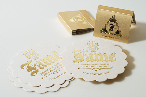
Invitation: Ahlstrom Blotter, 60 pt
A10 Envelopes: French Speckletone Brown
Number of Colors
2 Spot
Varnishes
–
Binding
–
Typography
Agincourt (Fontek), Leviathan (H&FJ), Stanzie (Jukebox), Bernhard Condensed (Linotype), Fling Plain (Linotype), Copperplate Gothic (Linotype), Archer (H&FJ), Knockout (H&FJ), Bryant Pro (Process Type Foundry)
Note: The details above are only for the invitation and envelopes.
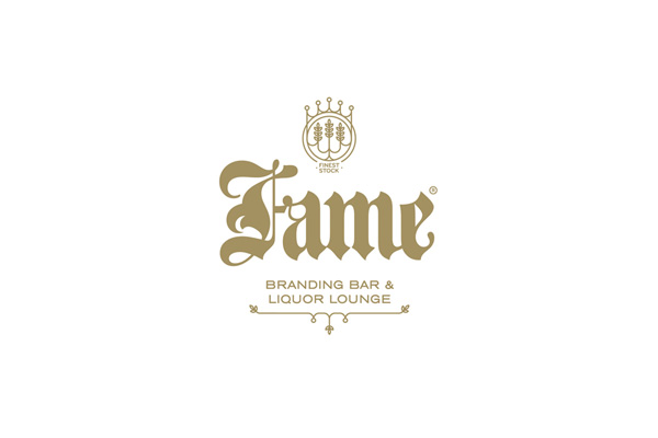
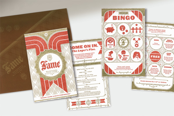
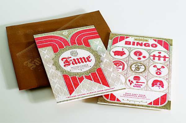
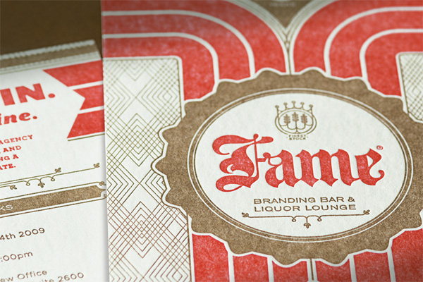
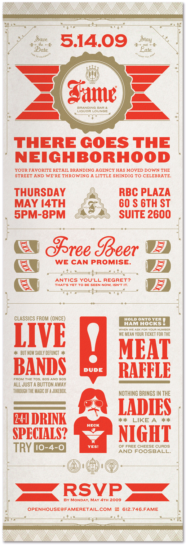
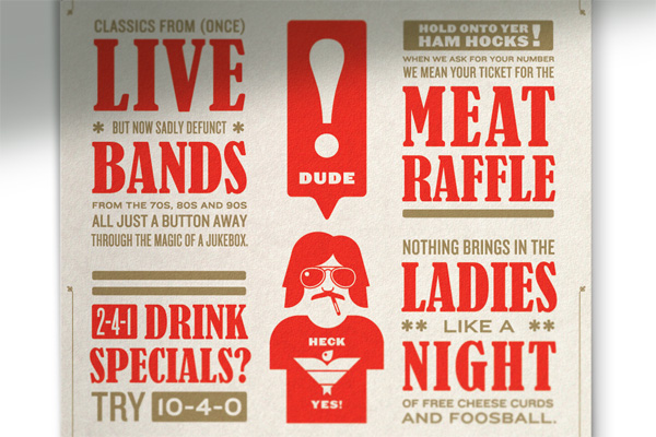
For 2009’s annual Open House party at Minneapolis-based FAME, a retail brand agency, the team decided on a “dive bar” theme that informed all the materials, from invitations to party accouterments. They created a fake identity for a fake bar, called FAME: Branding Bar & Liquor Lounge, that is actually pretty cool for any entrepreneur looking to open a bar called FAME. Sam Soulek, a designer at FAME, explains:
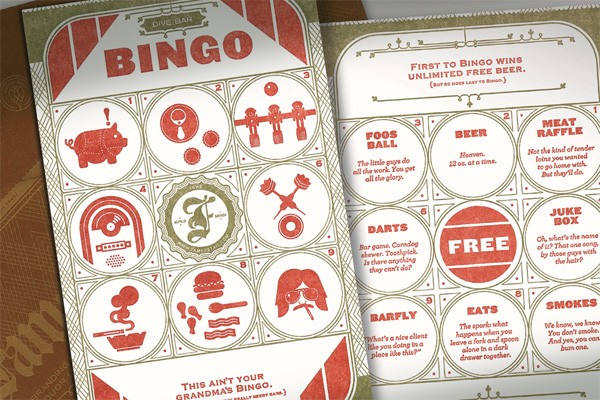
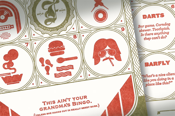
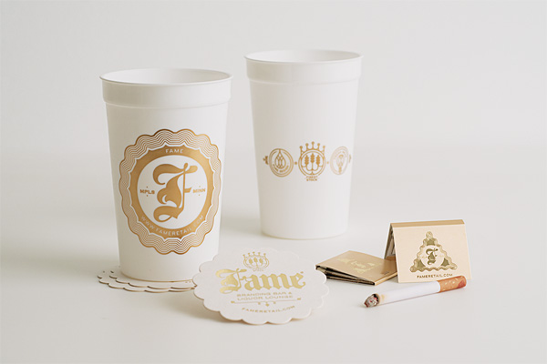
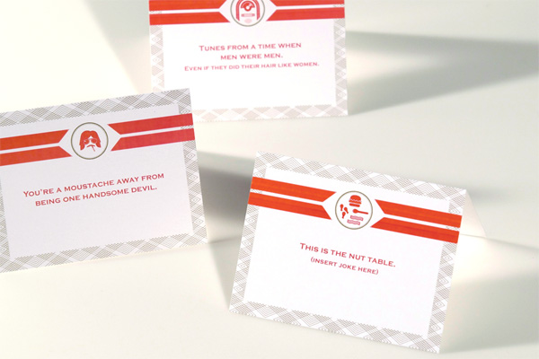
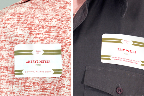
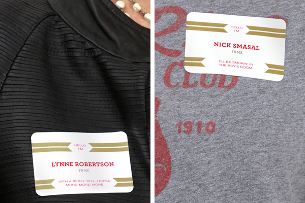
Being that it was a particularly good year for FAME but not the industry overall, we tried to restrain our print spending in the spirit of sensitivity. The bar kit elements were produced using economical online printing services that surprisingly did a great job for the price. The promo poster, table tents, and nametags were produced in-house. But when it came to the invite itself, we couldn’t resist the opportunity to work with our favorite letterpress printer, Studio OnFire. This was the real crowning achievement of the party. The double card invitation was send out in a rich brown envelope letterpressed in gold, advertising the event as a bar opening, complete with dive bar bingo and a meat raffle.
The invitation generated more buzz than any previous agency promotion and resulted in over 500 RSVP’s, ranging from current clients, potential clients, industry peers, vendors, and friends.
Meanwhile Studio on Fire chimes in with some advice for aspiring coaster-printers:
The blotter paper gives that thick coaster feel to the whole invite card and does take a nice impression. However, this is a notably difficult stock to print. Blotter stock has a textural and loose surface. Our joke is that it is basically like trying to run a rabbit through the press because it leaves so much fuzz and fiber behind in the press. The presses needs several wash ups during the run.
It’s really amazing to see what a simple color palette paired with a strong idea can do.

FAME Open House Party Materials
Production Method
Design
FAME
Creative Director: Bruce Edwards
Design Director: Eric Weiss
Designer/Illustrator: Sam Soulek
Copywriter: Chris Yocum
Printing
Letterpress Invitations and Envelopes: Studio OnFire
Matchbooks, Coasters: For Your Party
Keg Cups: Riptide

This post was published in the original layout of FPO so all images are smaller. Project descriptions as well as production lessons are quoted in the main content area.
Post Author
Armin

Armin Vit
Editor of FPO and co-founder of UnderConsideration LLC.
More: Online / On Twitter
Date Published
January 6, 2010
Filed Under
Self promotion
Tagged with
blotter
coaster
letterpress
thick


About
FPO (For Print Only), is a division of UnderConsideration, celebrating the reality that print is not dead by showcasing the most compelling printed projects.
FPO uses Fonts.com to render Siseriff and Avenir Next.
FPO is run with Six Apart’s MovableType
All comments, ideas and thoughts on FPO are property of their authors; reproduction without the author’s or FPO’s permission is strictly prohibited
Twitter @ucllc
Sign-up for Mailing List
Mailing list managed by MailChimp
Thanks to our advertisers
About UnderConsideration
UnderConsideration is a graphic design firm generating its own projects, initiatives, and content while taking on limited client work. Run by Bryony Gomez-Palacio and Armin Vit in Bloomington, IN. More…
blogs we publish
Brand New / Displaying opinions and focusing solely on corporate and brand identity work.
Art of the Menu / Cataloguing the underrated creativity of menus from around the world.
Quipsologies / Chronicling the most curious, creative, and notable projects, stories, and events of the graphic design industry on a daily basis.
products we sell
Flaunt: Designing effective, compelling and memorable portfolios of creative work.
Brand New Conference videos / Individual, downloadable videos of every presentation since 2010.
Prints / A variety of posters, the majority from our AIforGA series.
Other / Various one-off products.
events we organize
Brand New Conference / A two-day event on corporate and brand identity with some of today's most active and influential practitioners from around the world.
Brand Nieuwe Conference / Ditto but in Amsterdam.
Austin Initiative for Graphic Awesomeness / A speaker series in Austin, TX, featuring some of the graphic design industry's most awesome people.
also
Favorite Things we've Made / In our capacity as graphic designers.
Projects we've Concluded / Long- and short-lived efforts.
UCllc News / Updates on what's going at the corporate level of UnderConsideration.

Related entries
E.A.S.E. Stationery Set
End of Work iPad and Notebook Cases
Cranky Bucks Promotion
Pizza Box Promo Mailer
Bryan Patrick Todd Mailer