ADV @ UNDERCONSIDERATION Peek here for details
BROWSE
Client
True Story
Quantity Produced
200
Production Cost
Letterpress: $400
Silkscreen: $200
Production Time
2 weeks
Dimensions (Width × Height × Depth)
8.5 in × 11 in
Page Count
–
Paper Stock
59 pt Binders Board
Number of Colors
Letterpress: 1 Spot
Silkscreen: 3 Spot
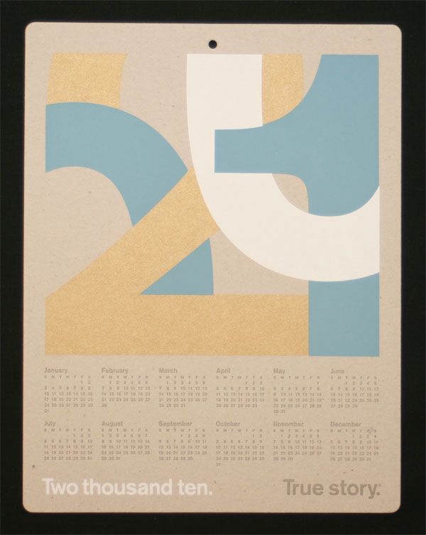
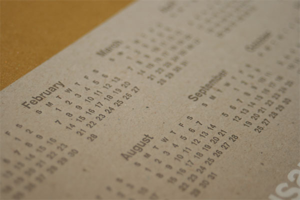
Every year True Story will sends out a holiday greeting to client and friends, and this past holiday was no exception. The one thing they changed was the durability of the greeting, by providing a year-long calendar that people could reference year round.
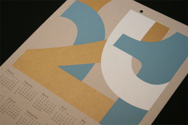
In keeping with our print identity, there is only type and color — no imagery or decoration. These limitations challenge us to create compositions that are interesting or dramatic based entirely on contrast and tension between the elements. For the calendar, we arranged and cropped the numbers of 2010 to focus on the beautiful form of the Akzidenz Grotesk numbers. We tried to balance between abstraction and clarity, providing enough information so the recipient could decipher what is says.
Having some experience in production helped the team determine some of the main characteristics of this project:
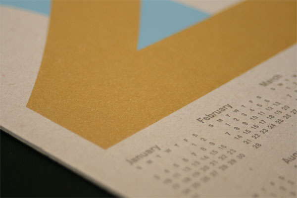
The size was partly chosen because Rohner, the printer, had an existing die available so we could save a little money. We used 59 pt. gray binders board (used to give hardcover books their rigidity) which proved to be a tricky surface for letterpress since it is both soft and toothy, sponging up the ink, but it was a great surface to silkscreen on. The mailing also included a note slip on French Speckletone Chocolate and Kraft Stay-flat envelopes.�
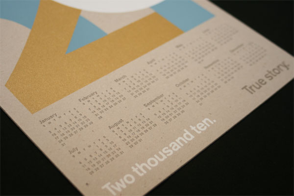
The days/months portion was printed by letterpress, allowing the type to be as crisp as possible at a relatively small size — past experiments with silkscreening fine type usually resulted in plugged screens and broken type. The silkscreen portion was printed in-house over a four-day period. The order of colors printed was gold, blue then white. The white screen contained both the big 0 and the spelled-out Two thousand ten, but after printing the first two colors, it wasn’t possible to precisely register the big number on top and align the smaller type on bottom, so we blocked off the screen and printed the white art in two separate runs.
And if I wasn’t keeping this project nicely protected and filed as part of the FPO archives, I would happily display — and use — it be it at home or in the office.

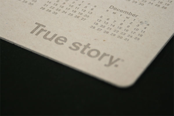
True Story 2010 Calendar
Production Method
Design
True Story
Design: Eric Wagner
Printing
Letterpress: Rohner Letterpress
This post was published in the original layout of FPO so all images are smaller. Project descriptions as well as production lessons are quoted in the main content area.
Post Author
Bryony

Bryony Gomez-Palacio
Editor of FPO and co-founder of UnderConsideration LLC.
More: Online / On Twitter
Date Published
February 10, 2010
Filed Under
Posters
Tagged with
berthold akzidenz medium
binders board
calendar
DIY
hole punch
letterpress
poster
rounded corners
self-promotion
silkscreen


About
FPO (For Print Only), is a division of UnderConsideration, celebrating the reality that print is not dead by showcasing the most compelling printed projects.
FPO uses Fonts.com to render Siseriff and Avenir Next.
FPO is run with Six Apart’s MovableType
All comments, ideas and thoughts on FPO are property of their authors; reproduction without the author’s or FPO’s permission is strictly prohibited
Twitter @ucllc
Sign-up for Mailing List
Mailing list managed by MailChimp
Thanks to our advertisers
About UnderConsideration
UnderConsideration is a graphic design firm generating its own projects, initiatives, and content while taking on limited client work. Run by Bryony Gomez-Palacio and Armin Vit in Bloomington, IN. More…
blogs we publish
Brand New / Displaying opinions and focusing solely on corporate and brand identity work.
Art of the Menu / Cataloguing the underrated creativity of menus from around the world.
Quipsologies / Chronicling the most curious, creative, and notable projects, stories, and events of the graphic design industry on a daily basis.
products we sell
Flaunt: Designing effective, compelling and memorable portfolios of creative work.
Brand New Conference videos / Individual, downloadable videos of every presentation since 2010.
Prints / A variety of posters, the majority from our AIforGA series.
Other / Various one-off products.
events we organize
Brand New Conference / A two-day event on corporate and brand identity with some of today's most active and influential practitioners from around the world.
Brand Nieuwe Conference / Ditto but in Amsterdam.
Austin Initiative for Graphic Awesomeness / A speaker series in Austin, TX, featuring some of the graphic design industry's most awesome people.
also
Favorite Things we've Made / In our capacity as graphic designers.
Projects we've Concluded / Long- and short-lived efforts.
UCllc News / Updates on what's going at the corporate level of UnderConsideration.

Related entries
36 Days of Type Poster
Ministry of Environment in Colombia Poster
National Parks Map
eBoy Poster
“Love Your Mother” Print